


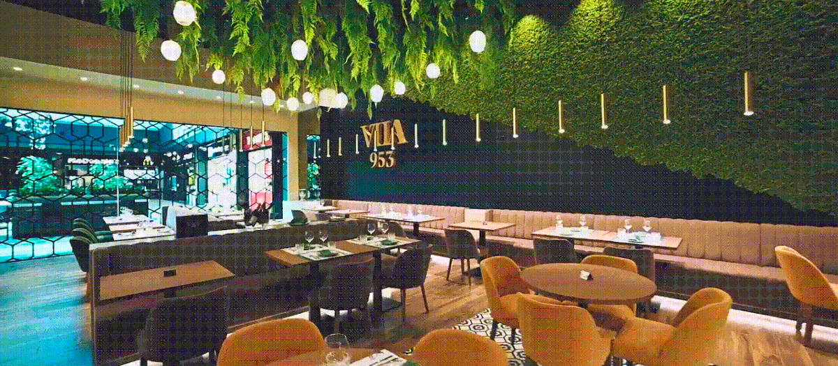
Restaurant before Opening (photo courtesy of Vila 953)
Vila 953 is a traditional restaurant with a contemporary approach, located in Vila do Conde, Portugal. As we delved into this branding project, researching for the narrative and designing the brand’s visual identity became a time trip and a thrilling challenge. As we dug through one of the oldest historic episodes at the genesis of our own country, we discovered the most charismatic characters and an unexpected commercial deal that led to the foundation of Portugal itself! How about that?! The final result tastes like tradition and is definitely one we are very proud of!
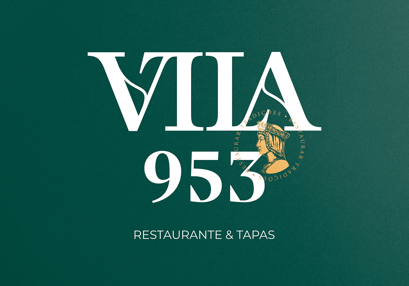
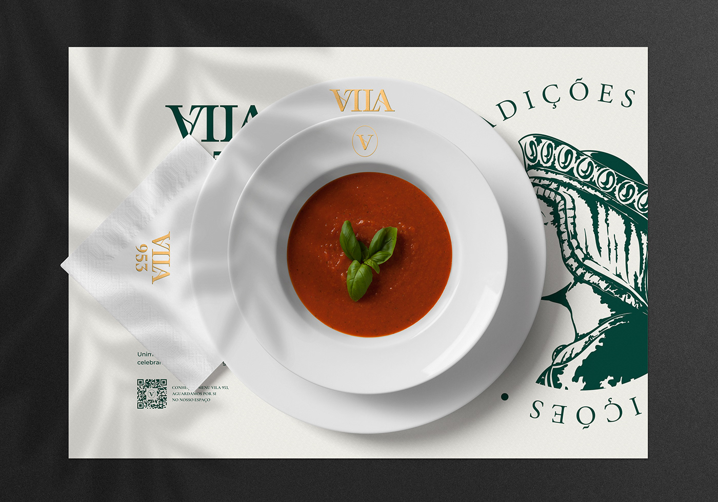
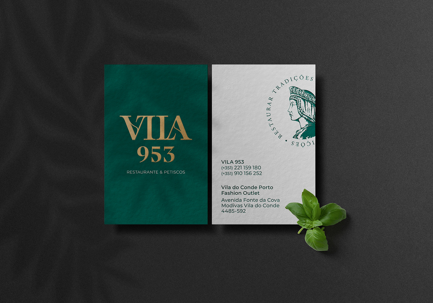
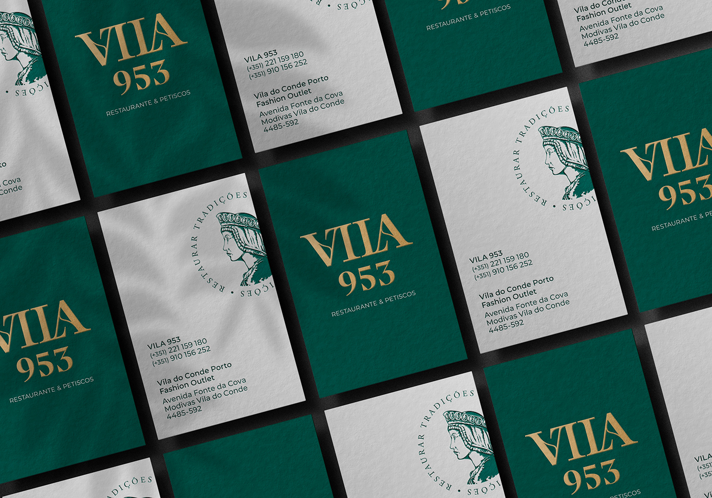
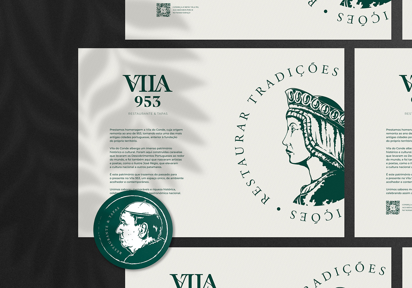
The Vila 953 brand breathes an elegant combination of tradition and contemporaneity, reflecting a modern and dynamic vision of the richness of our national gastronomic heritage. With a mission to pay homage to national gastronomy and the art of hospitality, the Vila 953 brand proudly incorporates strong traces of the past in an elegant visual aesthetic, reflecting the values of originality, quality and charisma.
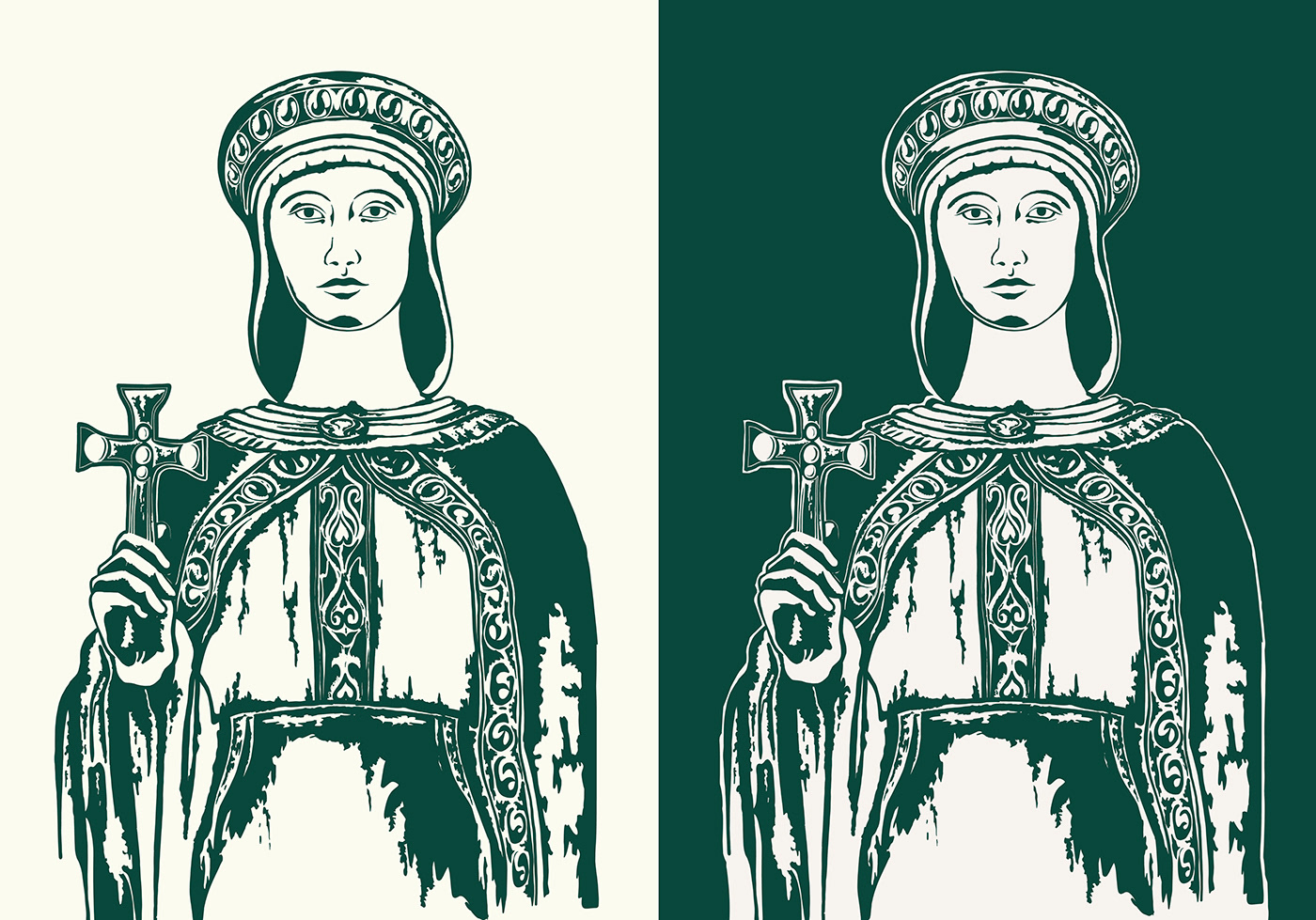
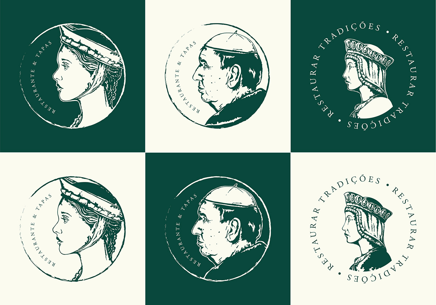
To achieve our client’s goals, we used some of the most emblematic historical figures that are at the origin of Vila do Conde and Portugal itself. They became the visual pillar of the brand, revealing an updated and sophisticated identity.
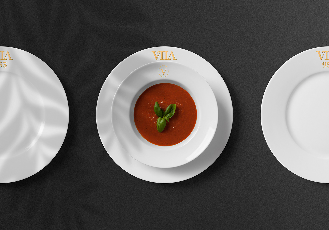
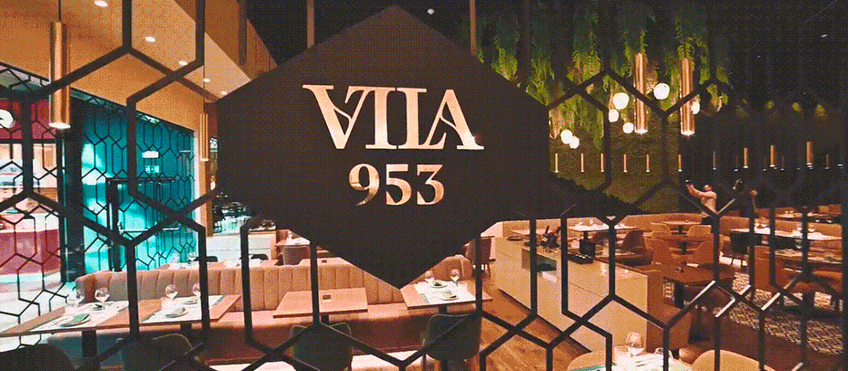
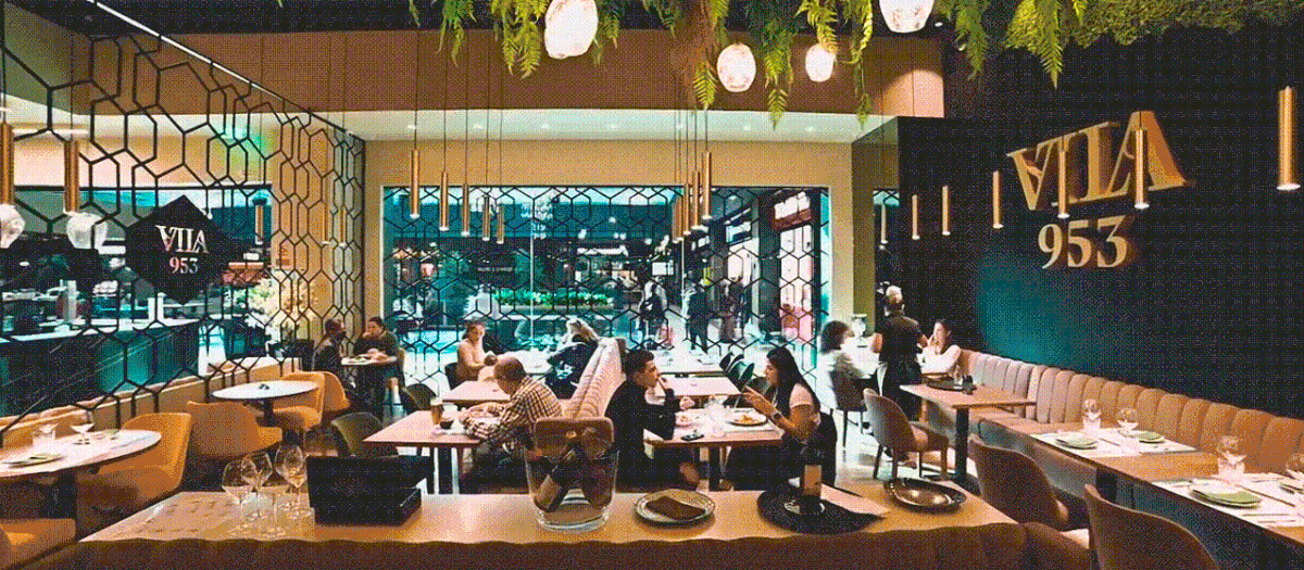
As a result of our collaboration in this branding endeavour, we find in Vila 953 a sophisticated yet welcoming space, which appeals to local memories of historical heritage while offering a wide range of high-quality traditional delicacies.
View more about this project here
—
Creative Director Sandra Lopes
Brand Strategist Isabel Evaristo
Brand Designer Brígida Guerreiro
Illustrator Gonçalo Cevadinha
Brand Strategist Isabel Evaristo
Brand Designer Brígida Guerreiro
Illustrator Gonçalo Cevadinha
Motion Designer Pedro Santos
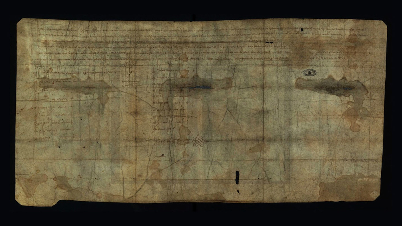
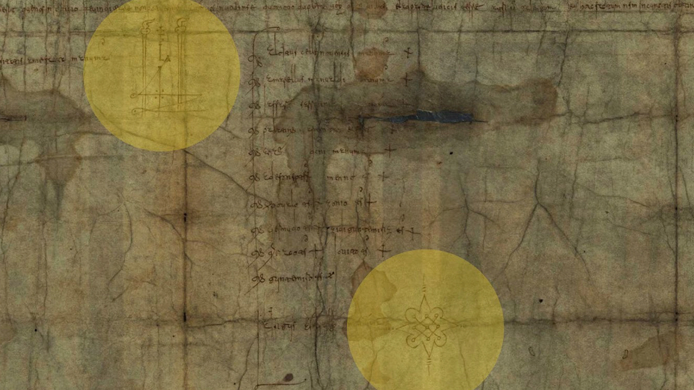
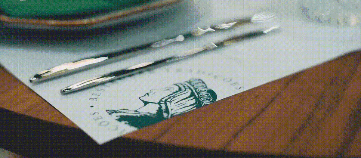
Original document dating back to March 26th, 953 AD: we went looking for visual references from that period and some elements became inspirational drivers for the visual rationale underpinning the brand. Visual references highlighted in yellow.
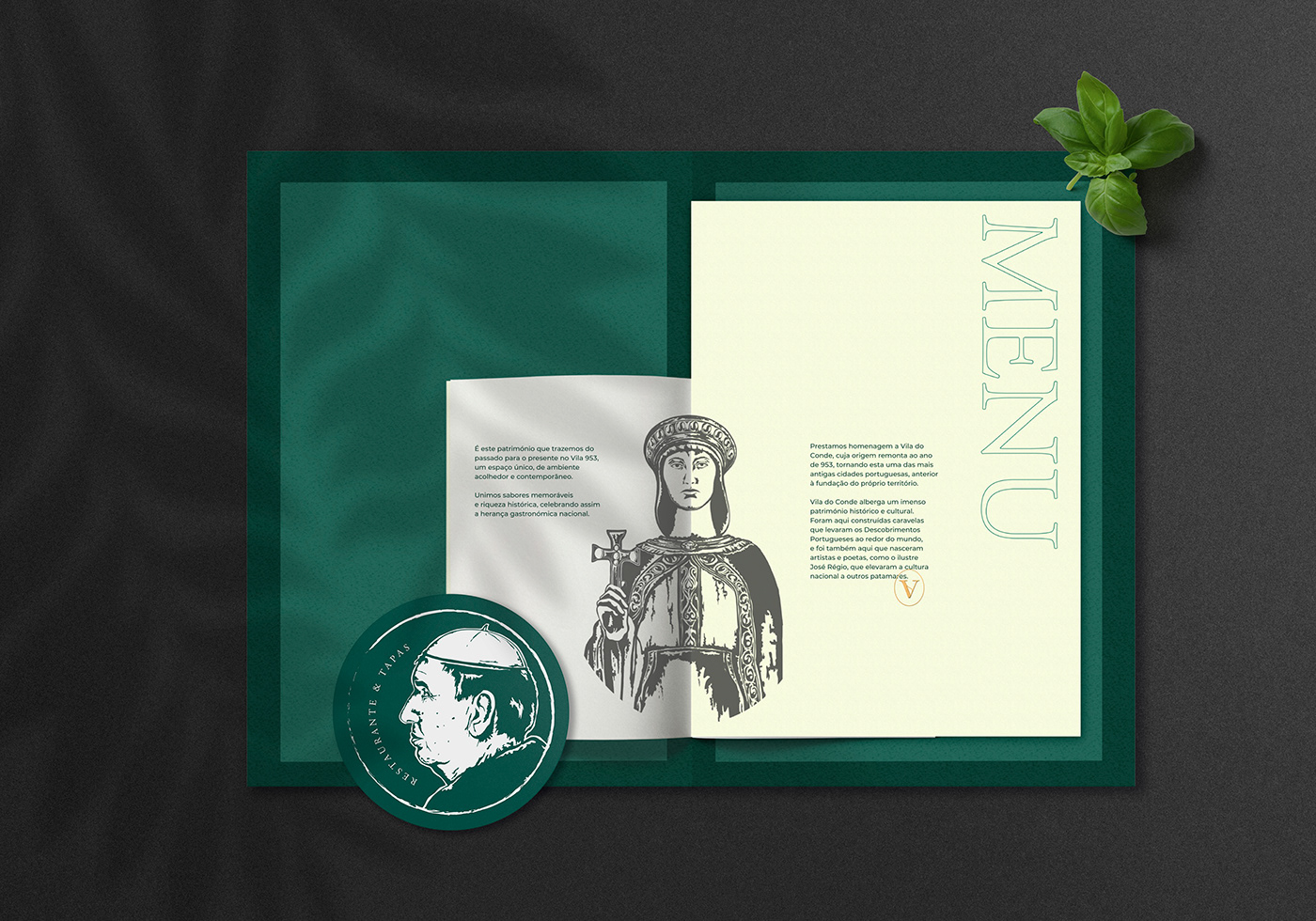
Vila 953’s message is closely associated with the history of Portugal, and the city of Vila do Conde in particular. The company intends to present itself as a traditional Portuguese food restaurant that will drink the charisma of its image and the diversity of its product from the roots of Portugal’s history.
The restaurant’s name refers to the foundation year of the village of Vila do Conde, which is surprisingly older than the country itself – we placed this fact at the root of the historical concept that ended up guiding the construction of the brand identity and visual universe defined for Vila 953. We used one of our most beloved creative tools – storytelling – to embody the richness of this brand.
Join us now in the exploration of the process.
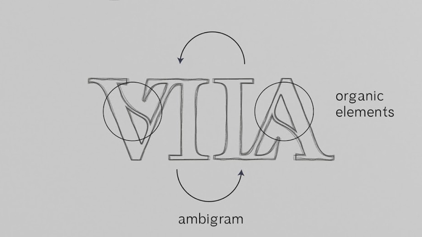
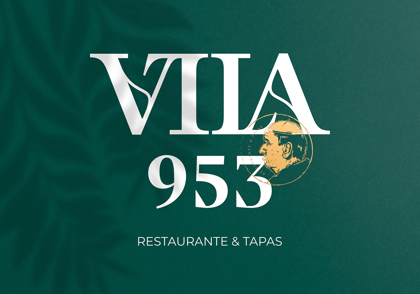
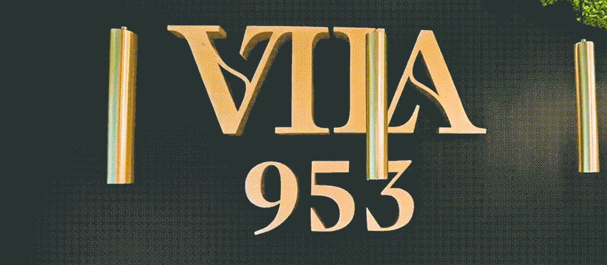
One particular characteristic of a graphic element in the manuscript called our attention: it displayed several axes of symmetry. It was an ambigram. As Douglas Hofstadter puts it, “An ambigram is a visual pun of a special kind” [1], a visual composition that can have palindromic features, to display symmetrical relationships. Ambigrams have been found in art and visual expression over the centuries, some of them dating back to Ancient Greece [2]. Isn’t this an inspiring discovery? It immediately sparked our interest and led us to explore the role of symmetry in brand design.
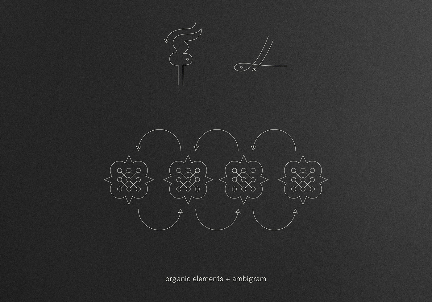
As we started designing the logotype, we went through several iterations varying between serif and sans serif styles. As the brand required a distinguished feel, it would be best to use a serif typeface with a humanist side – to perfectly breathe a medieval inspiration while aiming for a royalty-like mood. Coupling that typeface with the ambigram symbol we had previously identified as a geometric shape in the logo could be an obvious solution. Still, it did not convey any particular value nor would it be easily perceivable or associated with the story we were putting together. Instead, we pursued an alternative path to create something that would be visually appealing yet, embued with the concept of ambigram.
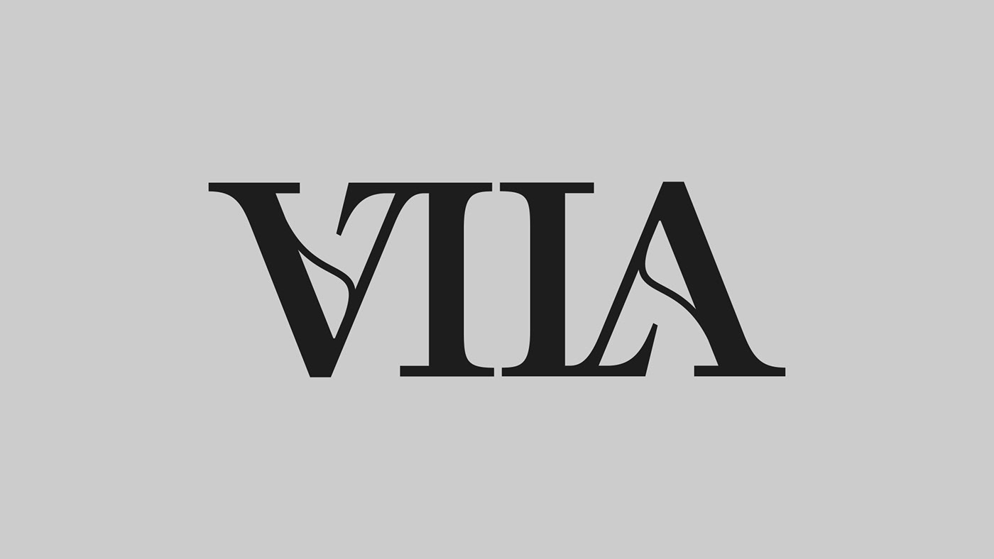
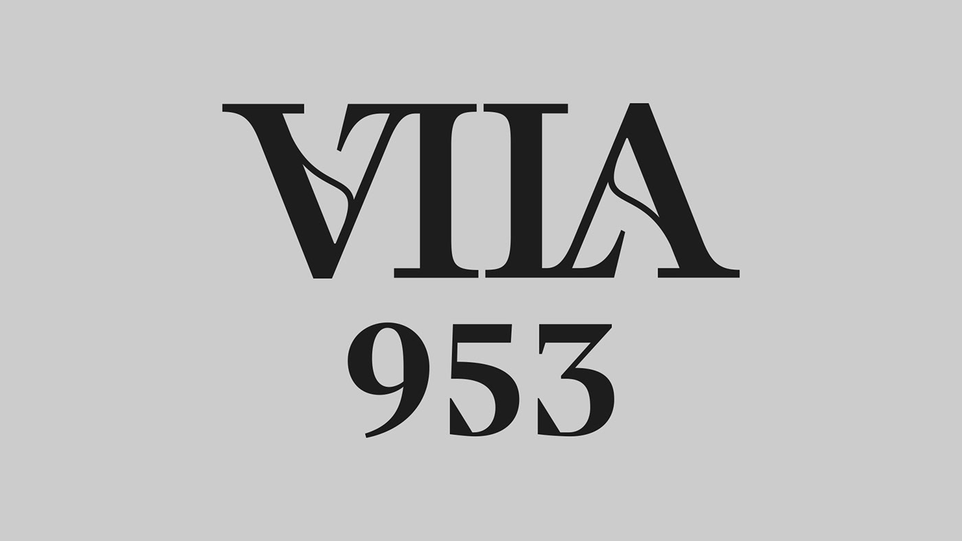
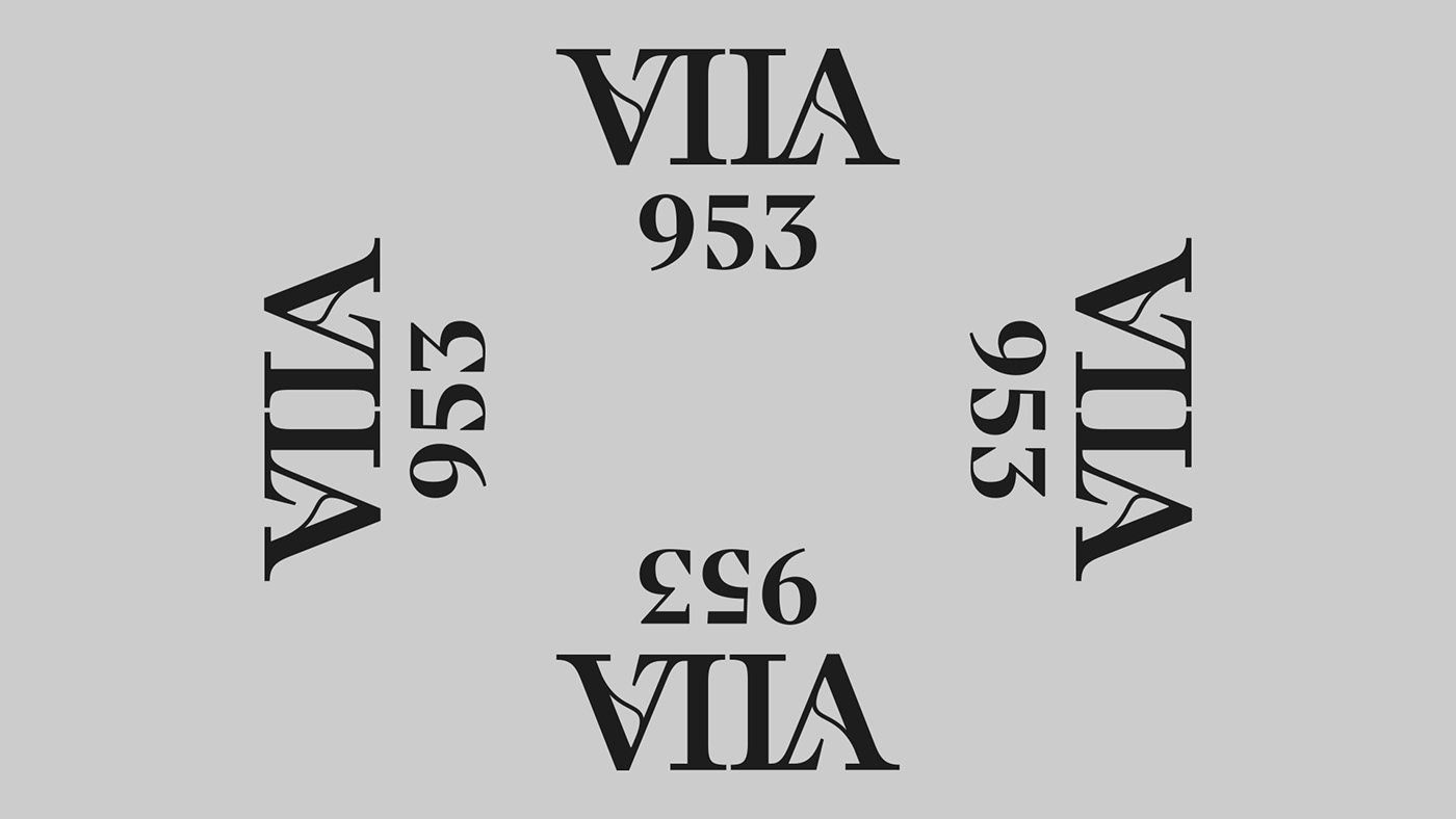
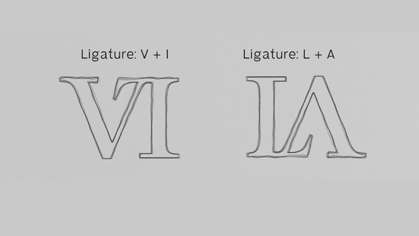
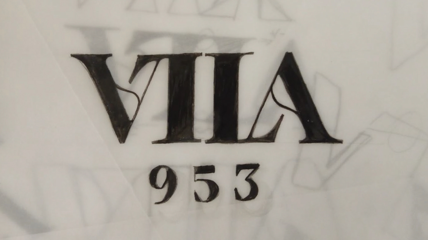
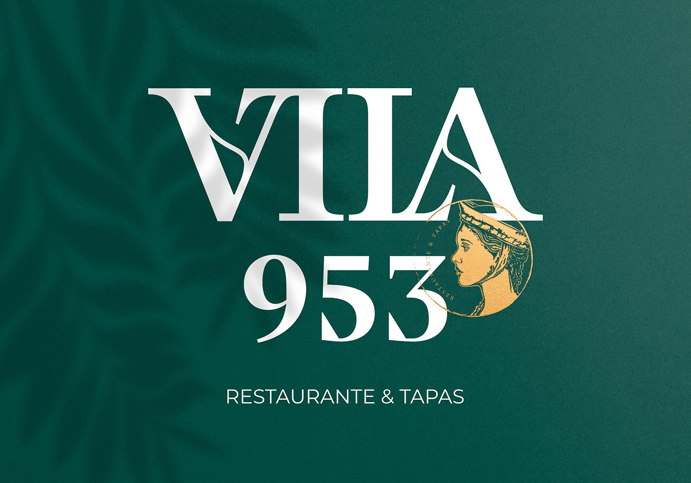
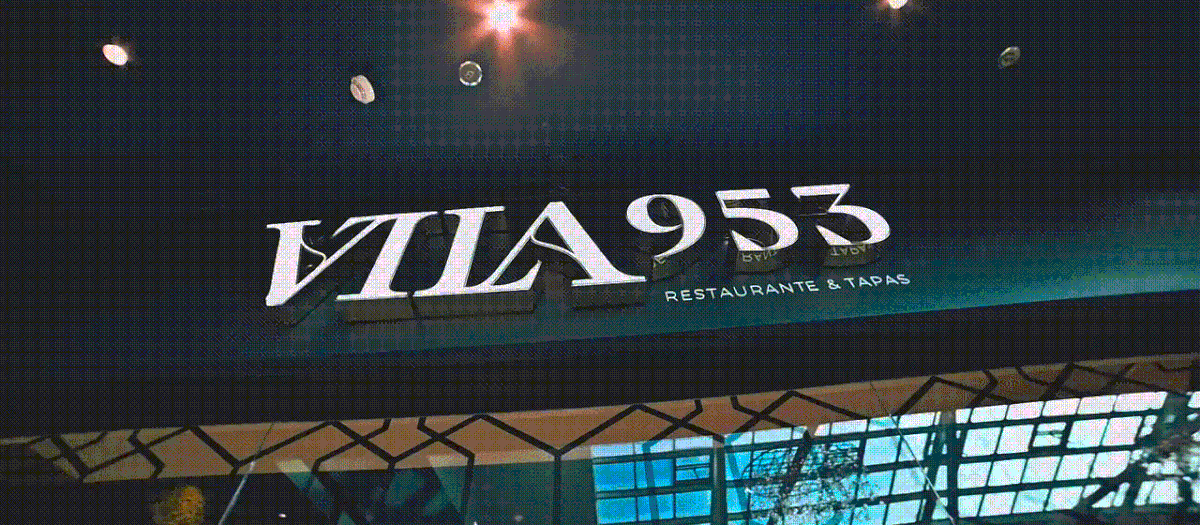
As you can see in the above image, the word “Vila” ended up representing itself as an ambigram. We designed two custom ligatures between “V”/”I” and “L”/”A” that together form the word “VILA” and display a symmetrical relationship: when inverted through a 180º rotation the word maintains exactly the same reading. Additionally, as we carefully looked into details, the crossbar in the “A” letter got its inspiration from the organic forms found in the 953 AD manuscript.
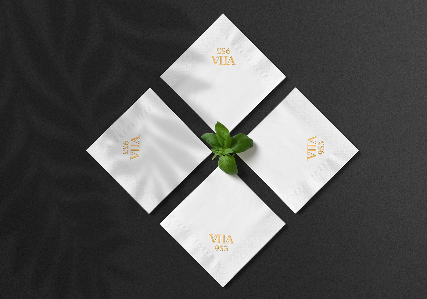
To finish the logo design, Vila do Conde’s foundation date – 953 – was placed below the word “VILA” using a similar visual language expressed through a serif typeface.


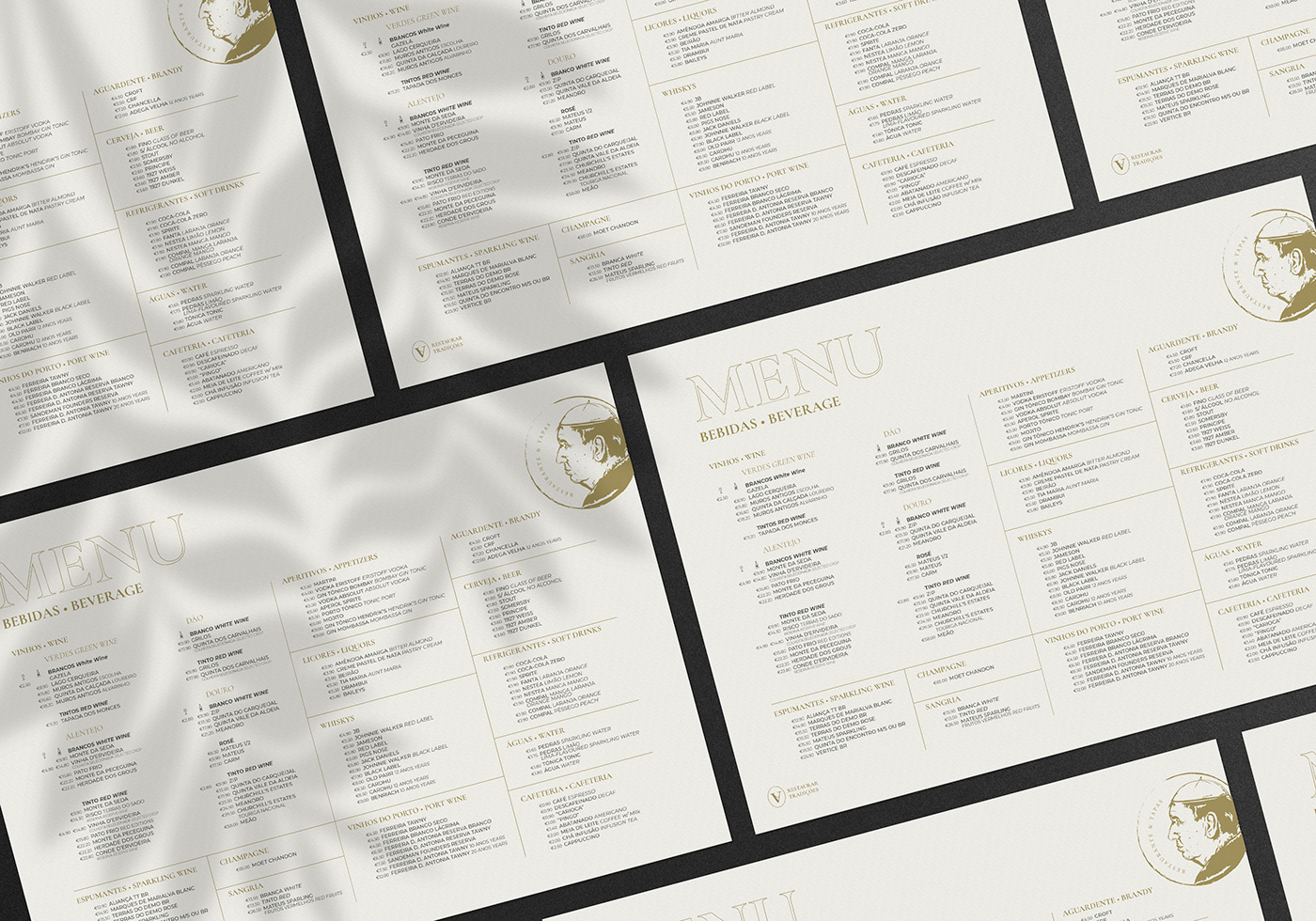


Segment courtesy of Vila 953
Segment courtesy of Vila 953
Segment courtesy of Vila 953
Segment courtesy of Vila 953
Segment courtesy of Vila 953
Segment courtesy of Vila 953


