


A brand redesign project that concludes in a strategic rethinking of its positioning and a total renovation of its image, graphic and communicative resources.
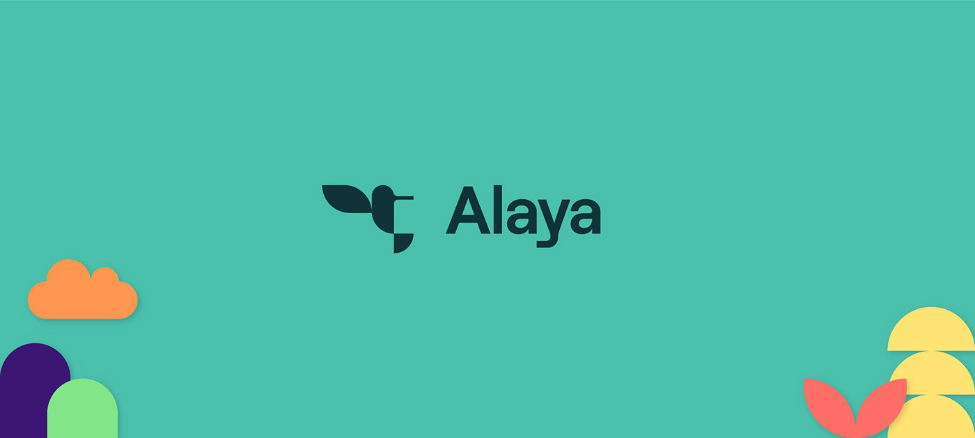
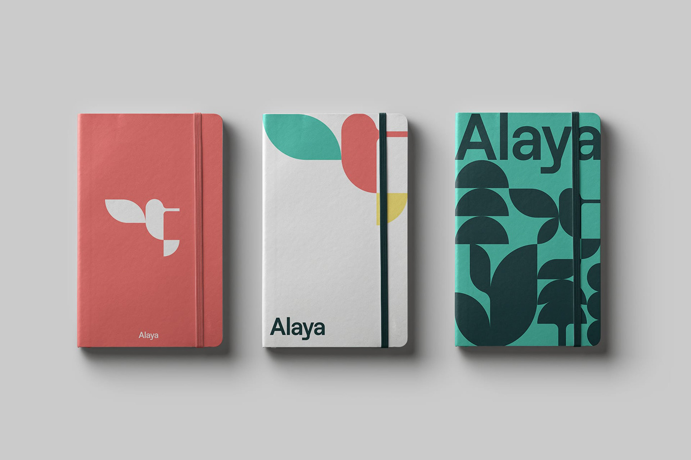
Alaya, a Swiss startup that helps companies to facilitate the participation of their employees in social and environmental actions, needed an update of its brand and graphic language. The hummingbird icon had to be kept as it is part of the legend on which their brand story is based. The work consisted of creating a new, more functional icon and all its graphic code to be applied in their materials, intranet and new website.

The challenge of the project is to generate a new icon that maintains the brand idea and at the same time helps to create a new way of communicating the company’s values. A whole new brand discourse that should allow the renewal of all its materials and also the intranet itself, which is accessed by all employees of the companies involved in the project.
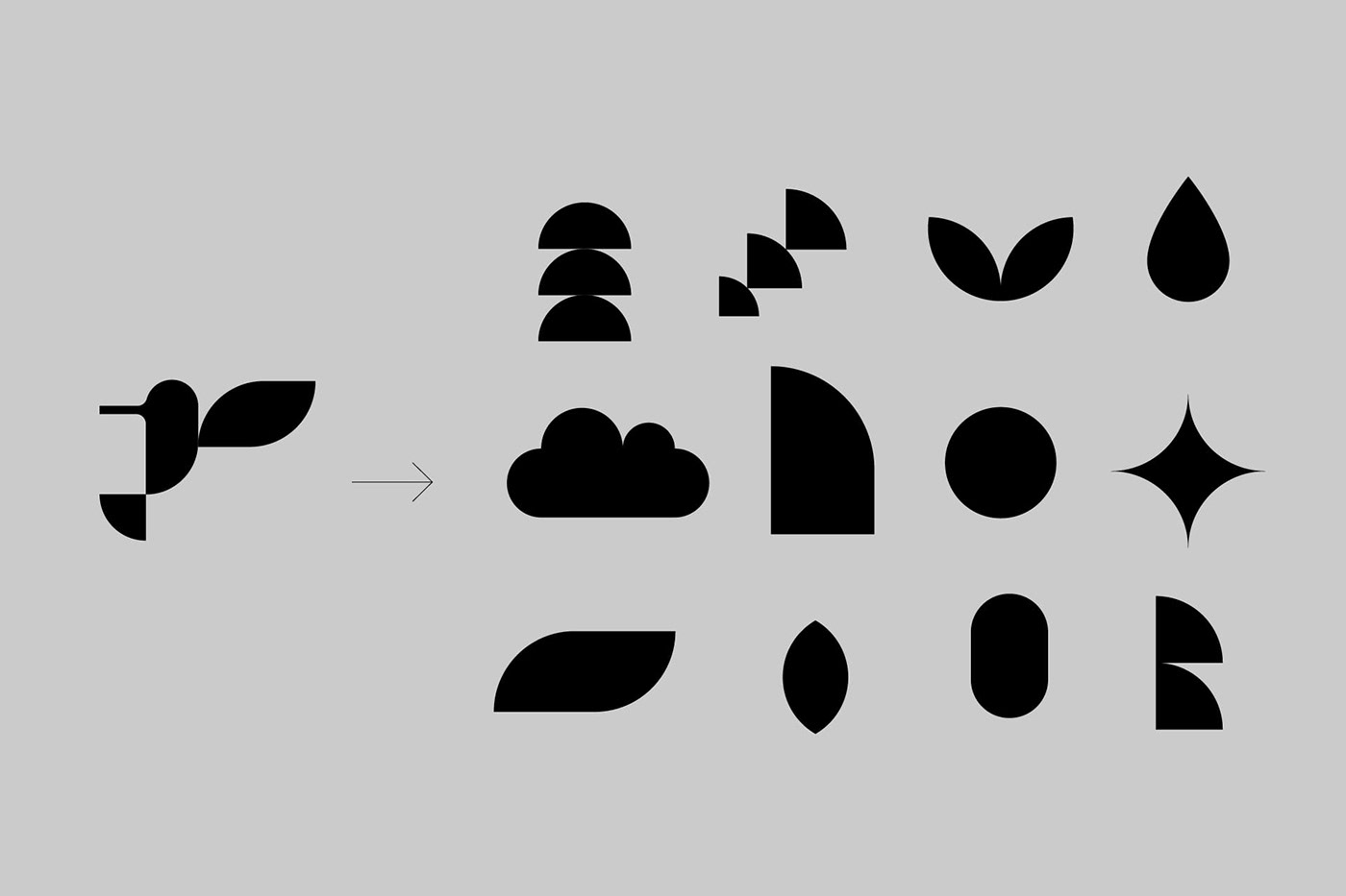
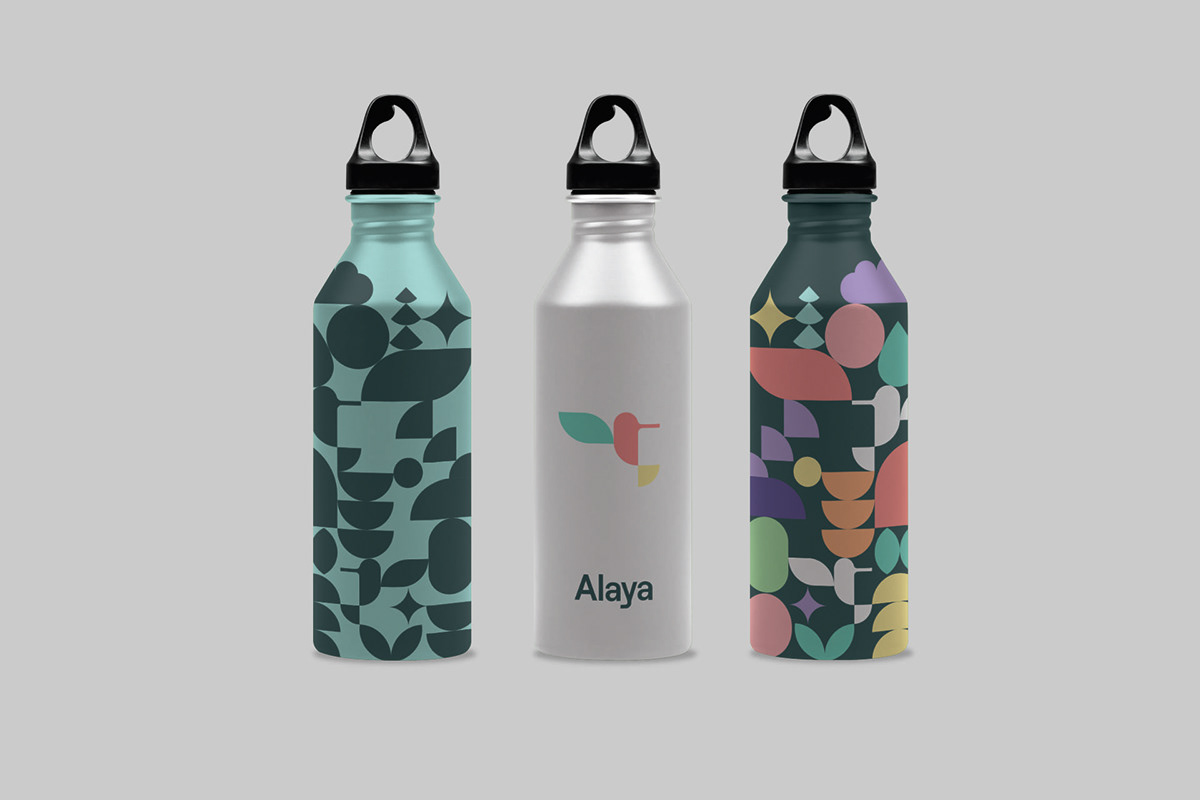
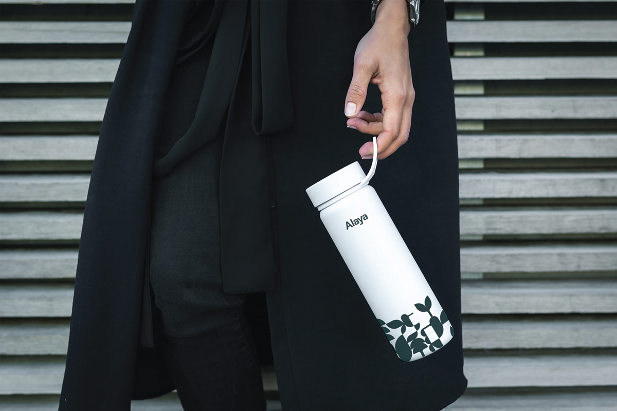
Through simple geometric shapes, the silhouette of the hummingbird is designed to be easily recognizable and at the same time allow a simple application in various media. The work of the same shapes of the logo allows the development of a whole graphic system that helps in the creation of various communication elements and graphics in harmony. A fresh, clear and very lively language that allows to generate positivism to the pieces and at the same time help to combine with images where the protagonist are the people, the great agents for change.
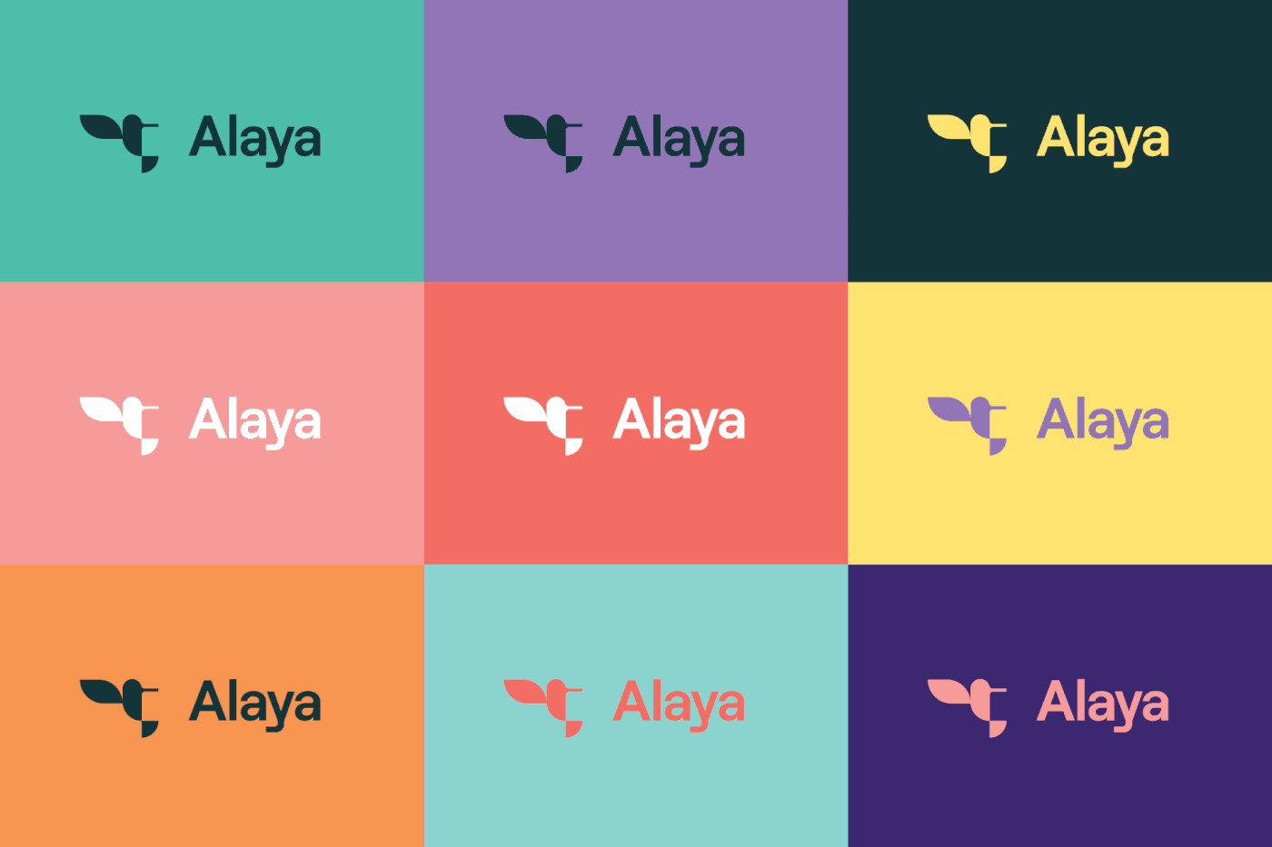
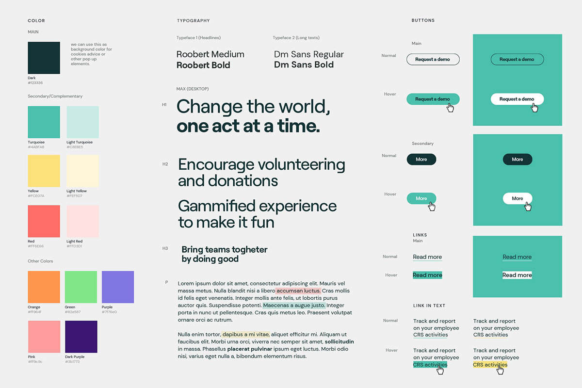
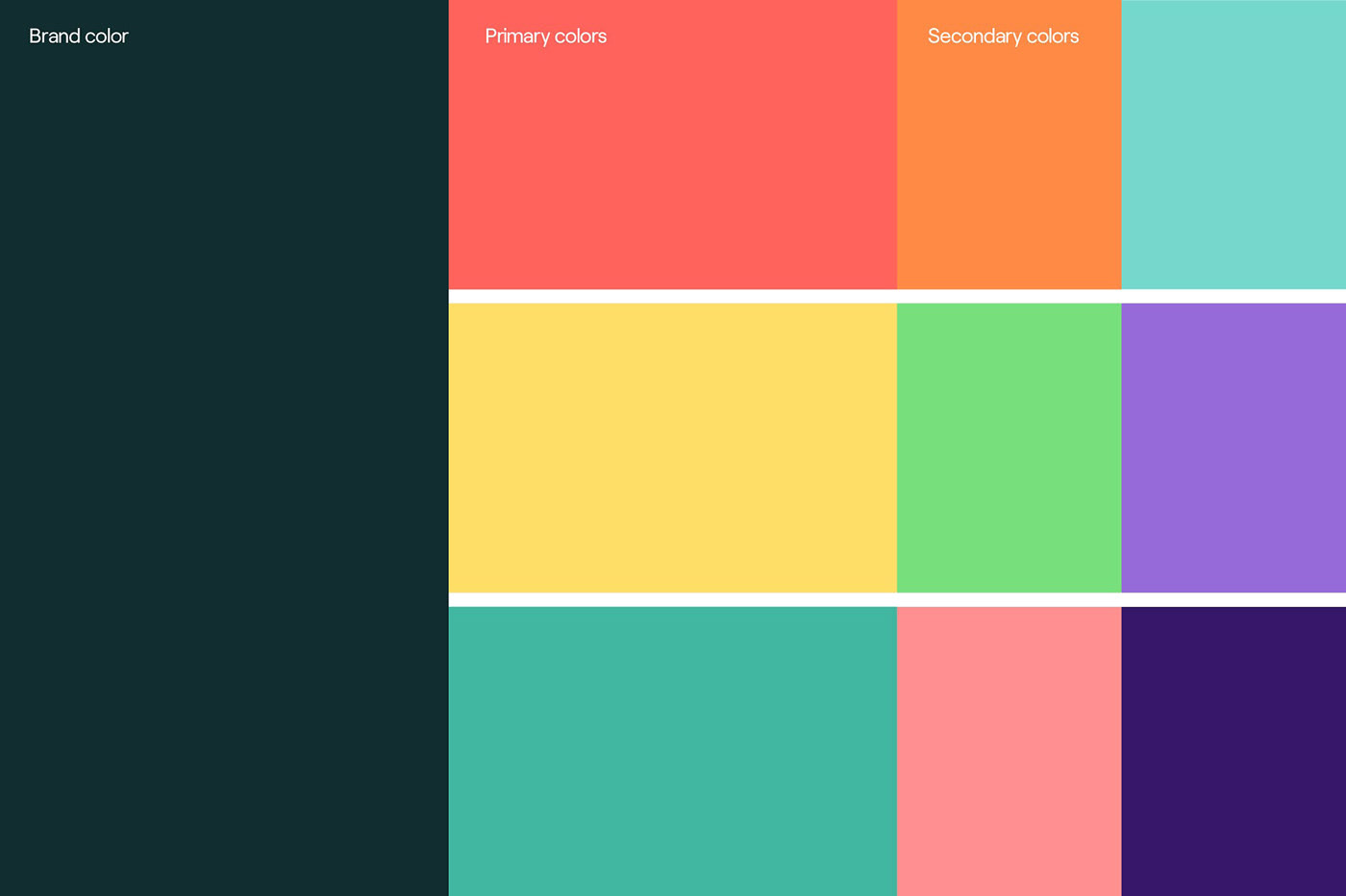
A colorful and unique chromatic palette that takes as a reference the bright colors of the hummingbird while connecting them with nature. Combinations rich in color that can be combined with each other to generate new compositions. A simile on the idea that several elements form a whole and that this whole symbolizes at the same time several stories.
A graphic language that through the use of a library of geometric shapes, the selection of a new corporate typography and the use of photographs of people from different cultures, allows to generate communication pieces that transmit joy, positivism and above all the benefit of working as a group for a common cause.


A story around the hummingbird gives meaning to the brand symbol and is therefore the protagonist that allows to generate a very graphic brand story. A new user manual and a Design System for the creation of the website provide a new complete brand guide for the creation of the various corporate and communication materials.

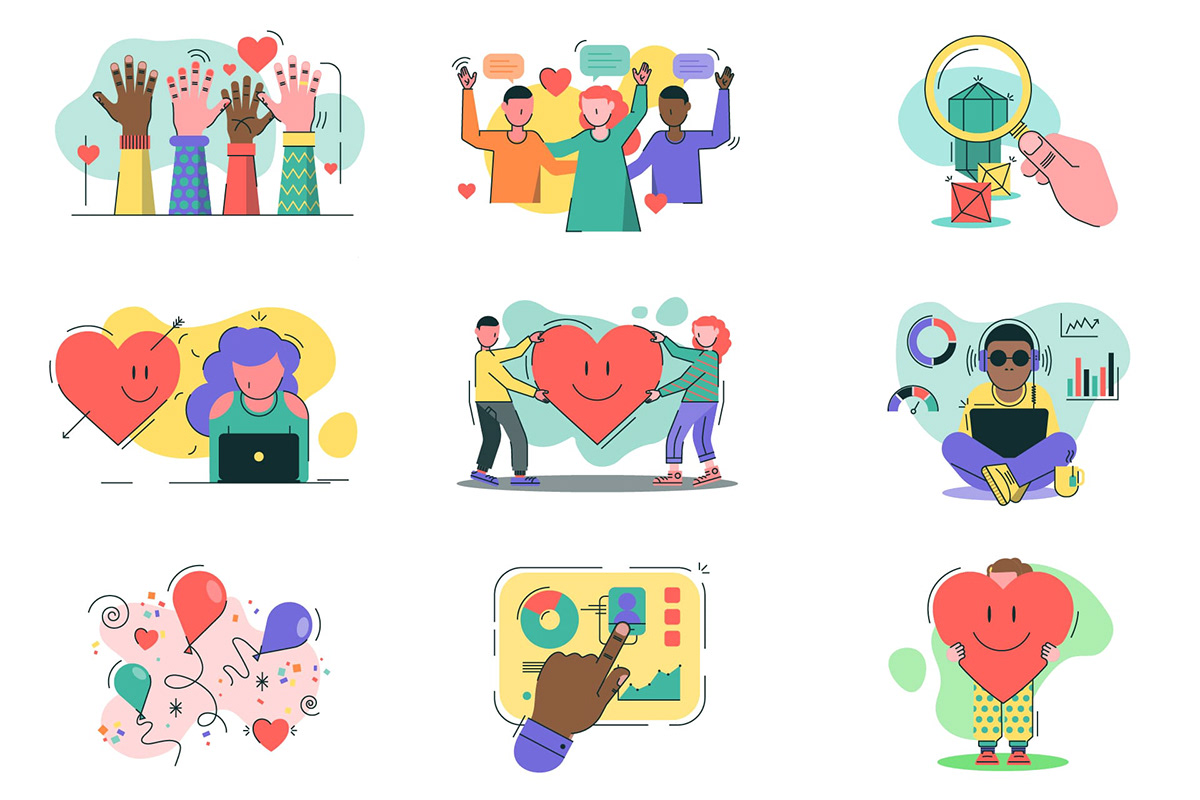
Library of icons and illustrations created to define the different types of activities in relation to the project as well as Alaya’s brand values.


A clear, colorful and very recognizable graphic story allows Alaya a new and functional way to connect with their users and at the same time make its communication, a system rich in messages and resources that positively approaches their audiences in a calm, coherent and participative way.


