
The War of the Worlds: An Introspective Into What Makes a Title Sequence
Prologue:
I have always been fascinated by the story H.G. Wells created in 1897 known as "The War of the Worlds". It was bold and wildly different than the other stories at the time and had a large effect on the media that I came to like growing up. The idea that an Alien force would come to Earth and seek out the annihilation of the Human race seems so unoriginal in 2021, but was literally out of this world in the 19th century.
Flash forward to the 1970s, we get Richard Burtons interpretation of the novel in his musical adaptation. Once again, I was influenced in my music tastes with a telling of a dreadful story with vibrant music. Details so clear and sound capturing the tone of the story perfectly, I find myself constantly listening to the musical multiple times a year.
The effect that The War of the Worlds had on me growing up was enormous. It influenced by tastes in media and undoubtedly influenced my creative style in my design work.
Title Sequences come in an array of shapes and sizes. Depending on the story, they can vary in color, style, tone, etc., but they all focus on one thing, story. It's crucial that the Title Sequence does not take away from the main story. It has to fall into the same realm as the main one. It can expand and open up the universe that the story is told in, but it can't diminish it. It has to be cohesive and connect to work.
My idea and plan with creating a Title Sequence for The War of the Worlds was to keep the universe the same, but show more of the tone and emotion that the original described so well. The world and tone is already there, I just had to help expand and show that to the audience.
________________________________


Keeping the shots consistent was one of the most important things. If they weren't consistent, it would feel disconnected and a jumble of shots strung together, not a story.
Using a blue fog and the encroaching red light helped tie the scenes together. Additionally, following a Tripod through the landscape helped connect the story.

________________________________
Red is an important color in the novel. Mainly used to show the corruption and expanse of the "Red Weed", it is also a symbol of desolation and the amount loss that Earth has taken. It was important to include the change from green to red to further expand the universe and show how far along the story is.


________________________________
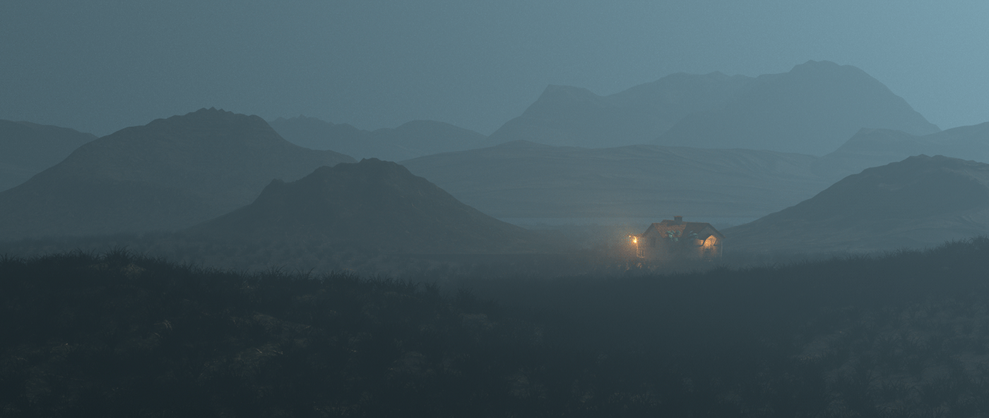
One definite shot that I wanted was to overlook the redbrick house, a pivotal point in the book. Deciding to make it stand out and use red lighting over grey and blue put more thematical emphasis on the scene. Using backlit lighting also allowed more emotion in the scene.

________________________________
The Title Card was an interesting challenge since it still had to encapsulate the tone of the story. Creating it entirely in 3D helped since I could use the same lighting and environment to match the tone. Manipulating lights to expand and shine through a cutout of the finalized text allowed an interesting and unique look.


________________________________


