© Branding__2020
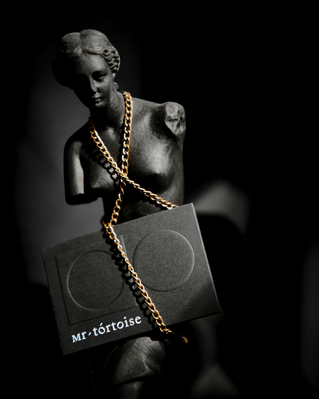
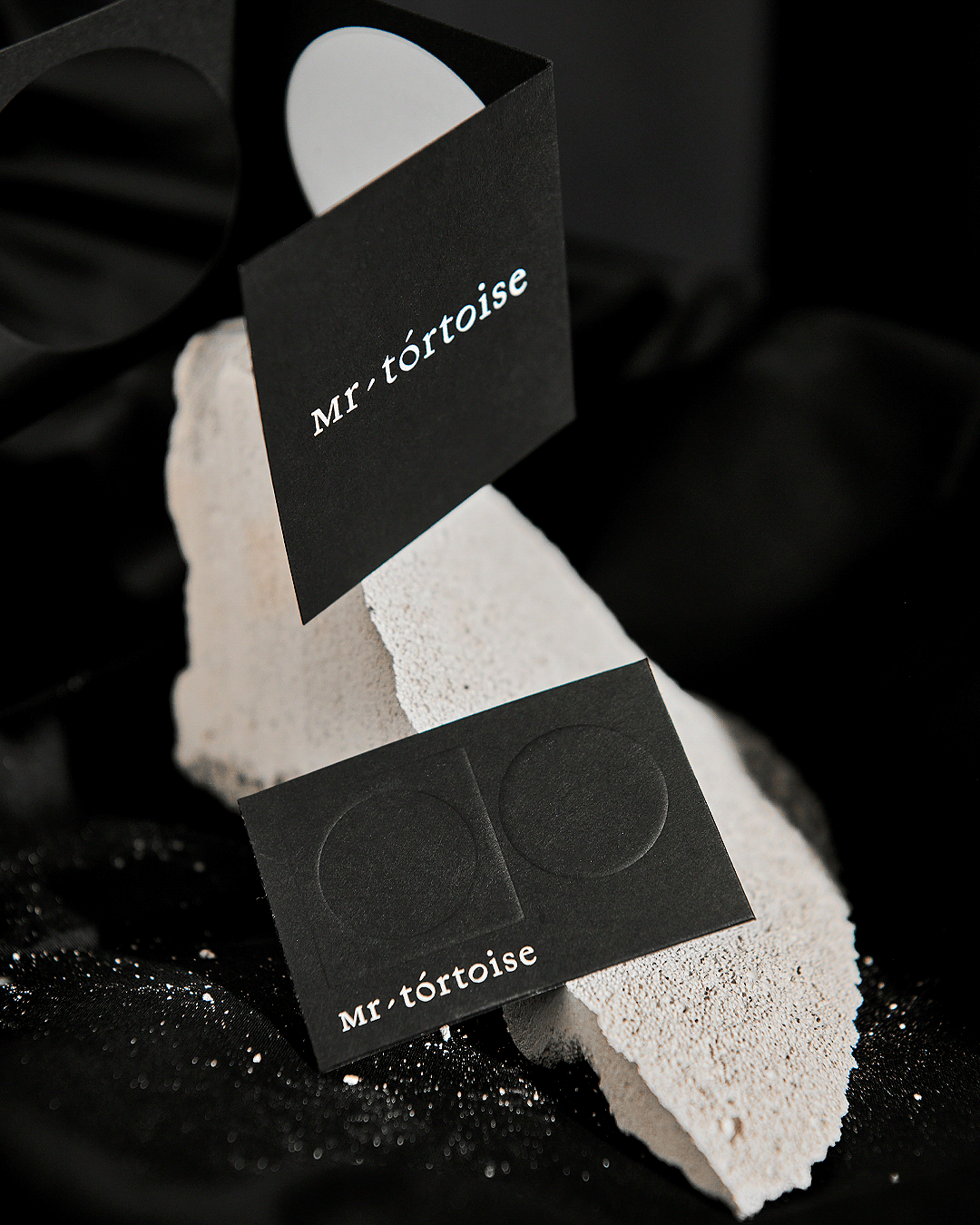
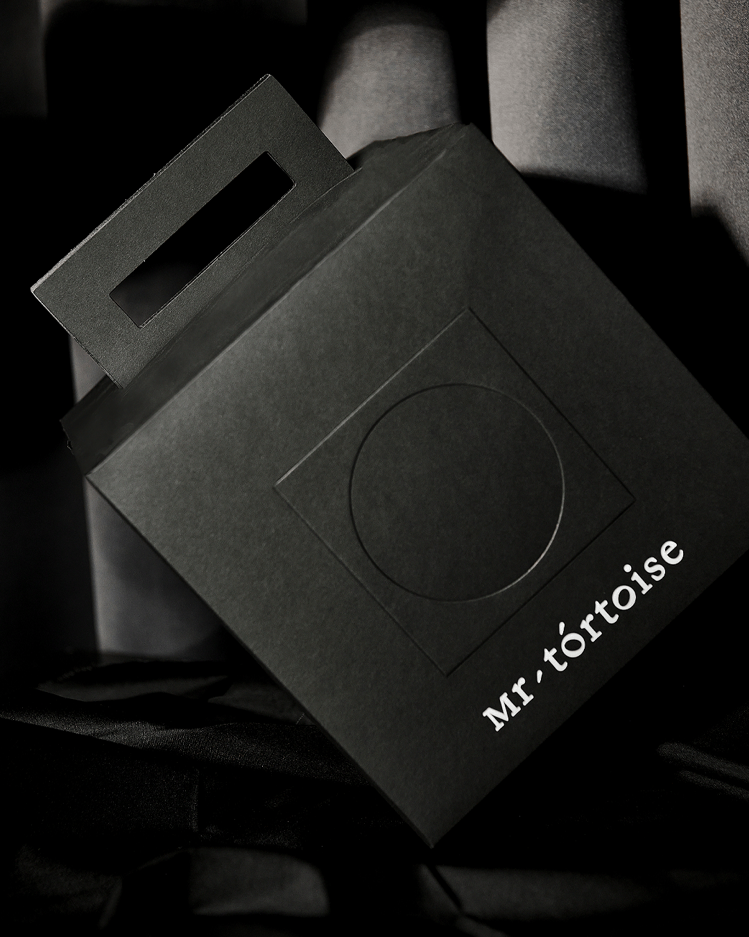
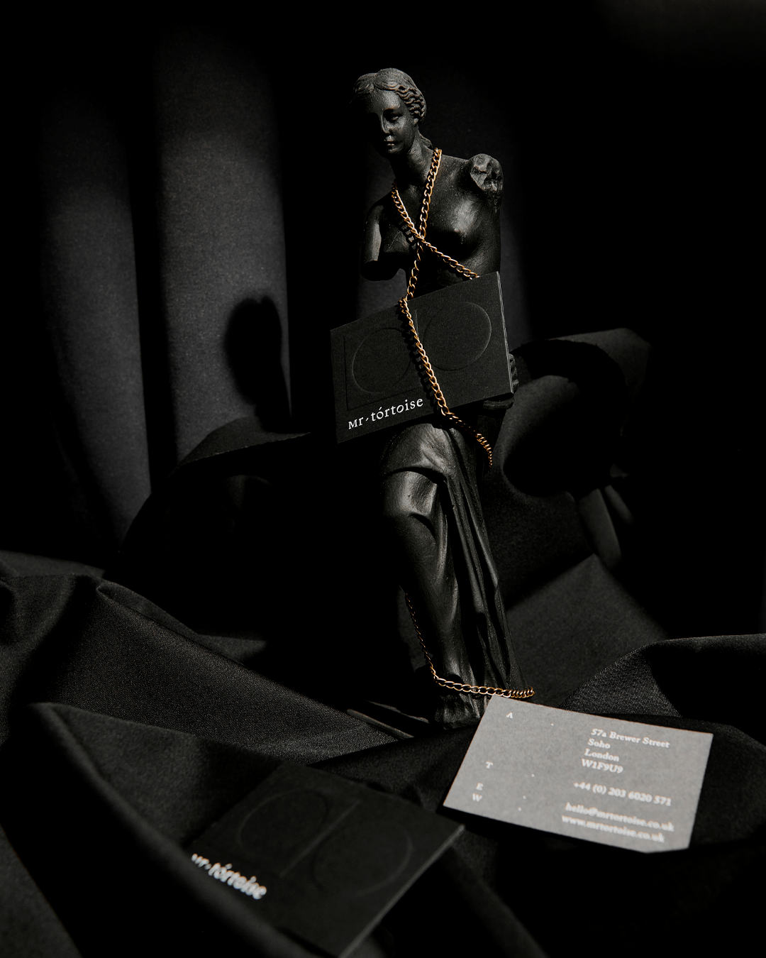
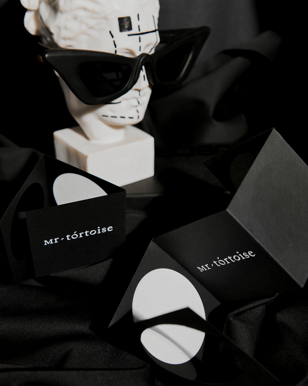
Since Mr Tortoise's brand represents a concept store in London (now also in Thessaloniki) with an emphasis mainly on the visual sector but also on accessories (with designers mainly from Japan) it was considered appropriate to design
an optical system based on Japanese minimalism in combination with the Anglo-Saxon system of typography.
Clear shapes such as circle and square communicate with one of the most common and distinctive fonts,
designed by the Englishman William Caslon. By emphasizing the letter ο in tortoise we emphasize the pronunciation
of the word tor | toise Pronunciation: / ˈtɔːtəs / / ˈtɔːtɔɪz / and at the same time we create the feeling of the characteristic monocondyle used in the Japanese script. The same element is used as a link between the two words, giving us
the feeling of a compact logo but with minimal aesthetics. The two o have been designed as clean circles in terms
of their outer frame, while the inner has been rotated left and right in order to give us the feeling of a pair of glasses.