Cunhapê
Client: Mokafe
Location: Brazil
Industry: Food
Location: Brazil
Industry: Food
Agency: Palp® Studio
Illustration: Lana Barcellos
Creative Designer: Priscylla Nunes, PSNDesign
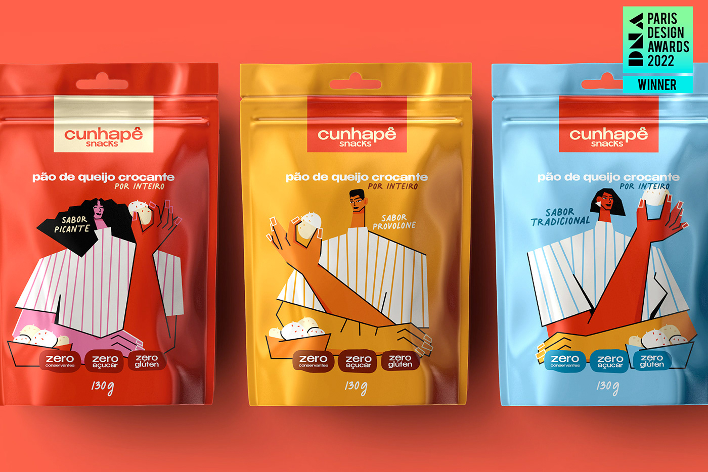
Winner at Paris Design Awards 2022
About
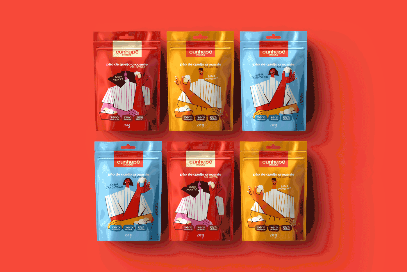
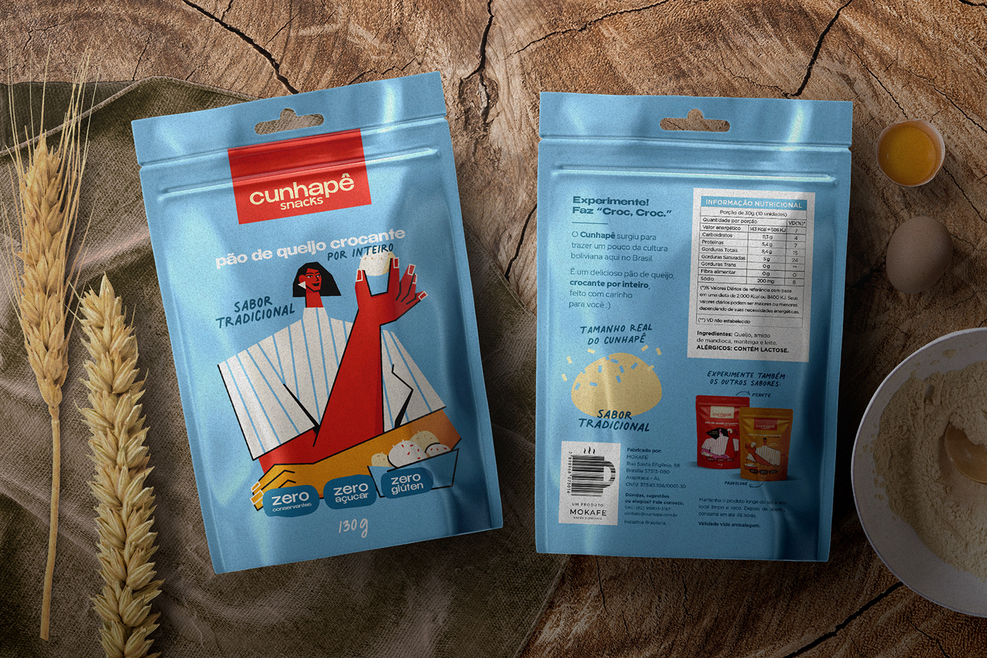
Cunhapê comes from a Spanish word “cuñapé” which refers to cheese bread but of Bolivian origin. Cunhapê is a whole crunchy cheese bread.
Concept
The challenge for the project was to create an identity that was modern, timeless and at the same time cheerful and that showed refinement. And the brand would reflect on the packaging communication. The solution was to innovate in typography and explore the most striking colors for a project that has to be cheerful and outgoing. The well-crafted typography conveys the tone of elegance and competence that the client sought, but without being serious or traditional. It is the mixture of the modern with the elegance.
Our Work
Concept Development
Print Design Supervision
Print Design Supervision
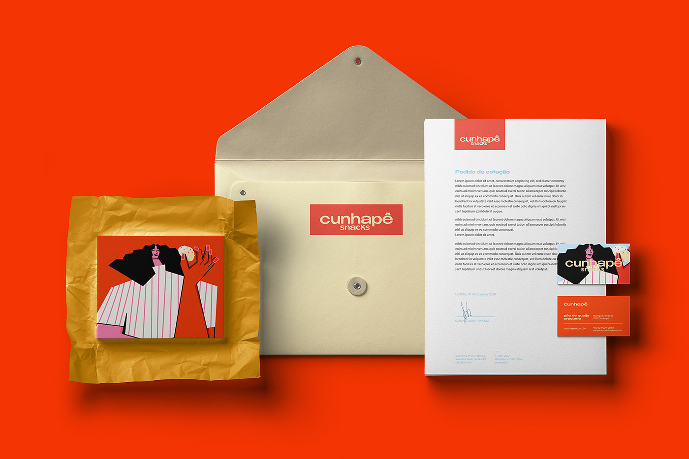
Packaging Design

I worked with a modern typography, striking and with a strong personality. This type combined with warm colors, brought elegance, but also joy and high spirits to Cunhapê.
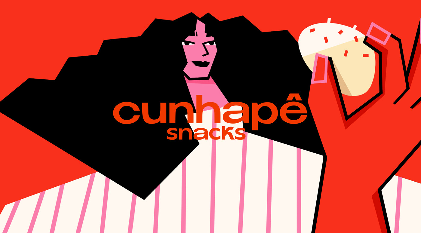


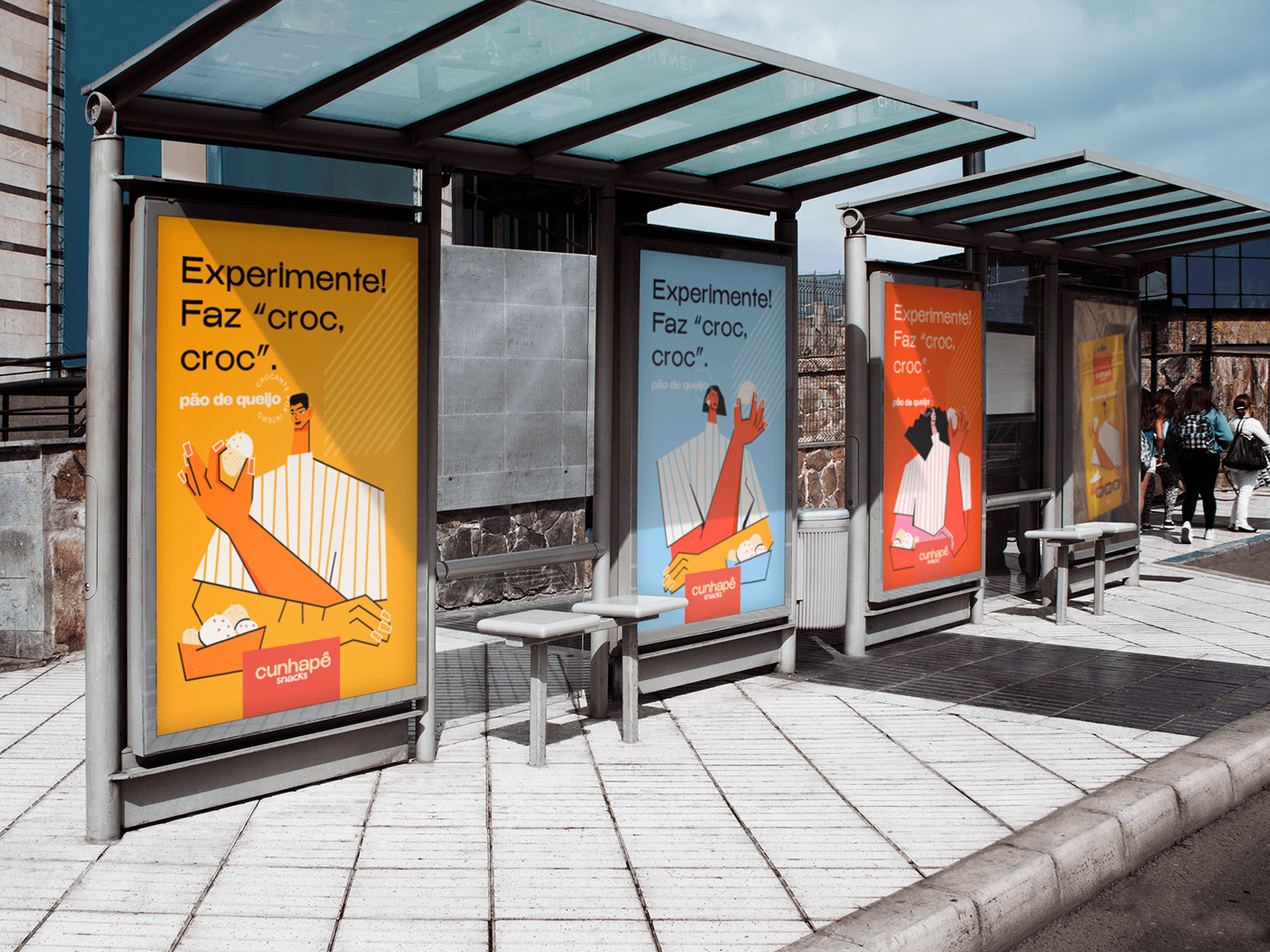

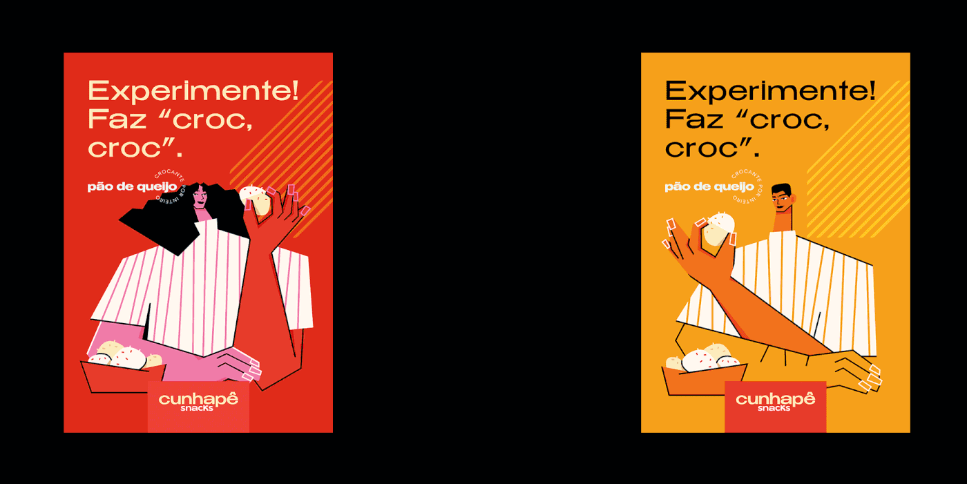
For the project I called an illustrator to represent the youthful tone that we wanted for the product lines. The language used in all communication is very relaxed. The "Try it! Croc, croc" clain brings the product closer to the consumer.