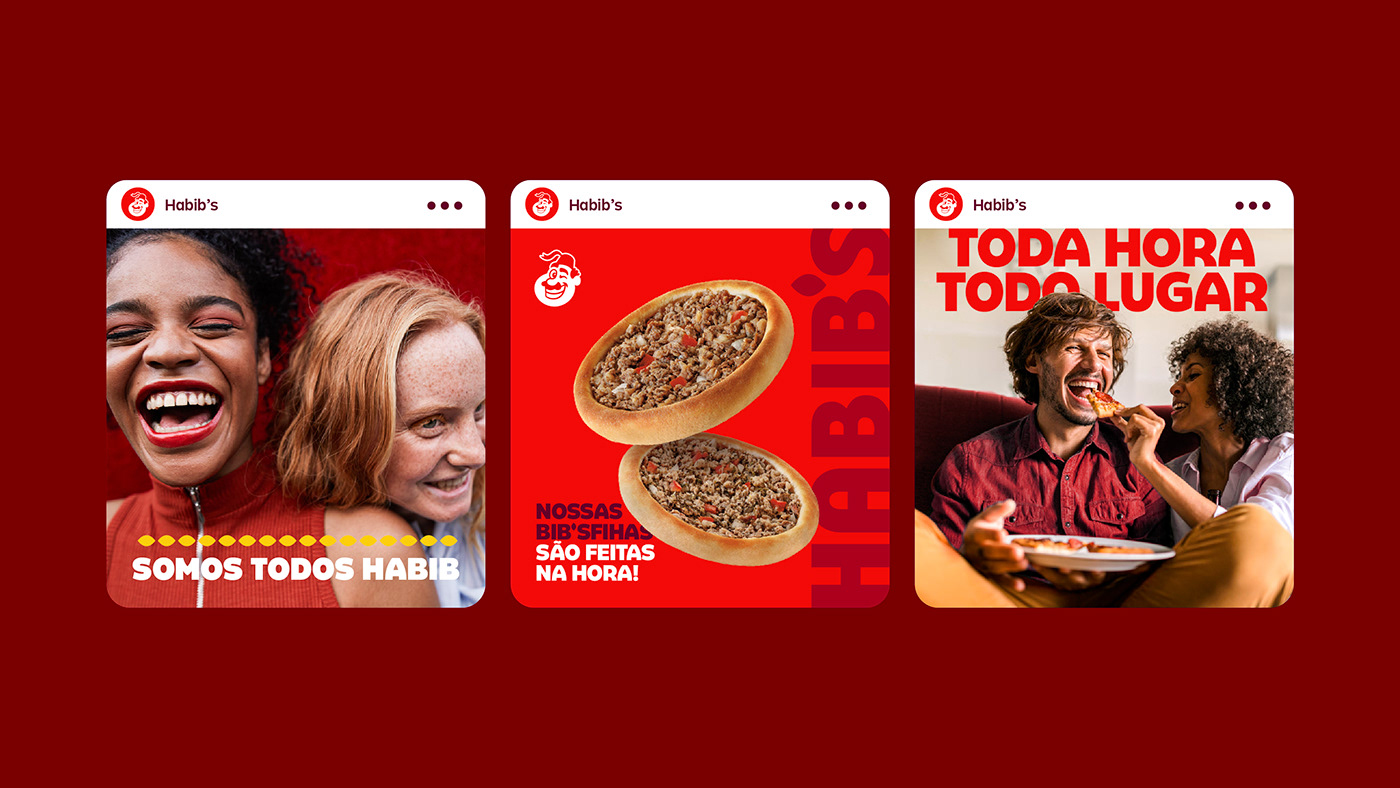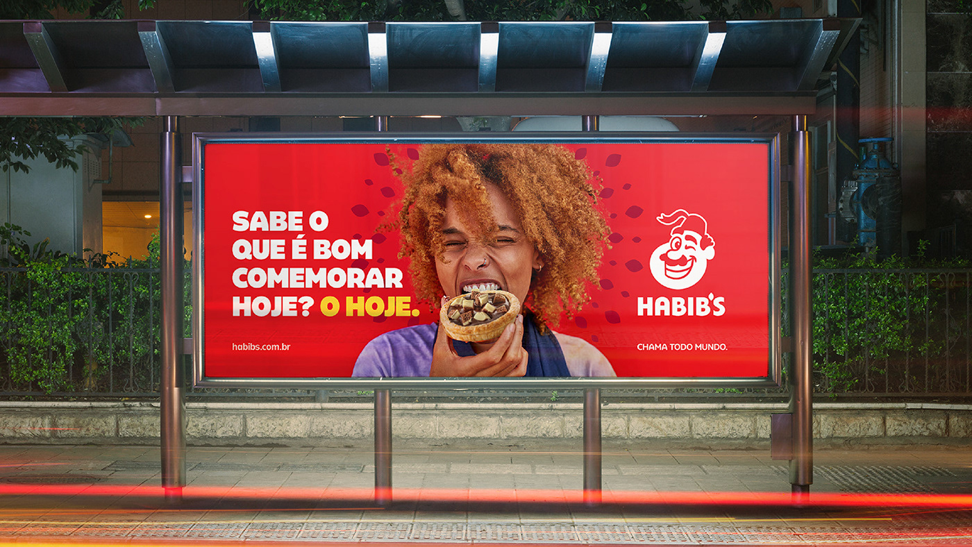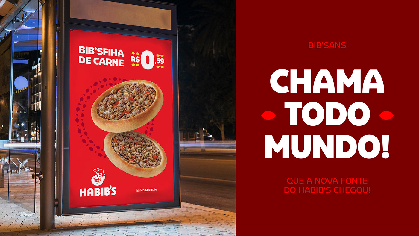
We were approached by FutureBrand to develop a typographic family for Habib’s – the biggest Arabic fast-food in the world – as part of its new visual identity.
On our first meeting with the creative team at FutureBrand, we were presented with some already existing fonts that displayed the atmosphere they were looking for. We were asked to create a custom type family based on those structures but combining elements of the visual identity.
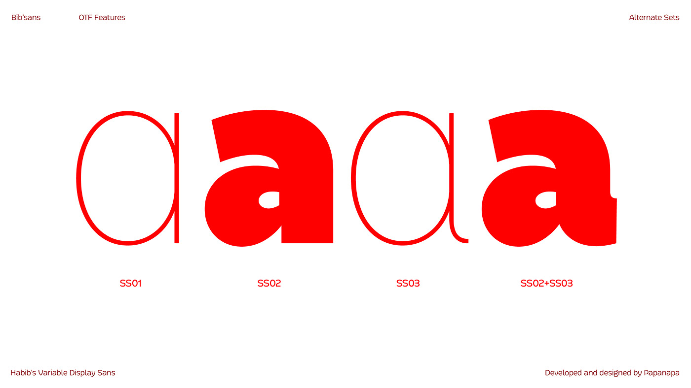
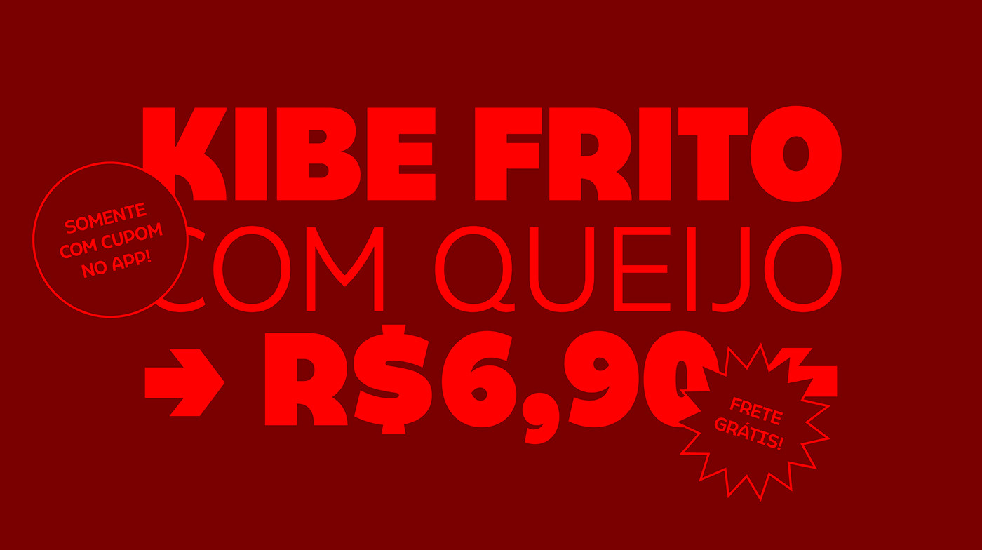
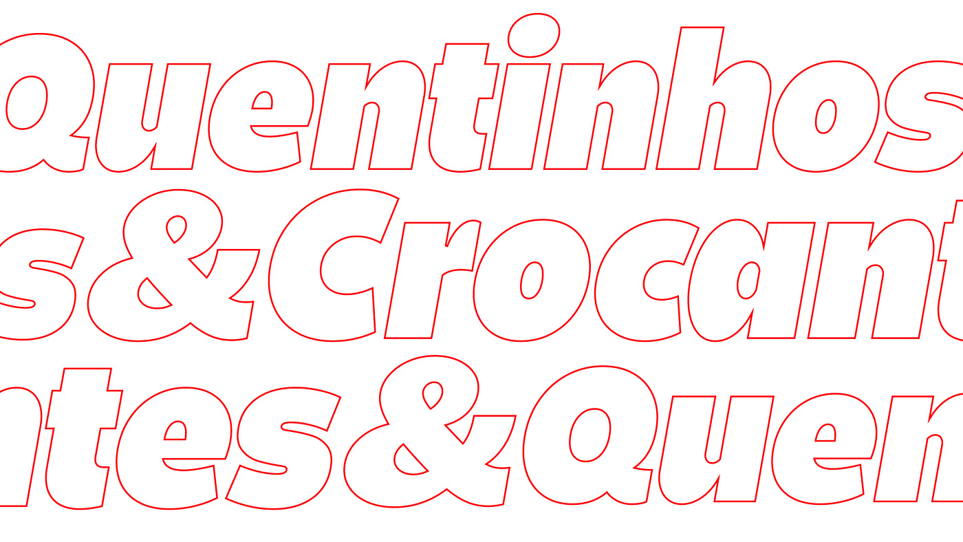
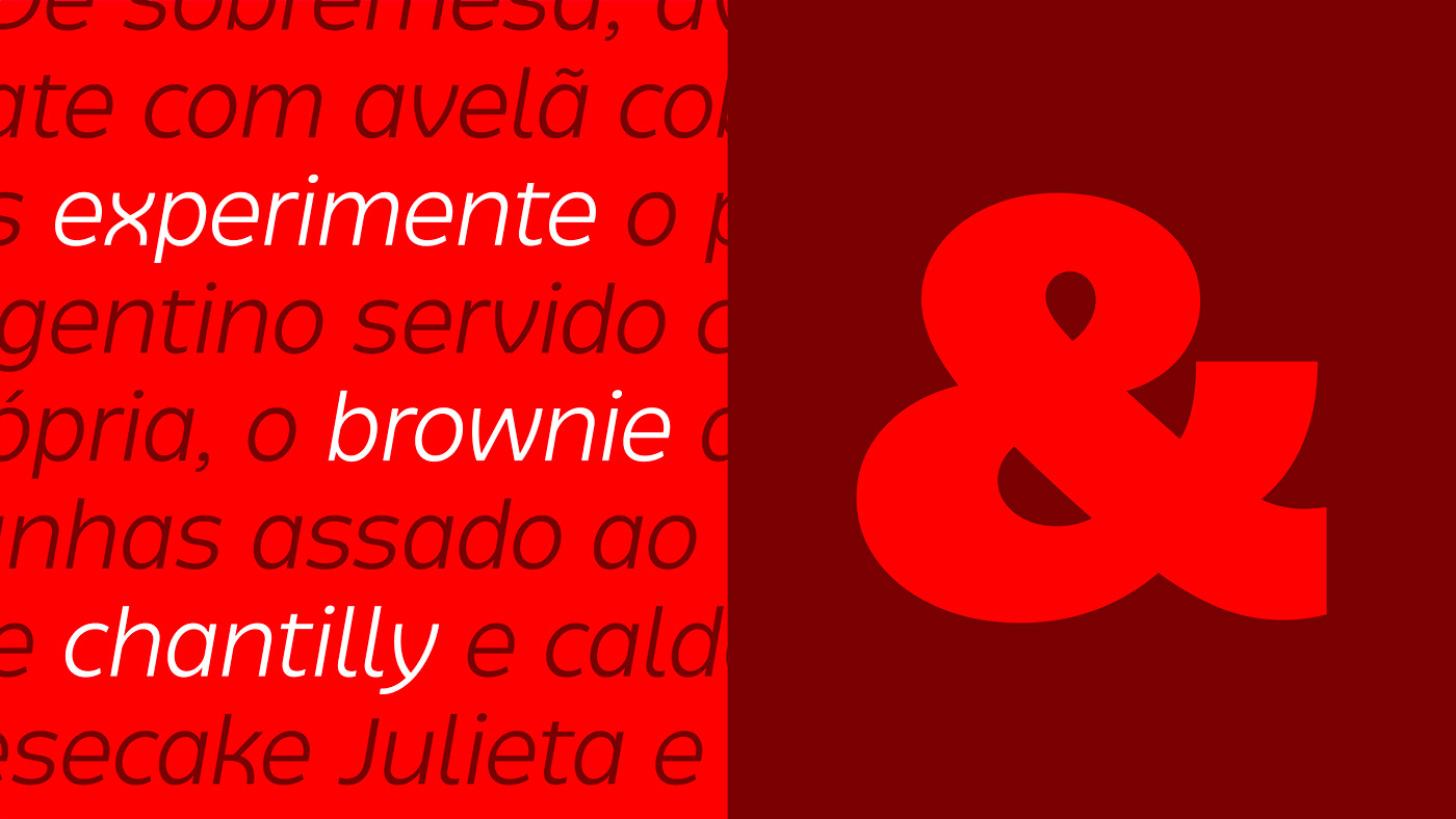
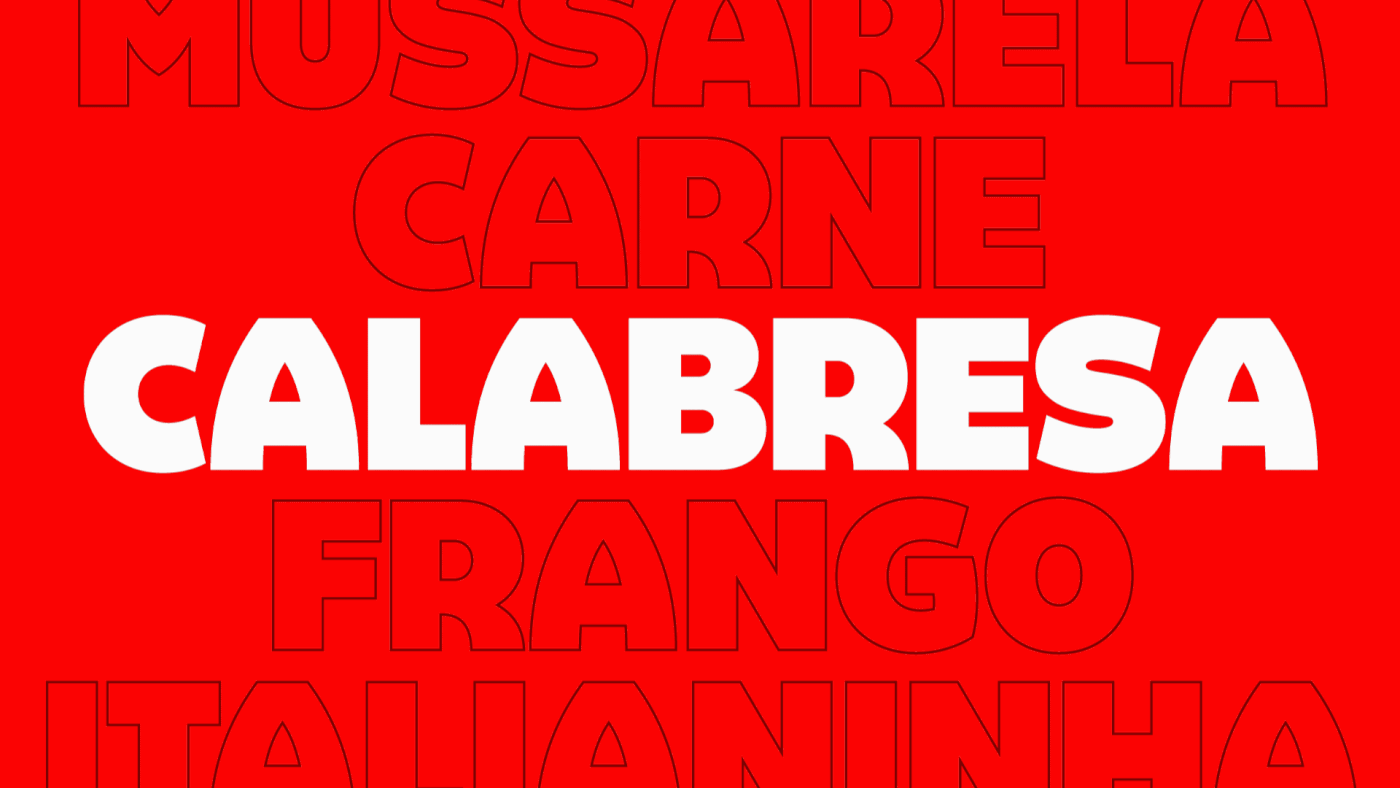
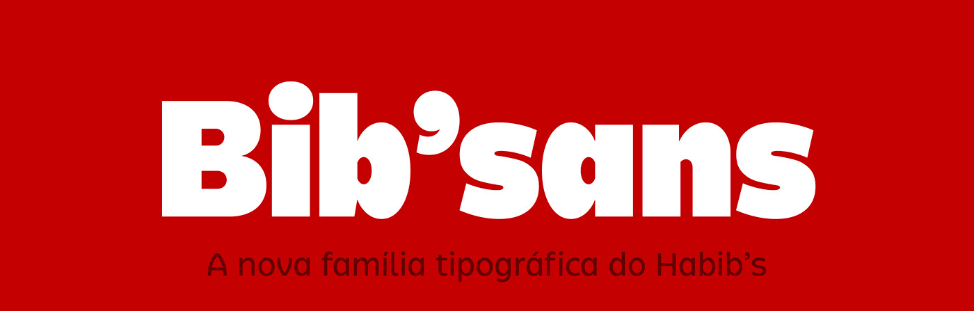
Within the entire communication system, one of the central elements is the graphic element of kibbeh. It was precisely its shape that drew our attention in our initial sketches and helped us find the main characteristic of Bib’sans: an eye-catching variable display sans serif with a bespoke, fun, and why not, yummy design!
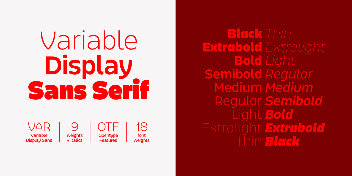
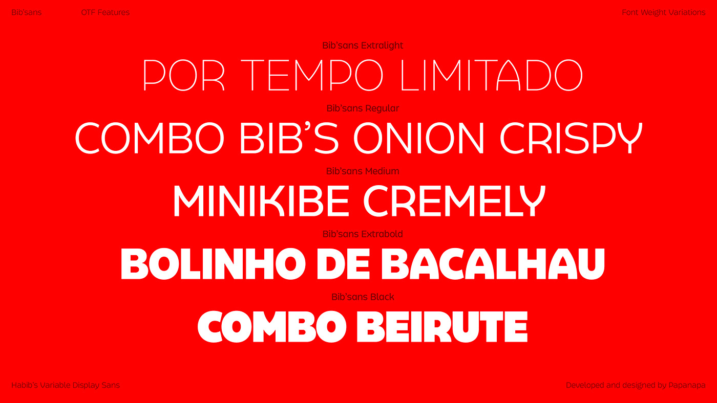
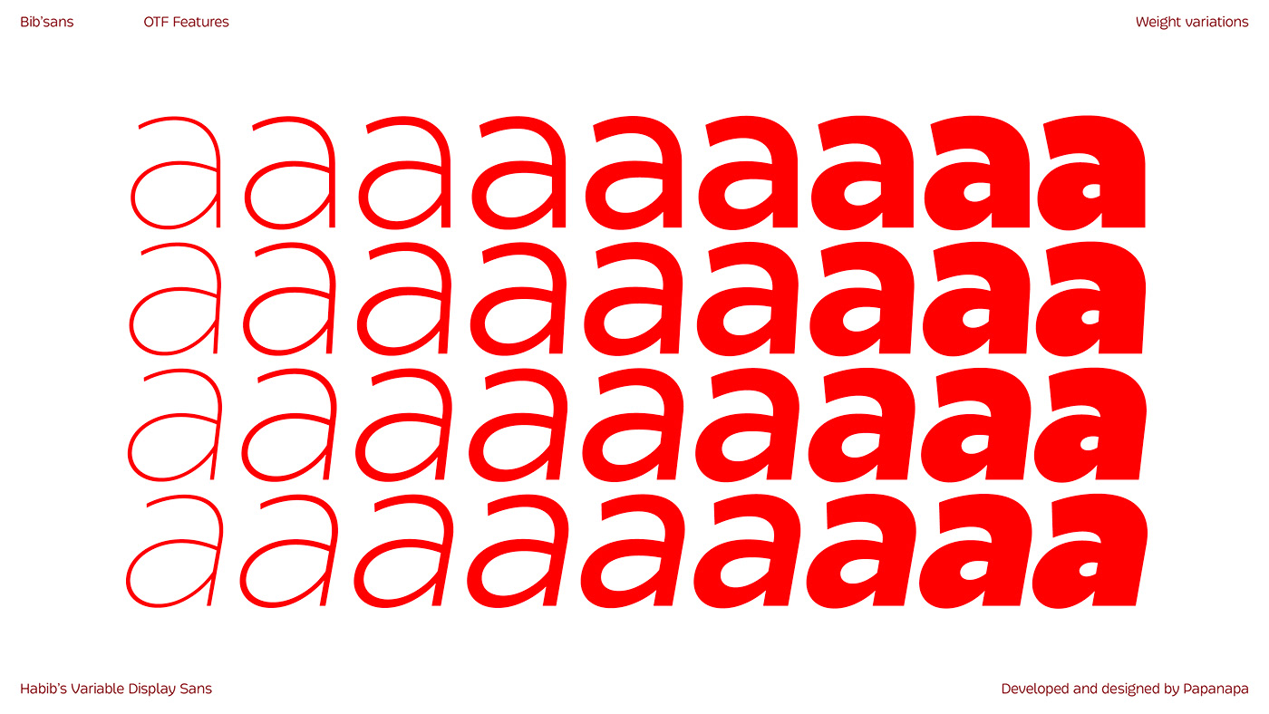
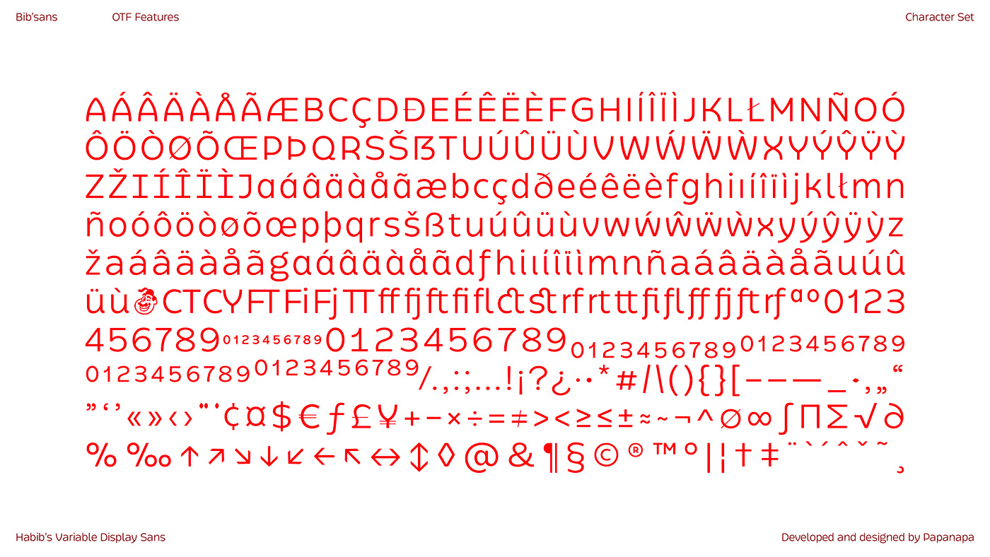
The family includes 9 weights, from Thin to Black, and its italic versions.
Bib’sans was designed by Papanapa in partnership with the FutureBrand team. Its use is exclusive to Habib’s brand.
CREDITS
-
Client: Habib’s
Creative Direction & Visual Identity: FutureBrand (São Paulo)
Typeface: Papanapa
Type Design: Thiago Bellotti
Typographic Consulting: Henrique Beier