Overview:
Project Info: Individual Design Exercise.
Timeline: Dec 2020 - Feb 2021
Timeline: Dec 2020 - Feb 2021
Tools: Figma, Marvel
Clue, a menstrual health app developed by BioWink GmbH in Berlin, aims to promote women's reproductive health with its three main functions: tracking period cycles and predicting them, analyzing health status, and providing scientific articles on reproductive health. Clue Plus is a key source of revenue for the company.
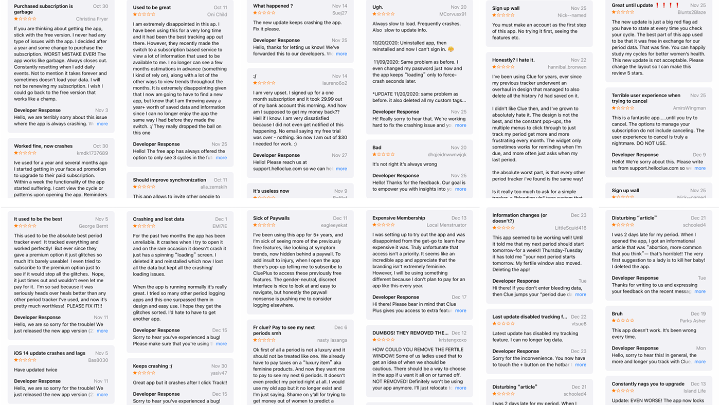
Research:
I conducted research by analyzing substantial feedback from users of the Clue app on the App Store. The recurring points that emerged include:
Requirement of subscription for previously free features.
High membership cost.
Unnecessary additional features.
Poorly designed layout.
Required creation of account as the initial step.
Insufficient number of symptom options.
Outdated user interface.
Frequent app crashes.


Personas & User Journey Map:


Based on my observations and comprehensive user research, I have pinpointed three primary areas for redesign:
Improving the initial user experience
Fine-tuning the advertising strategy for paid subscriptions.
Incorporating a pregnancy tracking feature.
Core function adjustment:
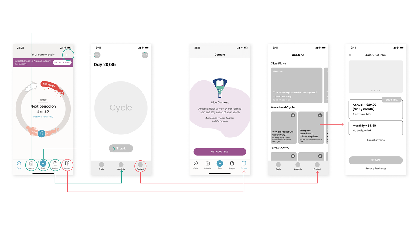
In the redesign process, my goal was to enhance the overall user experience by implementing essential functional modifications. To achieve this, I took the following steps:
Previously, the design directed users towards purchasing a subscription by limiting access to crucial pages, which garnered negative feedback. With the redesign, I maintained access to articles on the "Content".
I eliminated the prominent subscription advertisement that previously occupied the homepage.
I made the frequently used "Track" feature more accessible.
I simplified the bottom menu buttons for improved user navigation.
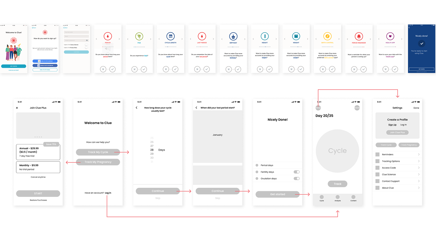
Current registration flow and redesign.
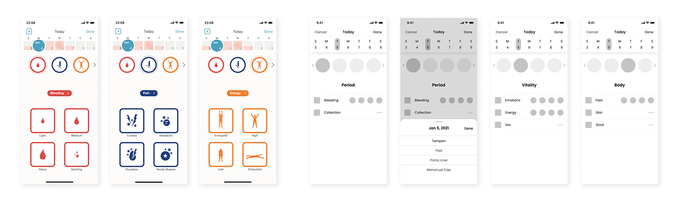
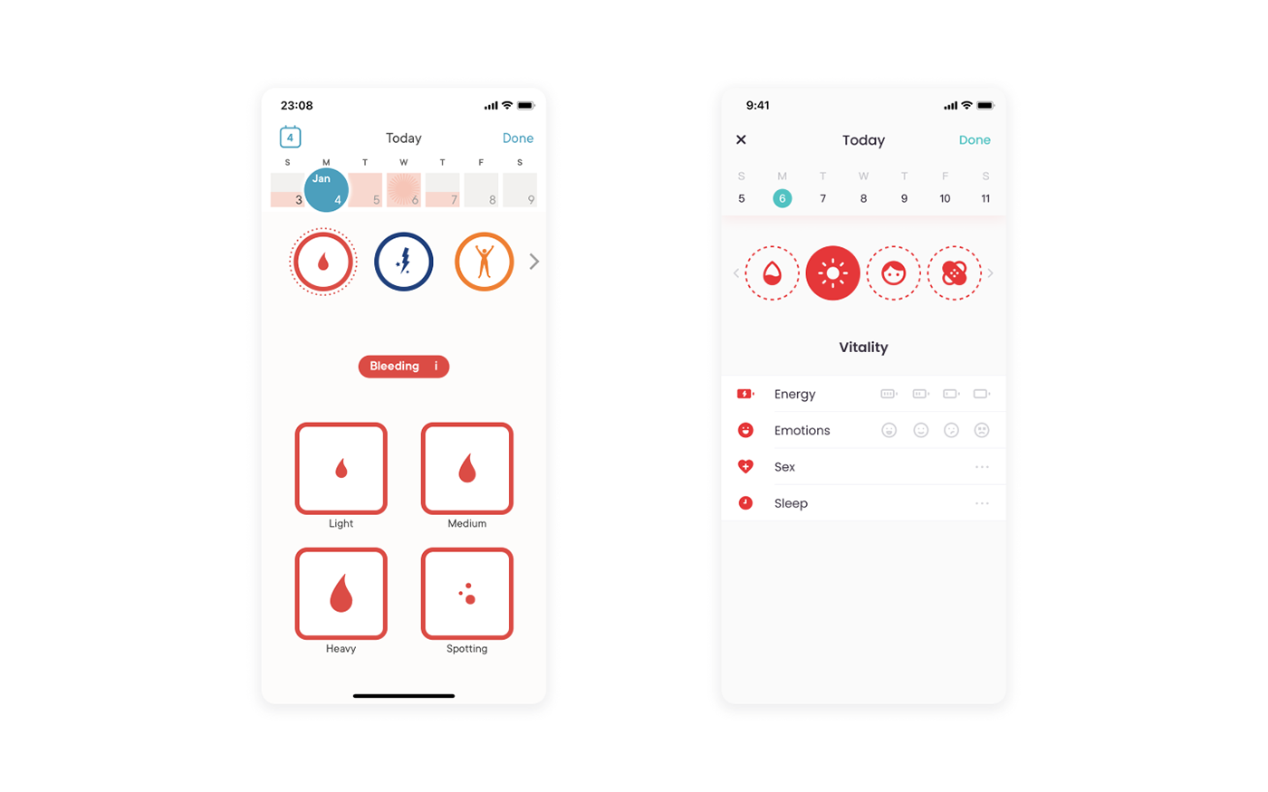
In the redesign, I consolidated all symptoms onto a single page, significantly reducing the need for multiple swipes. What used to demand 29 swipes now requires only three clicks and one swipe. Furthermore, I relocated the recording function to the same page, making it more accessible by sliding it up and overlaying it on the screen. This adjustment enhances convenience and user-friendliness in the process.
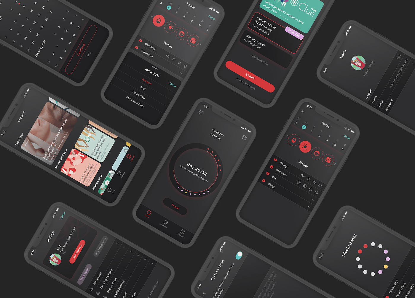
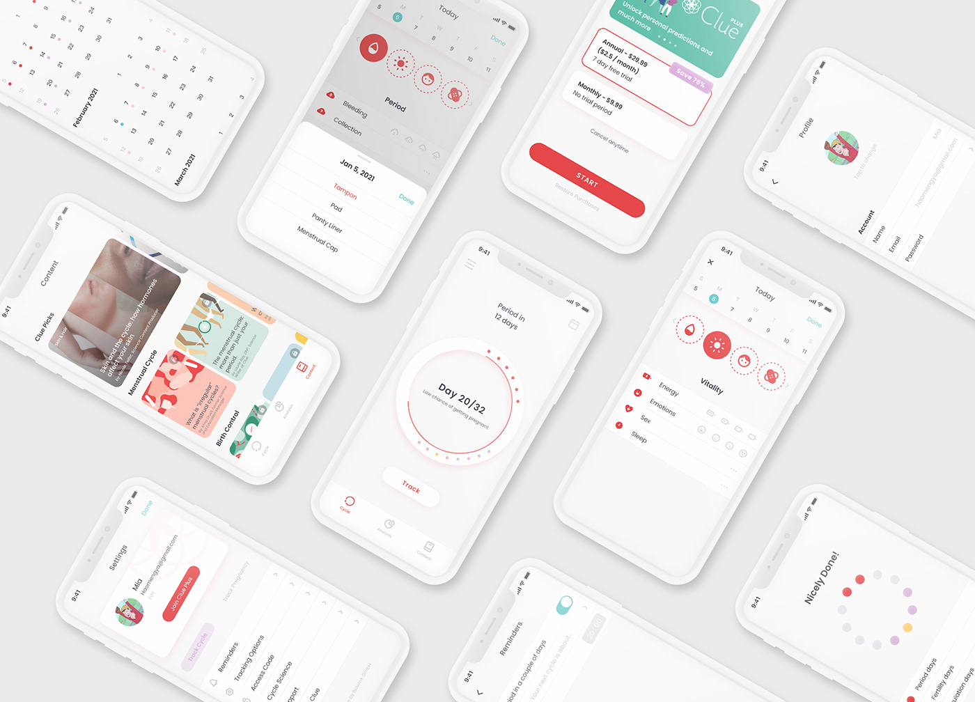
Design:
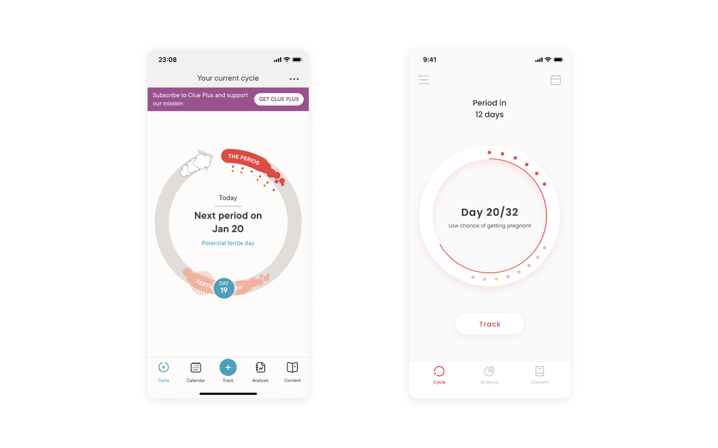
Home page
Current design / Redesign
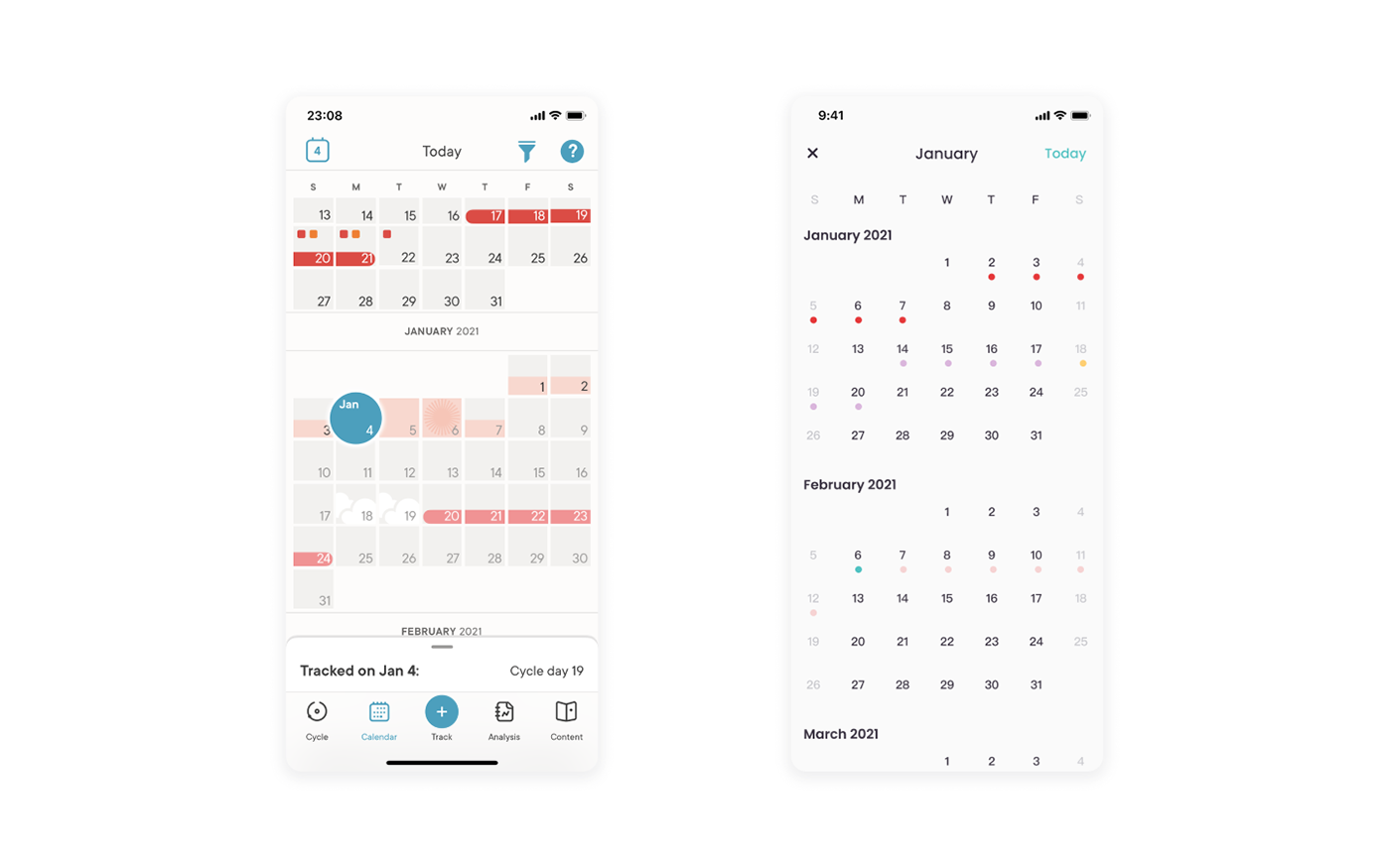
Calendar page
Current design / Redesign
Track page
Current design / Redesign
Clue plus page
Current design / Redesign

Content page
Current design / Redesign

Setting page
Current design / Redesign

Prototype:
You can browse the full experience using the prototype below or click here.

Darkmode: