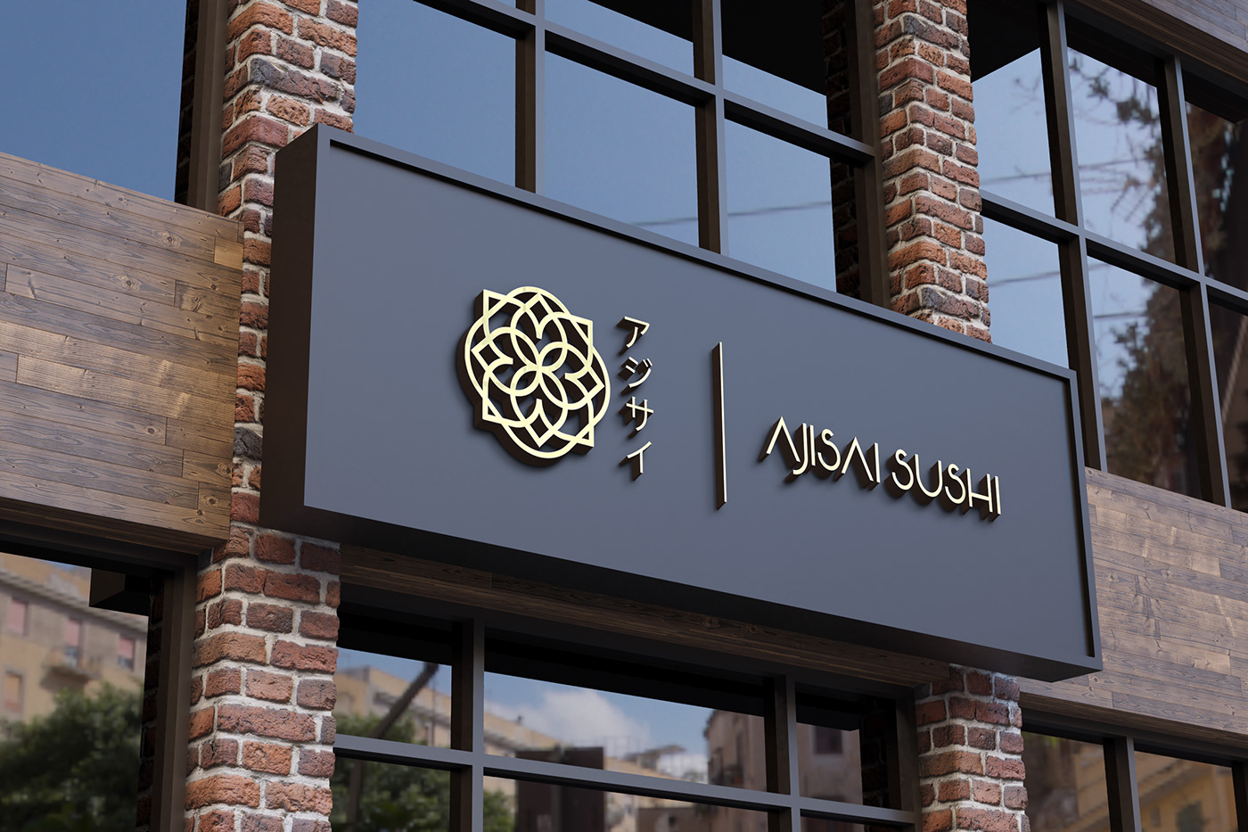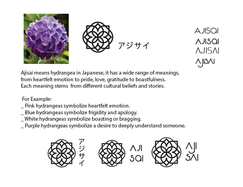
The client for this project is Akira Walker, an itamae chef and second-generation owner of a sushiya in Palm Beach Miami. After taking over the family’s business, Akira decided to upgrade the visual identity of the brand toward a simple yet sophisticated style but still include the elegance of traditional sushiya. Hence, the main objective for this project is to create a logo that translates the business value, as well as to make traditional omakase sushi stand out and get the recognition it deserves among other modernized/fusion sushi brands. After sitting down and brainstorming with Akira, we decided to name the brand after Akira’s mother’s favorite flower ajisai which is hydrangea in Japanese.
Ajisai is very popular in France, South East Asia, and especially where Akira’s family is originally from; Kanagawa, Japan. This flower has diverse species in color, ranging from blue, green to light pink. In the language of flower, each hydrangea color has different meanings, from pride, vanity, boastfulness, humble to family ties and gratitude. In the earlier design stage, purple hydrangea was the first option as it represents wealth and prosperity; however, we faced a minor setback as the Walkers were unable to finalize the color. To solve the problem, designer Mac decided not to go with any existed hydrangea color and chose gold to create the parallel meaning to the very concept of omakase sushi. Omakase means, “I leave it up to you” or “I trust the chef” at a menu-less and intimate sushi dining experience. The customers trust the itamae’s culinary skills and the selection of seasonal ingredients for a 16 + entries meal while the itamae leave it up to the customer’s interpretation and appreciation to each serving dish and the brand.