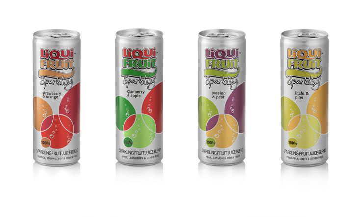
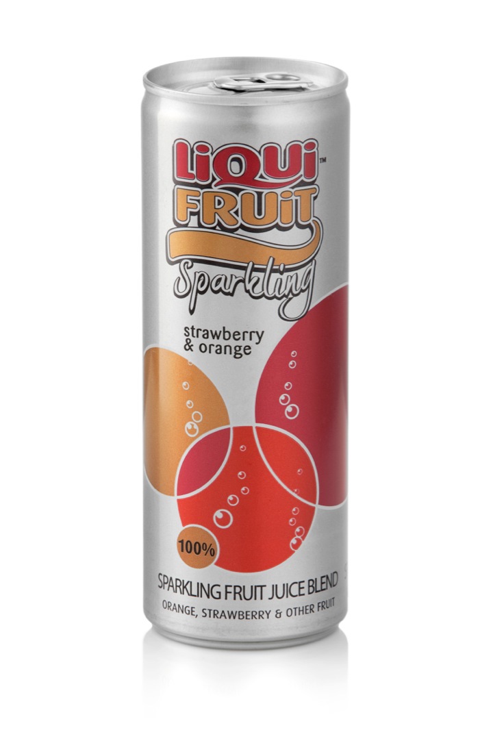
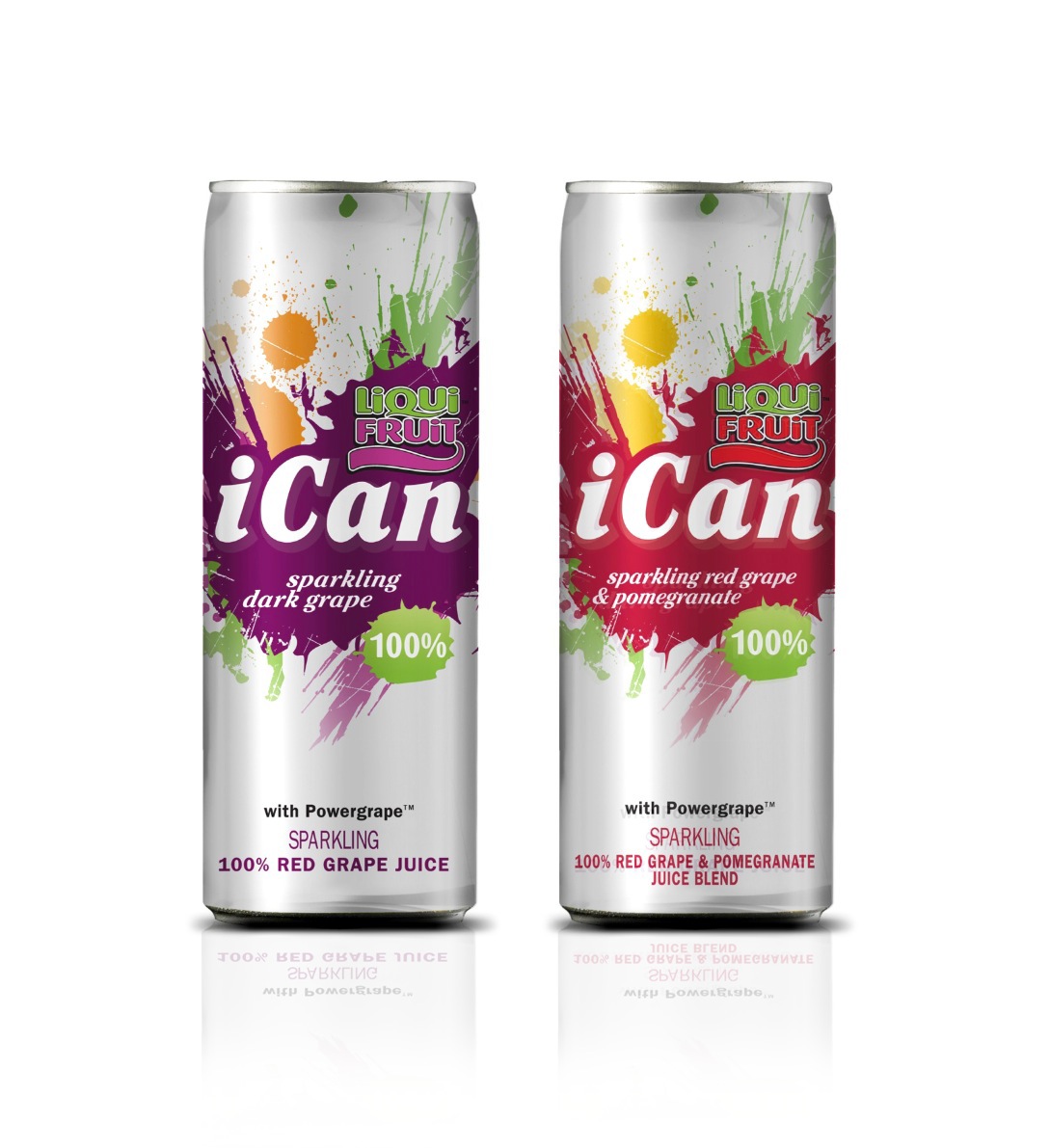
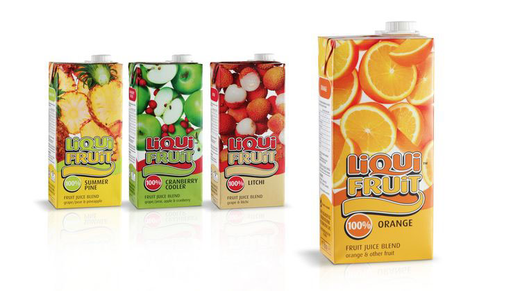
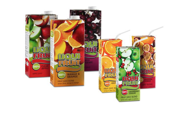
Nothing but fruit is taken to heart in the Liqui-Fruit brand redesign. The key was to upgrade the visual identity while, at the same time, retain the elements that make it a familiar and popular local classic. Fruit became the hero, packed onto the front panel and crowding out any white space. Bold colours and a dynamic pack architecture highlight the vibrancy, freshness and naturalness of 100% real fruit. Add to this some innovative brand extensions and you have an SA favourite that’s still leading the category in all arenas:
− iCan – a percentage of proceeds are donated to the David Grier charitable foundation
− Sparkling – a new product launch in a slim line can uses modern, stylised and simplified bubbles in bold colours for shelf standout
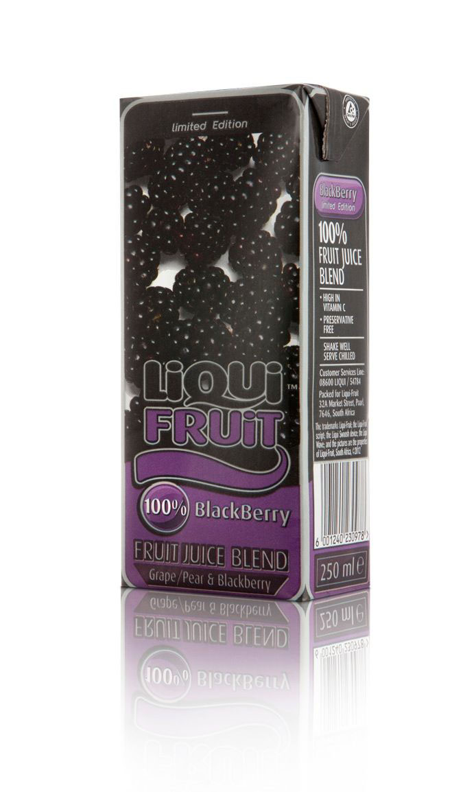
− Blackberry – a small tetrapak that plays on contemporary popular culture