
Project overview
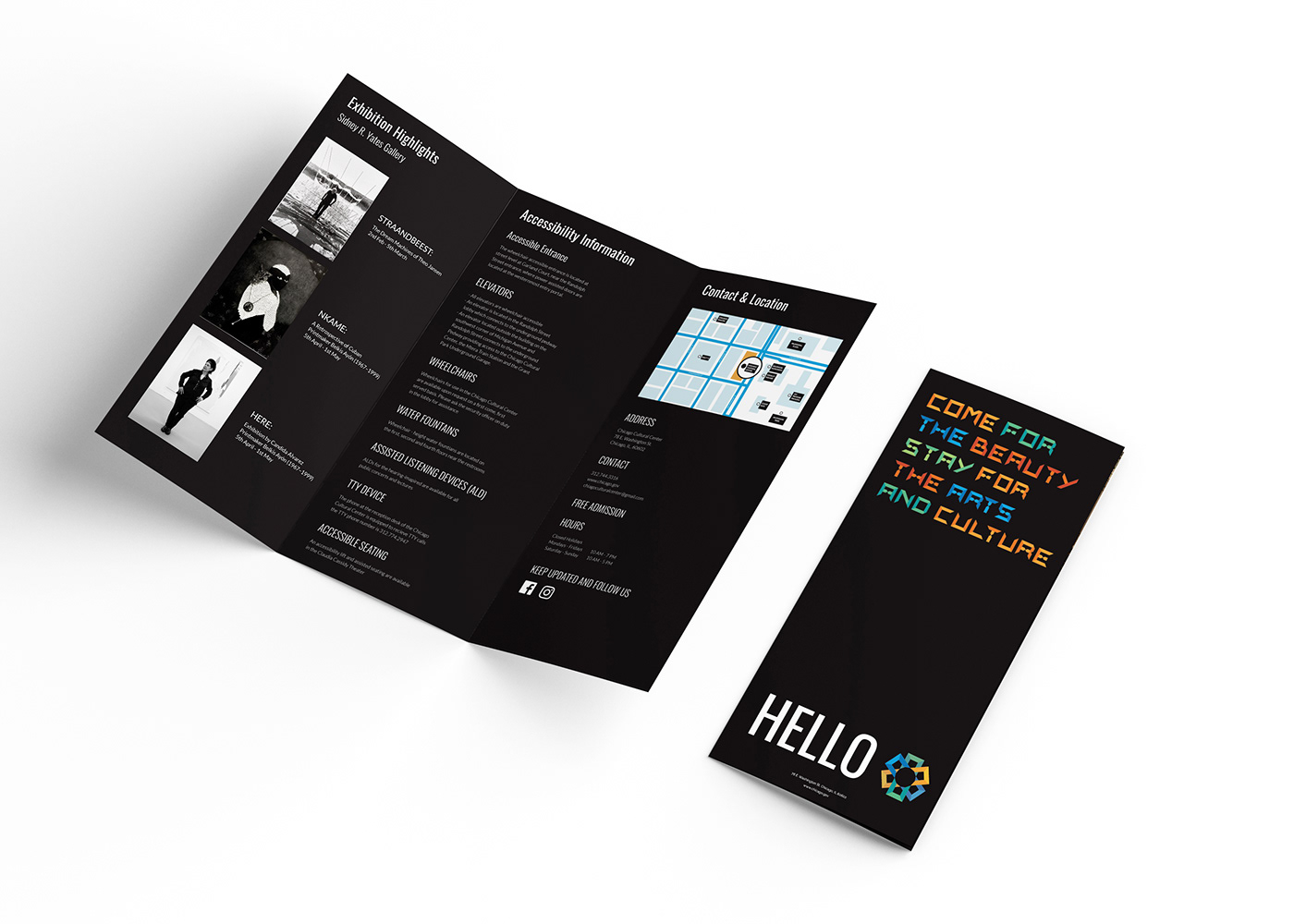
I designed a large scale identity system for the Chicago Cultural Center. After extensive verbal and visual research the new identity included the mark, the basic identity system, and appropriate prototypical applications.

LOGO DESIGN
Chicago Cultural Center is the nation’s first free municipal cultural center. The design direction is an abstract representation of the architectural elements present within the cultural center. The dome stands as a metaphor for education and culture, whereas the mosaic becomes a metaphor for diversity, inclusion and community.


These are part of the main identity of the building and represents the idea of art, culture, and beauty coming together to form a whole entity. The three C’s of the Chicago Cultural Center come together to form the “Y” letter in the front, which is the symbol of Chicago. The multiple colors are directly borrowed from the architectural mosaics.


Project designed by Sama Kasliwal


