CREATIVE BRIEF:
Evolve the email design to more accurately reflect the changing nature of the brand.
But first, a brief look back...
PROJECT GOALS:
One of the issues with the old ‘red envelope’ email design was its limited ability to showcase anything more than a single heavily text-based message. Also, the look was dated and out of alignment with the current direction of the brand which was motivated by a richer dynamic user experience.
Some of the chief goals of the redesign was to create modularity, visual excitement, and a mobile-optimized template that together would deliver a more refined, tailored experience.

We had to deconstruct the aspects of the design that had value for us and use that as a baseline to build out a wholly new design that encompassed many features that were previously missing. Some of the additional elements touched upon:
• Effective use of typography
• Nuanced approach to color, negative space and spatial balance
• How to effectively design a robust experience for both mobile and desktop
• Recalibrate the design process to a mobile-first approach
• Effective use of photography
SOME EARLY EXPLORATIONS:


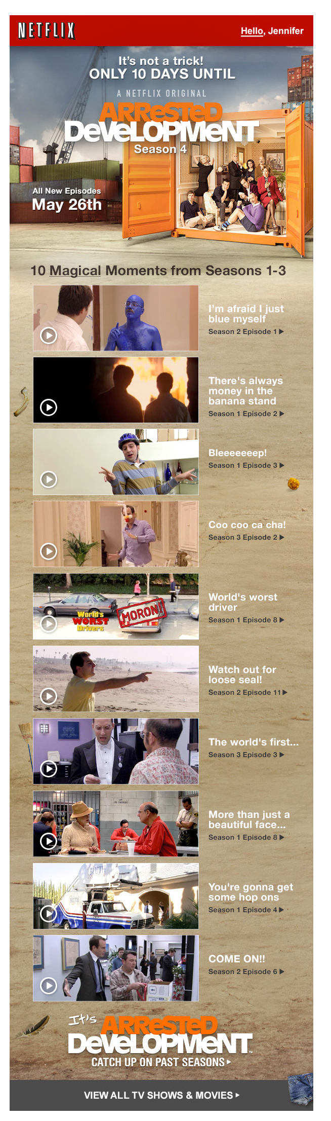
Arrested Development Season 4 • Pre-Launch Email
• Personalized eyebrow
• Animated gif showing cast walking out of closed container
• Localized in 9 languages
• Easter eggs hidden throughout linking to funny scenes
• Links to 10 iconic moments from previous seasons
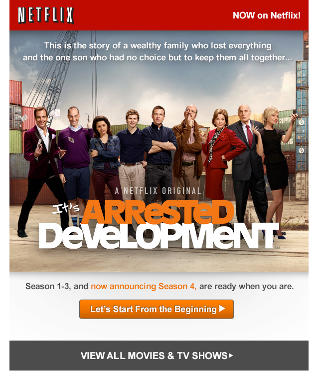
Arrested Development Season 4 • Launch Email
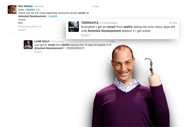
AUDIENCE REACTION:
The Arrested Development emails received our highest-ever response on Twitter.