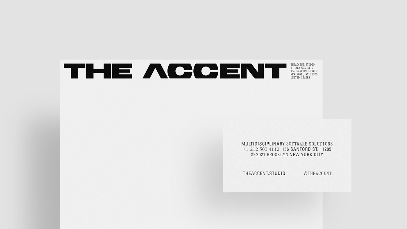
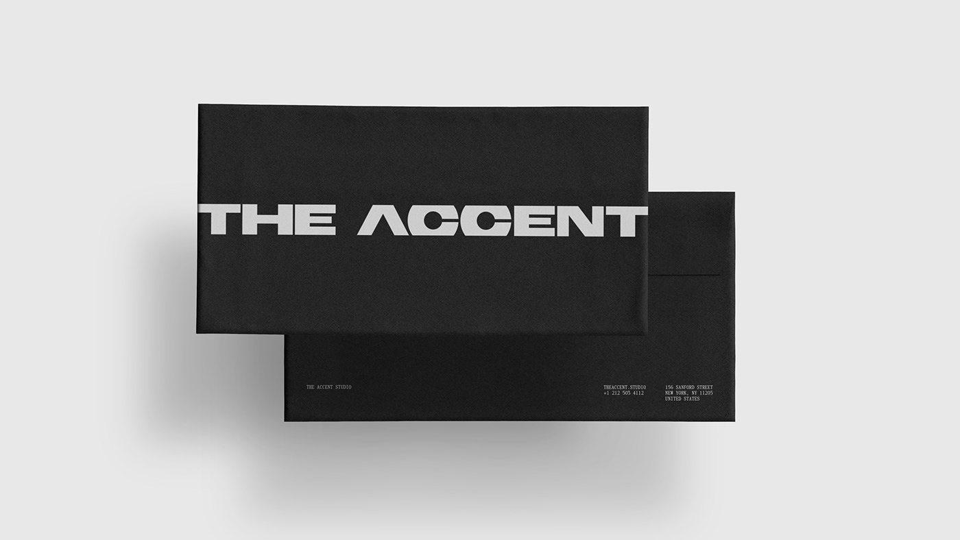
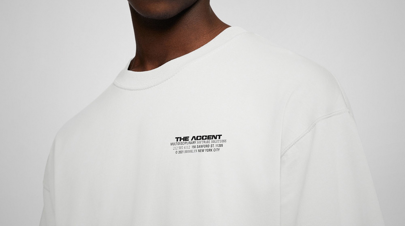
The Accent
The Accent is a New York City-based studio building software solutions in partnership with early Saas companies. An important factor for creating their visual language was to steer away from the traditional tech company look and create something bold and different while embracing the core values of the company. The studio has a pragmatic approach to their process and so this became the driving force behind the brand identity. Brutalism, a movement known for its pragmatism, was the main source of inspiration to achieve this straightforward aesthetic, resulting in a strong and uncomplicated logo.
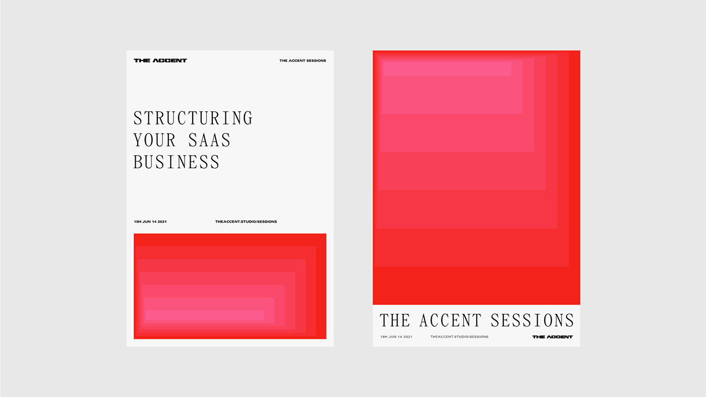
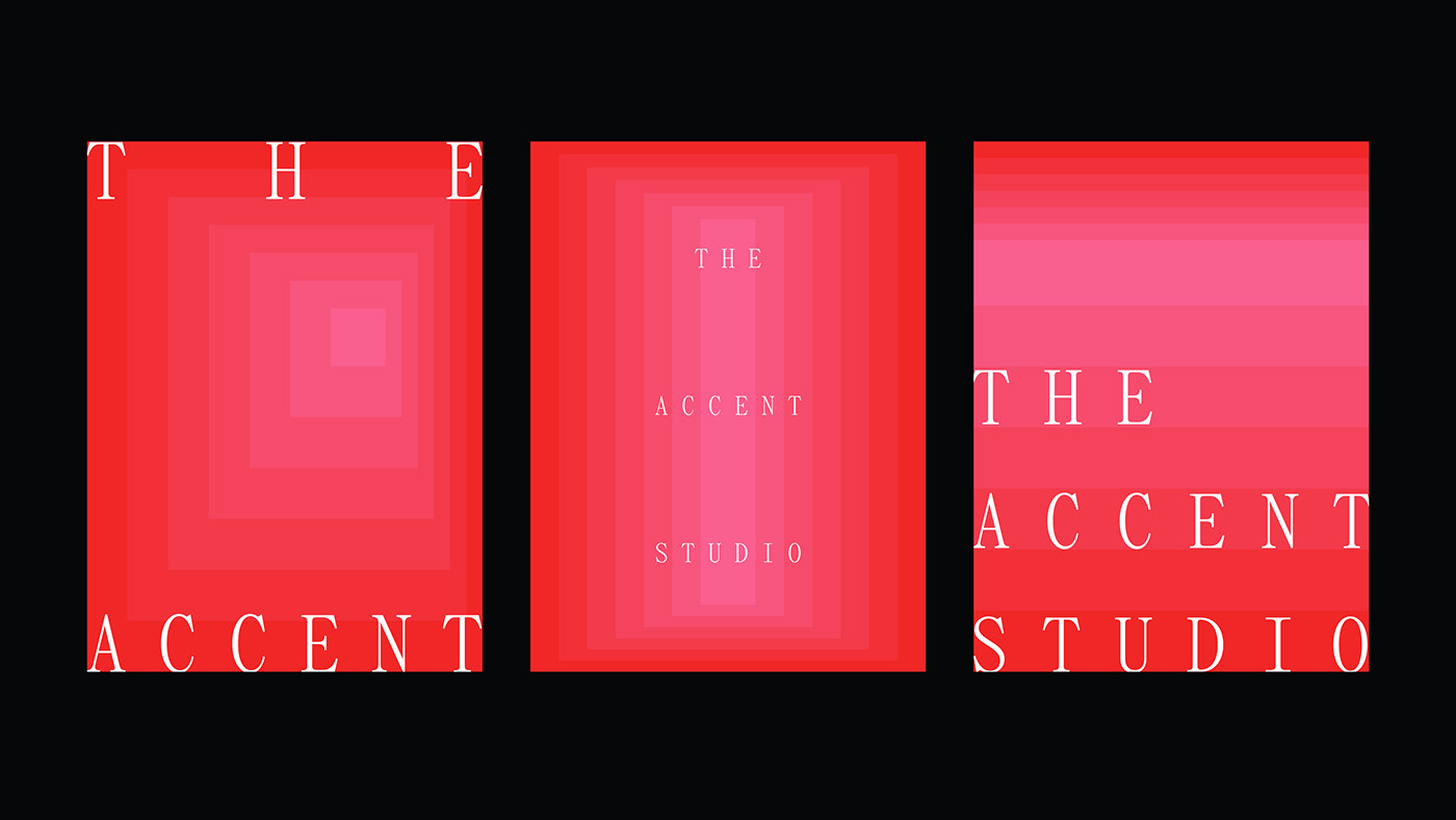
In order to further develop the visual language and bring warmth to an otherwise cold identity, a colorful kind of Brutalism found in the works of architects such as Luis Barragán and Ricardo Bofill, and artists such as James Turrell, were used as inspiration to create a dynamic gradient built out of blocks. The energetic color and dynamic movement of the gradient, combined with great utilitarian typefaces (Panama Mono and Univers), were able to convey the pragmatic values of the company while maintaining a fresh look that is adaptable to each material and touchpoint for the future to come.
Design Fields Brand Identity, UI Design, Motion Design
Client Sector Technology, Consultancy
Client Sector Technology, Consultancy