

2021 SPRING FESTIVAL AMUSEMENT PARK
GIFT BOX DESIGN
年货节红包设计
01 Background & Inspiration 项目背景 & 灵感来源
Spring Festival Amusement Park is a major marketing event, launched by RED e-commerce at the end of 2020, linking both online and offline markets. In addition to the webpage design for online events, we designed a set of red packages, which includes redemption cards for different categories of products, in the theme of an amusement park for offline events as well. After purchasing the red package set on the RED e-commerce event page, users can redeem the corresponding products online using their redemption cards, in turn, completing the closed-loop marketing online and offline.
年货游乐园是小红书电商在年底推出的线上线下联动大型营销活动。除了线上活动页面设计,我们还为线下活动设计了一系列游乐园主题的红包利是封,内含不同品类产品的兑换卡。 用户在小红书商城的活动页面购买红包后,即可用兑换卡在线上商城兑换相应产品,进而完成线上线下的营销闭环。

02 Structure 结构
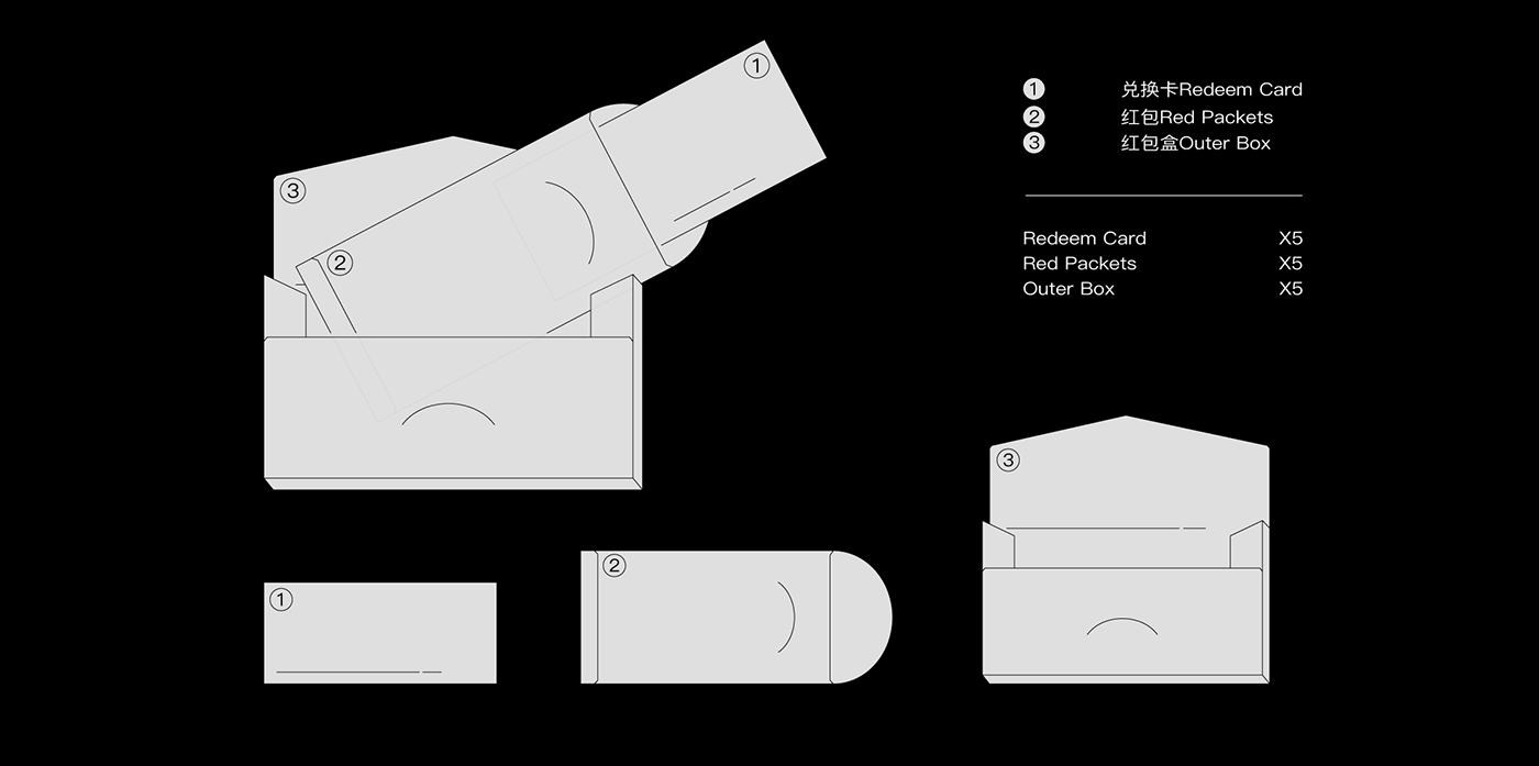
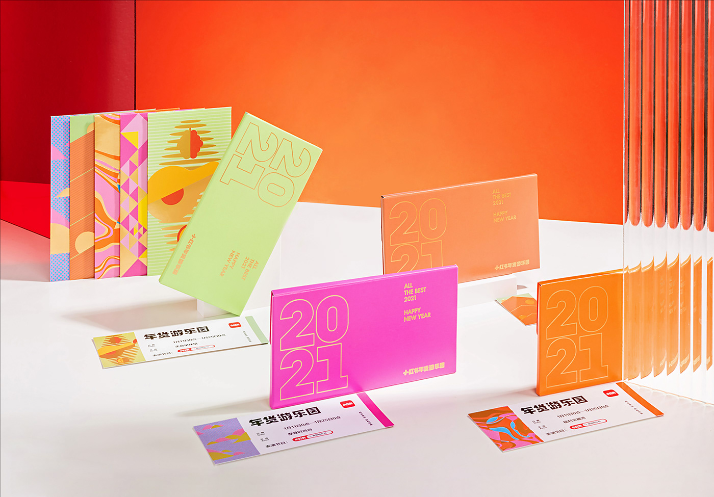
The red package set includes: red packages, redeem cards, and a red package outer box(with five colors).
这次红包包含的内容有:红包、兑换卡、红包外盒。
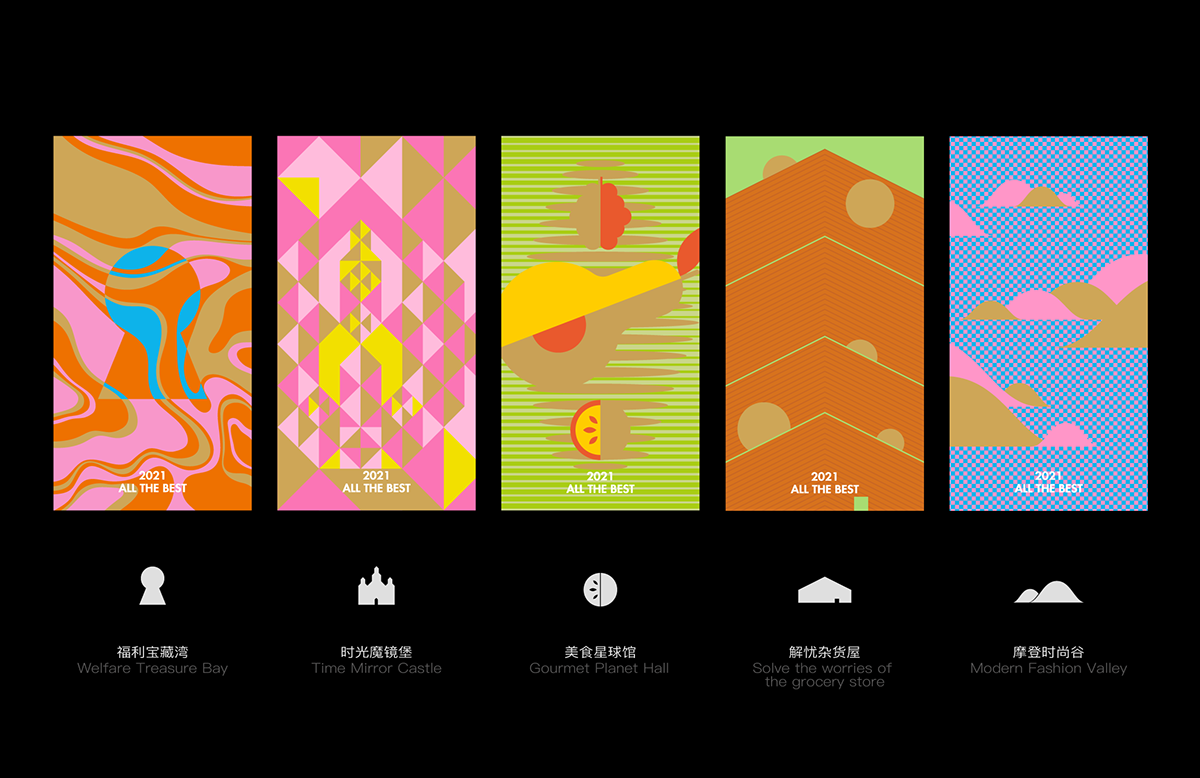
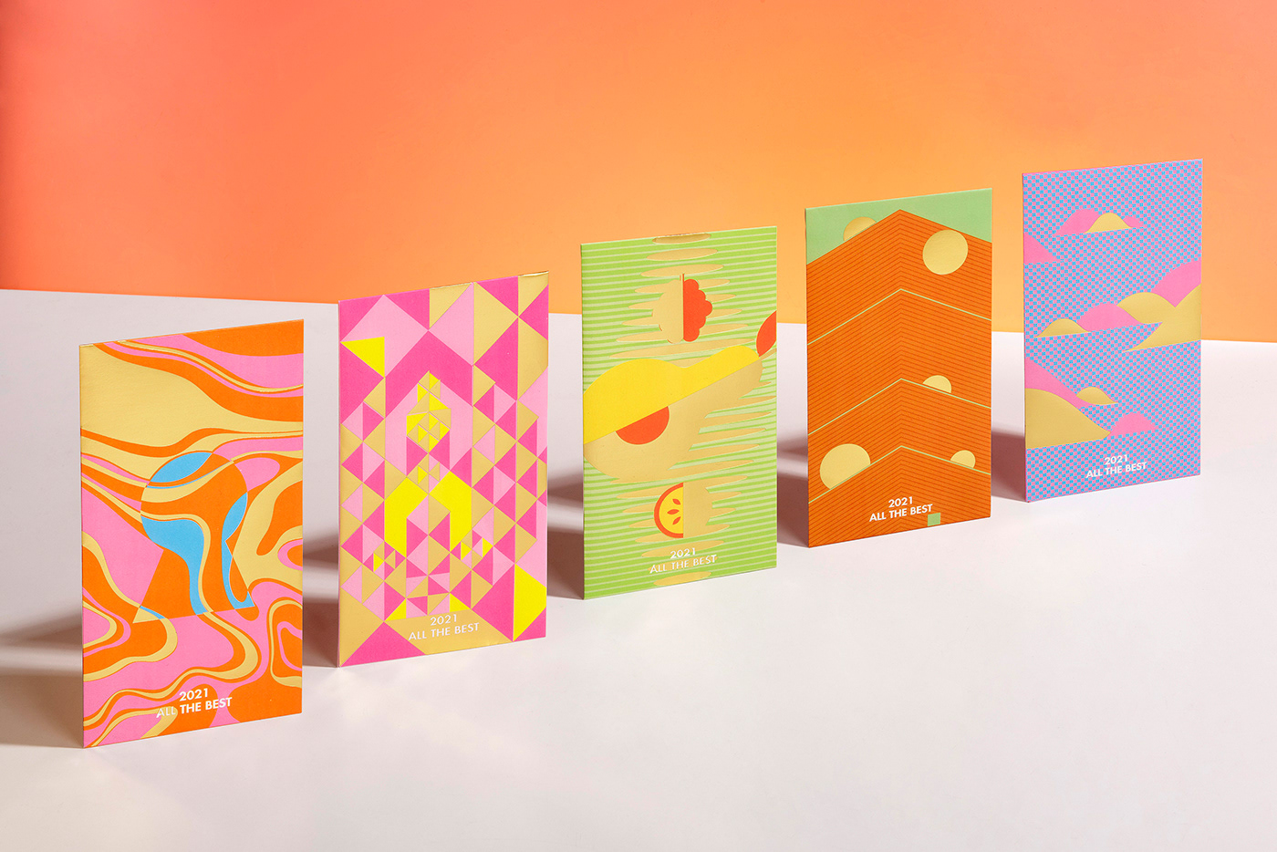
03 Elements 元素设计
Red Packets红包>>
In the theme of the amusement park, we chose five representative scenes in an amusement park to design, which are: the Welfare Treasure Bay, the Worry-less General Store, the Time Mirror Castle, the Gourmet Planet Hall, and the Modern Fashion Valley.
以游乐园为主题出发,我们挑选出五个具有代表性的游乐园场景进行红包设计,分别是:福利宝藏湾、解忧杂货屋、时光魔镜堡、美食星球馆、摩登时尚谷。
We used abstracting techniques to extract amusement park elements, expressing a cheerful atmosphere and delivering New Year’s greetings.
我们运用抽象概括的平面设计手法提取游乐园元素,以此表现欢快愉悦的氛围,传达新年的祝福。
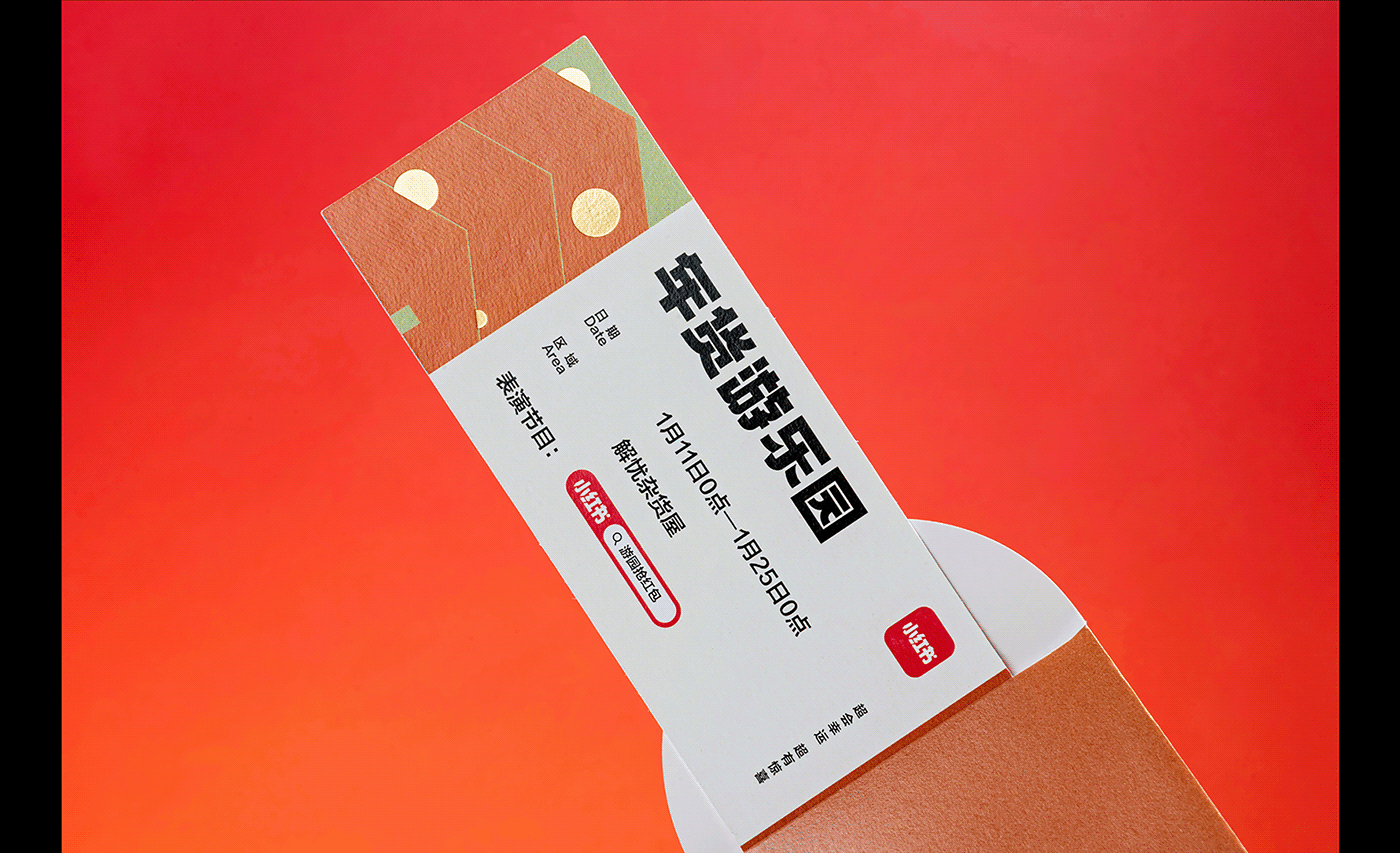
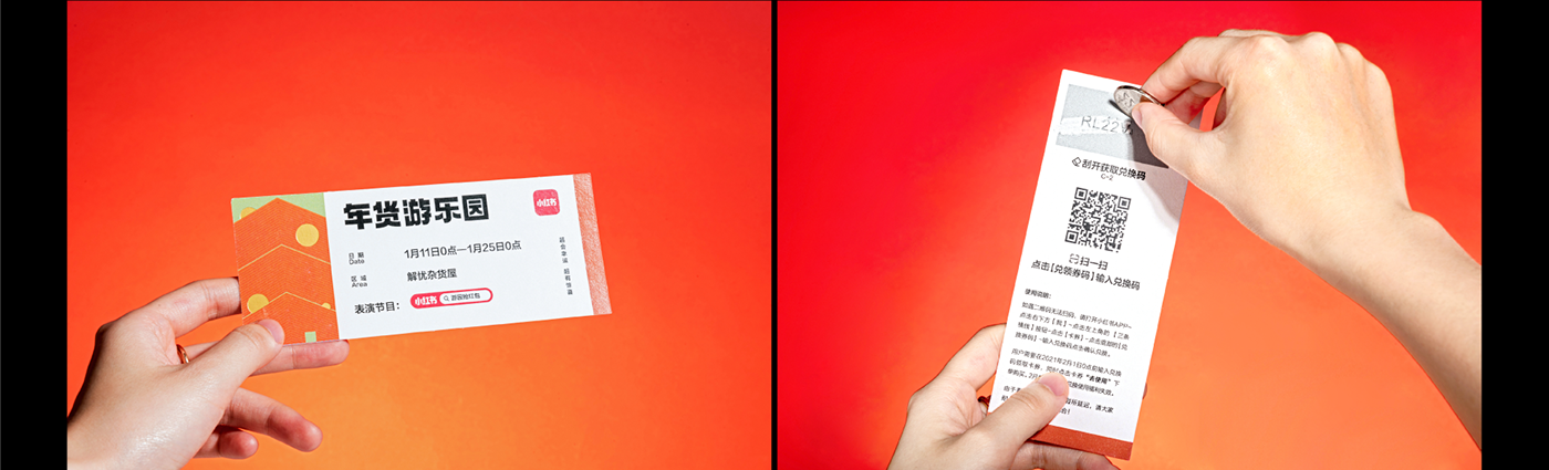
Redeem Card兑换卡>>
To correspond to the theme and maintain visual unity, we designed the redemption card in the form of an amusement park ticket. An area on the back of the redemption card is covered by a layer of silver ink coating. The redemption code reveals after scratching out the coating.
为了呼应主题,保持视觉的统一性,我们将兑换卡设计成游乐园入场券的形式。在兑换卡背面做了银墨涂层区域,将涂层刮开,可以获得兑换码。
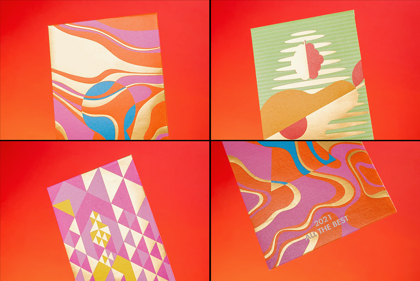
Outer Box红包外盒>>
We designed the outer box as an envelope, creating a sense of ritual and increasing the expectation for users when opening the package. The use of Pantone color and bronzing technique makes the box simple yet refined. The outer box is also designed precisely to fit just five red packages.
我们将外盒设计成信封形式,增添一点仪式感和开盒的期待。专色和烫金工艺的使用,让外盒简约精致。在厚度上,控制在刚好可以装下五个红包的尺寸。


Art Director 美术指导:Hayley
Graphic Design 视觉设计:Hayley / Yue / 谭
Photography 摄影:He (RED Studio)
Check out more of our work on 关注我们 :


