An identity design for our degree show. The task was to represent the entire creative side of the university - around a dozen different courses - in a single identity.
I realised that this was an impossible task, because of the range of creative projects being produced at the university. What one person's idea of their experience may be, every other person's will be drastically different.
So I decided to try to encompass every single student within the identity. This would work in several stages:
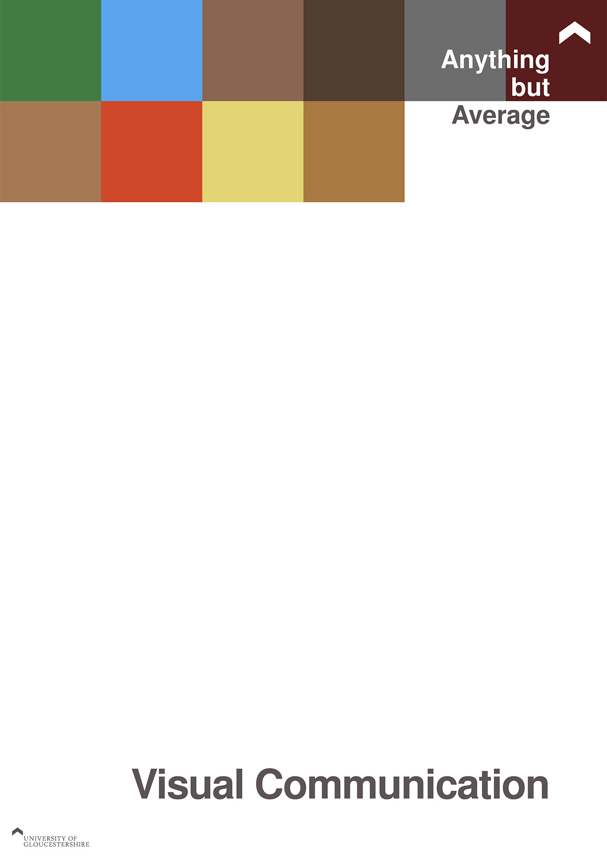
1. Each student picks three pieces of work that they think describes their portfolio best. I take the primary colour from each piece and then combine the RGB profiles to get an average. That is the individual's colour that is used on any signage, business cards or other periphenalia unique to them.
2. Each personal average is then added together according to their course to give a course average colour. This colour will be used for directional signs as well as specific mailing invitations.
3. The courses are all added together to give an average colour for the entire university. This will be used on the main advertising campaign and for all university-wide press releases and signage.
In this way each student is represented without having several thousand pieces of work to choose from. It's an average colour for everyone, thus spawning the degree show moniker "Anything but Average".
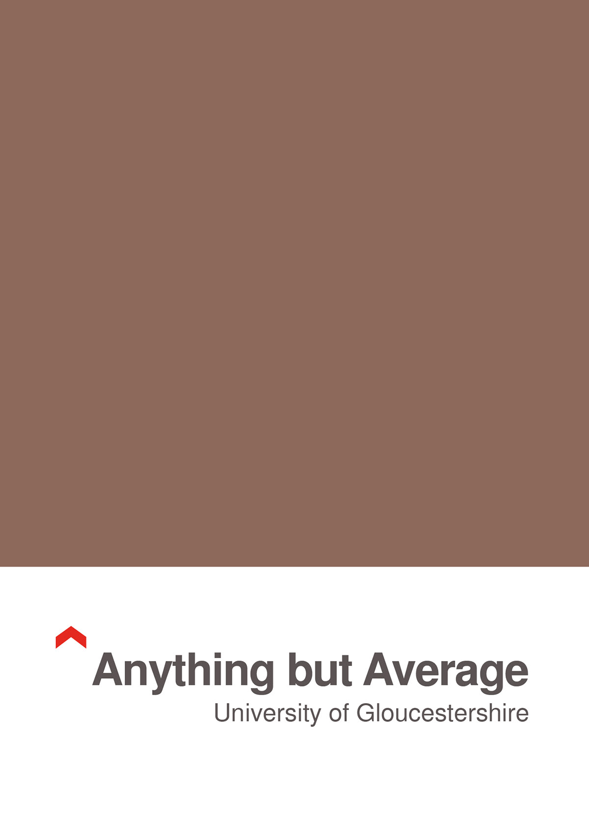
Designed to represent a Pantone swatch, a colour profiling system that every creative course should be familiar with. The average university colour was always bound to end up as a greyish brown, which unfortunately is the only downside to the project.
However, I see it working in the opposite way - since no one in their right mind would use brown as a main advertising colour, the viewer would be intrigued as to the meaning behind the piece, thus making them explore further.

This version of the poster uses course sizes to add a further dimension to the idea, creating an extra infographic dimension to the piece.

The first completed poster was based around graphic design in order to make the individual squares the correct size. Graphic design was the largest course, so I would need to start there and work backwards.

The second version of the graphic design poster, this one using the course colour. The two options were presented, with either being able to be used in any situation, depending on space and effect wanted.

Fewer students means fewer squares, which creates more white space, actually making for a more striking image, and putting the focus on the students themselves.