


Apolo Design System is a set of resources focused on human-centered design, taking into account ergonomic, cognitive, and logical issues. Based on atomic design, where each part is modularly designed to create a component, ADS is the easiest and quickest way to create new screens and features.
Colors
The basic colors of Ninsaude Apolo were chosen based on their function. The four groups of color gradients, although subject to change depending on the theme applied to the system, must fulfill their fundamental roles, respectively: personalization, focus, alert, and grouping of information.

Typography
Typography uses four variants of the Poppins font, namely: Poppins Bold (credits), Poppins Semi-bold (titles), Poppins Regular (paragraph), and Poppins Light (special).

Icons
All Apolo Font Icons were custom-made for the project and follow their own guidelines to balance and inform the correct actions on the interface, as well as to ensure legibility on all supported screen types and sizes.

Illustrations
Like the icons, the internal illustrations are also customized and follow the branding colors. In addition to making the interfaces more friendly and vibrant, they serve to summarize and draw attention to important information or resources.

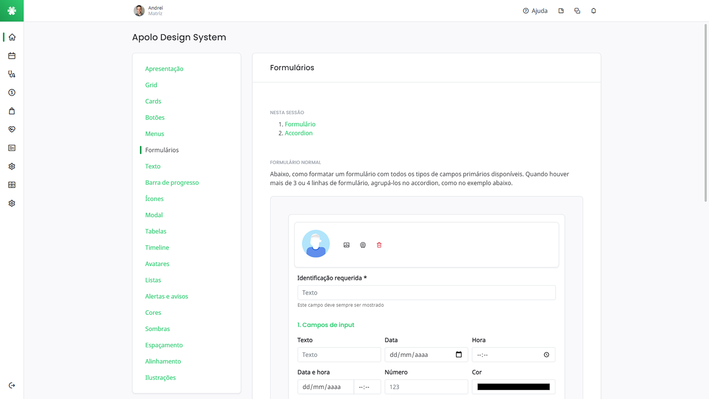
Docs
The complete documentation of the Apolo Design System was created using real interface components and inserted into the system itself, with access only for development and design teams. Not only are the components shown, but also their respective codes and groupings to standardize the overall experience.
Source
Ninsaúde Apolo
2020


