The Challenge
____
Plasma is the coworking and makerspace of the State University of Campinas (Unicamp) in Brazil and was created as a new place for innovation aimed at the entire university community. A space to meet the growing needs of students to develop in a more creative, autonomous, entrepreneurial and socially engaged way. Plasma's visual identity should then not only reflect the wishes of this new culture of creativity and technology, but also should have the premise of dialoguing with the legacy of the former Plasma Laboratory of the Institute of Physics that now houses and gives name to the new space. In addition, being a space more focused on the student community, its look should be essentially human, inspiring and inclusive, reflecting a new young generation that embraces the new and wants to change the world.

The solution
____
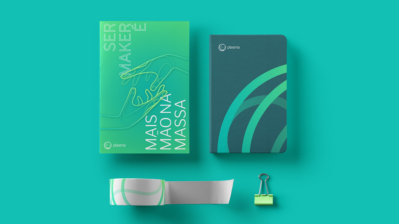
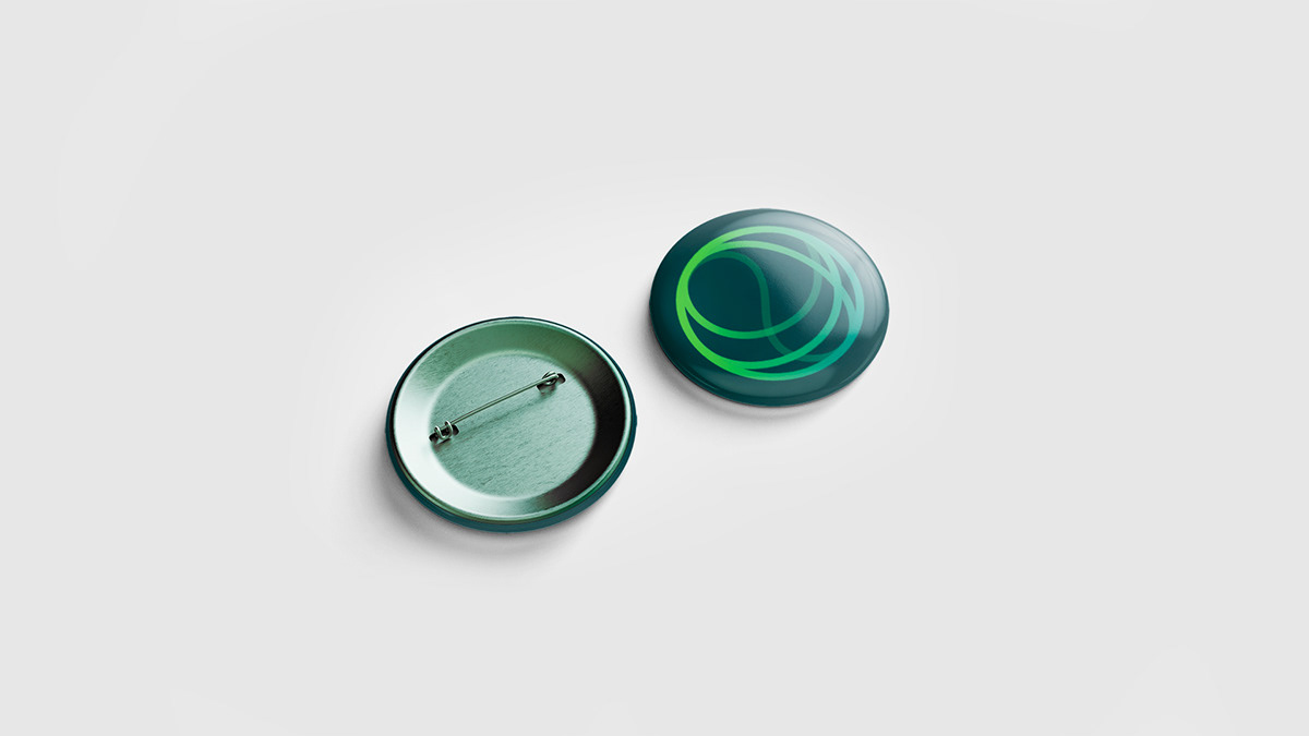
Plasma's visual identity is vibrant, unusual, dynamic and helps to consolidate its personality. The logo, the brand's centerpiece, refers simultaneously to the 3D printer's filament, as a symbol of the maker culture and the plasma sphere, characteristic of the old Plasma Laboratory. The wide color palette reflects the ideals of diversity and dynamism of a world in constant change and expansion. Chosen after a long chromatic study, the colors - analogous and complementary - have great harmony in the set and allow versatility to the communication pieces. Along with that, the pictures used in the visual identity carry a deeply contemporary and youthful aesthetic, making students identify and take ownership of this new space of innovation and creativity that belongs to them.