You know sometimes there's a little app/service that is pretty efficient and handy but their design seems dated and could use some improvement?
Being a designer I feel that strongly so I'm beginning to revamp the graphics of my favorite apps/services as a side project.
Being a designer I feel that strongly so I'm beginning to revamp the graphics of my favorite apps/services as a side project.

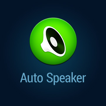
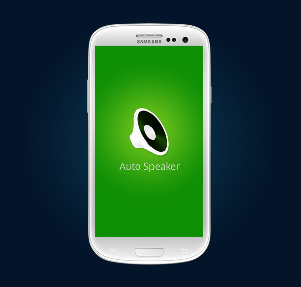
I’ve been using Auto Speaker app for a long time. It’s an excellent little app and does the job pretty well. But I thought it’s icon could use a redesign.

Since this amazing little app is available for free at Google Play, I didn’t charge for the redesign. The developer really liked it and voilà it’s live. (To show his gratitude the developer gifted me one of his paid apps.)
App icon design is one of the areas that I'm beginning to explore out of my comfort zone. This is my first attempt. In fact, this is the second one. I did a redesign for my another favorite app before (that I won't name here) but the developers didn't bother to respond. Nevermind! ;)