
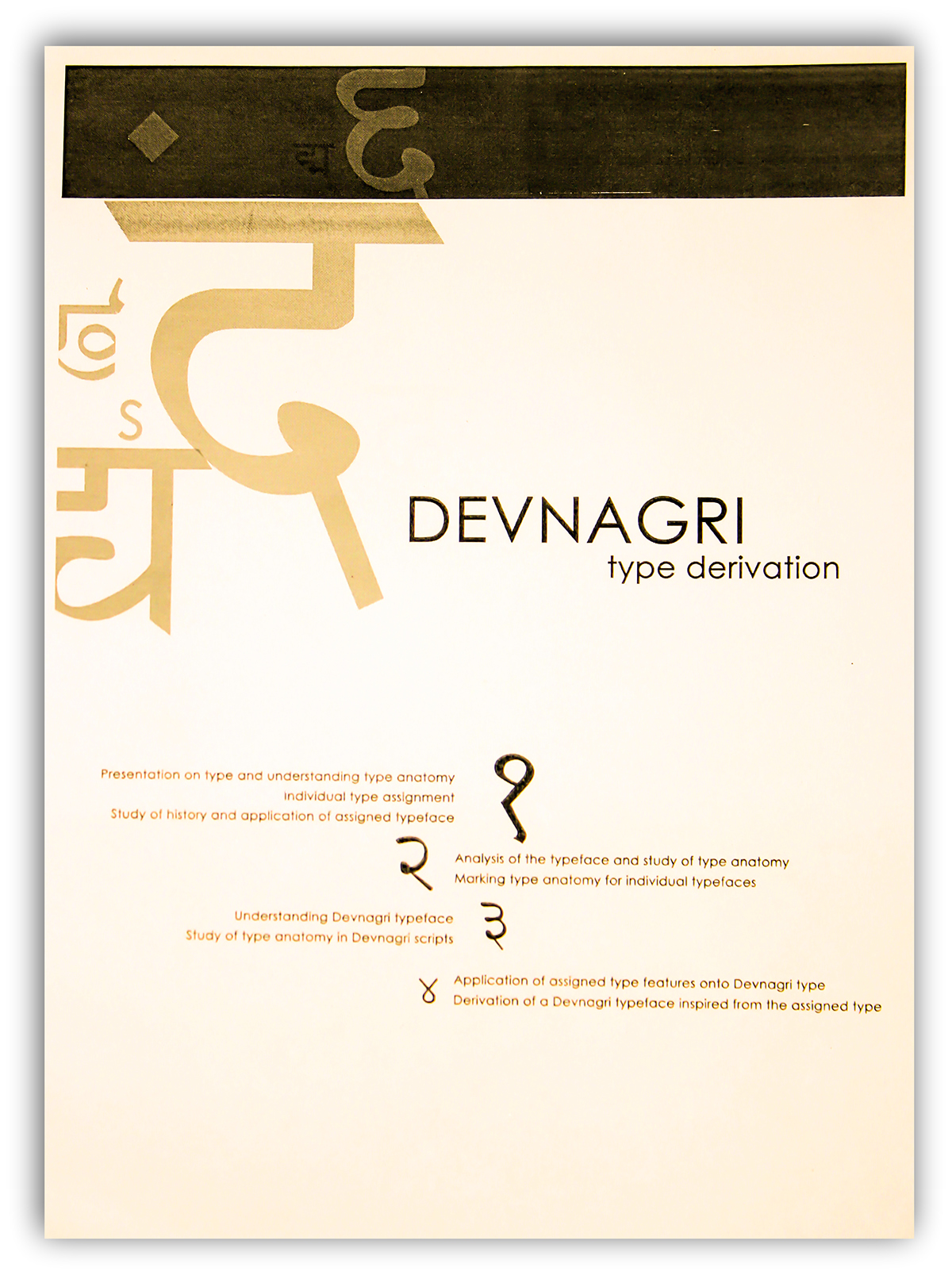
DEVNAGARI TYPE DERIVATION
This project is about deriving a Devnagri typeface from an existing typeface- "Didot".
The project is divided into four steps:-
Step 1- Study of the "Didot" typeface- its origin, characters,etc.
Step 2- Hand tracing the typeface outline and studying the type anatomy.
Step 3- Deriving a "Devanagri" typeface from the type. The derivation is done after studying the key features of the type.
Step 4- Studying anatomy of the derived typeface.

The Didot type was designed by Firmin Didot in Paris in 1783. While designing Didot, F Didot moved away from handlettering and calligraphic characteristics of the era in search of a cleaner and more legible solution.
The Didot types defined the characteristics of the modern (or Didone) roman type style. These are characterized by extreme contrast in thick strokes and thin strokes, by the use of hairline serifs and by the vertical stress of the letters.
Didones are most commonly used for display and semi-display purposes, where the accentuated contrasts or stroke width create dynamic and elegant draphic effect. Effective use of Didone typefaces depend upon high quality printing and paper, and serves in turn to demonstrate that quality. As a consequences, they are frequently used to denote values of exclusivity and sophistication.
Didot has almost see-through quality. They act as typographic veil over photography; making them particularly useful for magazine covers.
Key features of the Didot typeface-
--Vertical Axis --Horizontal Stress --Classic --Hairline Serif --Modern --Contrast --Versatile --Catchy --Less Readable --Dynamic --Elegant --Sophisticated --Exclusive --Stiffness --Dazzling Effect --See-through --Romantic --Veil --Compact --For headings and sub-headings


The typeface is traced by hand. Hand tracing is done to observe each element in detail. The traced works are then labelled to understand the anatomy. Study of the type anatomy is all about looking more closely at letters.
To understand how the attributes of letterforms (such as contrast, detail, and proportion) affect the mood, readability, and use of each typeface.


Developing / Designing the "Devnagri" Typeface on the basis of "Didot".
- The Cap line of the Devnagri is inspired from the hairline serifs of the Didot typeface.
- Extreme contrat in thick and thin strokes.
- Horizontal stress is there.
- The use of the element "ear" (of the 'g' in the didot typeface) in the Swara(Vowels).
- Important elements of all the alphabets are separated first and then joined to form new letters.


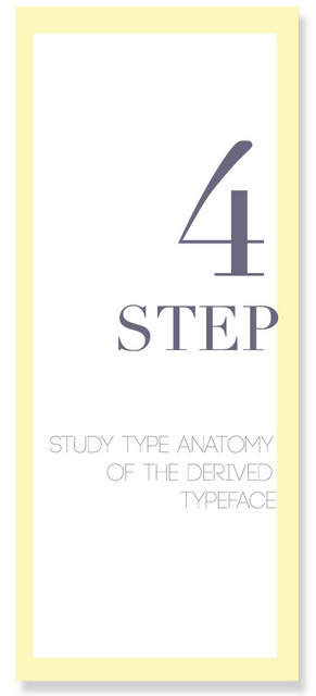
Labelling of the Devnagri type anatomy to check the validation of the derived type.


