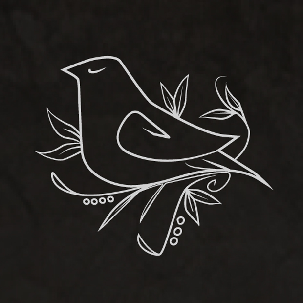
Altought this project is brand new, I've designed the first Cecília Ribeiro's logo 3 years ago, at that time Cecília was starting to come out and show what she does best to the rest of the world, I worked on her communication, marketing and on her Logo ofcourse, and now, because we wanted a thing truly genuine (the last one we used Signeria font type) now I did the lettring and drew a more elegant bird (the older one wasn't completely original).
By the way, the bird is a Sparrow, carrier of good news and also, symbol of the Lovers , so they say.
Enjoy
By the way, the bird is a Sparrow, carrier of good news and also, symbol of the Lovers , so they say.
Enjoy
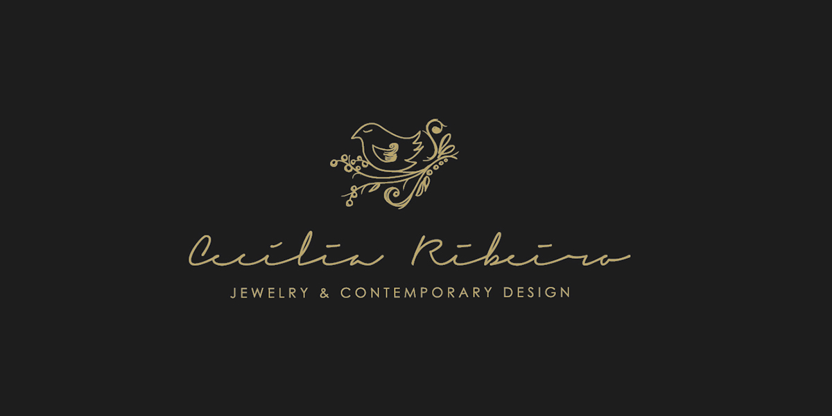
The older Logo here represented in Gold.
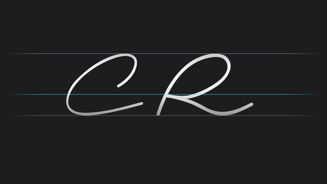
The Capital letters is always my starting point.
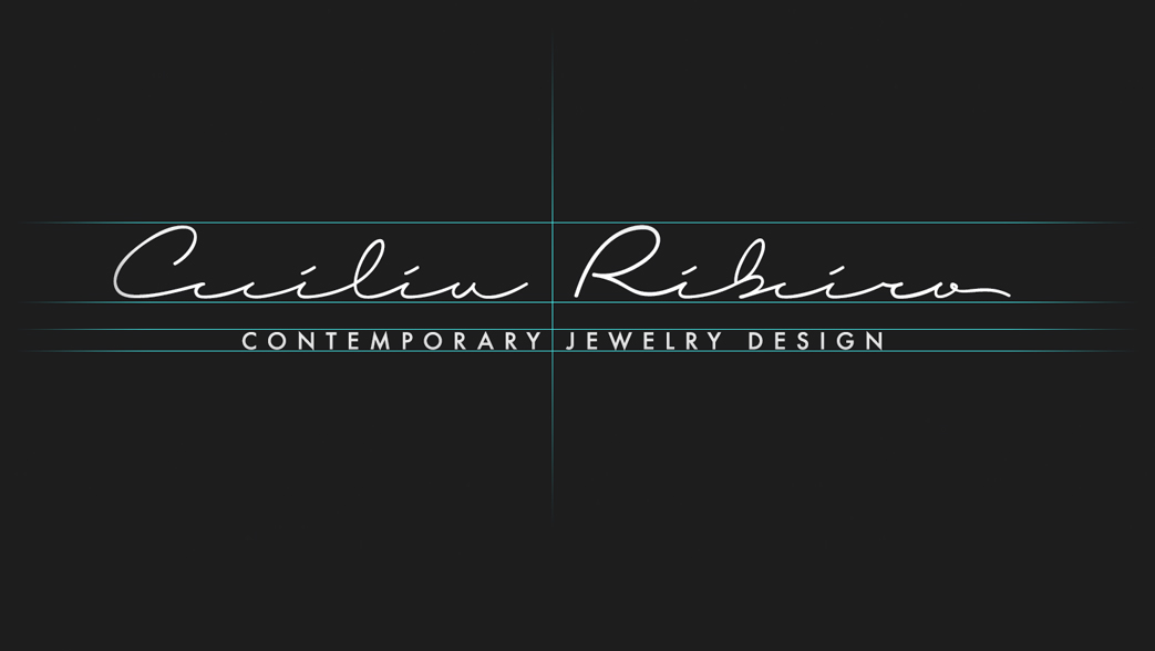
All the Logo here balanced, the font of the signature on the bottom is not mine it's actually Futura EF, I did use it on the otder logo and I decided to used it again.
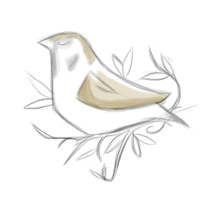
The symbol mock-up with color on it, I decided to drop the color after I did the vector,, looks nice on the drawing but not really on the final result.

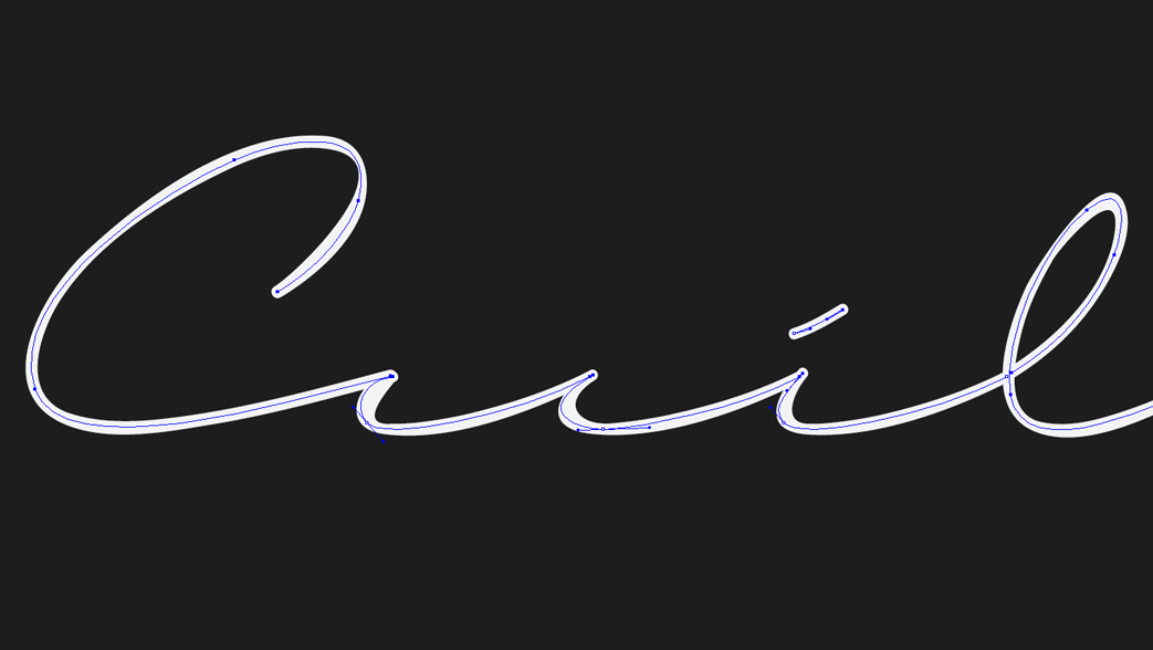
It was almost finished when I realized the "e" letter didn't have a lot of reading, we couldn't really difference it from the "c", so did go back to the beginning on that one, and then...

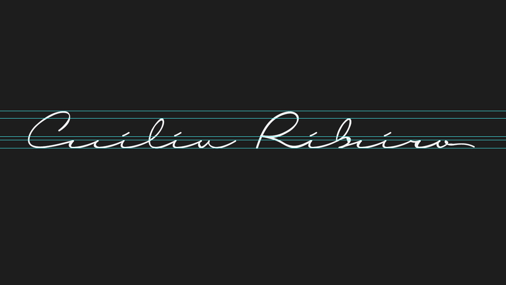
... only then, I was quite happy with the result, so did Cecília and so far the feedback has been very positive.
What do you think?
What do you think?

You can find out more about Cecilia Ribeiro's work at
www.fb.com/ceciliamribeiro
www.ceciliaribeiro.com
www.fb.com/ceciliamribeiro
www.ceciliaribeiro.com