


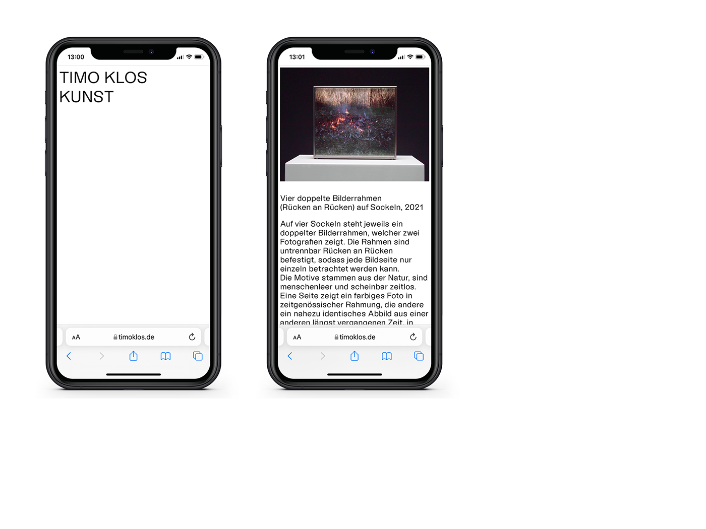
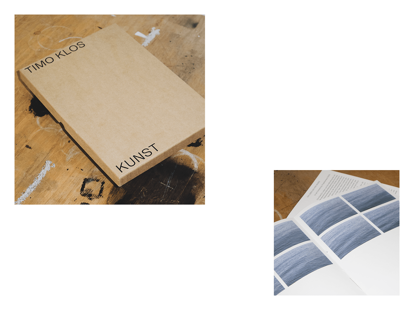
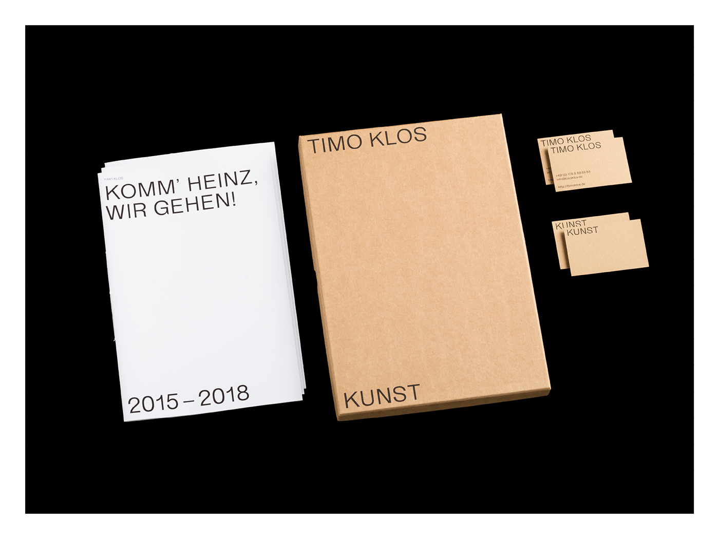
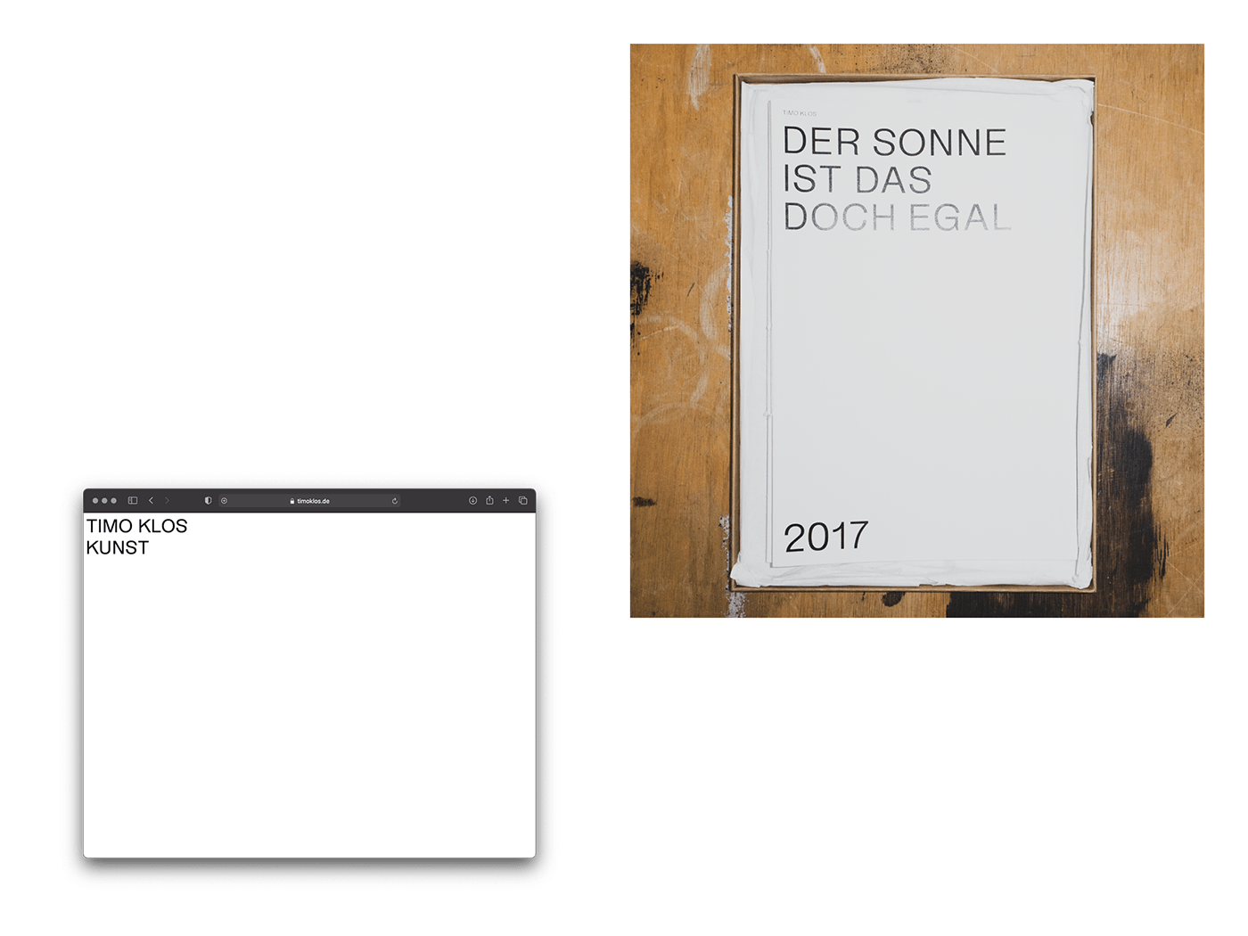

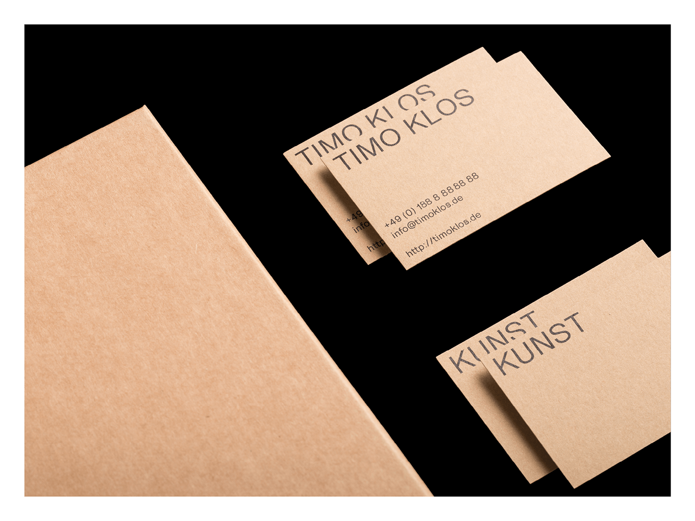


Like Timo Klos art, the Corporate Design developed for him unfolds its effect at second glance.
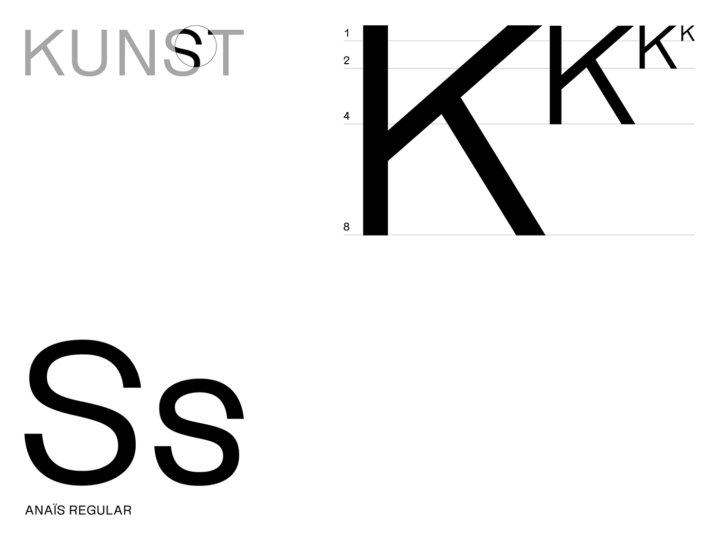
A simple typographic system is the basis: one font and clearly defined proportions. The strict structure is a reference to the artist's very systematic way of working. The font sizes are identical in all printed matter produced. Whereby the next size always results from a doubling of the previous one.
The font used, Anaïs, appears sober at first, but then surprises with unusual details.
The overall reduced structure of the appearance supports Timo Klos work and provides an appropriate framework for his photographs.


