Evermade needed to define a strong brand strategy, story and identity to stand out from the competition and to attract & retain talent. They needed our help to better express the passion and excitement that was deeply present, but not shown enough outwards. By defining the brand values, positioning, future ambition and purpose for Evermade, we created solid foundations for the brand.
The key design drivers were developed based on those brand foundations, which enabled us to create a unique identity that expressed what Evermade is truly about: Honesty, curiosity, mastery and heartfelt.
The key design drivers were developed based on those brand foundations, which enabled us to create a unique identity that expressed what Evermade is truly about: Honesty, curiosity, mastery and heartfelt.
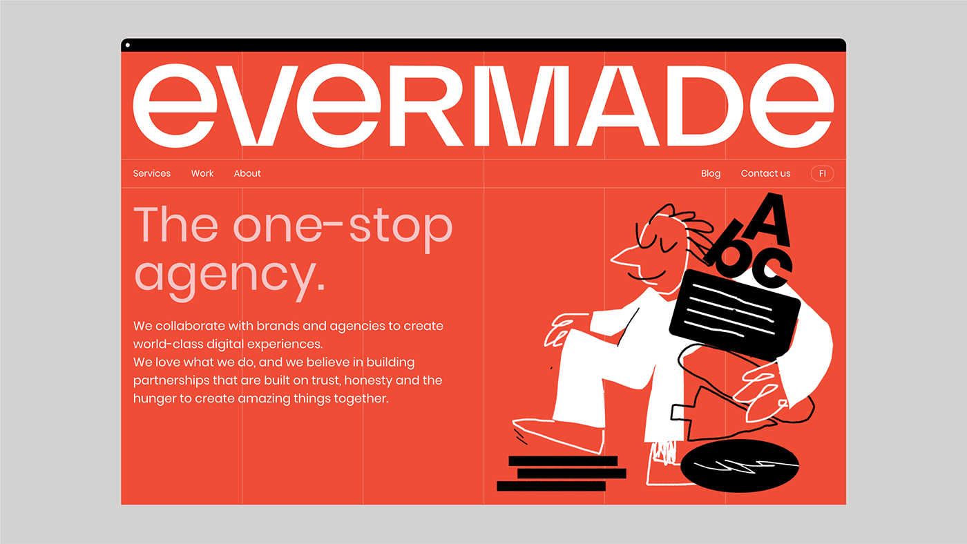
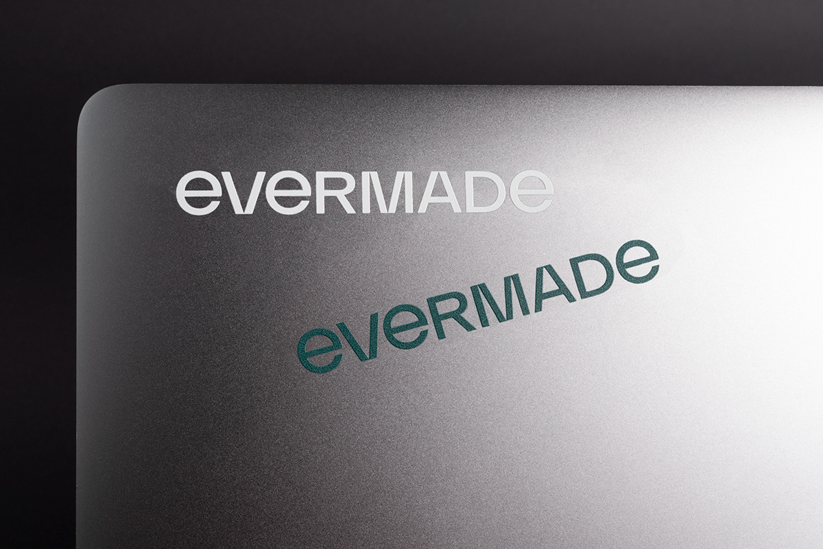
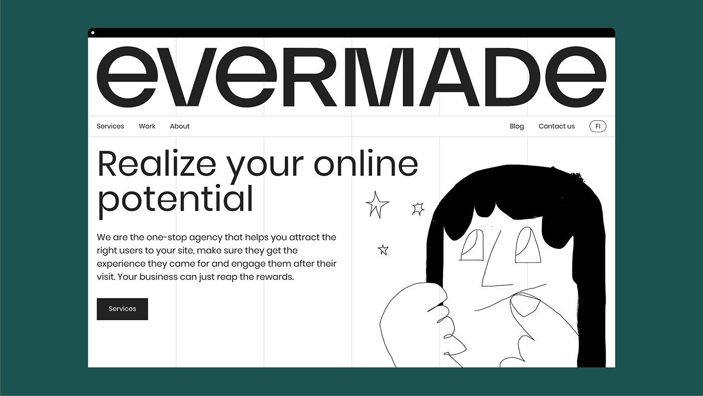
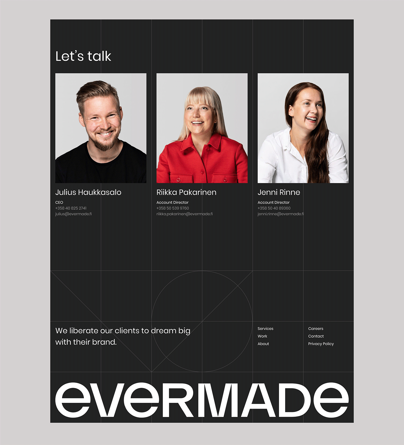
The logo was designed to be simple and systematic, with a balanced contrast of round and sharp shapes.
The grid is one of the essential elements of the identity, binding the geometric typography and curiosity evoking illustrations together. It’s rooted in the Swiss design legacy of functional mastery and leaving base structures proudly & honestly visible.
The color palette brings a heartfelt touch to the identity. It has warm and gentle energy and is designed to evoke harmony.
The color palette brings a heartfelt touch to the identity. It has warm and gentle energy and is designed to evoke harmony.


The illustration style and photography concept express the curiosity & heartfelt nature of Evermade. They add an overall sense of humanity.
Illustrations, photography and web by Evermade.


