CLIENT: FAIRY NAILS
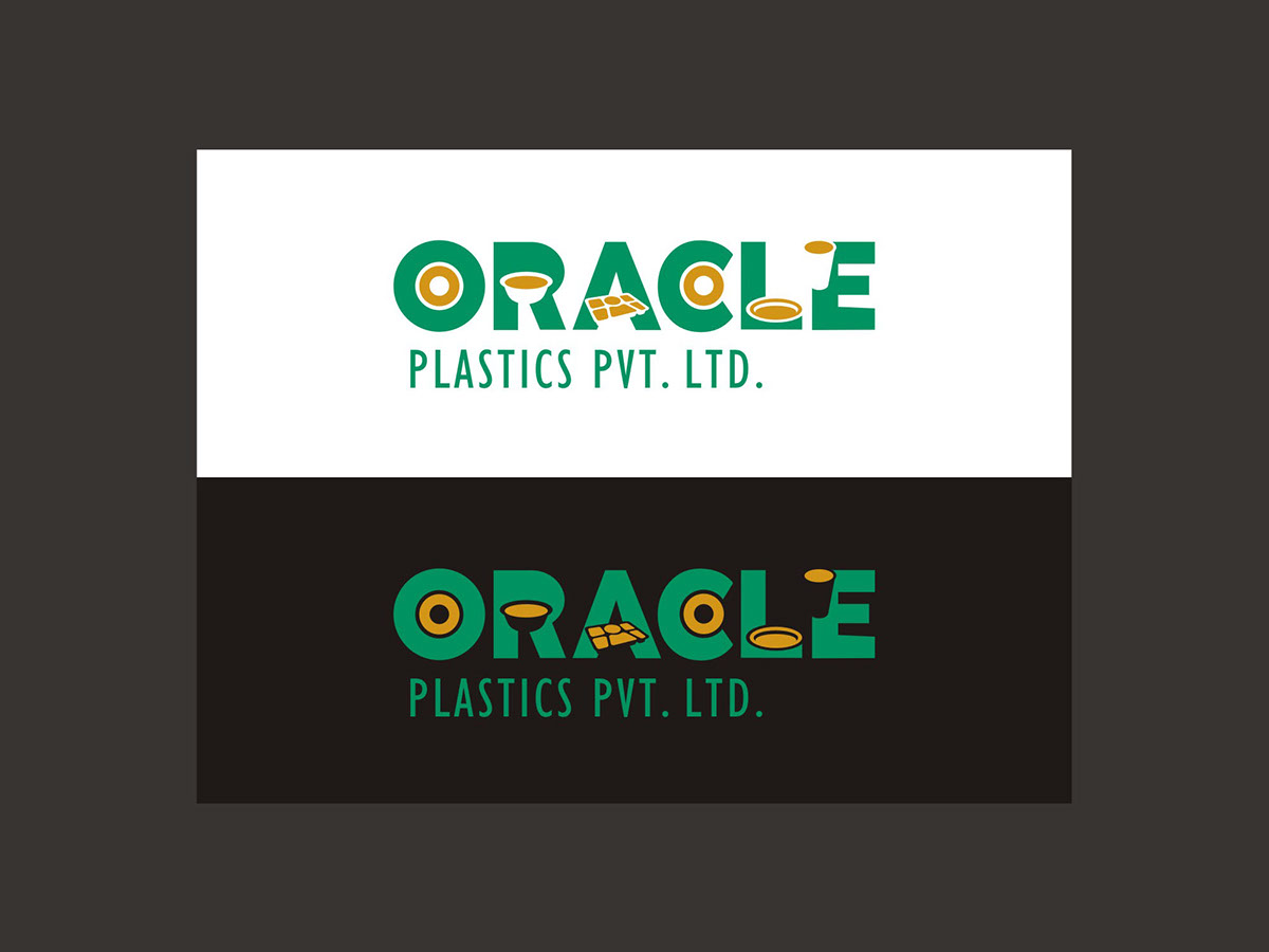
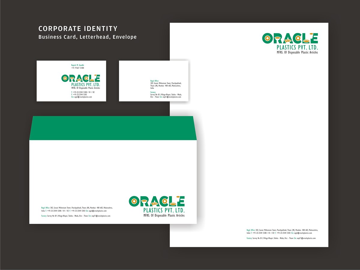
CLIENT: ORACLE PLASTICS
The Brief was to create an identity which is bold, contemporary, expressive and environmentally aware (since it is a manufacturing company of plastic related products).
The Solution: The identity was made with a contemporary look, smartly and stylishly incorporating the various products offered by the company. The use of a bold font ensures the name is visible despite use of various elements. The colour green reflects the Eco-friendly understanding of the company.
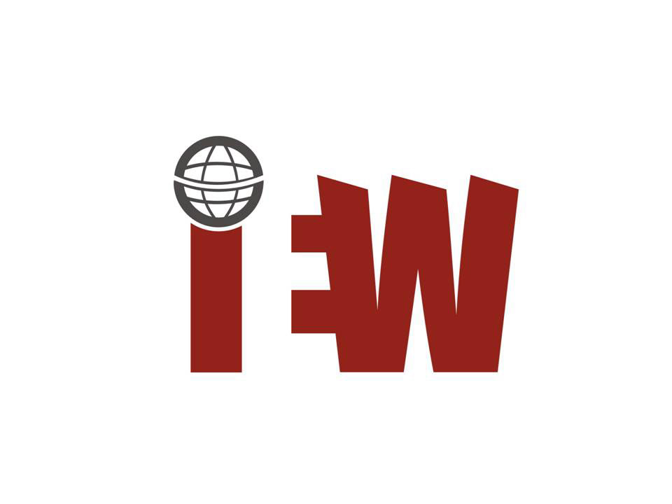
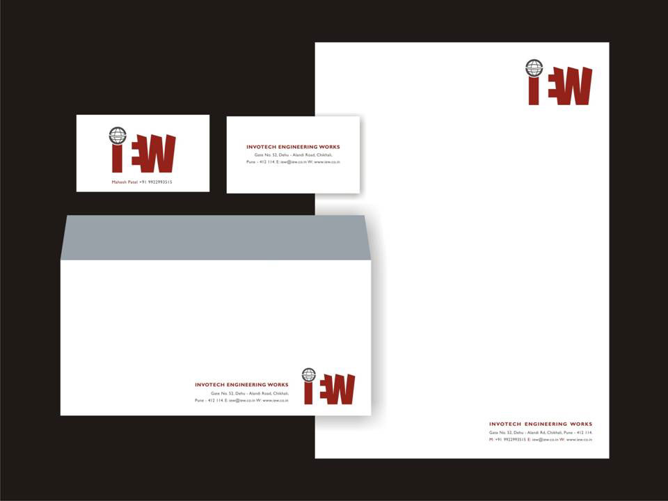
Client: INVOTECH ENGINEERING WORK
The Brief: Strength, vision, strong personality and business focused were some of the trigger points from the team.
The Solution: The outcome is a strong word mark with edges to depict the industry and the globe suggests global vision of the company. The letter 'E' in negative space fits perfectly between two alphabets which is a visual metaphor for engineering.
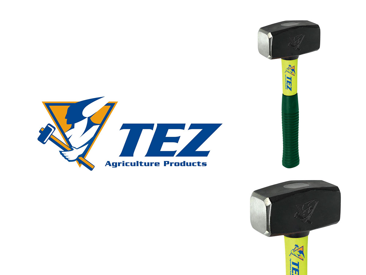
CLIENT: TEZ
The Brief: TEZ is a Agricultural equipments manufacturer company. The identity needed to be direct, sharp with some element which will help the brand connect to the consumer.
The Solution: An identity with a bold mark of a man with a hammer referring to the strength they offer and an edgy word-mark depicting to sharp agricultural instruments, appealing to the modern-day man.
Client: IDIZARC, Architect & Interior Designer
The Brief: Brand to convey the strength of the company, beginning with the logo identity.
The Solution: The icon, interestingly, forms the letter ‘I’ that looks like an edifice . The square shapes at the bottom refer to the company’s thoughtful approach towards every square inch it develops.


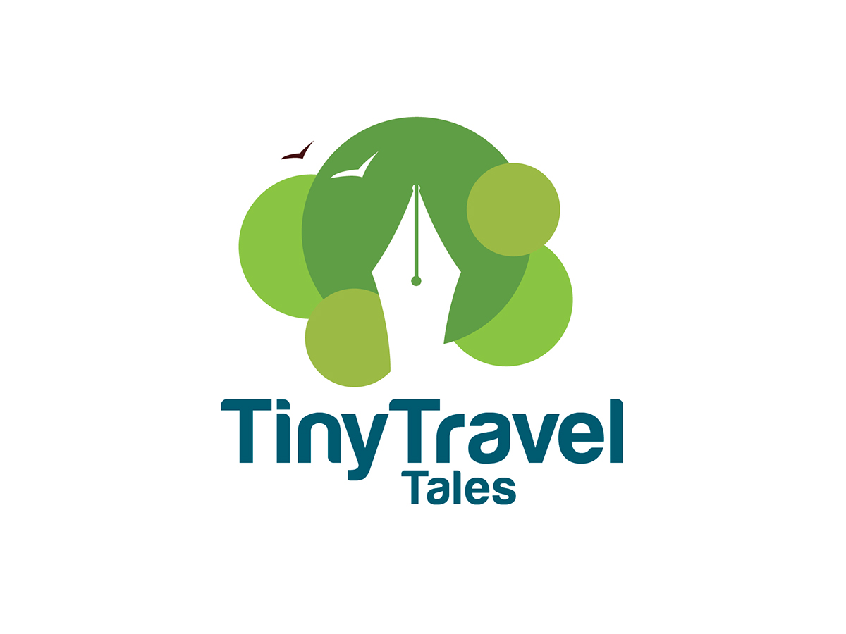
Client: TINY TRAVEL TALES
The Brief: To encourage travelers to write their travel stories.
The Solution: I brought forth the experience of traveling and creating a story of the memorable journey, depicted through the nib of a pen. Green refers to the natural trails where a wanderer would want to be and the flying birds refer to the freedom of movement.
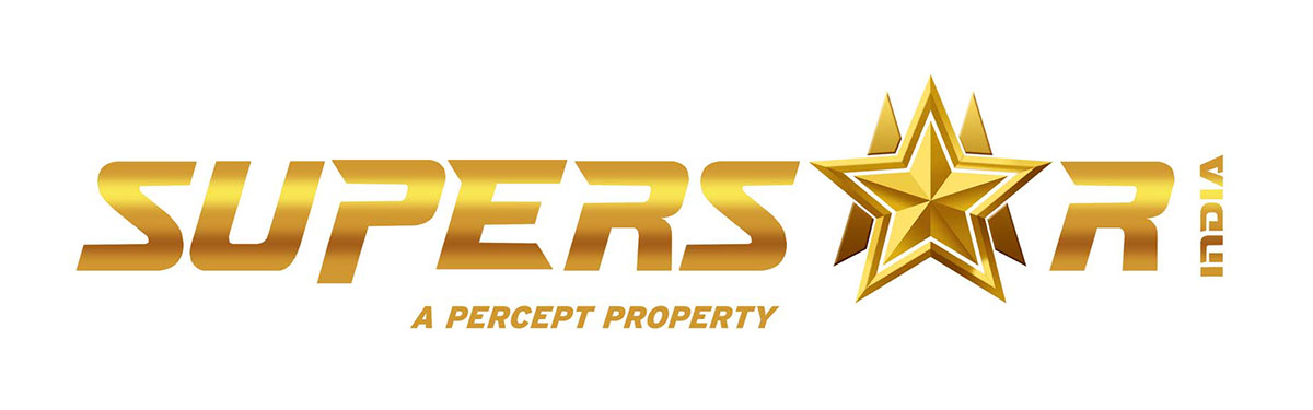
SUPERSTAR INDIA
The Brief: To recreate a property for pan-India talent company - Superstar India. The company functions on a global level to arrange for large-size events across the globe.
The Solution: I designed a logo to bring out the star in every participant. Of the several logos sent by leading designated persons, my option managed to enchant the client and break the ice.
FUTURESPEAK
A summit of the world's renowned doctors on new innovations in the field of medicine and healthcare.