


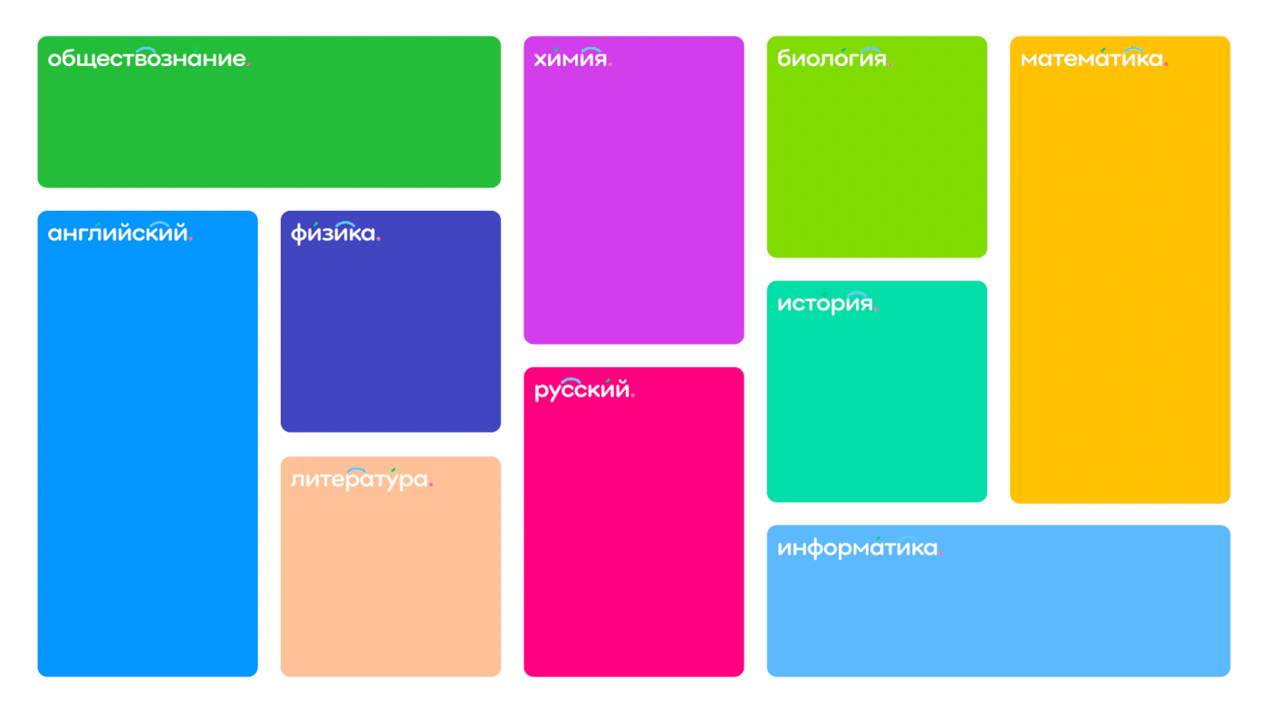
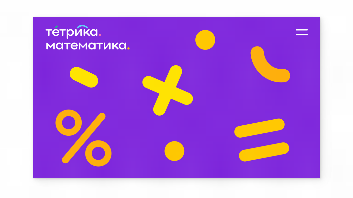
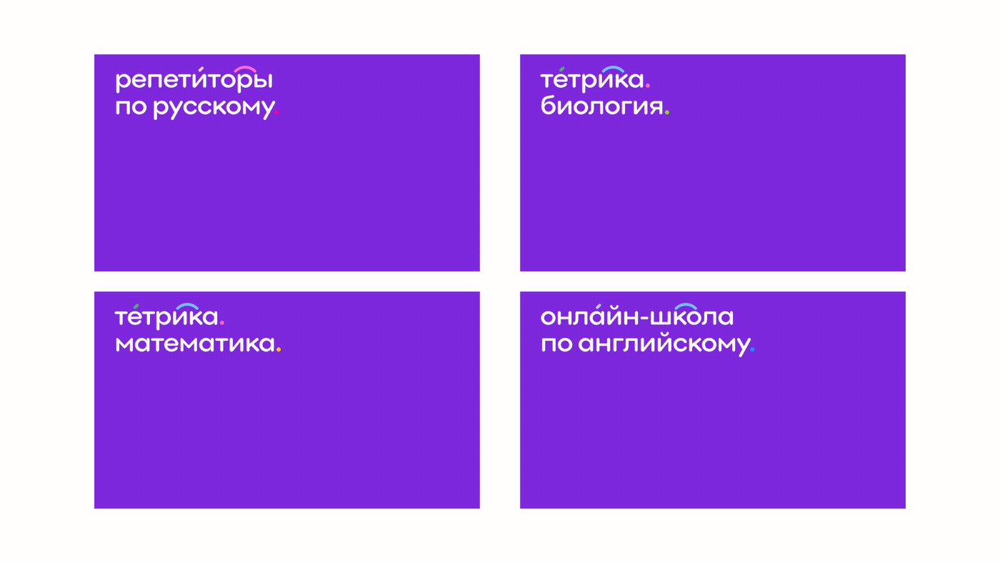
We updated the identity of the Tetrika online school. Now it stands out from the competitors because its new directions are combined with a general ecosystem, and its design is friendly for parents and children.
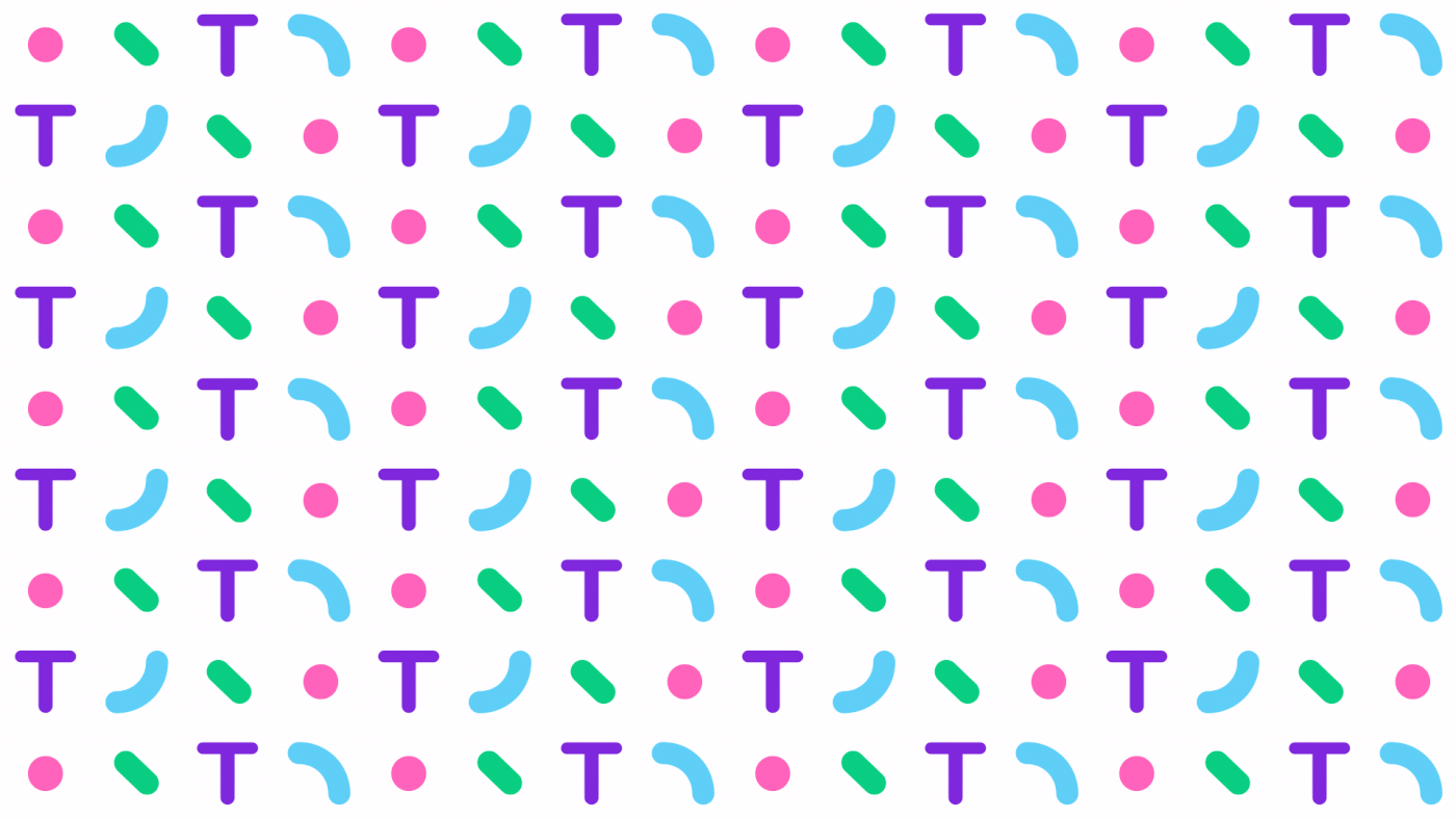
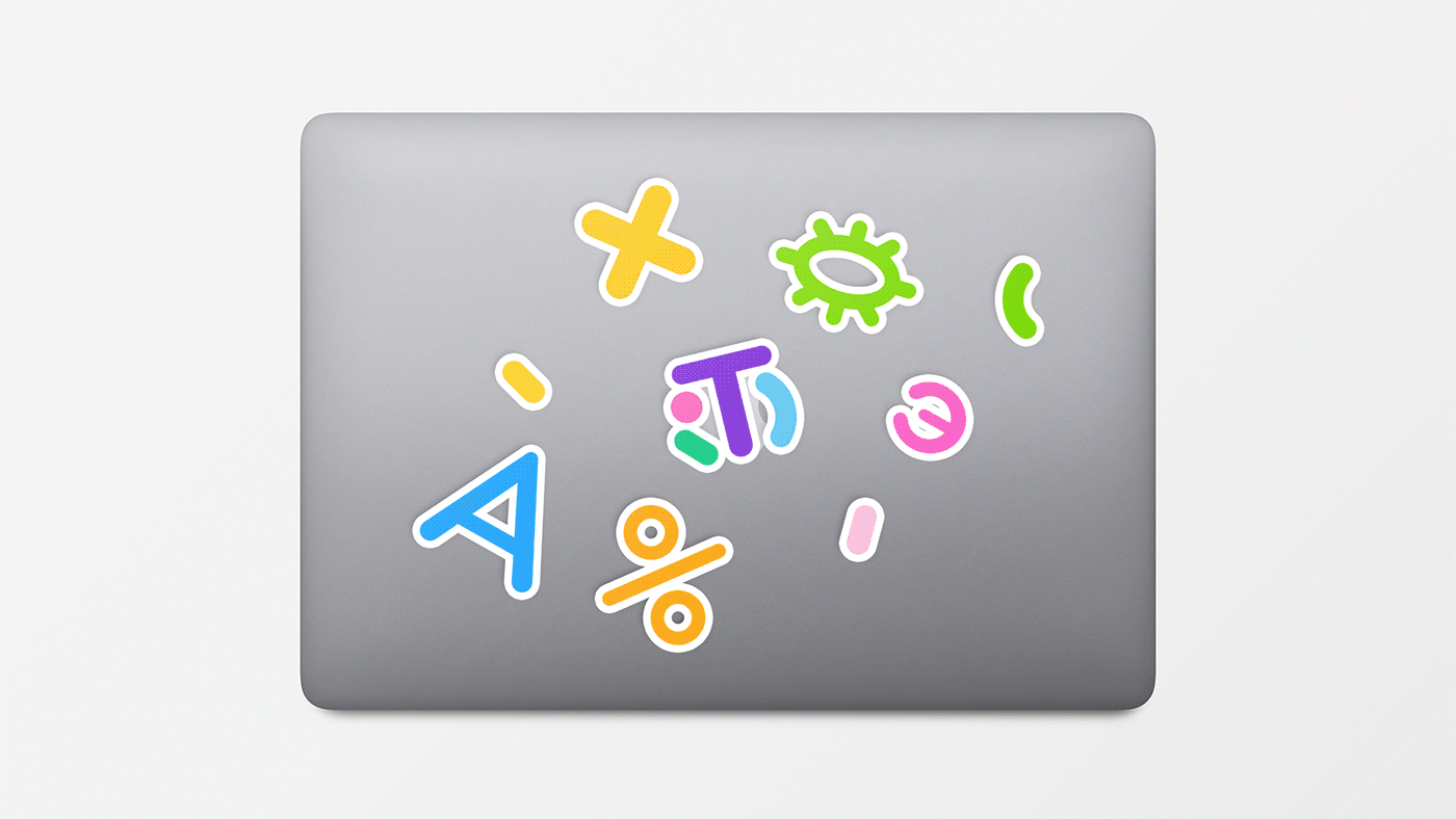
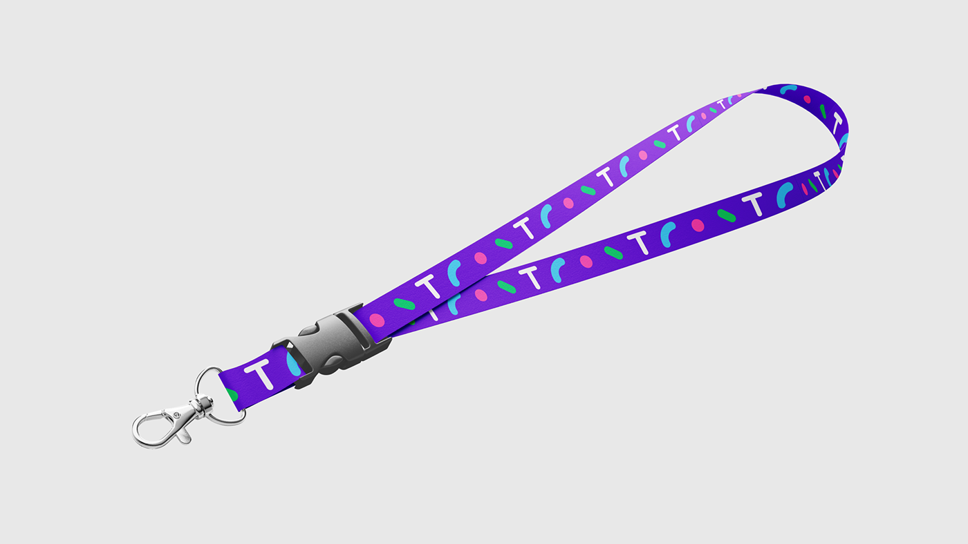
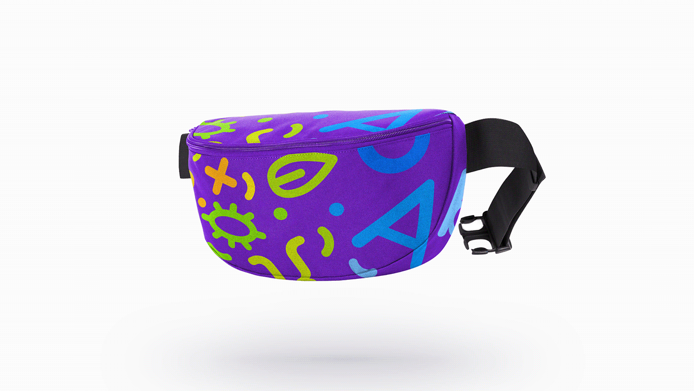
The main concept is based on rounded shapes and elements. A dot is a basic element that symbolizes the starting point in learning a new subject and the final goal of every child and their tutors.
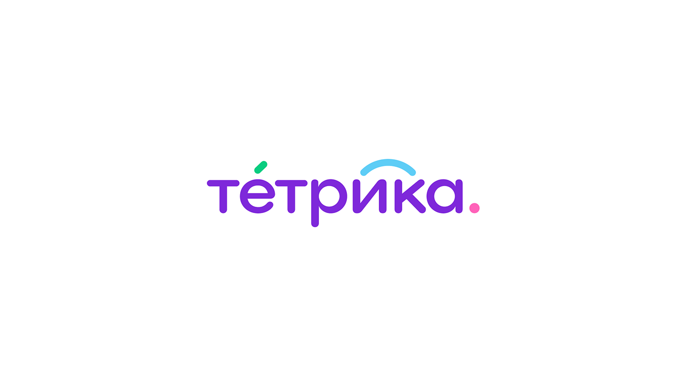
The online school logo can transform from a dot into a corporate icon (the letter T) and, finally, into the full name of the company. This technique shows that Tetrika can adapt to the needs of students.


SETTERS AGENCY:
Head of design department: Ksenia Zhavoronok
Art director: Dmitriy Litvinov
Motion design: Kirill Troshin
Design: Alla Pugacheva, Dasha Yakushina
Thanks for watching!


