


Enlarge | Typographical Poster
This project that began in early February was based around the idea of designing a typographical poster for the word “Enlarge”, by the way of a visual style that combines minimalism and simplicity together.
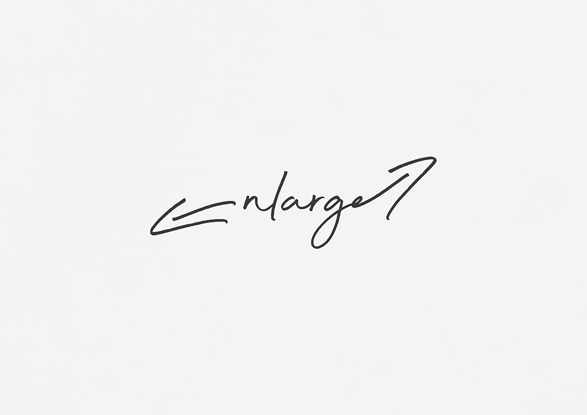
As you will see, the final outcome consists of the word being displayed a light script style-of-font, with the first “e” letter taking on the form of a downward-facing arrow, alongside the second “e” letter having an upward-facing arrow (being attached to the end), as this effectively recreates the traditional and commonly-seen enlarge symbol.
To push the overall depth of the design that little bit further, I decided to include a grain texture to help push away from a look that would appear too flat and too polished for my own personal liking.
So, be sure to tell me what you think in the comment section below!
This is a non-commercial project.
*Some imagery has been subject to alteration and editing*
Credits:
Fonts - Beyond Infinity
Imagery - Pixabay
Final Design
Follow Me:
Pinterest: http://www.pinterest.com/karlbembridge
Dribbble: http://dribbble.com/karlbembridge
Flickr: http://www.flickr.com/photos/kbembridge
Instagram: http://instagram.com/karlbembridge
Vimeo: http://vimeo.com/karlbembridge
Pinterest: http://www.pinterest.com/karlbembridge
Dribbble: http://dribbble.com/karlbembridge
Flickr: http://www.flickr.com/photos/kbembridge
Instagram: http://instagram.com/karlbembridge
Vimeo: http://vimeo.com/karlbembridge


