2020
Carmel Cannabis
Brand Identity, Tagline, Digital Design, Packaging Design
Carmel Cannabis
Brand Identity, Tagline, Digital Design, Packaging Design
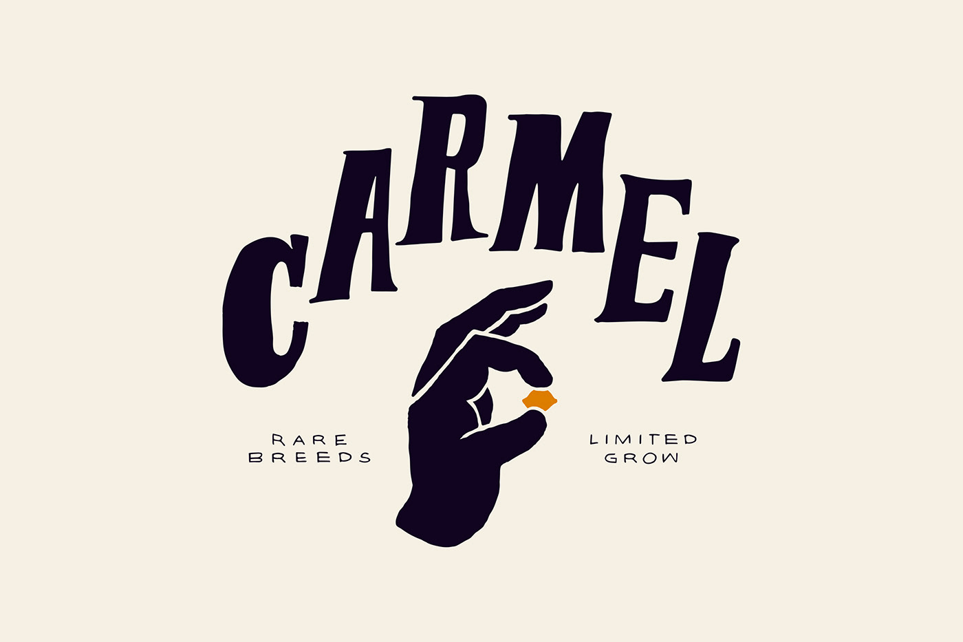
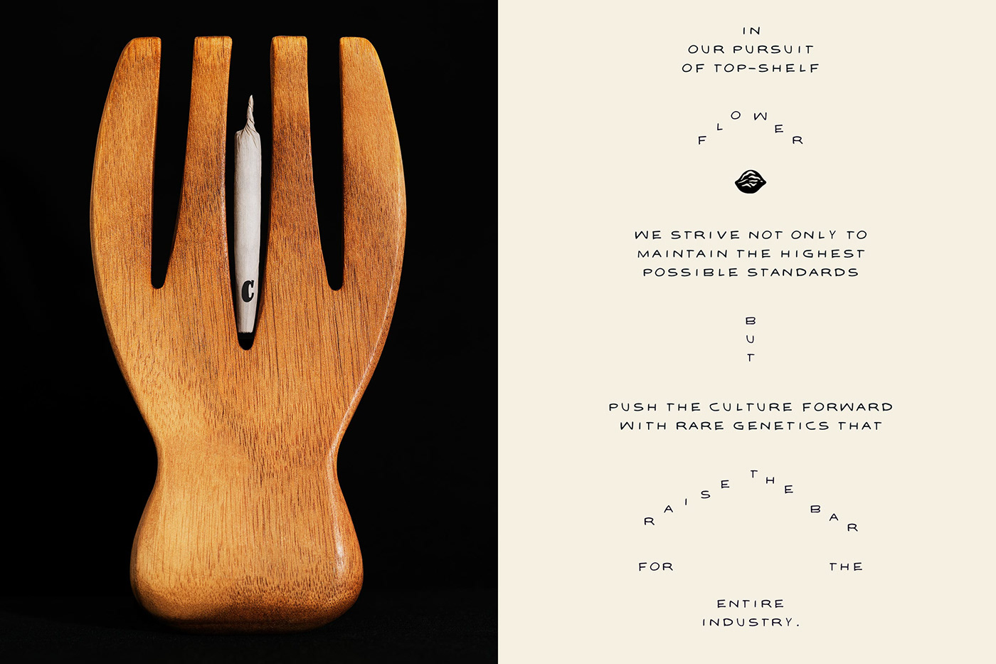
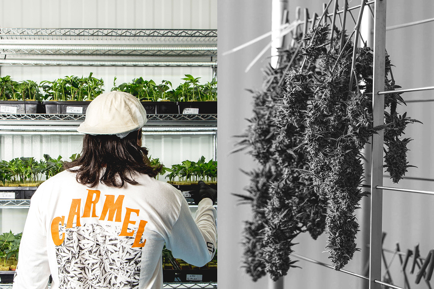
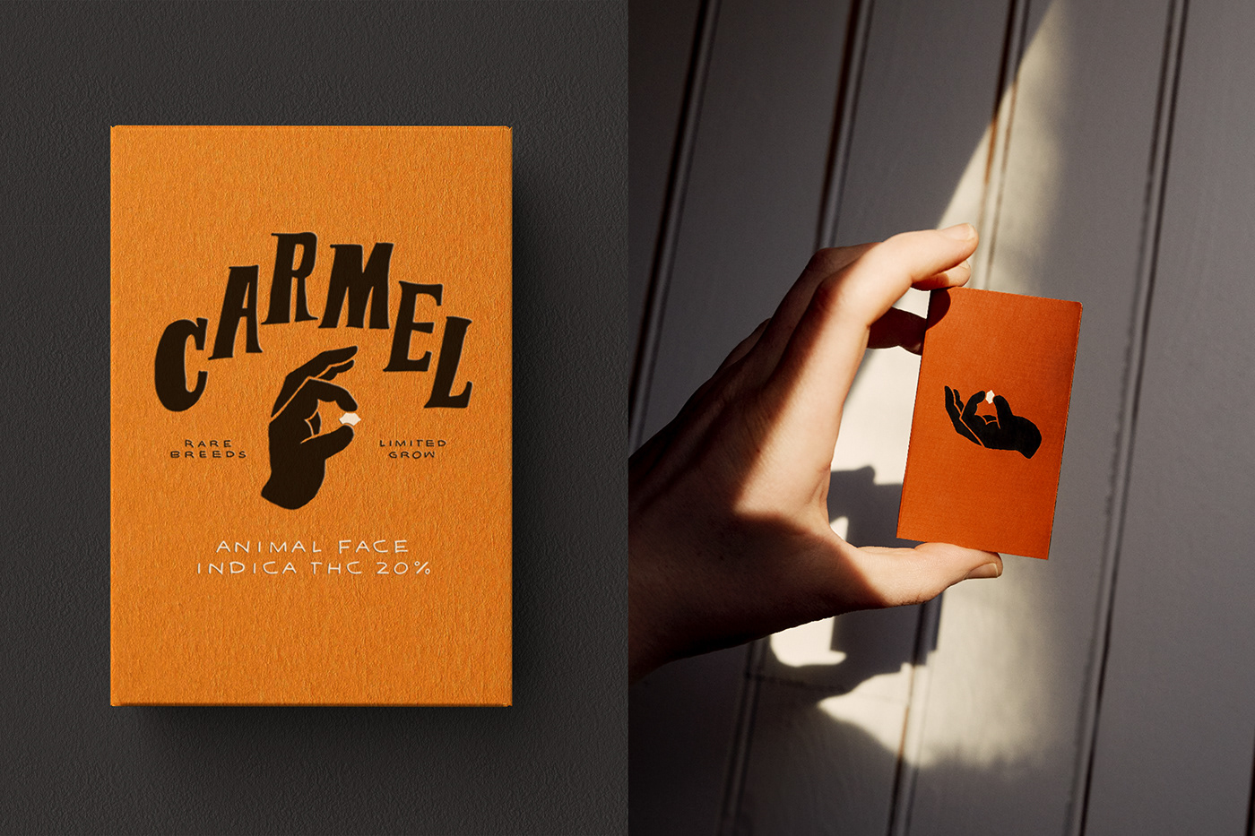
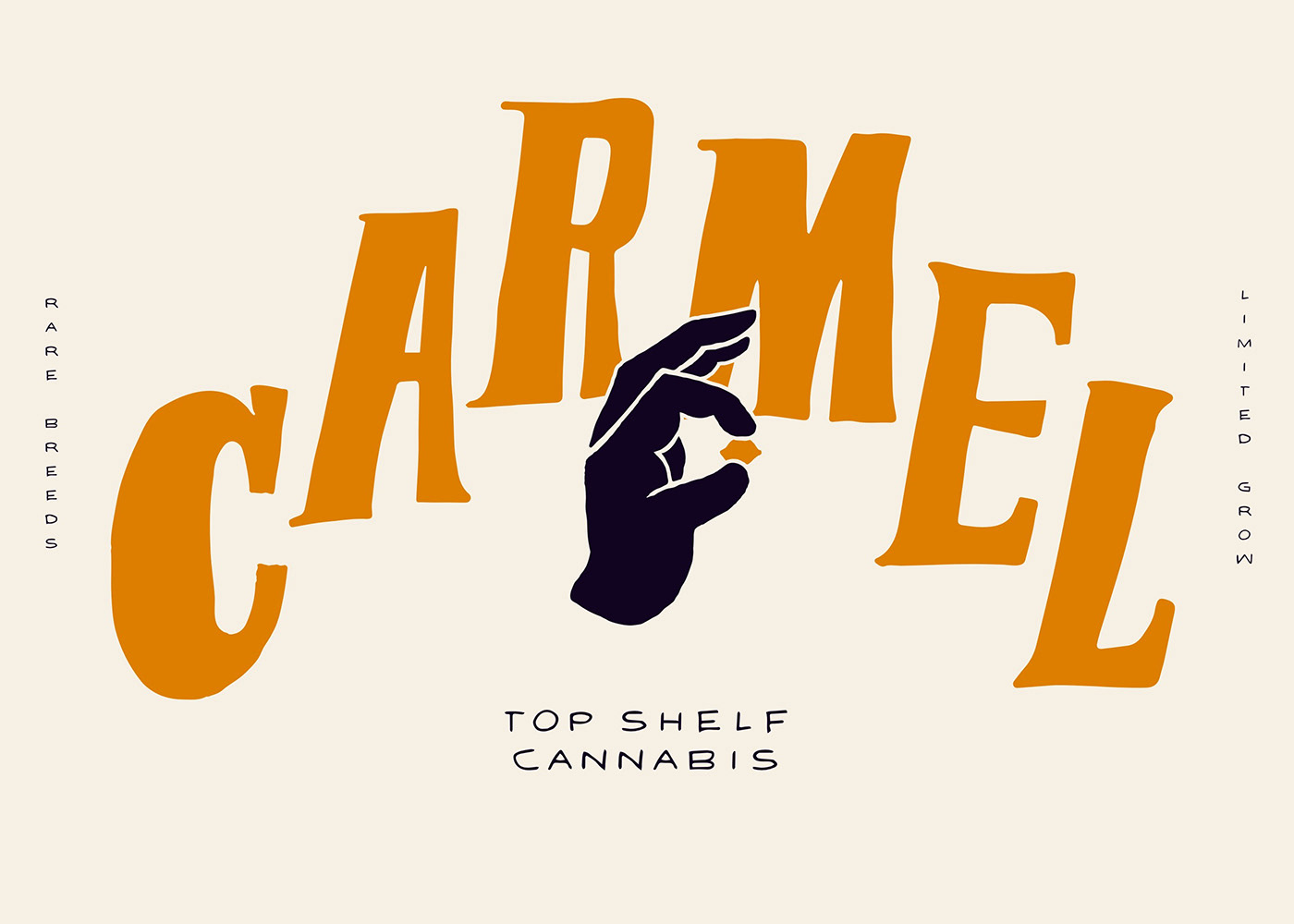
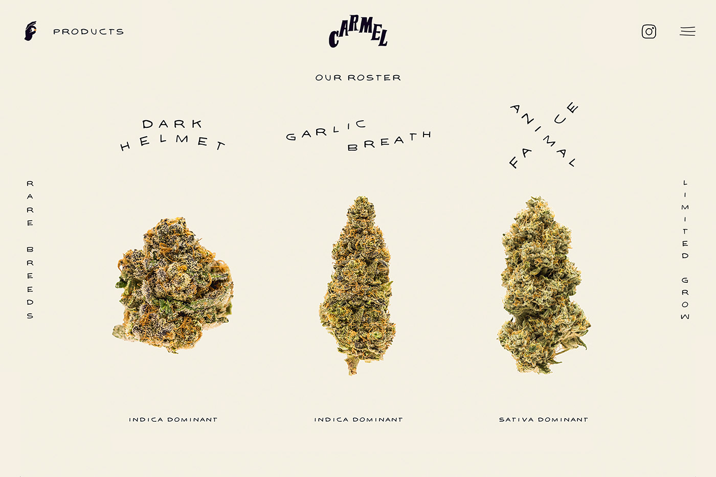
Carmel is an independent grower based in Toronto, breeding some of the most special seeds into small-batch flower with a no compromise vision: "Rare breeds, limited grow". They select seed, trim flower, hang dry, and tend everything by hand. Behind the scenes, Carmel is co-founded by the real deal from the off-market. No "corporate weed here.
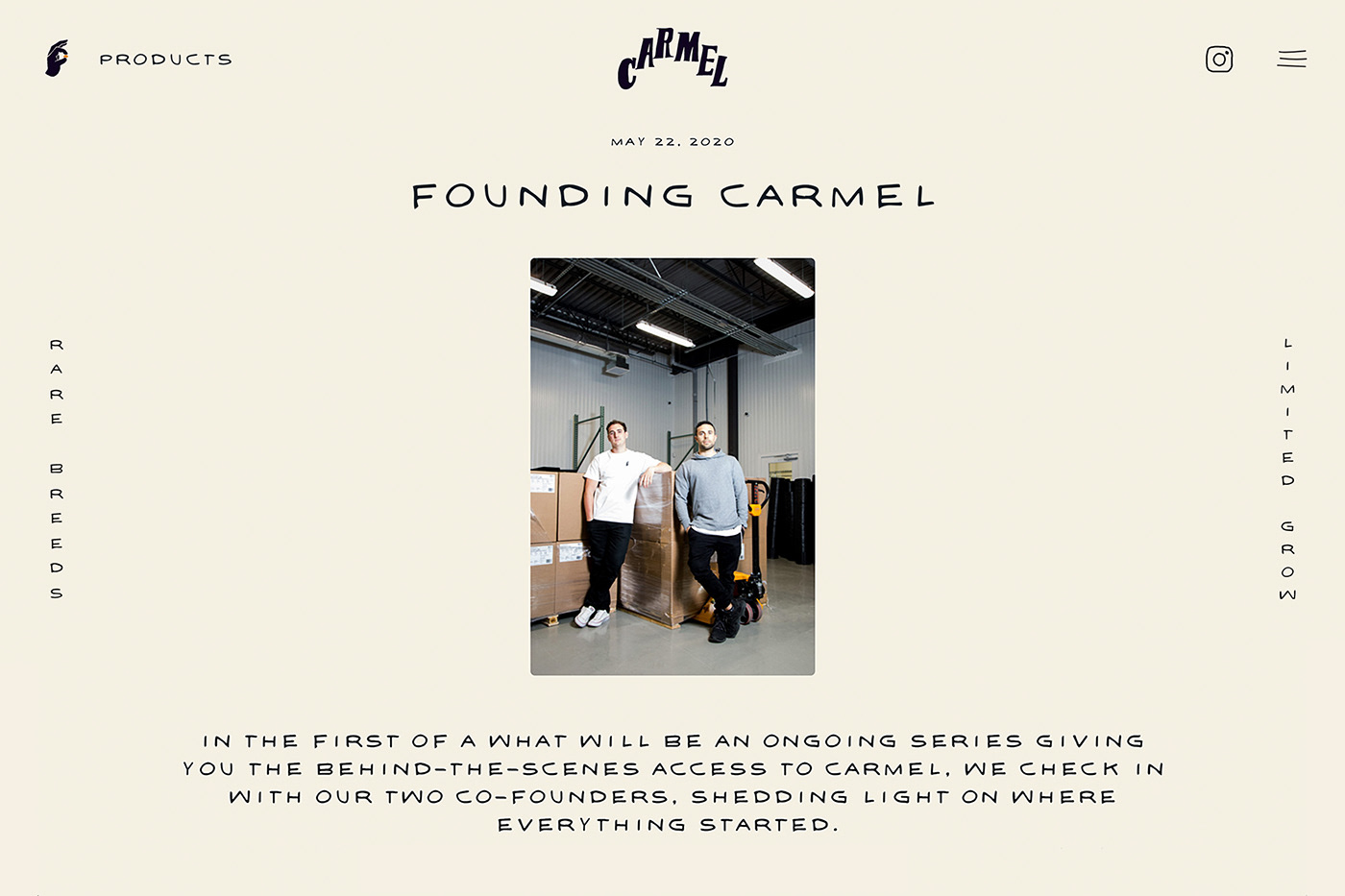
Our team had the unique challenge of building the brand for Carmel as a new company, while staying true to the roots of their grow team. While the brand was new, what Carmel stood for was deeply rooted to their legacy. Authenticity was key.
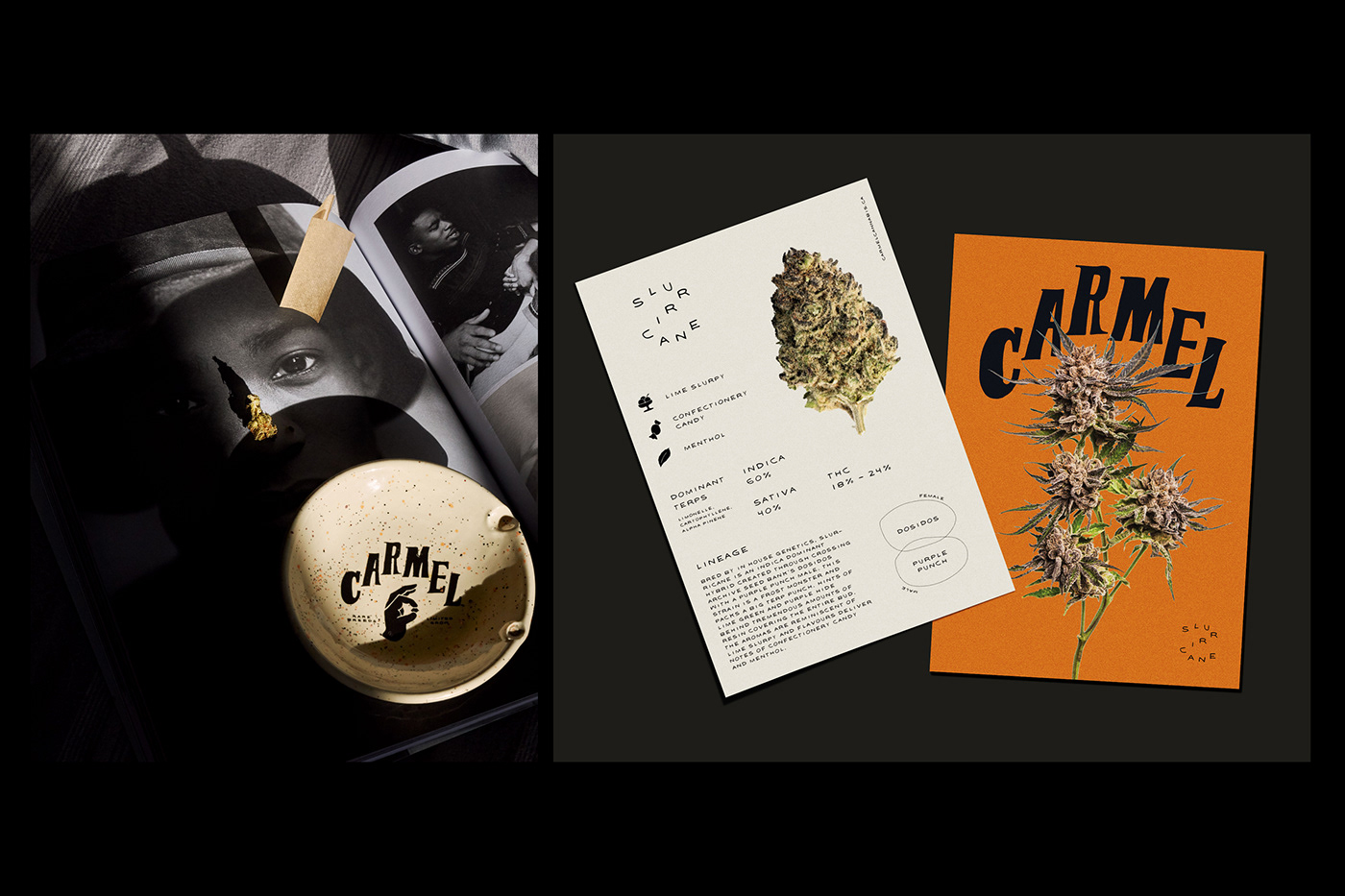
Typographic lockups act as unique symbols for each individual strain in the lineup. The commitment to one signature brand colour is obviously intentional, to reinforce the Carmel name and cement brand recognition over time. We’d know if Carmel was a true success by the feedback we’d receive from the legit community, the smokers who know the real deal and who’d become loyalists. The feedback from the community and budtenders has been phenomenal, creating a true desire and differentiation.
Read more about the work, on The Brand Identity.