

"Hi! Where do you want to go?" – Onboarding screen.
Design your trip | UX/UI
Two-week sprint for a mobile commuting app.
PRODUCT
SL-Reseplanerare
CLIENT
AB Storstockholms Lokaltrafik
BACKGROUND
I was part of a team of UX-designers working in a two-week sprint investigating commuters need for information about delays when planning trips with public transport in Stockholm, Sweden.

User tests were performed on commuters.
USER TESTS
We benchmarked the existing app with other products and tested a redesigned prototype showing a map with GPS positioning and visible alternative routes. The people we talked to didn’t want the map to show at launch. However, they were interested in getting alternative routes.
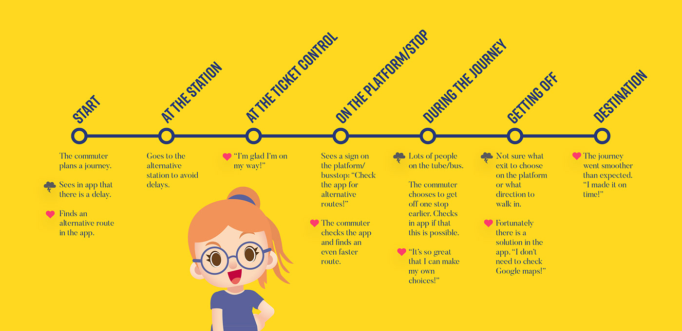
Customer journey with pain points.
PROCESS
We collected data through user research, online polls and interviews — a total of 150 participants. We wanted to know what information they need when planning a trip.
SOME OF THE RESULTS
75% wanted to know how long a delay would last.
0% wanted to know the reason behind the delay.
85% used a travel app frequently.
72% wanted to get push notifications about a started journey.
0% wanted to know the reason behind the delay.
85% used a travel app frequently.
72% wanted to get push notifications about a started journey.
FURTHER TESTING
We tested the option to choose means of transportation. People liked that you could choose walking or bike. We also made the delay information more visible with an animated character — this vas also appreciated. Lastly we placed the map and the Start Your Journey button deeper in the flow.

Animated character pops up when there is a delay in traffic.

Start Your Journey button and map is placed deeper in the flow.

Wireframe with user flow. Use of animated character signaling a delay.
SOLUTION
The presented solution is based on user tests and interviews. Our hypothesis is that we need to show alternative routes and how long delays will last more clearly in the app. This will result in more active and decision-making commuters. Today many of them choose to wait. This results in inactivity, unnecessary stress and complaints to customer service.
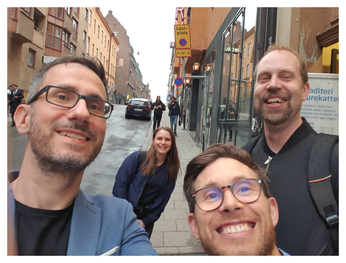
Our UX-team for this sprint was made of four happy students from Bergs School of Communication. From left to right: Dennis Wojda, Nina Svärd, David Falk, Niklas Hallgren.
Thank you for watching!