
[EN]
Created to awaken the feeling of dissatisfaction and anxiety, FLYWOODS aims to offer clothes and accessories for those looking to venture out with style, comfort and, above all, have more freedom.
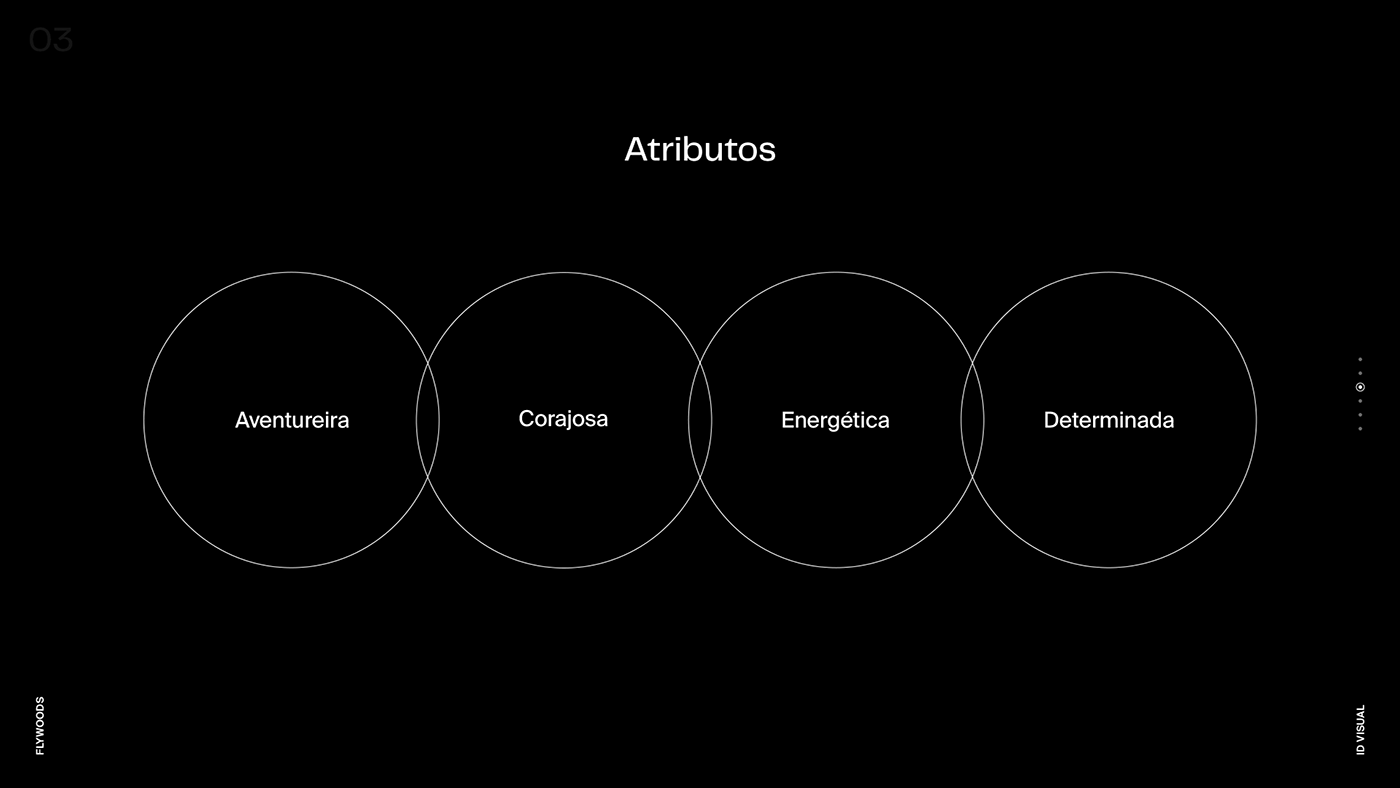
The challenge for the visual direction of the brand was to create an identity that clearly conveyed the personality of the brand, inspiring values such as: adventure, energy, courage and determination.


[EN]
The symbol is a monogram with three references: the letter F, which represents the initial of the brand; The circle, which represents the sun; And the mountain.
As part of the concept, the symbol carries a little bit of history with alchemy, which sought a greater purpose and the elixir of life, a "medicine" that would free people from all the evils of life, including death. And as a “medicine” the brand inspires and encourages sport and adventure for its consumers.
The circle represents the sun, found at each end of the journey along with freedom.
And the mountain represents resilience, evolution and resembles the adventurer's archetype. And it also intends to represent mountains with forests that refer to the word “WOODS” present in the brand.


