
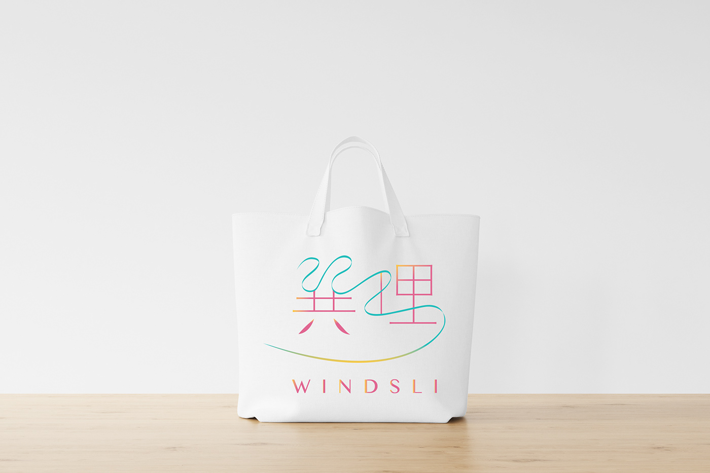
Logo Design for an Online Chinese Geomancy Company
The client wanted
1. To appeal to both Chinese & non-Chinese clientele, while retaining the traditional Chinese characters of the company name
2. To incorporate all 3 of their corporate colours
3. A clean and minimalist vibe
4. To incorporate the wind, earth and fire elements of Chinese geomancy
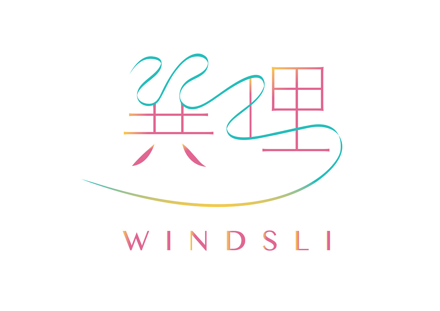
The wind element is represented by the flowing ribbon unifying both Chinese characters.
The fire element is represented by the flames.
This logo incorporates both modernity and tradition, perfect for a company bringing an ancient art form into today's digital world.
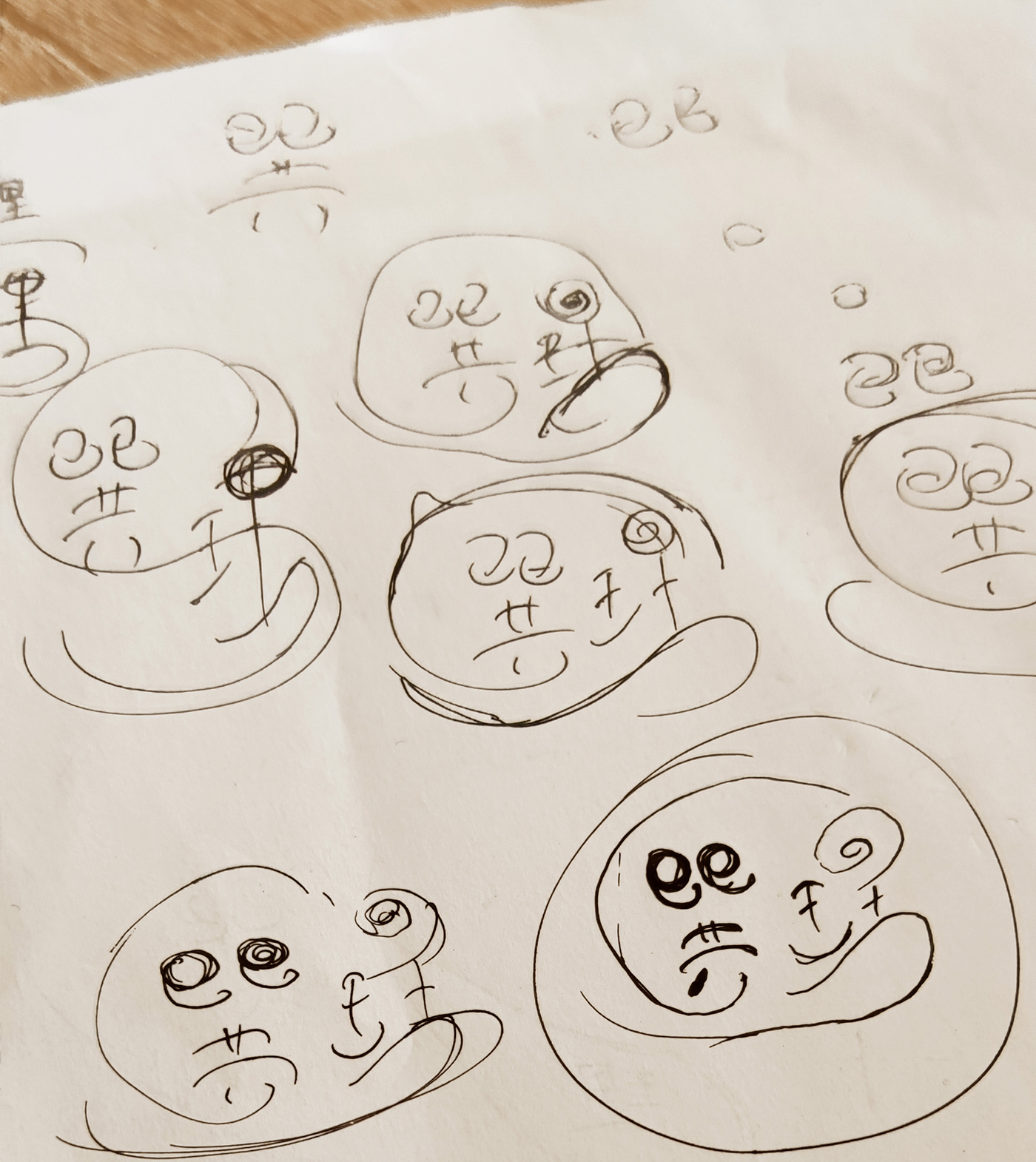
Behind the scenes: the sketching & brainstorming process
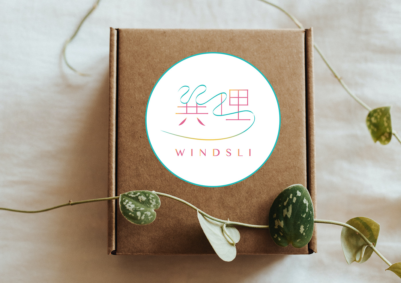
A circular form of the logo as a sticker on packaging


