

"Blood and Truth" video game UI/UX/design development. Spov. (2018)

above artwork by David Penn for Spov
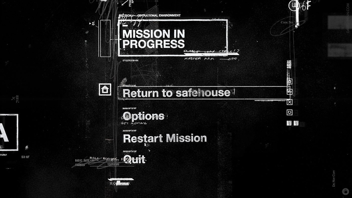
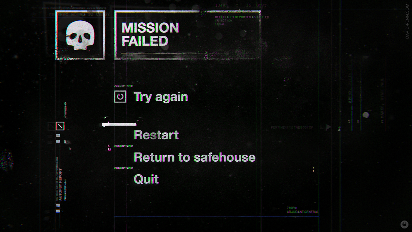
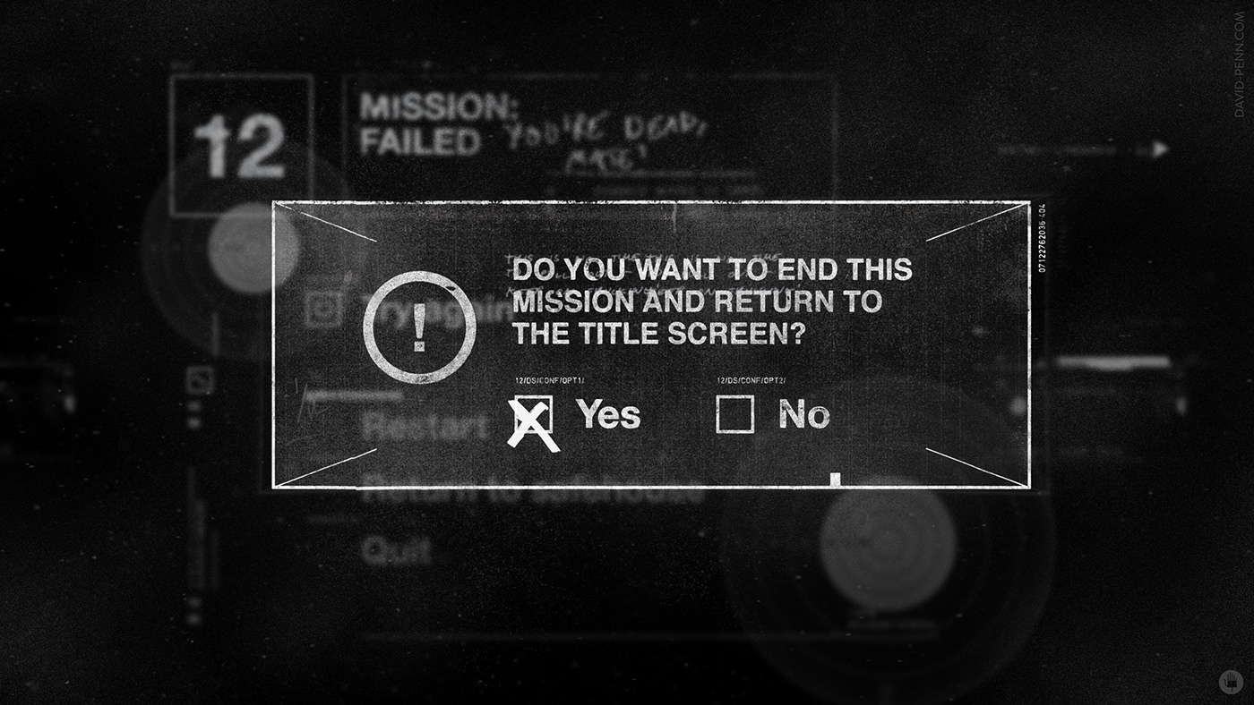
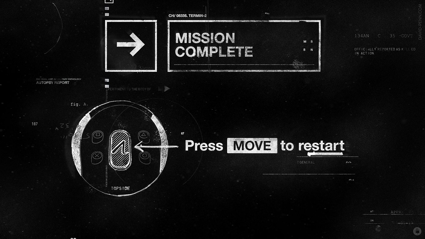
I was invited by Spov to offer my take on virtual reality user interface design for the much anticipated Sony VR video game "Blood and Truth". I began by trying to distill the game's personality; I favoured a chaotic, brutalised, scatter-gun approach to the front end/menu system that could filter through the rest of the game's UI.
Taking into account player head-turns and repositioning, we embraced the opportunity for using a parallaxed stacking of elements and refocusing so that UI elements would brazenly pile up in an orchestrated disorder.

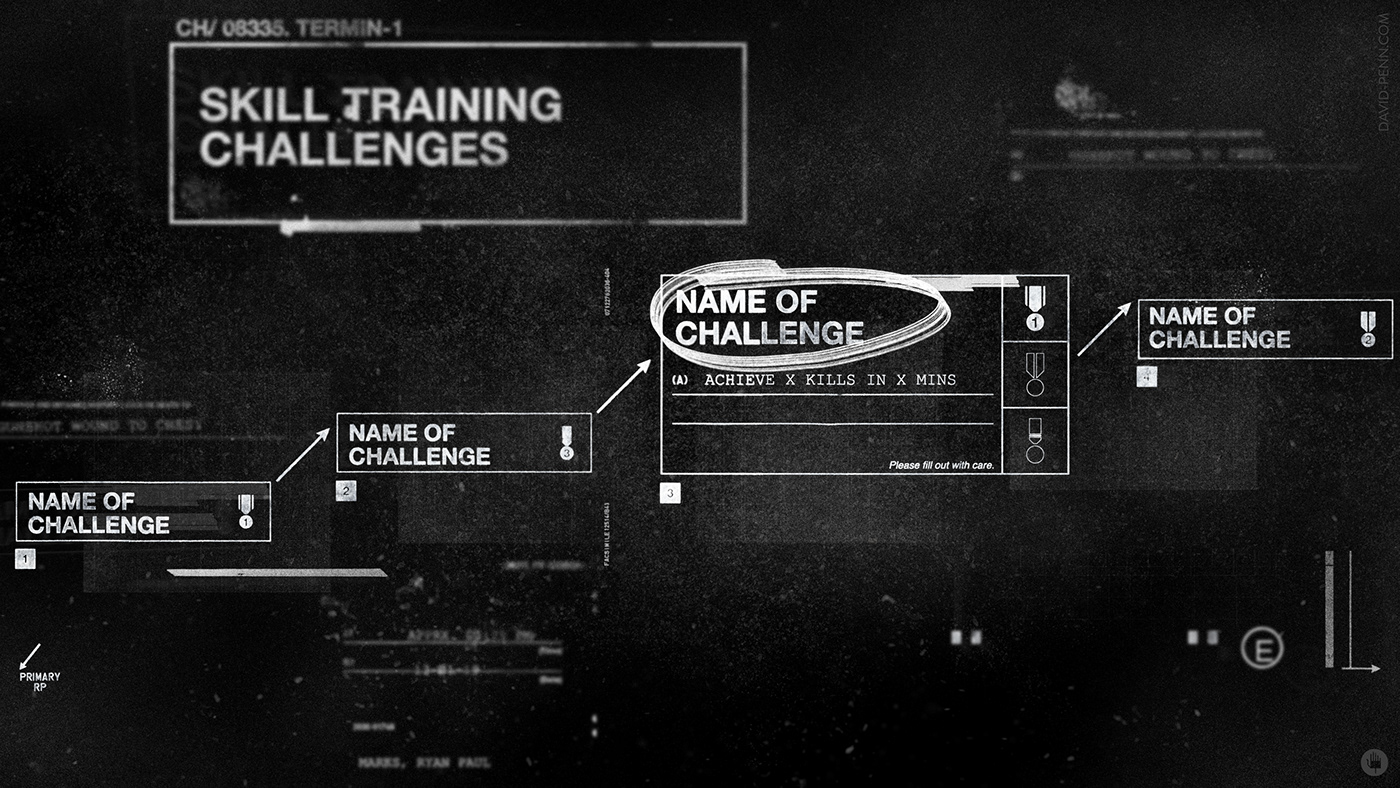
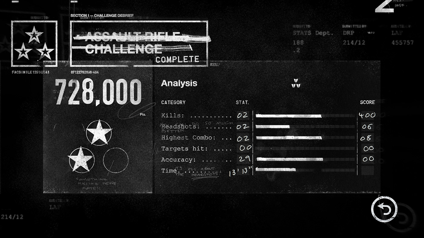

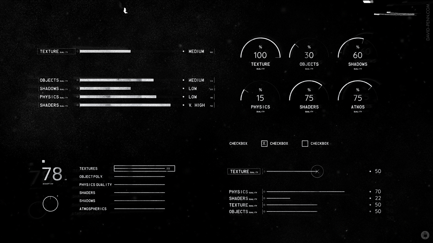
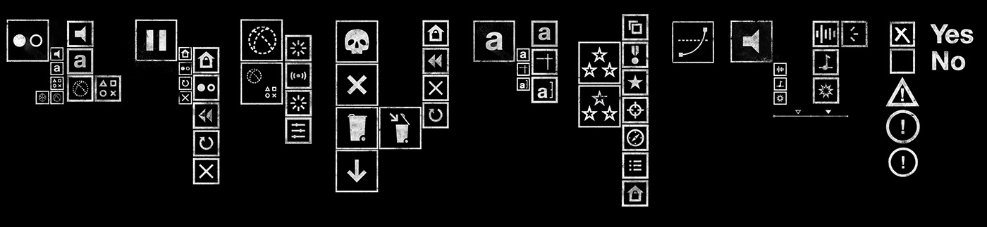
Some of my icon/widget development for UI and menu system:
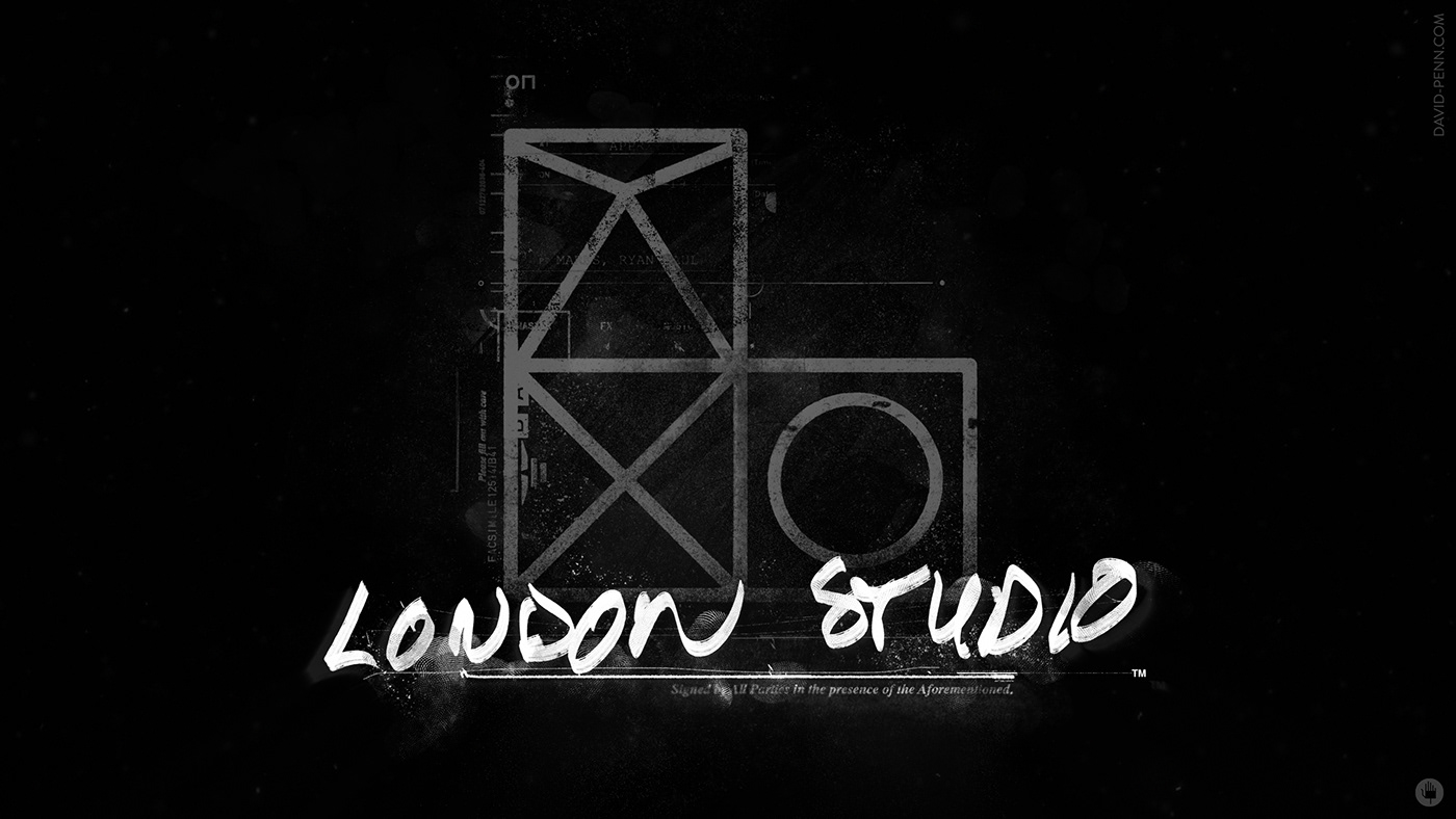
Below are selected examples of my experimentation in carrying across the feel and character of the UI to existing studio and game logos.
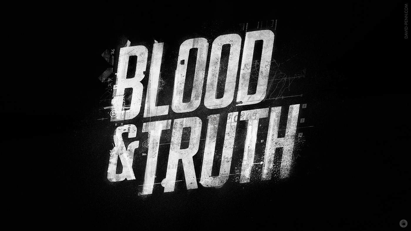
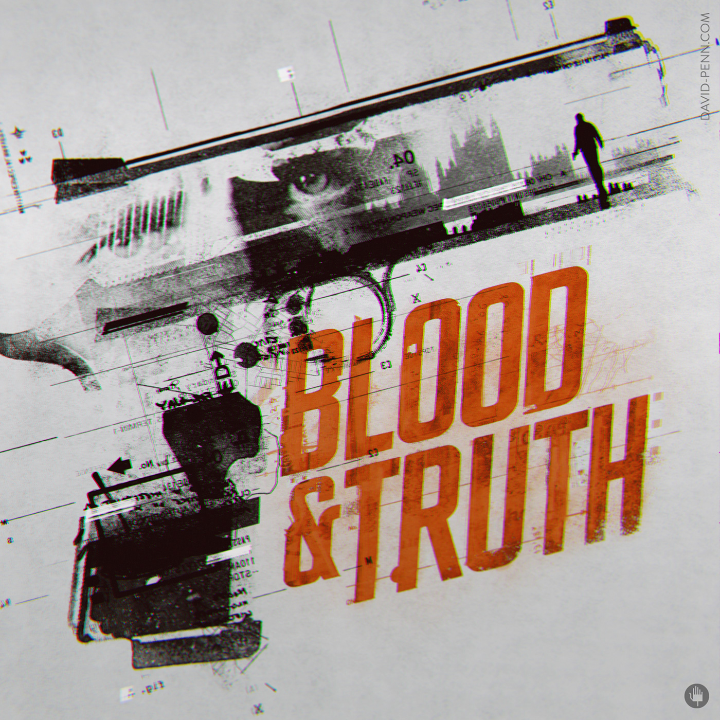
As a part of the style exploration, I mocked up some poster artwork to help distil the myriad facets that comprise the game world. Many of these elements then filtered through into the UI.
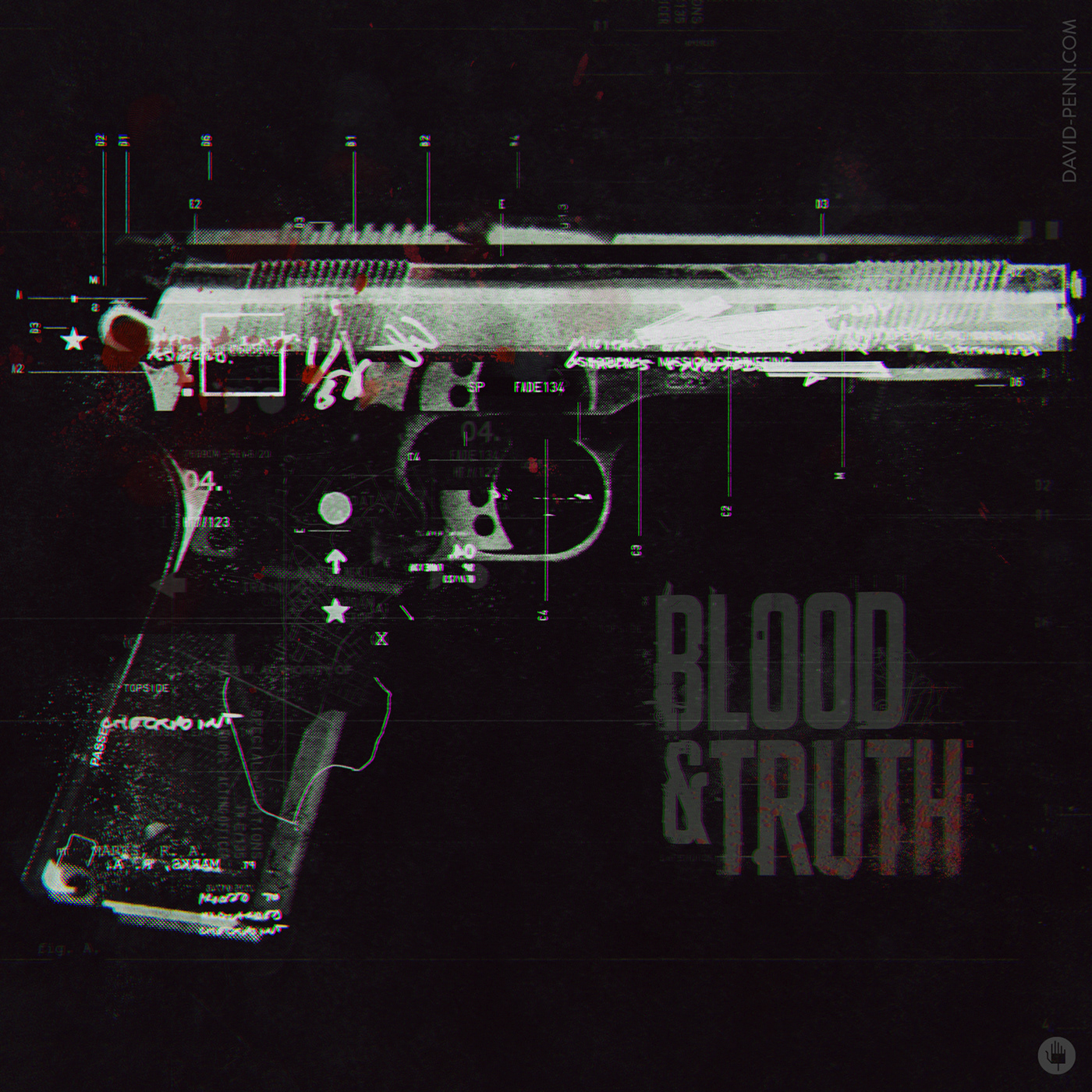
The above represents a palette I favoured to adopt across UI.


Concepts and design: David Penn
Studio: Spov
Client: Sony
Client: Sony


