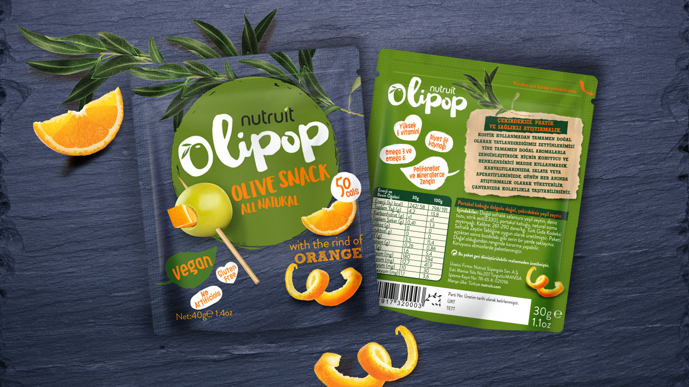
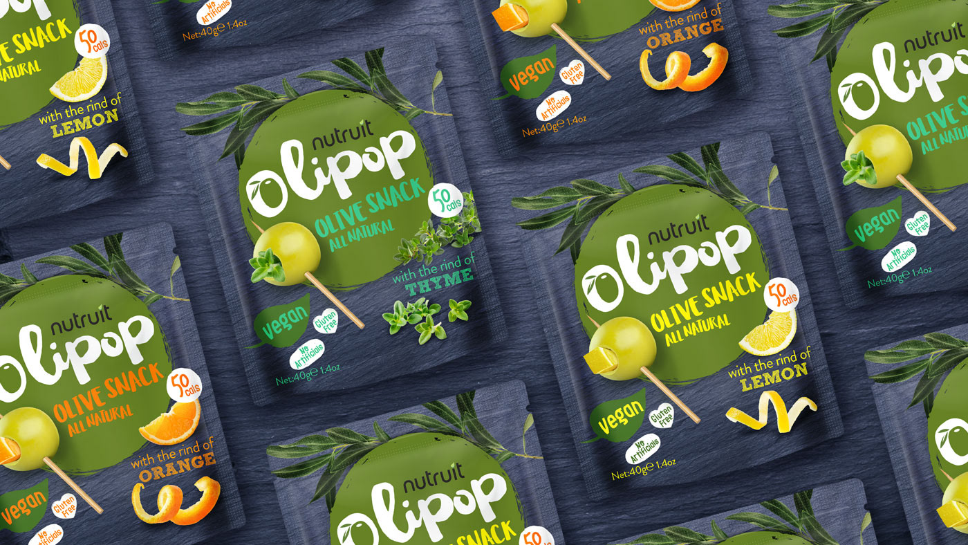
O L I P O P O L I V E S N A C K S
Packaging Designs
_______
The Olipop brand is created from the words “olive” and “lollipop” and was inspired by the image of a single olive on a toothpick that looks like a lollipop. We also visualized an olive on a toothpick to underline the meaning of the brand. We used vibrant colors that contrast the navy blue and olive-green tones on a natural stone background but also reflect the snacking vibe.