
Redesign of user login flow for existing education mobile app

Introduction
Sometimes its not always easy to identify the best path to success. when all eyes are focused on the end goal of the overall vision, the small details that make the experience better can be overlooked, missed or ignored.
Everything starts with the first step, and as we have all been told throughout our lives, we should always put our best foot forward.
The login page is the first step, so the first step should set the pace for the rest of the journey.
Objective
To create a new User Login for a mobile app and a new User login flow.
Role
UX Designer
UI Designer
QA

Process & Approach

Using the existing design that has been released, I will be updating the UI and flow based off what I can see happening within the app and developed code, and based off of Hick's Law to simplify the process.

Heuristic Evaluation


Customer Journey Map


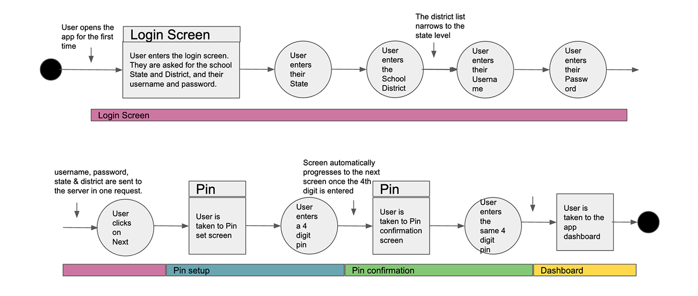
New Login Flow

Prototype


Wire-frame


Summary
While the original login flow did not hinder or prevent the user from logging in, It was an area of the application that had very little thought or design go into it in comparison to the rest of the application. This meant that this could be a prime are for a redesign since it was
1. Not really touched on
2. Had elements that could be vastly improved
3. Had functionality that was not being utilized
Taking the approach of ‘less is more’ and simplification while trying to build on the underlying functionality and keep existing functionality, there was clear scope within this small feature to change how it looked and felt and how the user interacted with it while taking advantage of the functionality that was built under the hood when talking to the backend.
We were also able to reduce the amount of time the user takes to login and set up their pin, while taking advantage of the existing function of the login authentication handshake to help make these changes. We also looked at what space was being used and what space might be available which allowed us to increase the branding of the application and the company and combine elements from two pages onto one which brought context to the login form.
Once the user is logged in we were then able to allow them to skip a step which they might not want to do in setting up a pin number or have more fluid control over it with allowing them start the process again, resetting what they have just typed in case it was wrong, or just removing the last entered digit with a back function. We also allow for the built in function of feedback with a visual bounce and an error message to inform the user if they enter in the wrong number.


