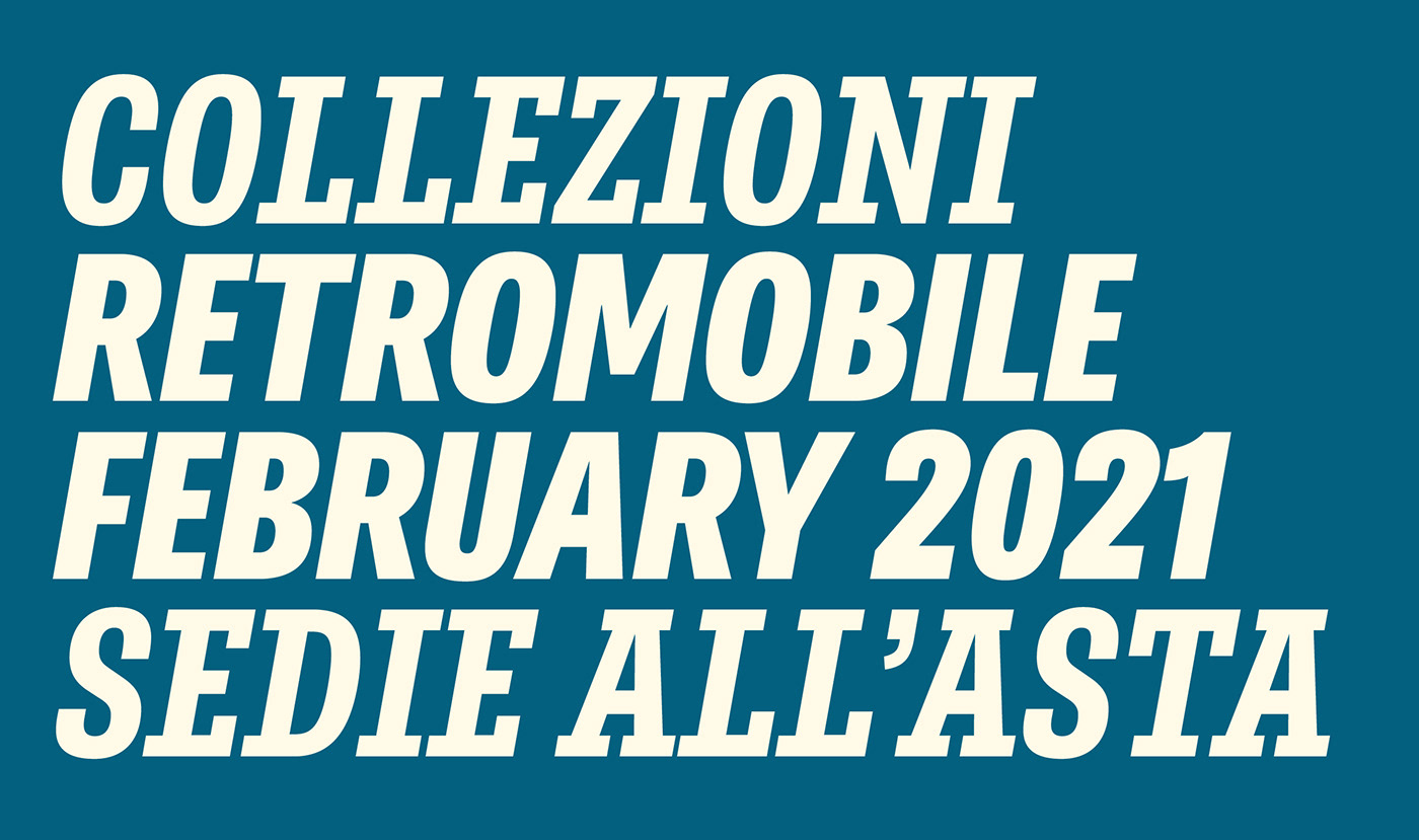
We are happy to announce the release of the suave editorial typeface, Belarius! Part of a trifecta, this is the font family focused on packaging, headlines, posters, subheads & ads.
A few years ago José Scaglione and Veronika Burian decided to build a three-family story arc that would encompass the demands of skilled text designers. Belarius is the sans and slab serif middle release of that planned triptych, able to claim its own bright spot on the release charts and also be appreciated as part of the trilogy, the other being Catalpa and Aneto (still in progress). Belarius is by nature restrained to fulfill its midrange purpose: packaging, headlines and subheads, advertising, decks, and pull-quotes. And its variable font technology means you are able to fine-tune adjustments for perfect copy, every time.
View and test Belarius here: www.type-together.com/belarius-font


