


It's More Than Sunflower Seed Oil, It's FLWRPWR
by Alianne Valladares-Prieto on 02/17/2021 | 2 Minute Read
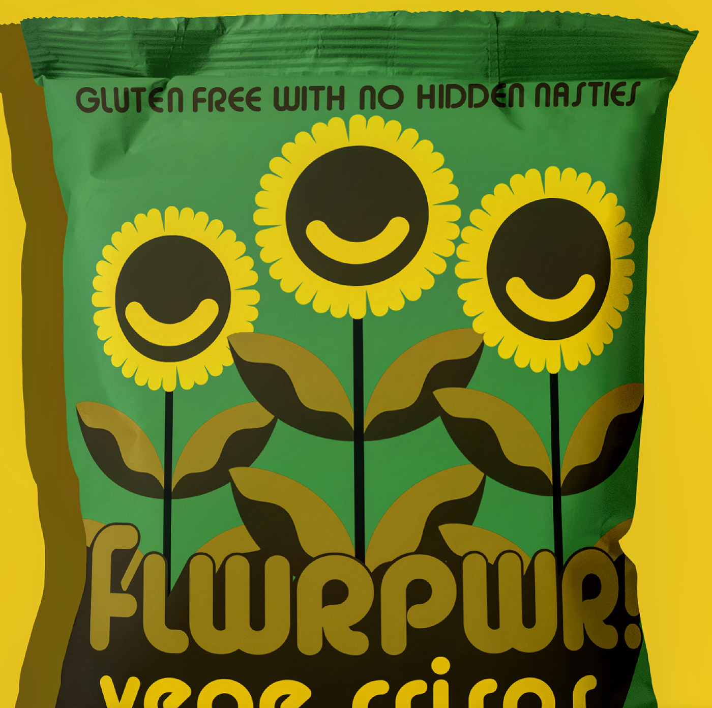
FLWRPWR reached out to Candy Brophy Creative in order to give their brand packaging a crispyedge over their competition. What was once regarded as an anti-war slogan in the late 60s and early 70s, is now going to be known for providing smiles and satisfaction from the grocery store shelf to the moment you realize you already had the last chip.
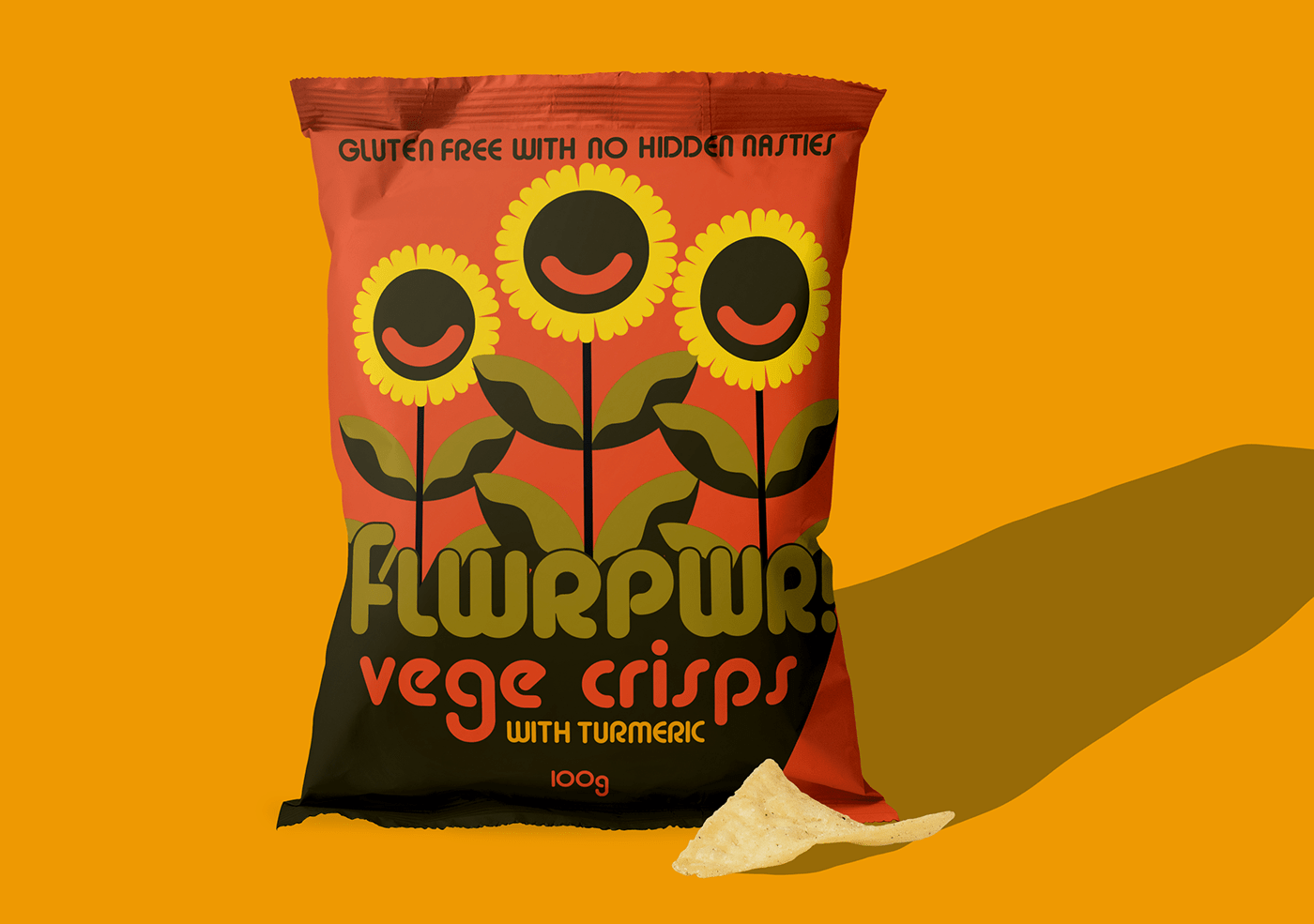
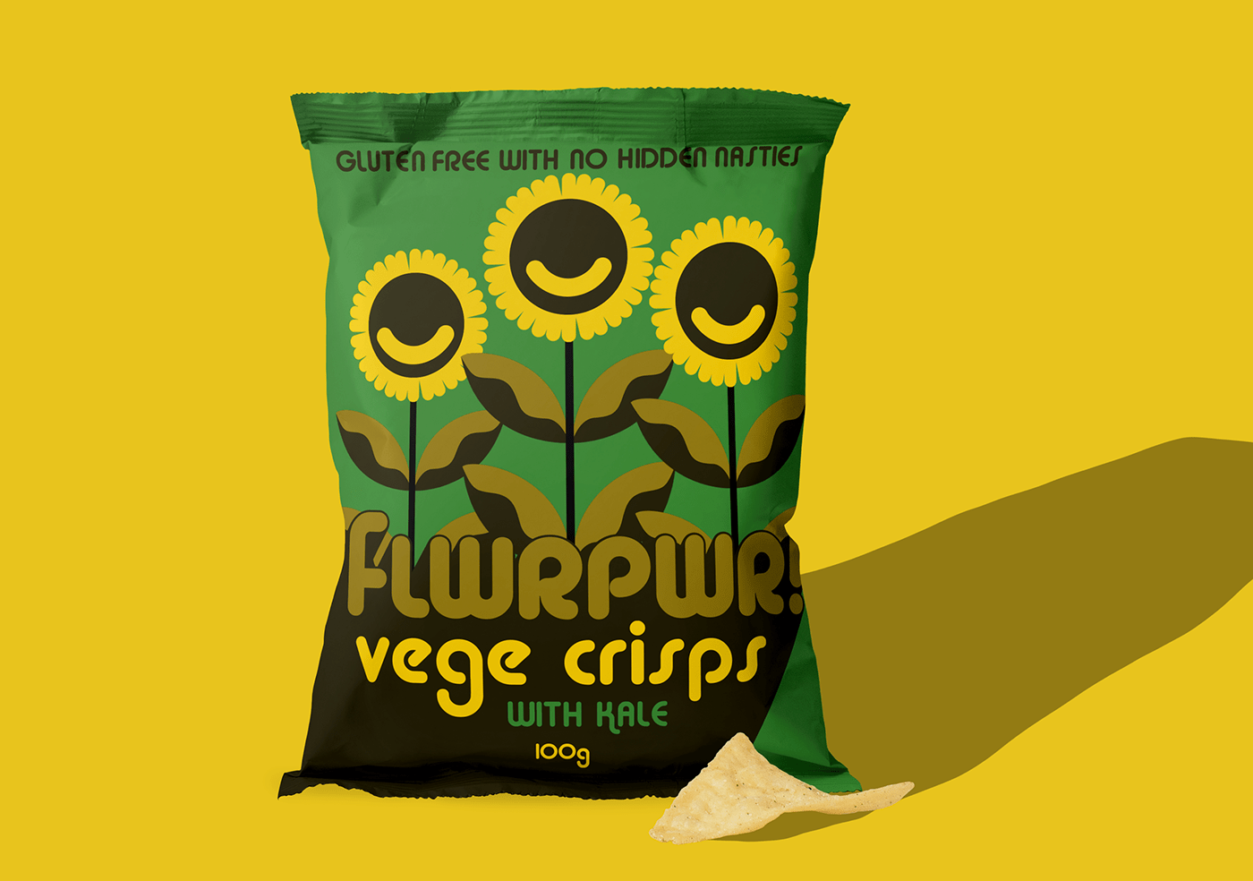
Focusing predominantly on retro color schemes and the combination of soft, rounded shapes and sharp-angled strokes, Candy did well to acknowledge the ideals of the 70s culture through her design. The emphasis on health and wellness through the inclusion of sunflower seed oil is found, not only in the clever name, but in the incorporation of nature on the label as well. The sunny, contagious smiles on the cartoon flowers suggest a level of trust in the whole and organic ingredients within.
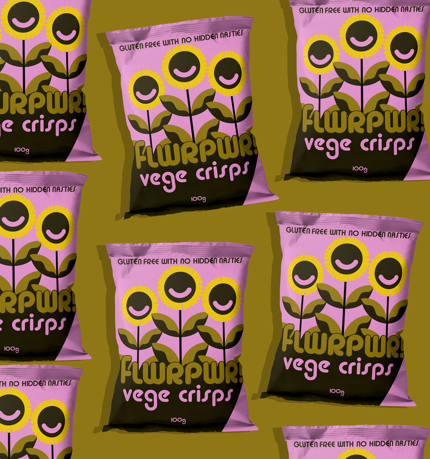
FLWRPWR Vege Crisps are vegetable crisps with a sunflower seed oil twist. The bold, funky branding paired with the muted colour scheme and blocky architecture, come together to formulate a brand identity that has a wow factor.
The rounded typography is a nod to the traditionally 60's and 70's vibe, which add to the "flower power" theme of the brand’s namesake. Each color contrasts each other well, making for a strong shelf presence. The retro vibes juxtapose the modern aspect of a gluten free product category. This does well to set FLWRPWR apart from the competing vegetable crisp varieties.


