
Revial | Naming & Visual ID
SOBRE / About
-
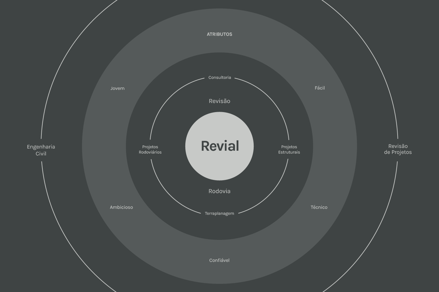
Revial Engenharia Estratégica surgiu em 2020 com o propósito de ajudar construtoras e empreiteiras com consultoria especializada em projetos rodoviários, estruturais, terraplanagem e revisão de projetos, diminuindo os custos e o tempo de execução de suas obras.
Revial Strategic Engineering emerged in 2020 with the purpose of helping builders and contractors with specialized consultancy in road, structural, earthmoving and projects review, decreasing the costs and the execution time of their works.

NOME / Naming
-
A inspiração para a criação do nome foram seus dois principais serviços: revisão de projetos e projetos de estrada e rodovias. Utilizamos o prefixo "RE" para trazer o sentido de refazer, rever, recomeço, reduzir e também em ligação direta com o nome do fundador da empresa: Renan. Junto ao substantivo VIA, que significa: conduzir de um ponto ao outro; orientação; rumo, direção, rota, trajetória. Ao final foi utilizado o L para efeito sonoro. Revial é um nome fácil, jovem e distintivo dos concorrentes, que em sua maioria utilizam o termo "Enge" ou então seus sobrenomes para as empresas.
The inspiration for the creation of the name was its two main services: project review and road and highway projects. We use the prefix "RE" to bring the meaning of redoing, revising, starting over, reducing and also in direct connection with the name of the company's founder: Renan. Next to the noun VIA, which means: to drive from one point to another; guidance; heading, direction, route, trajectory. At the end, L was used for sound effect. Revial is an easy, young and distinctive name of competitors, who mostly use the term "Enge" or their surnames for companies.
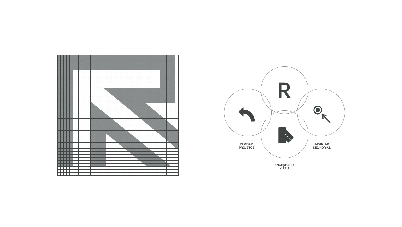
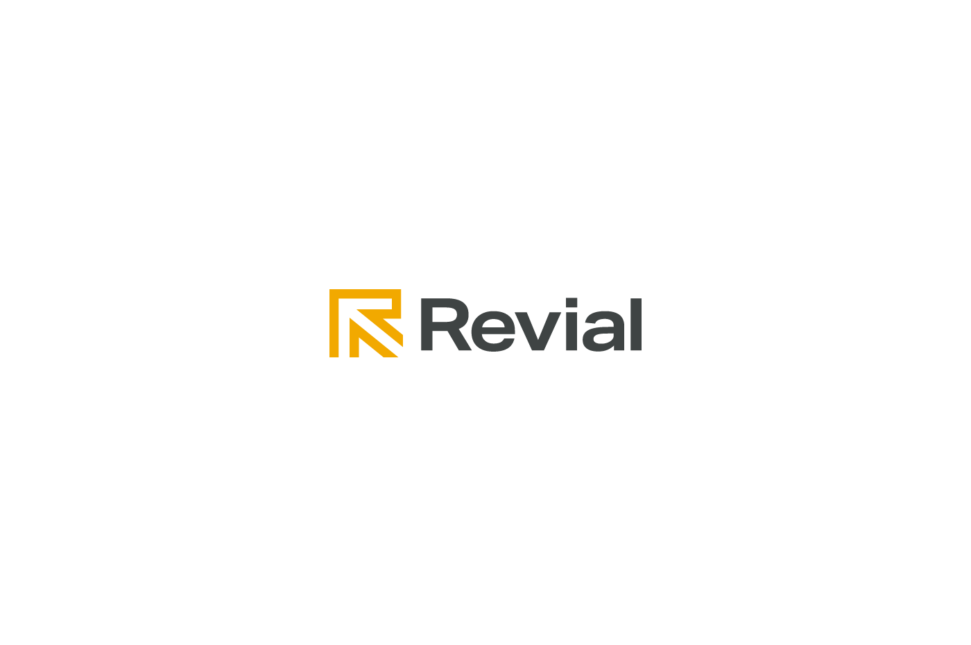
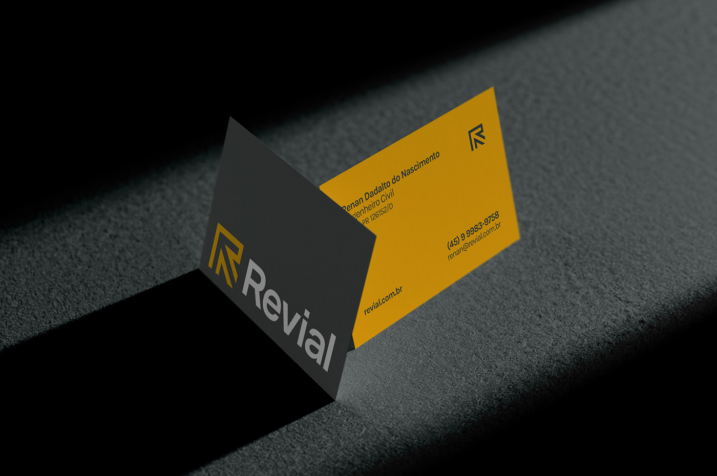
SÍMBOLO E LOGOTIPO / Symbol and logotype
-
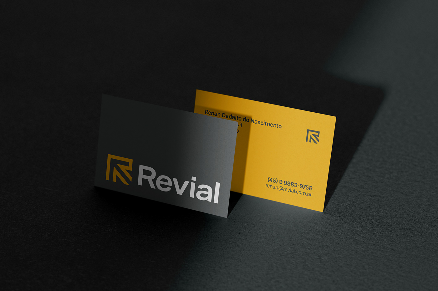
A simbologia foi construída a parti de três elementos: a inicial "R"; a seta apontando para a esquerda, remetendo a revisão e análise de projetos; por fim o símbolo traz no seu espaço negativo vias, reforçando a principal área de atividade da empresa. O logotipo utiliza a fonte Aktiv Grotesk, uma fonte sem serifa, neutra, que agrega uma linguagem técnica e corporativa para a marca.
The symbology was built from three elements: the initial "R"; the arrow pointing to the left, referring to the review and analysis of projects; finally, the symbol brings in its negative space a road, reinforcing the main area of activity of the company. The logo uses the font Aktiv Grotesk, a sans serif font, neutral, which adds a technical and corporate language to the brand.
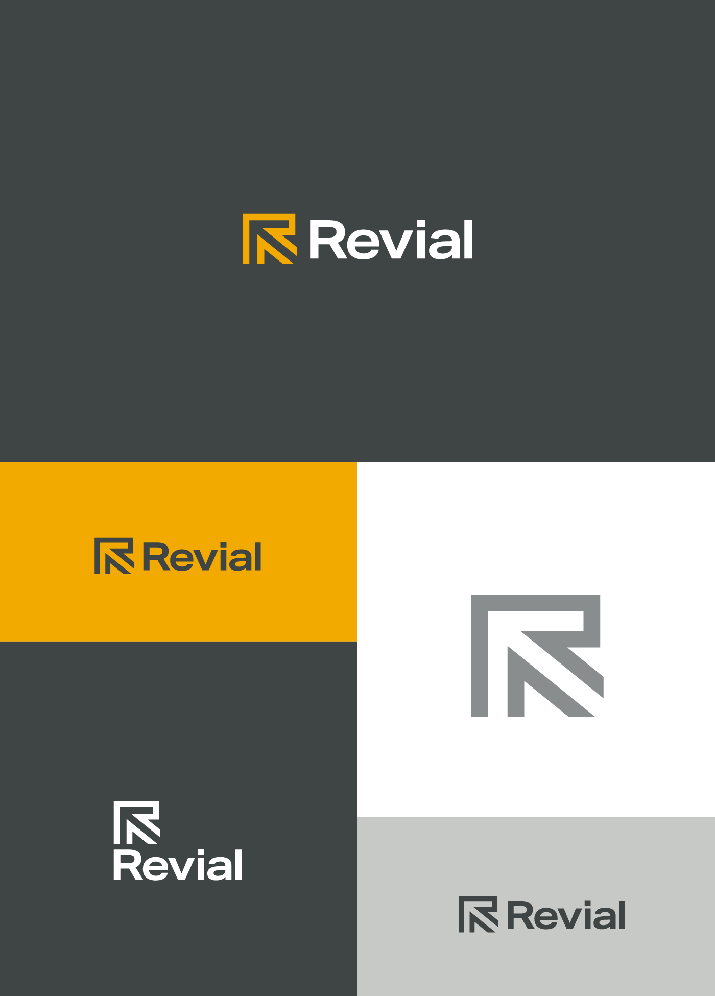
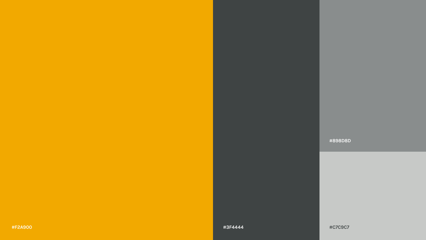
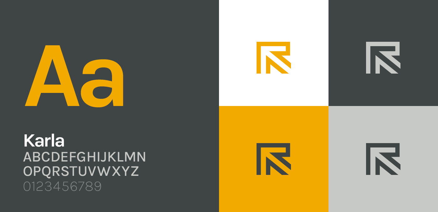
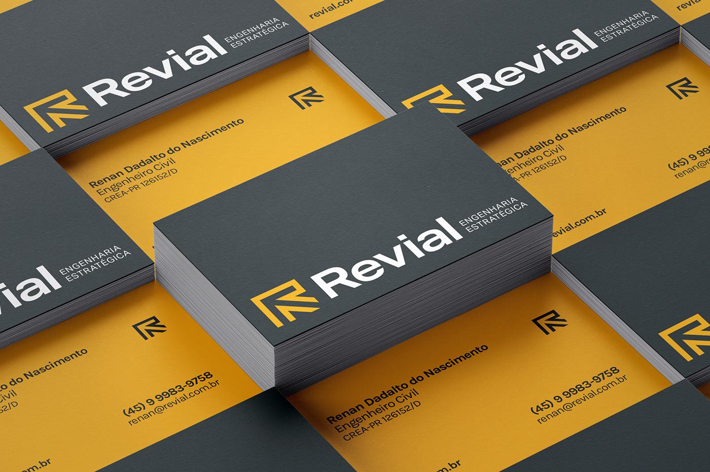
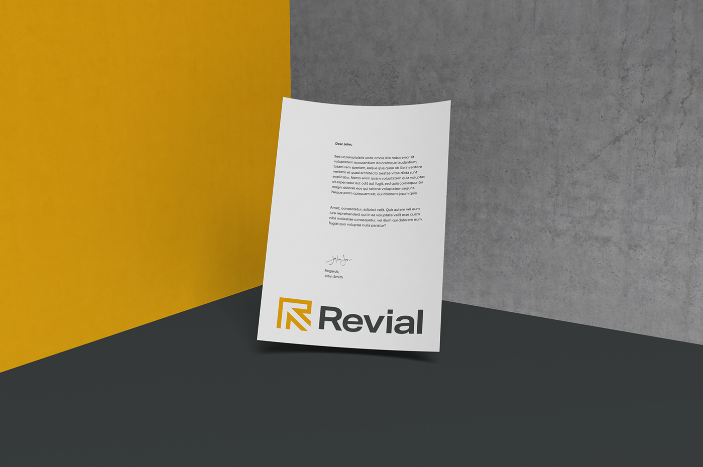
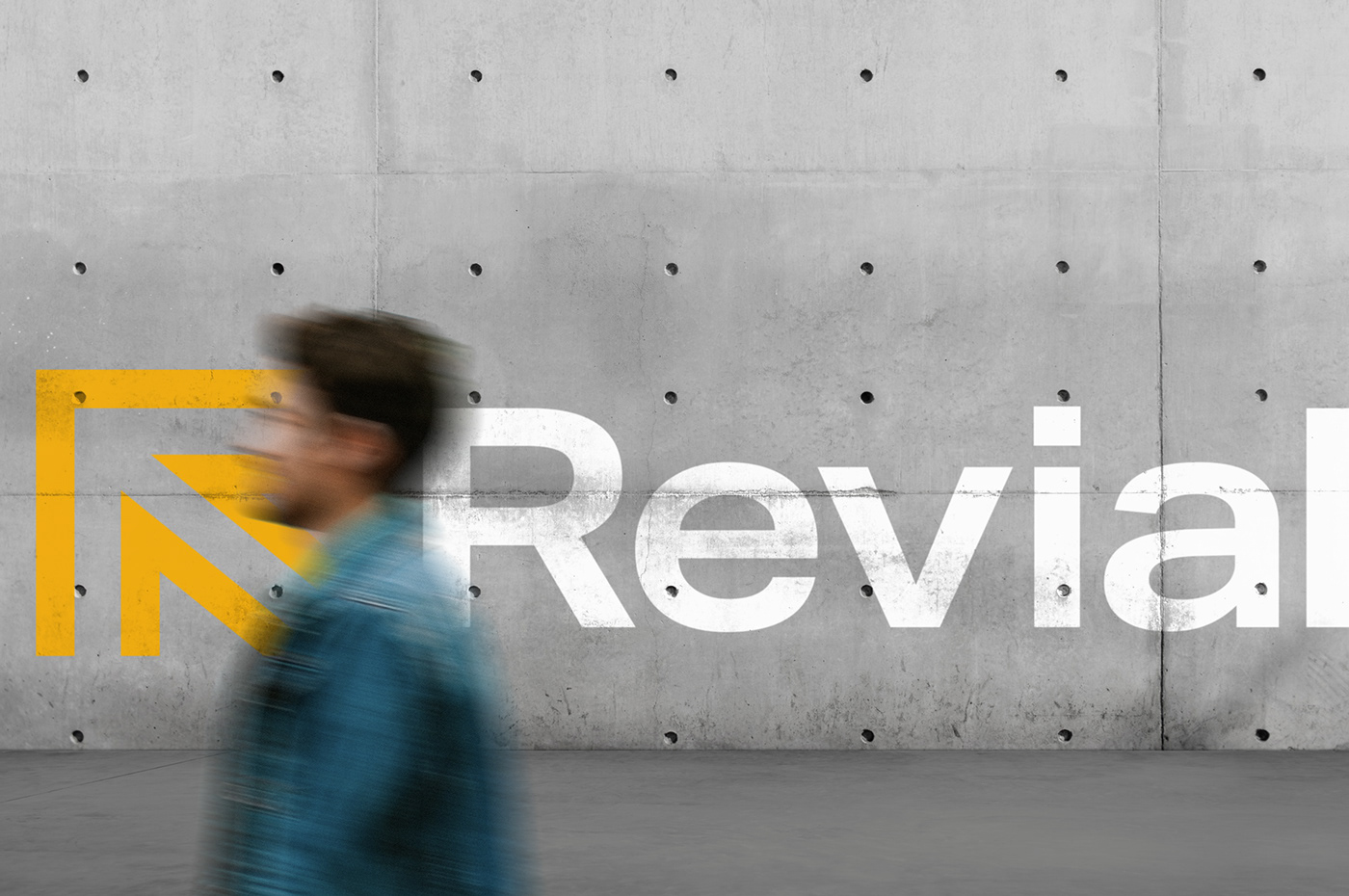
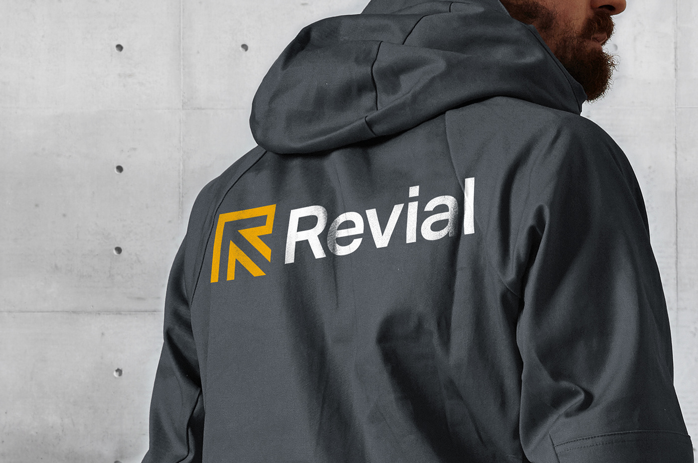
IDENTIDADE VISUAL / Visual identity
-
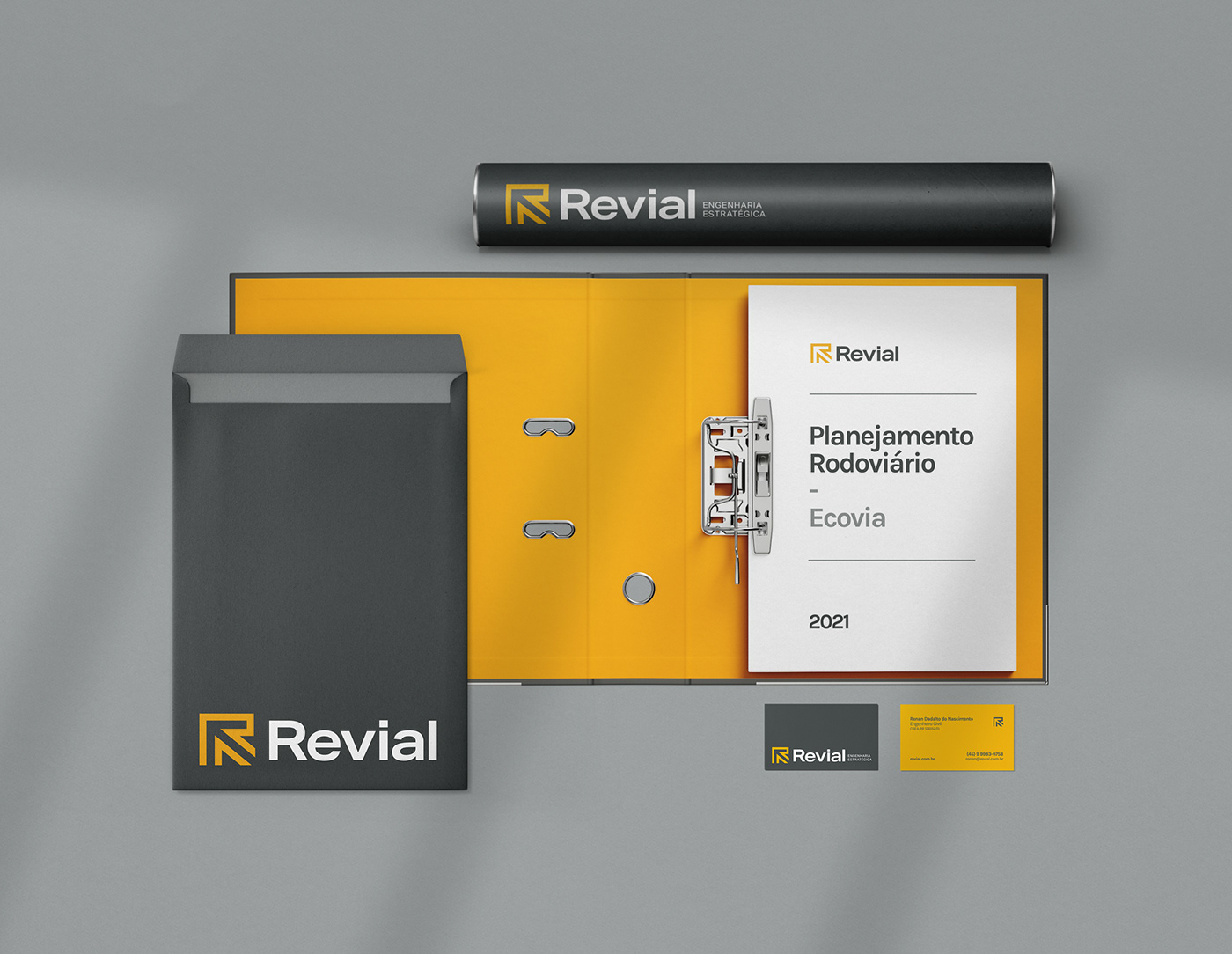
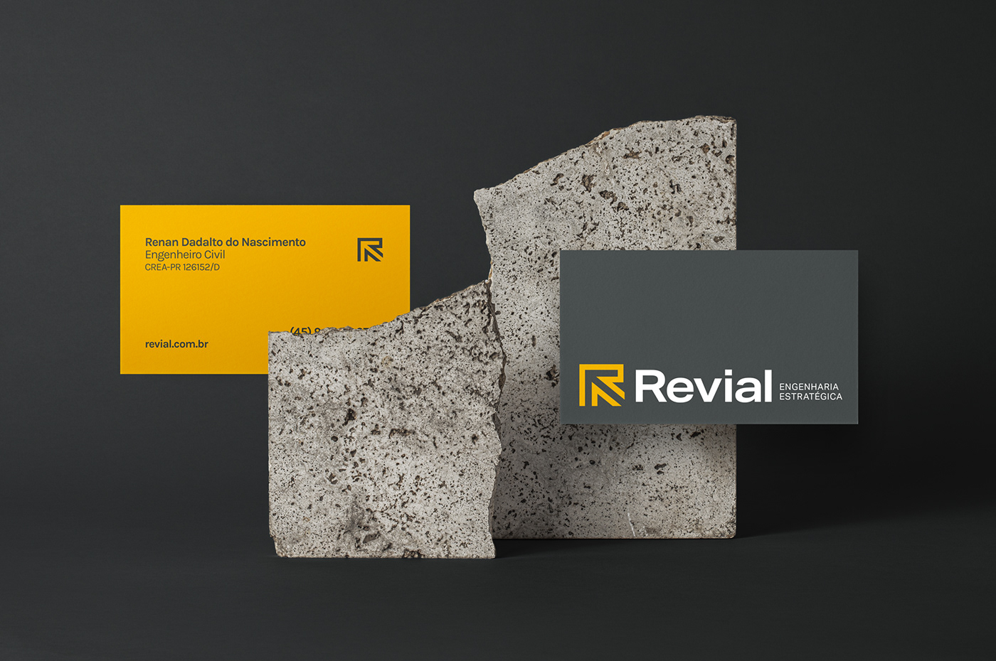
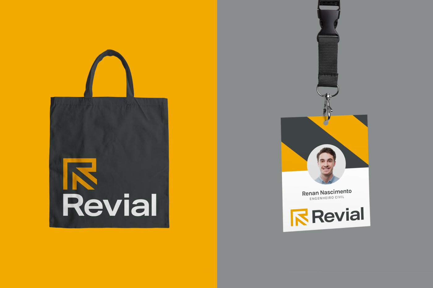
A identidade visual explora uma paleta de cores baseada no amarelo e em tons de cinza. Ela remete ao concreto, asfalto e sinalização viária, sendo mais um elemento de fixação e que reforça o ramo da atuação da empresa. A comunicação é limpa e explora o logotipo em primeiro plano. As linhas diagonais do símbolo também aparecem na forma de grafismo em algumas peças.
The visual identity explores a color palette based on yellow and shades of gray. It refers to concrete, asphalt and road signs, being yet another fixation element that reinforces the branch of the company's operations. Communication is clean and exploits the logo in the foreground. The diagonal lines of the symbol also appear in the form of graphics on some pieces.
CRÉDITOS
-
Naming: Hayane Issa e Nadini Moraes
Design: Guilherme Mazzo
Atendimento: Hayane Issa