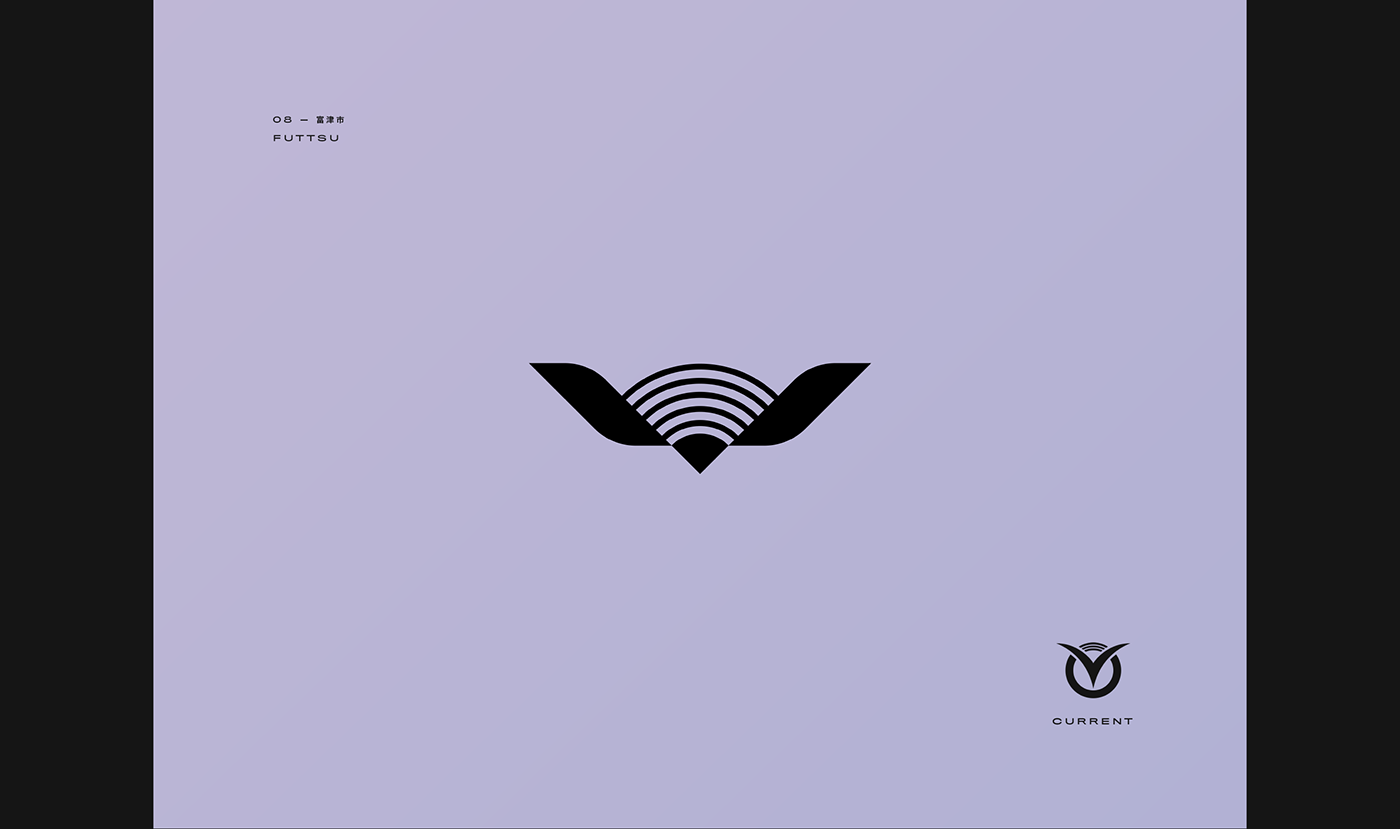
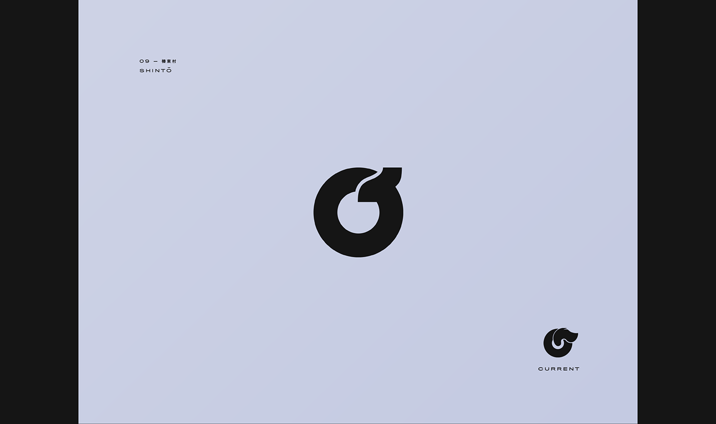
Each ward and city in Japan has its own flag with a simple and timeless symbol on it, often incorporating characters from the Japanese writing system. Locking eyes on a symbol each time I pass by a manhole, I couldn't stop thinking about making this series ever since I moved to Japan.
The goal was to redesign my favorite symbols in a style that I like to think of as the logo equivalent of "béton brut", for a nice blend of modernist/minimal approach and an authoritarian tone. Imposing, confident, geometric and yet flowy.