Farmia
Farmia is a widespread federal pharmacy chain. Over the years of its existence it has got quite a lot of clients.
While rebranding our goal was to refresh the pharmacy's visual style and not to discourage the existing audience in doing so, but also to attract a new one. As a new audience we expected the youth that seemingly doesn't need pharmacy much.
To achieve this we invented a 'pharmacy for health people' concept. Farmia is not a common drug store any more, where one comes to buy some medicine. Farmia is a spot where you can buy some vitamins but also have a cup of herbal tea, vitamin cocktail; buy a cool shopper or thermo mug.

The main customer requirement was to keep the icon of heart, which had been used before. We've redesigned it and adjusted to our style.

before / after
For the logo design we've used a modern attempt at typographics. We created a modular font based on a form of drops, which took a shape of an infinity sign in the ‘F’ litter.
So, we kept the existing audience by virtue of loyal pricing policy, widespread chain and plain communication language; but also won the new one, which does not need medicine, but values the healthy lifestyle.


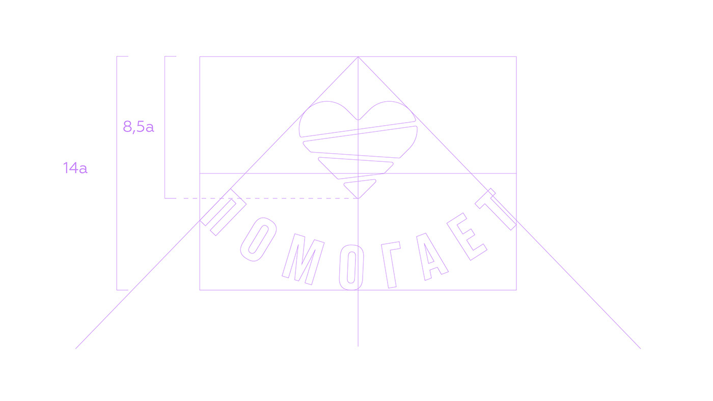
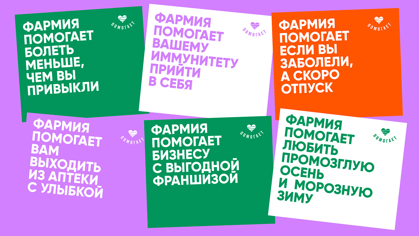
We also designed a special logo for the slogan “helps”. “Farmia helps…” and then comes a list of what it helps.
Design
In the design we meant to underline that pharmacy is not a hospital. It can have friendly banners, nice wall colours and the staff not wearing their usual white uniform.
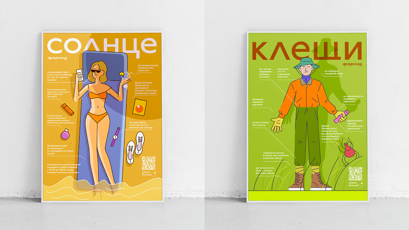
We also designed a number of banners and pharmacy showcases that explain the important things vividly and in a not boring way.


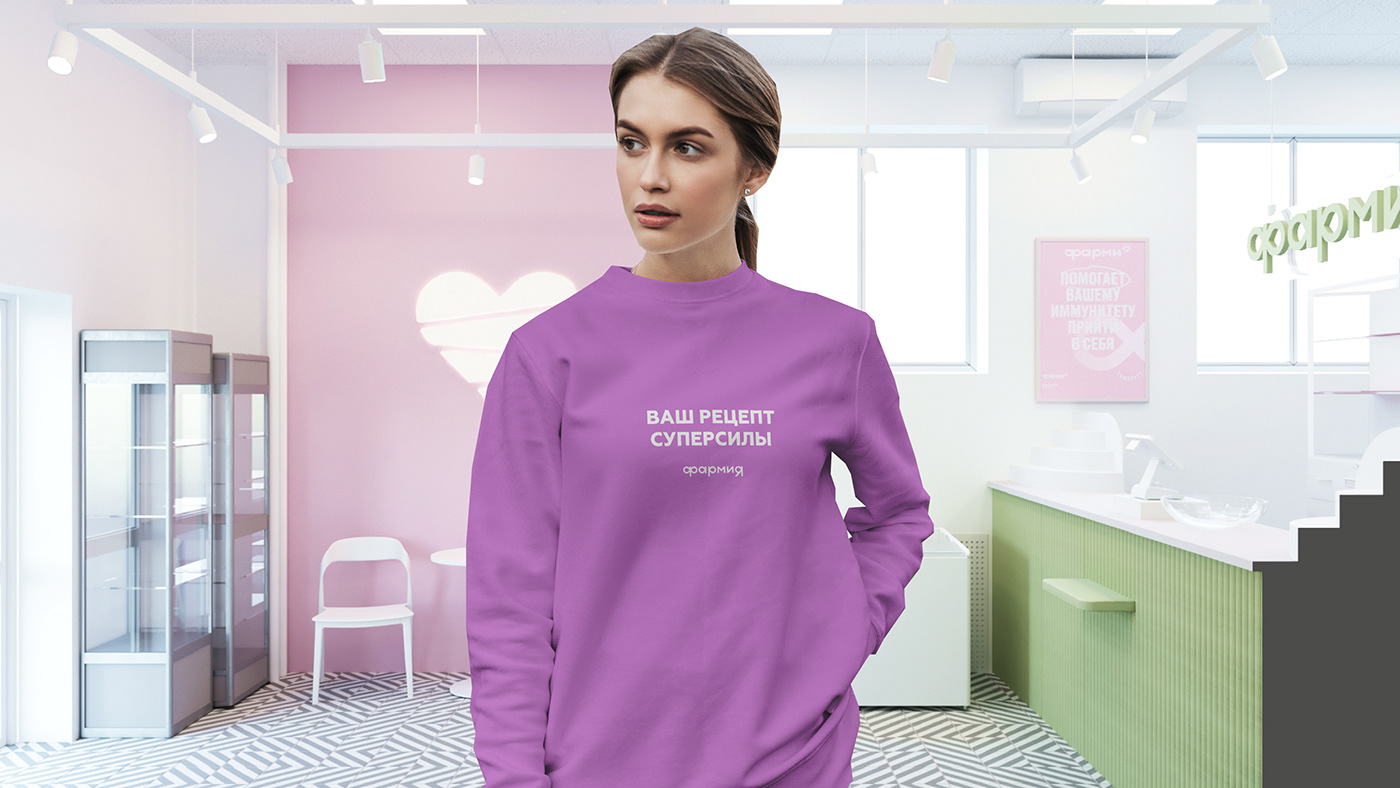
We also created a number of T-shirts with some catchy slogans (and we are glad that at the Farmia franchising community event they were wearing them).


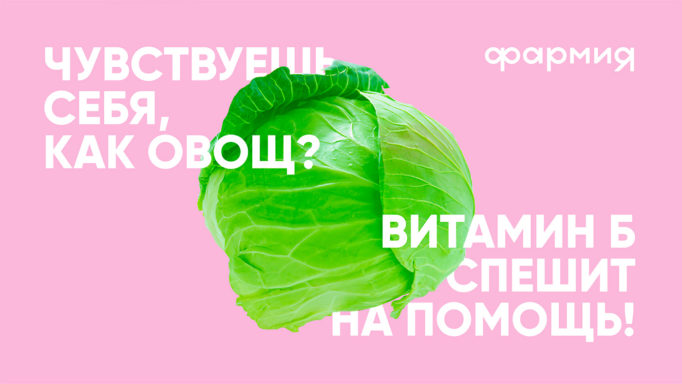
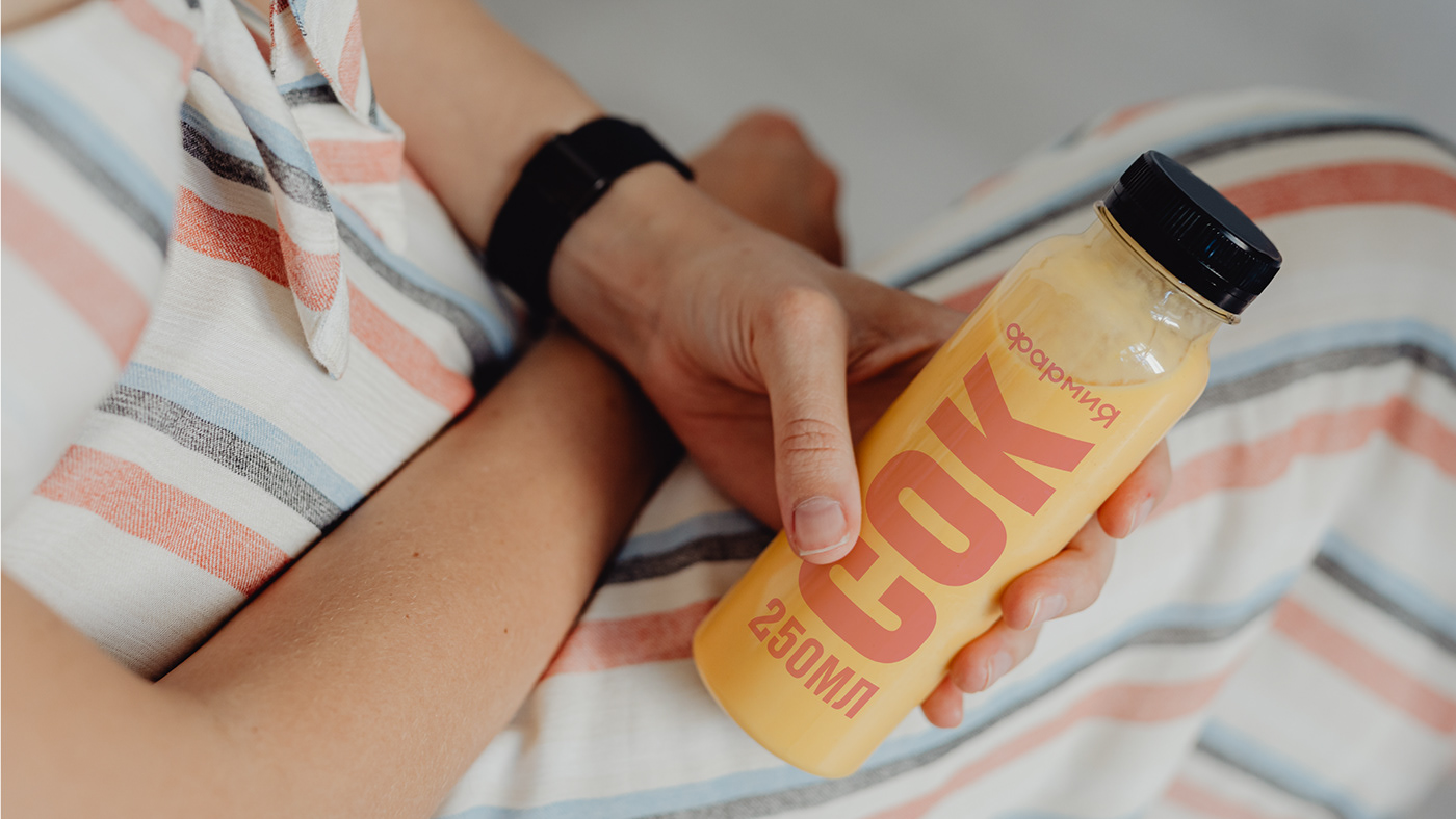
We designed a variety of packaging for Farmia's own products saying “Something against/for …” and the purpose of the product. This was our intention to turn to account a common situation when one comes to a pharmacy with a certain problem without knowing what medicine could possibly solve it.


Interiors
The communication with consumers itself usually takes place in drug stores and we couldn't leave them unchanged. We created a whole new concept for storerooms and designed a visual language that consists of room cleanness, no advertisement flyers and no aggressive images of illnesses. In our stores people should feel themselves healthy and be confident that they will get professional advice instead of being sold yet another useless health supplement. For final fulfilment of this idea we invited our friends from TOU Architects.


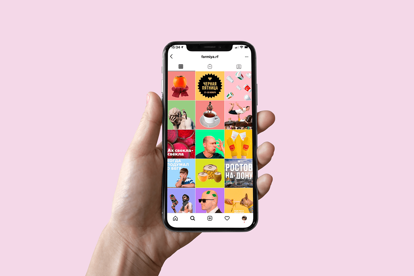
Instagram
It was decided to implement the new visual communication and the new concept through social media first. We also created a modern attempt and communication language for Instagram and prepared content for project launch and further handover to Farmia.
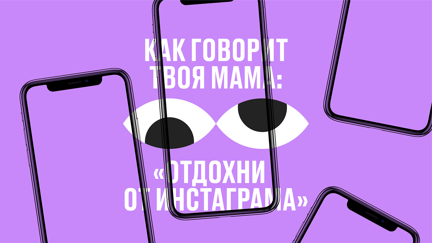
We shot several series of short videos with doctors where they answered our stupid questions. 😬 😬 😬
No one case could describe all the variety of executed work and carriers prepared, but we are happy that Farmia Company had entrusted us such a complex work task. By means of long-lasting negotiations we managed to jointly achieve this top-class and bold solution.