Doctor who series 8, 9, 10 main title design
After the Doctor Who executives saw our Youtube video (above), we were invited to collaborate with BBC Wales Graphics to deliver the main titles. They would run for the whole of Peter Capaldi’s tenure as the
eponymous “Doctor”.
We created storyboards, style-frames, typographical treatments and an animatic.
Steven Moffat – showrunner and writer – was immensely proud of what we achieved, saying “it’s
the only truly new idea I’ve seen since the very original in 1963.”
the only truly new idea I’ve seen since the very original in 1963.”
The Official titles for Doctor Who series 8, 9, 10
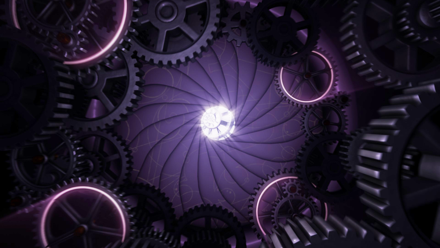
The broadcast version took the colour palette back to blue, like our original YT version and also reintroduced Gallifreyan symbols. The cogs and swirling clockfaces provided BBC Studios with additional brand assets that would result in visibly defining this era of Doctor Who.
During the pandemic we took the opportunity to create a ‘studio’ version, encapsulating our original vision. Read about it here.
During the pandemic we took the opportunity to create a ‘studio’ version, encapsulating our original vision. Read about it here.


Originally, the cog tunnel at the very start was to be used as a device to contain the lead actors names.


As we are always keen at Motionworks to incorporate the branding / logo into the animation – the show title would have been revealed in a way that harked back to the very first Doctor Who title sequence.


