


In this version I tried to give the type in the logo a 3D feel like you would see on an old highway sign. I also tried to use vintage elements in the design but give them a slight modern twist.
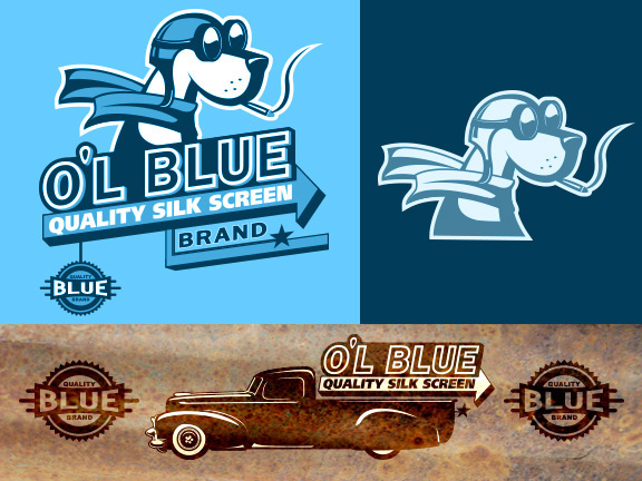
Since the client uses a silkscreen as their main business, it was important to make sure the logo would work
in multiple colors as well as one color. I also made sure that the logo would work with just using the type or just using the icons.
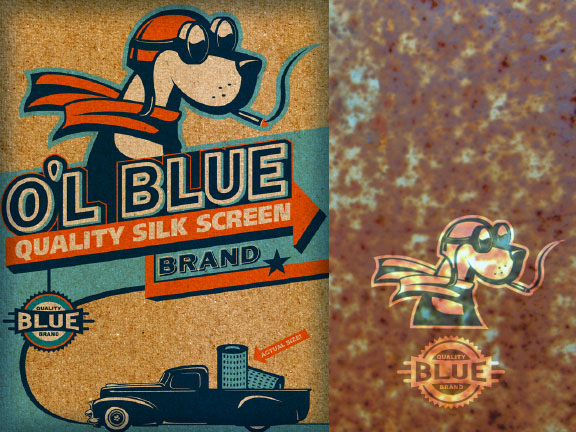
I also designed a little poster using the logo as illustration. I used sandpaper in Photoshop to give the poster a worn texture feel as if it were printed on thick recycled paper.


