


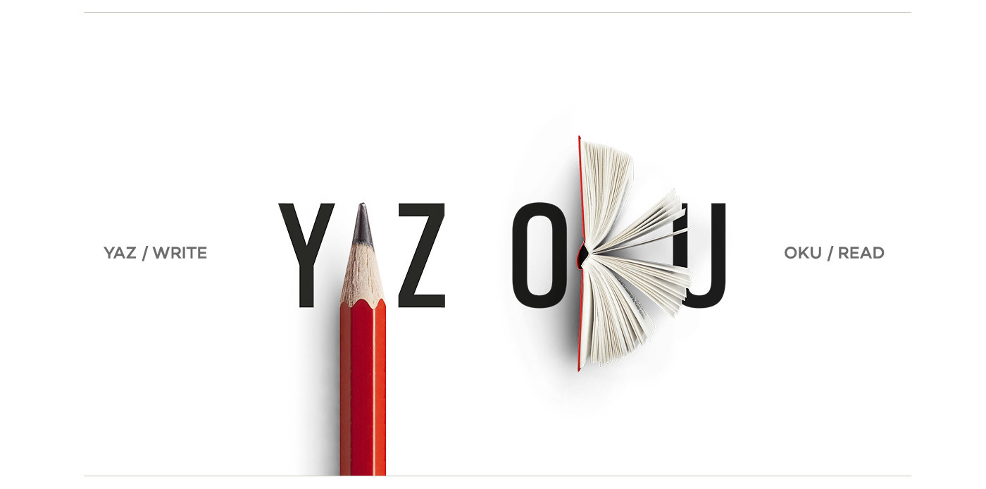
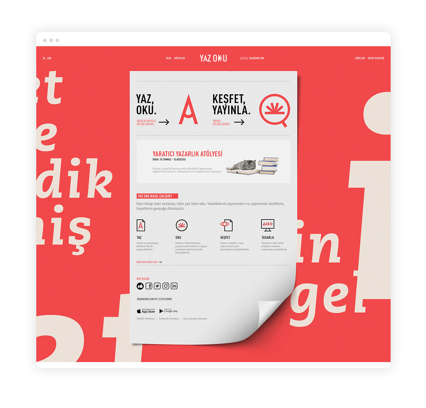
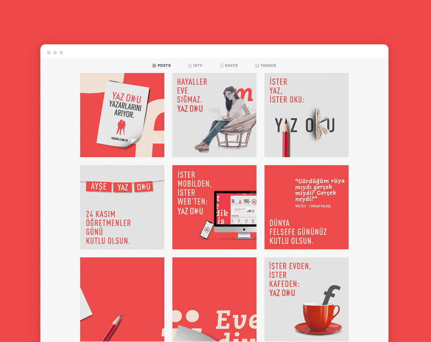
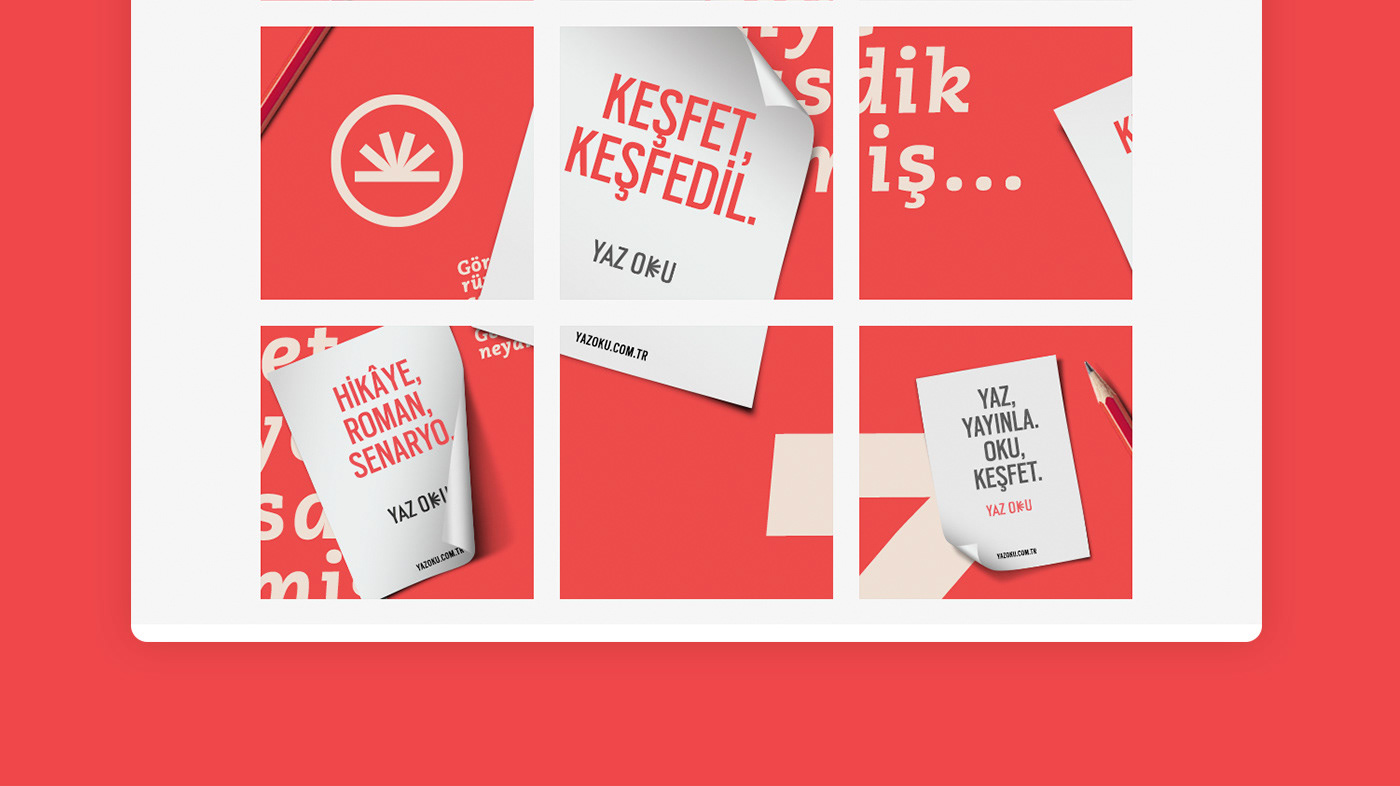
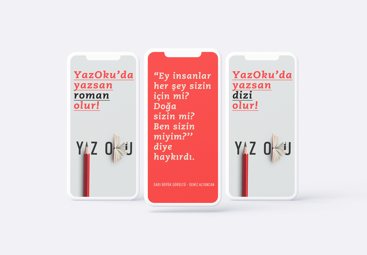
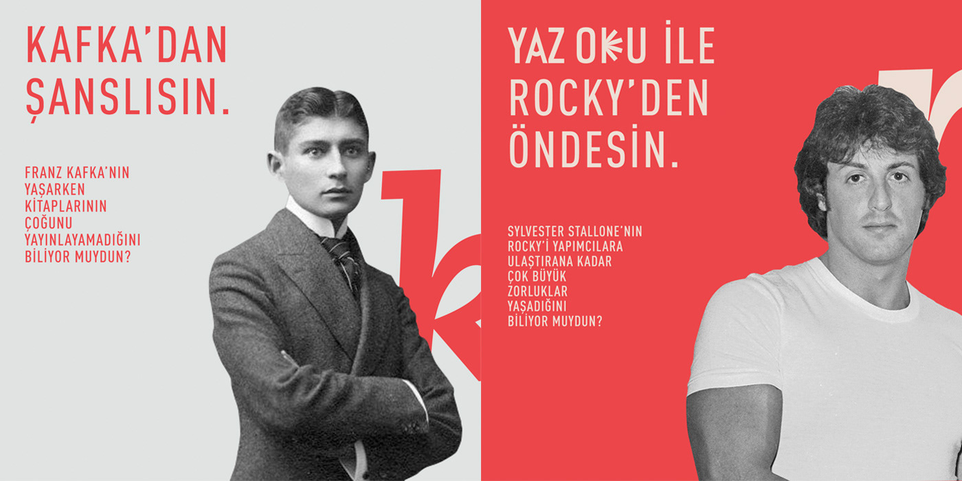
YAZ OKU directly translates as Write Read. Starting with its naming, the communication strategy we have developed for YAZ OKU was fast-paced, clear and fostering close-connection. For our target group of 25-35-year-old adults who have an affinity for reading and writing,
the visual communication was built upon the main focus of YAZ OKU, writing, and typography.
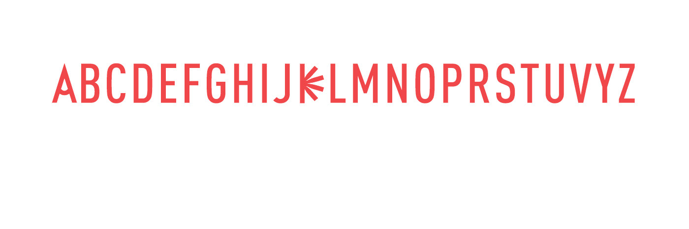
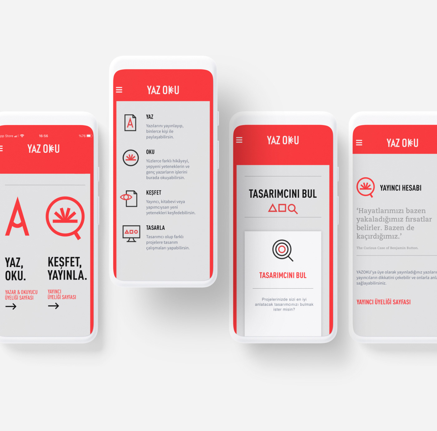
For the logotype work, we have developed symbols from associating the meaning of the words with the letters’ geometric forms. The letter A, located in the middle of the word YAZ (meaning “Write”), was symbolized by a pencil, while the letter K, in the middle of the word OKU (meaning “Read”) was symbolized by a book.
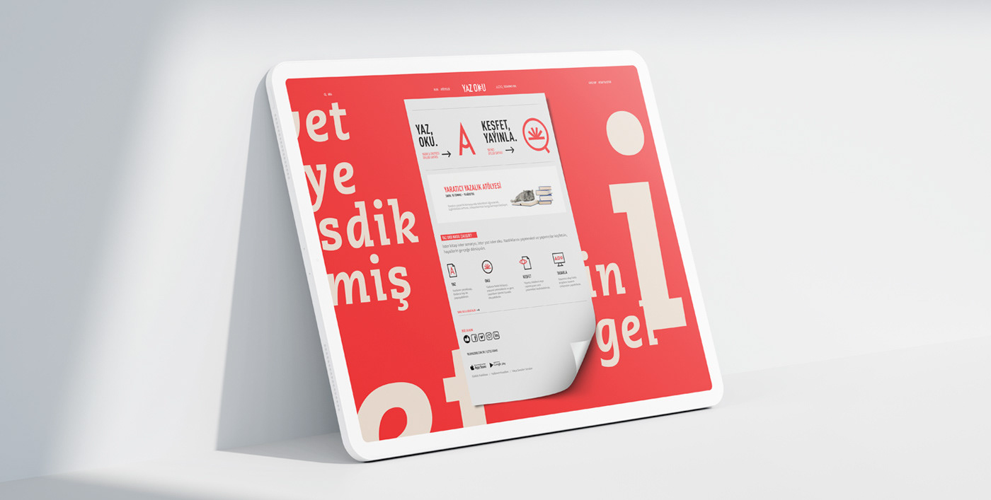
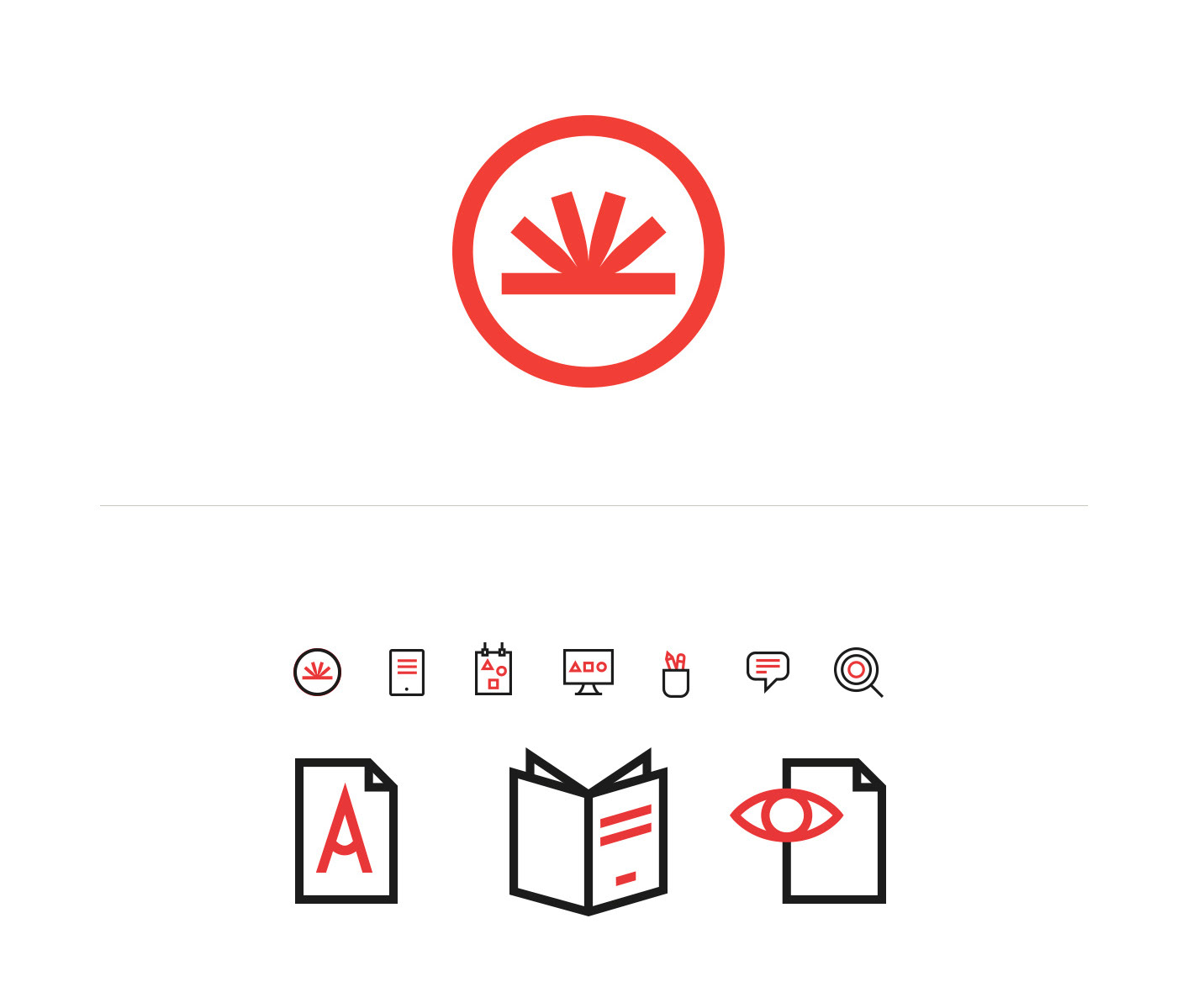
Then, we have designed a font family that included the A and K that was designed for the logotype. Being the key visuals, these symbols contributed to the uniqueness of the typography. To clearly communicate the sub-headings on digital platforms, we have developed animated icons that were a continuation of the visual structure.
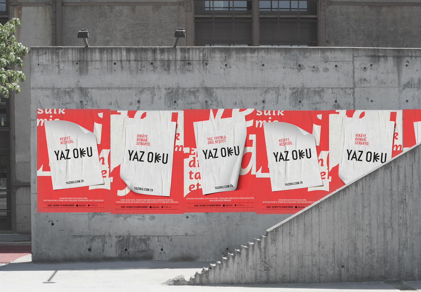
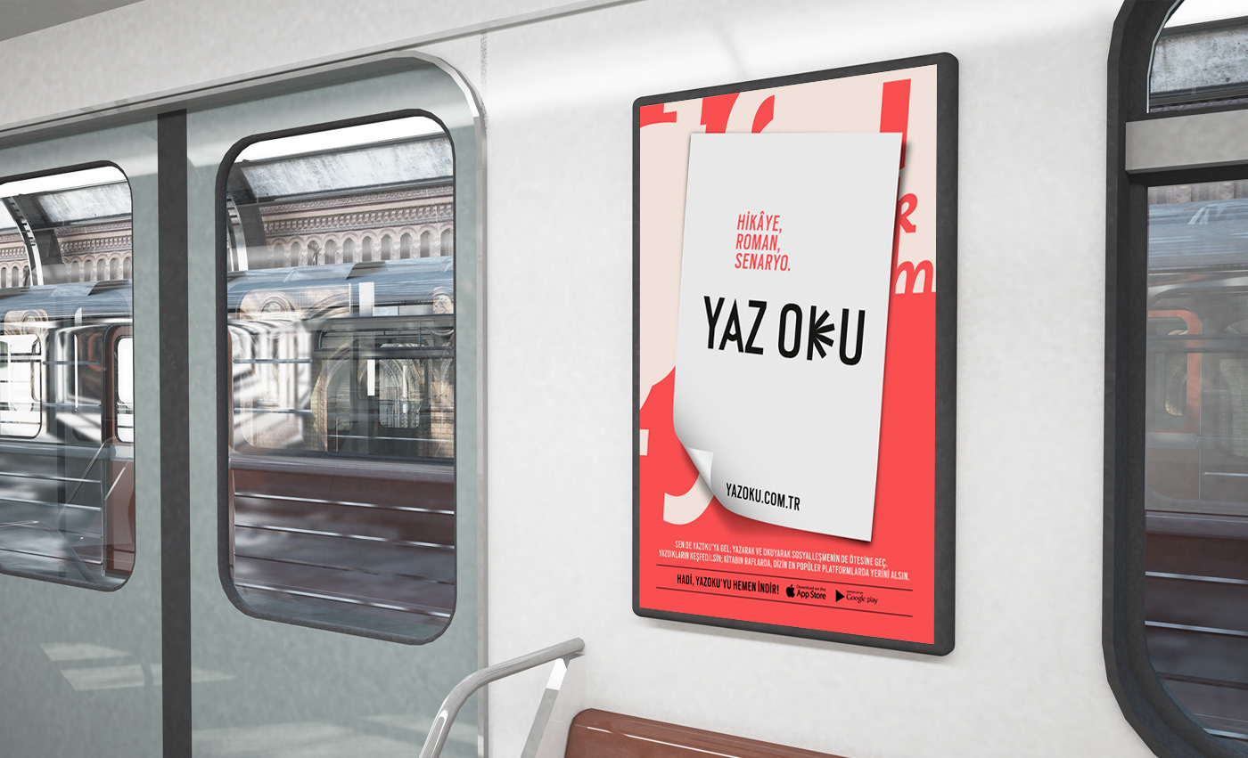
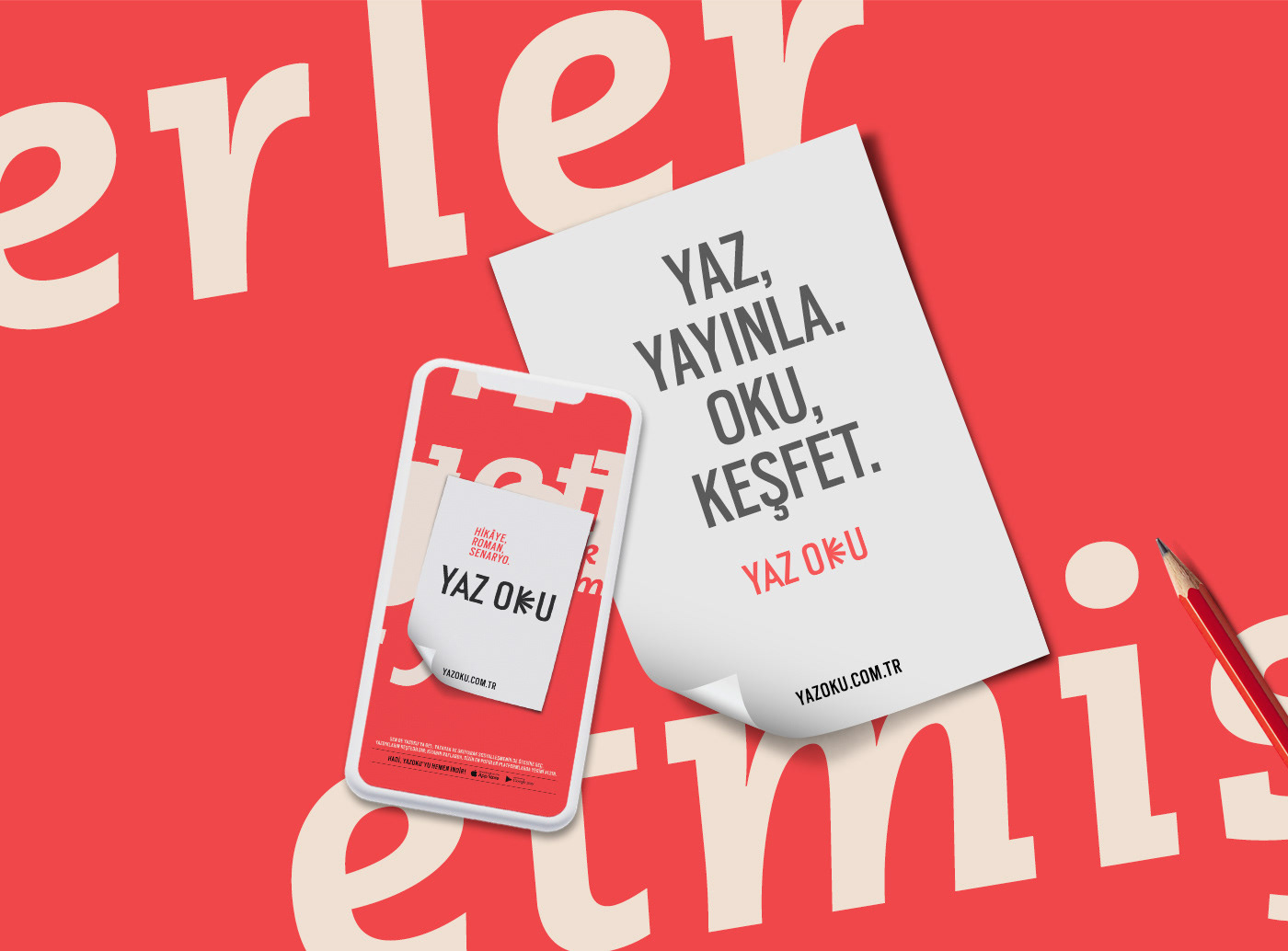
The succint and action-oriented expression of the name was continued on (transferred to) written materials. Sincere, succint, and clear statements encouraging taking action were chosen in communication.
YAZ OKU 2021
LOGO / VISUAL IDENTITY / SOCIAL MEDIA / WEB SITE / APP / POSTER
CREDITS
Clients: Yaz Oku
Concept & Design: Polat Gülkaş - Paper
Account Director: Sezen Aksoy Çakır - Paper


