


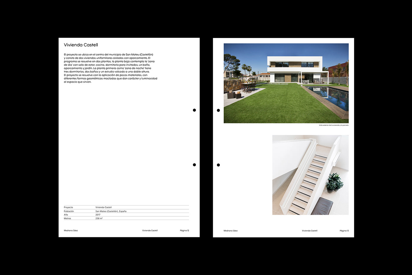


Medrano+Sáez Arquitectos
ES — El despacho de arquitectura Medrano+Sáez Arquitectos fue fundado en el año 2000 por Jose María Medrano y Gustavo Sáez con la firme convicción de que el profesional debe recoger en su trabajo la influencia del lugar, siendo respetuosos con el entorno y atendiendo las necesidades de la sociedad.
Con 20 años de experiencia a sus espaldas, el estudio se propuso actualizar su identidad visual, manteniendo su característico color naranja y el símbolo '+' como elementos continuistas. El resultado es pura simplicidad, con una gama cromática que apuesta por la honestidad del blanco junto al naranja y el uso de una única familia tipográfica —F37 Moon, de la fundición Face37– a lo largo de toda la identidad con la intención de reforzar la idea de funcionalidad.
EN — Medrano+Sáez Arquitectos is the architecture practice of Jose María Medrano y Gustavo Sáez, founded in 2020 with the certainty that professionals must gather the influence of the space within their work, while respecting the environment and paying attention to the needs of society.
With more than 20 years of experience, they decided to update their visual identity but keep their characteristic orange color and '+' symbol as significant features. The resulting solution is pure simplicity: a color range that bets on the honesty of white, together with orange, and one single typeface —Face37's Moon– used throughout the identity meaning to convey functionality.


