PT
A Barter é uma marca de gin artesanal duplamente destilado com uma composição única de botânicos. Nasceu a partir de uma proposta com um propósito bem definido: compartilhar momentos. O objetivo principal da construção da marca e identidade visual foi contextualizar os bons momentos, seja um almoço em família, um jantar romântico ou uma confraternização entre amigos.
A criação visual da Barter foi baseada em refletir as sensações dos bons momentos, tornando-se uma memória afetiva. Se tem Barter, tem alegria.
EN
Barter is a brand of artisanal, double-distilled gin with a unique composition of botanicals. It was born from a proposal with a well-defined purpose: to share moments. The main objective of building the brand and visual identity was to contextualize the good times, be it a family lunch, a romantic dinner or a get-together with friends.
Barter's visuals were based on reflecting the sensations of good times, in order to become an affective memory. Where there's Barter, there's joy.
Barter's visuals were based on reflecting the sensations of good times, in order to become an affective memory. Where there's Barter, there's joy.
___________
PT
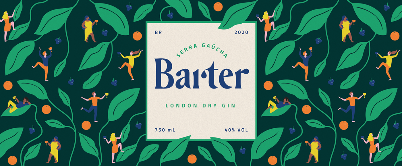
A identidade visual da marca Barter reflete sua personalidade jovem, alegre, divertida e plural.
O logotipo, inspirado pelo formato do alambique, é apresentado na cor azul, que transmite confiança, tranquilidade e harmonia. A cor também é associada à comunicação e a conexão.
Os elementos visuais ilustrados se referem ao contexto dos bons momentos onde a marca se insere: pessoas, drinks e ao movimento.
A cor verde no rótulo do produto principal – uma garrafa de gin de 750ml – está ligada aos conceitos de liberdade, frescor, juventude e natureza viva, fazendo uma livre associação aos botânicos que compõem o produto.
A identidade também possibilita trabalhar novos rótulos com as diferentes cores da marca para produzir edições limitadas e colecionáveis das garrafas, de acordo com a estratégia adotada pelos gestores.
EN
The visual identity of the Barter brand reflects its young, cheerful, fun and plural personality.
The logo, inspired by the shape of the alembic, is presented in blue, which conveys confidence, tranquility and harmony. This color is also associated with communication and connection.
The illustrated visual elements refer to the context of the good times where the brand is inserted: people, drinks and the movement.
The green color on the label of the main product – a 750ml bottle of gin – is linked to the concepts of freedom, freshness, youth and living nature, making a free association with the botanists that make up the product.
The identity also makes it possible to work on new labels with the different colors of the brand to produce limited and collectible editions of the bottles, according to the strategy adopted by the managers.


Identidade visual: Vinícius Agliardi e Raísa Casagrande.
Fotografia: box90.design
___________