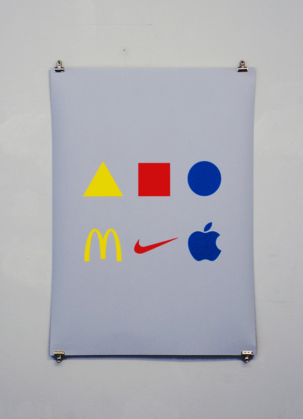
Bauhaus Revisited is based on the reinterpretation of a theory developed at Bauhaus in the early 20′s concerning the association of primary shapes and primary colors. The logos of McDonalds, Nike and Apple, use the same primary colors and there is a similarity, to a certain extent, with the Bauhaus shapes. Logos, as well as primary shapes, tend towards purity and simplicity, they strongly act in the collective imaginary and they are easily recognizable by children. The intellectual charge of the Bauhaus, though, went lost, substituted probably by marketing logics.

At Bauhaus, in the early 20′s, the theory of primary shapes and primary colors developed by Wassily Kandinsky and Heinrich Bormann, has been taken as a starting point to design a series of objects. Following the same way of operating, I asked Gianluca Gimini to design a low table using the logos instead.

In collaboration with: Gianluca Gimini


