
Background
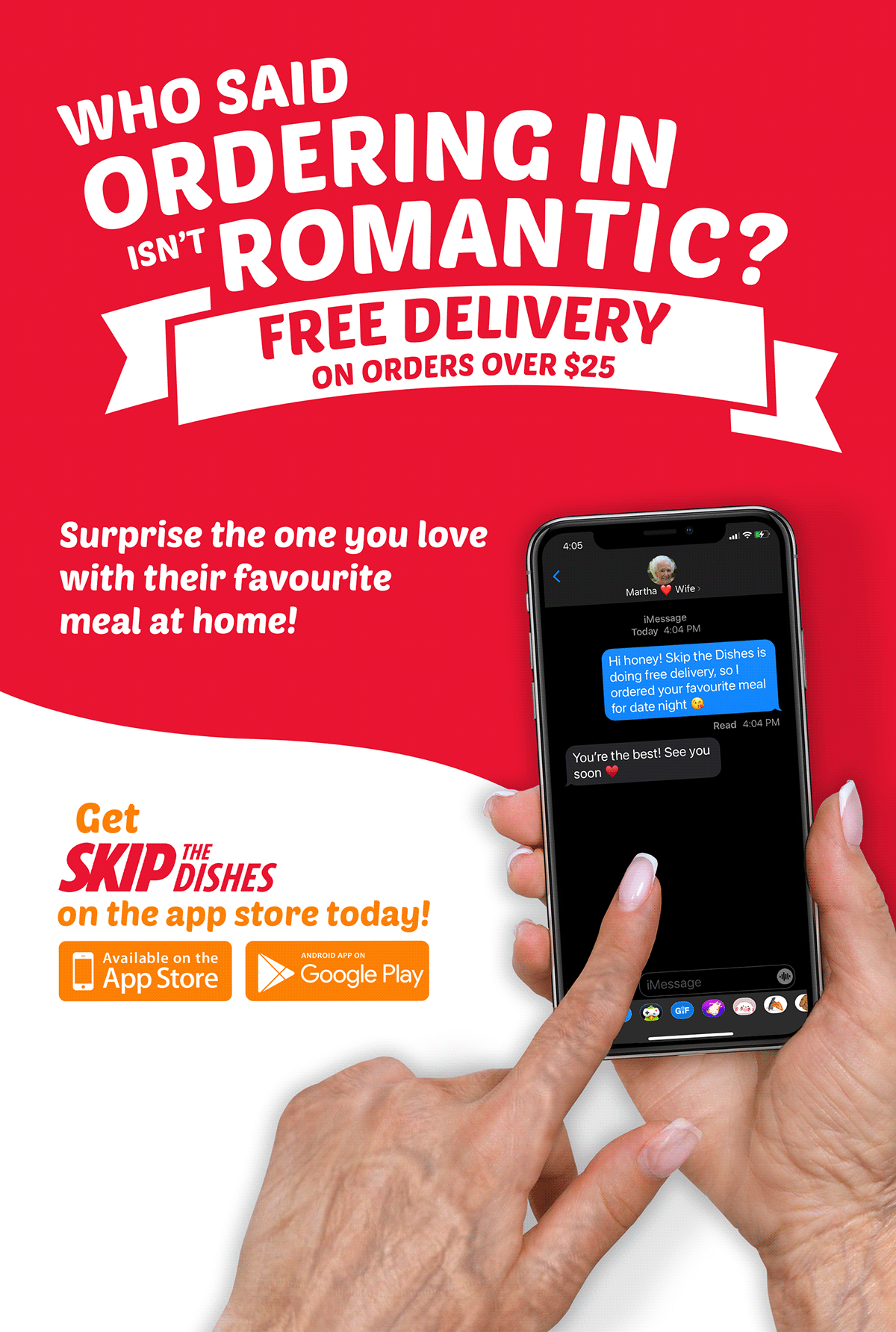
The primary objective of this project was to craft an impactful advertisement that would capture the attention of retired individuals, aged 60 - 70, within the LGBTQ community. The goal was to make the content clear and concise, ensuring it appeals to the target demographic during their transit, ultimately driving increased engagement with the food delivery service.
Design Elements
Typography:
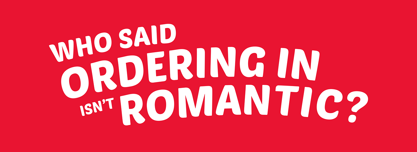
Poesten One Chosen as the prominent headline typeface, Poesten One conveys a fun feeling while being bold and eye-catching.
Colour Palette:
For the color palette, the goal was to blend Skip the Dishes’ new colors with their old ones, maintaining recognition. I used #e91431 (Red) from their logo and #ff7a00 (Orange) as their new color. These, combined with #ffffff (White), create contrast, separate text, and add a visual divider between sections. The Skip the Dishes logo remains red for the call to action, ensuring it stands out and draws attention to the brand.


Poster Development
The main challenge was targeting the demographic subtly:
Brainstormed catchphrases and illustrated them until satisfied with the layout.
Found a phone mockup and aged up the user's hand to fit the demographic, as there were no available mockups.
Played with hierarchy for a smooth transition and separated the background for contrast, emphasizing the call to action.