


Even though it was classified into different types, there’s one category name “unclassified”. This condition is unpredictable, has unknown cause, and still no cure.

We have collected information about the days in life of the patients, and summarised the people’s frustration and painpoints as shown here.
They are all related to each other.
1) Their conditions often disrupt their daily plan because of any bathroom break or embarrassment.
2) The treatment they undergo could be on Trial and Error bases, of course with the side effects that come along.
3)There’s a lack of public recognition where their family and friends don’t fully understand their illness and question why don’t they hang out and by saying “You don’t look sick”.
4)In a long run, it all adds up to bring a negative effect in their mental wellness.


On a broader level, can we increase user’s confidence in going out?


Here's a snapshot of my ideation process through exploring possibilities by sketching out wireframes.

• The map view gives a visualised presentation to the users showing the route and distance from where they are, to the facilities they need.
• A One tap search filter showing the most common needed facilities is at the bottom of the screen.
After this, once user confirms to add this event to their planner, an event ticket will be generated.

The idea is similar here when user views upcoming events on the application. By tapping on the event ticket, a summary with same format will pop up.

Joy List is implemented here. Now when they looked at the summary of a previous event, there is an ‘add to joy list button’. It adds user’s selected event to a joy list, which is a saved list of the events that brought them pleasant and convenient memory, so that they can reuse it in the future.

Daily view is chosen primarily to display instead of a monthly view, because user’s condition can be changing in a short term, a daily view with a scrollable date selector could be more convenient to them.
If they hope to use the monthly view, the idea of allowing user to change view is presented by the calendar icon on the top right corner.

In the case when user is already heading to the event or an event that is going on, if they launch the app, the map view will show, instead of the schedule view on the landing page like before.
It is to eliminate any information that they don’t need at that moment when users are obviously looking for the time, distance and facilities they need as the main actions.
User can see themselves as the locator icon on the map.
They also can see a live action icon next to the title of the event to indicate that the event is happening.
Here is a sample prototype of show how the interaction is like:


Today’s Checklist button at the bottom of the landing screen:
• This is one of the first things users check before they go out. And it provides a quick access if the users really forget to bring something and they need to buy them when they are already outside. It is also when the one tap search filter comes into the picture.
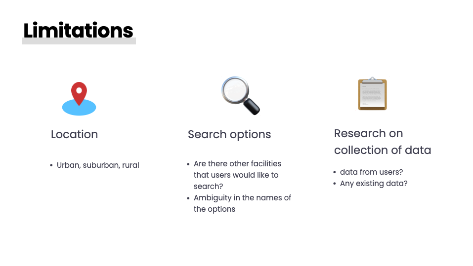
Throughout this project, we do realise that there is limitation on location and traffic. Sometimes there is just no facility available depending on the density of the city. Another limitation or challenge for us would be how can we improve on our search options. Knowing that this is an individualized physical condition, we believe that they are not perfect for all users. Also after presenting our ideas to a few users, we found out there is an ambiguity in naming of the option: ’Rest stop’. It could mean very differently among patients. And we are still exploring ideas.
If we are really pushing this project into real life, we keep in mind that we would still need to figure out the ways of putting the data with filter together.

Our next step would be focusing on how to present feedback to the users in different situations. e.g. what’s the language like when we have to tell the users facilities not found.
Also, we will explore ways to improve the search function, make it even more customizable, like implementing ways to filter by miles or time, so that if they are too far away from certain distance, maybe the planner can send a push-notification to the users.
Collecting feedback is always our priority. Right now the navigation of the planner is our focus.

Besides, what can we do for long term?
of course we would love to bring personality of the planner to the users. We want the experience to be positive, pleasant and energising.
Having considered a more complete experience, can we also develop a product with a sensor that could pair up with our checklist in the planner, so that it can send a reminder to the user and that the user knows what they forget to bring when they go out, or even send a purchase reminder?
I would love to see the possibility of expanding the use of this product for other people like people with long term sickness, pregnant women, people having menstruation or even travelers in a new place.


