

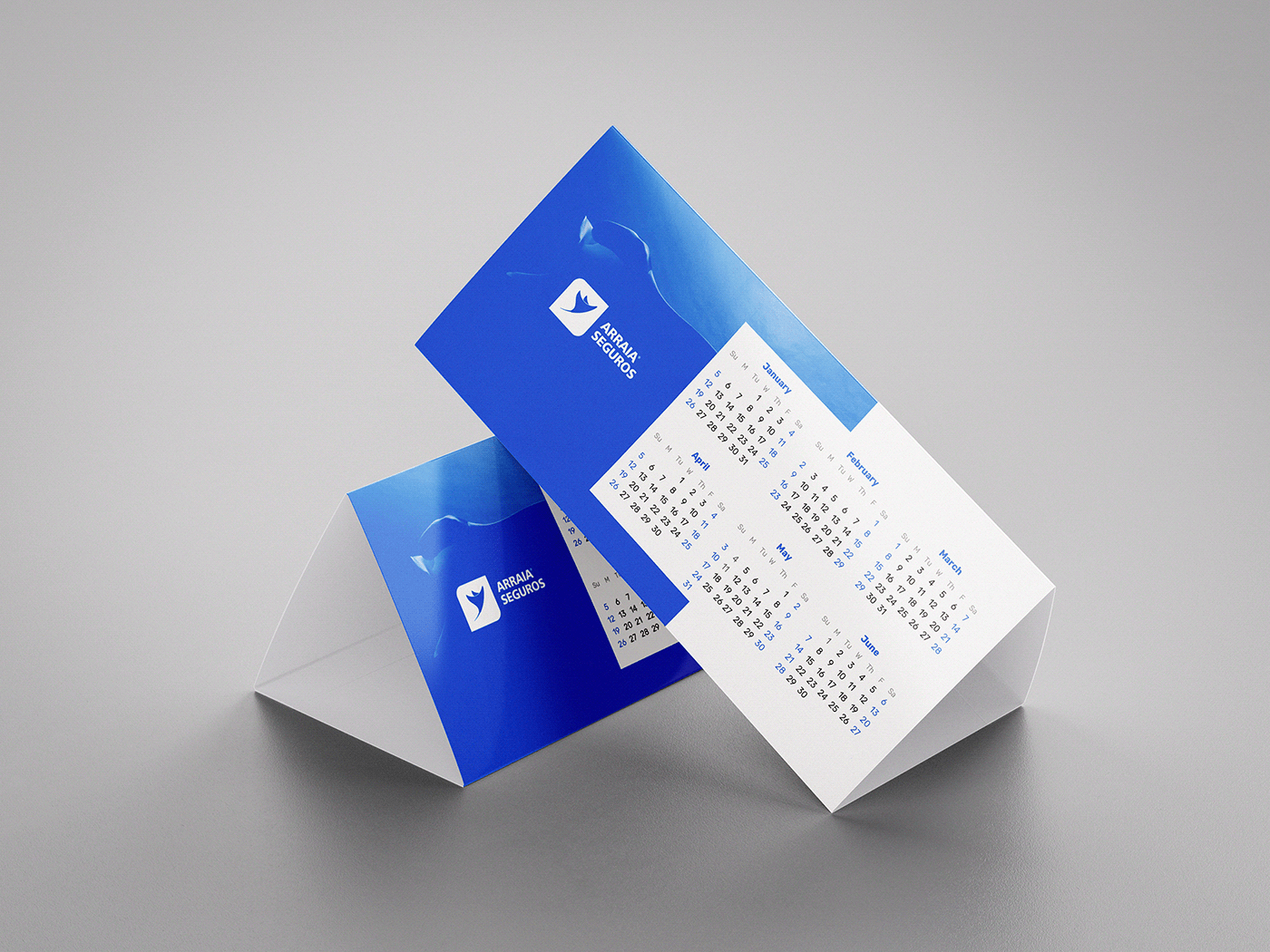
Arraia Seguros
Stingray Insurance
Insurance broker located in the State of Rio Grande do Sul, Brazil, specialized in all branches of the area.
PT - Corretora de seguros localizada no Estado do Rio Grande do Sul, Brasil, especializada em todos os ramos da área.


Concept
meaning
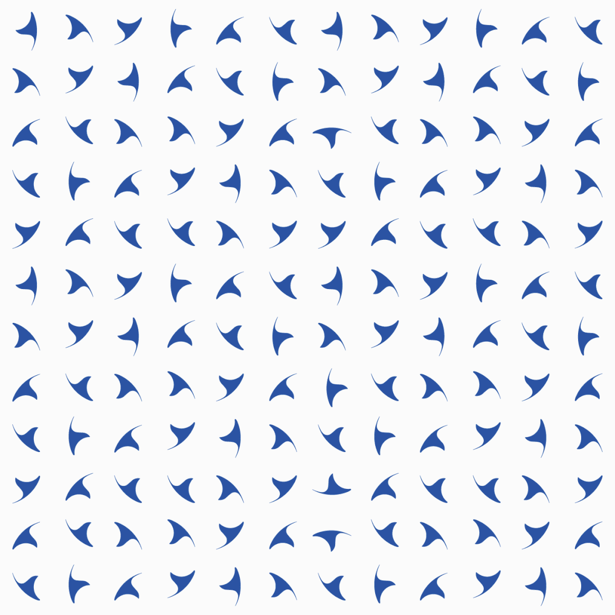
The symbol is the pictorial representation of a stingray, an aquatic animal very close to sharks and which impresses with its peculiar beauty and strength, and which bears the name of the company.
The stingray is inserted in a square, which represents protection, protection and security. The square is formed by straight and curved corners. The rigid shape of the straight corners represents stability and strength, while the curves, due to their smooth and organic shape, convey empathy, friendship, humanity. The combination promotes both an aesthetic and conceptual balance to the brand.
Finally, the stingray is in an upward position, representing the company's vision of growth and expansion.
PT - O símbolo é a representação pictórica de uma arraia, animal aquático muito próximo dos tubarões e que impressiona por sua beleza peculiar e por sua força, e que leva o nome da empresa.
A arraia está inserida em um quadrado, o que representa resguardo, proteção, segurança. O quadrado é formado por dois cantos curvos e dois cantos retos. A forma rígida dos cantos retos representa estabilidade, força e profissionalismo. Já os cantos arredondados, por sua forma suave e orgânica, transmitem empatia, amizade, humanidade e promove um equilíbrio tanto estético quanto conceitual à marca.
Por fim, a arraia está em posição de ascensão, representando a visão de crescimento e expansão da empresa.


Construction
grid
The symbol of the stingray was built on a grid formed by circles, which guarantees perfect angles that generate visual harmony and an organized and purposeful design.
The relationship between the parts of the logo are proportionally aligned, which causes an aesthetic feeling of balance, of harmony.
PT - O símbolo da arraia foi construído sobre um grid formado por círculos, o que garante ângulos perfeitos que, por sua vez, gera harmonia visual e um design organizado e proposital.
A relação entre as partes do logo estão proporcionalmente alinhadas, o que provoca um sentimento estético de equilíbrio, de harmonia.

Colors
Blue is the predominant color of the brand. It transmits harmony and balance, promotes a sense of peace, confidence and security. In addition, it alludes to the color of the ocean.
PT - O azul é a cor predominante da marca. Transmite harmonia e equilíbrio, promove uma sensação de paz, confiança e segurança. Além disso, faz alusão à cor do oceano.


Thank's for watch!
Created by Danilo Ribeiro, Brazil. © All rights reserved.


