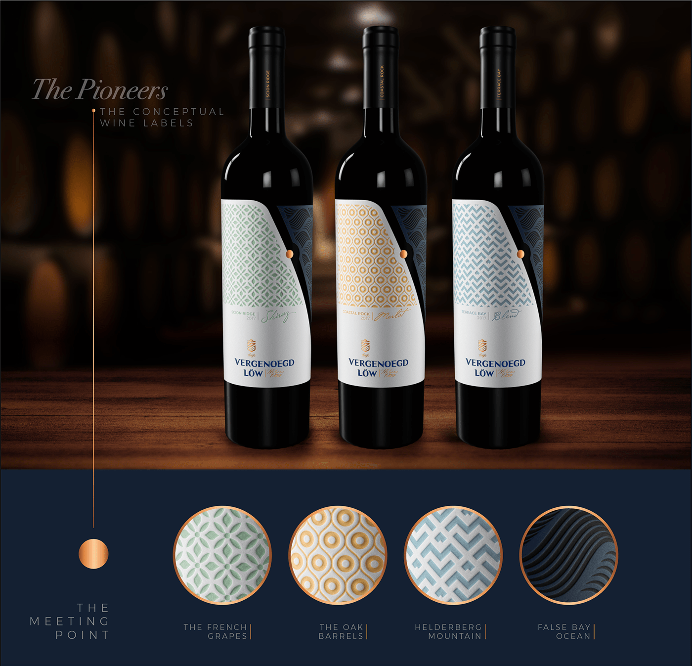
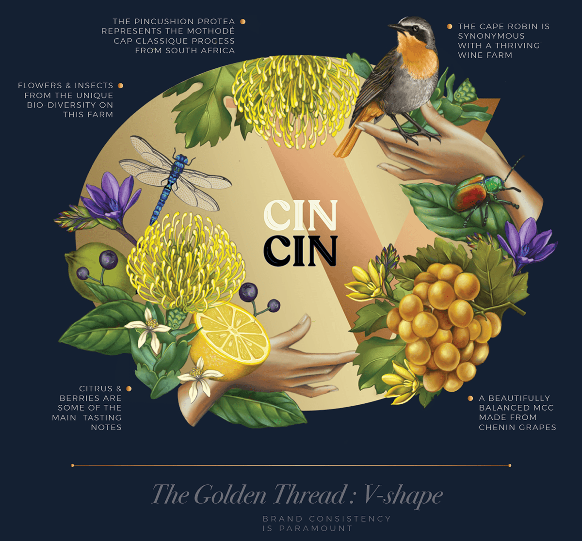
Vergenoegd Löw The Wine Estate is perfectly situated in between the peaks of the Helderberg and the coast of False Bay. This unique location allows the sea breeze to fill the air and infuse our fertile soil with a distinctive maritime character. This Meeting Point where ocean meets mountain is the inspiration behind our labels.
The unusual die-line has a diagonal split to create a dynamic shelf presence. The wavy pattern on the right represents the maritime influence on all three labels. The coloured pattern on the left on each varietal pays homage to the different elements that contribute to our distinctive terroir and wines. Our Shiraz heroes our French heirloom grapes, our Merlot focusses on our Oak barrels that imbue the depth of flavour and our Blend celebrates our terraced foothills. The dot in the middle of the split represents the farm and its location between these converging elements.
CLICK HERE TO SEE PHOTOGRAPHY CASE STUDY

At Vergenoegd Löw The Wine Estate one of our cornerstone principles is exceptional quality and craftsmanship.
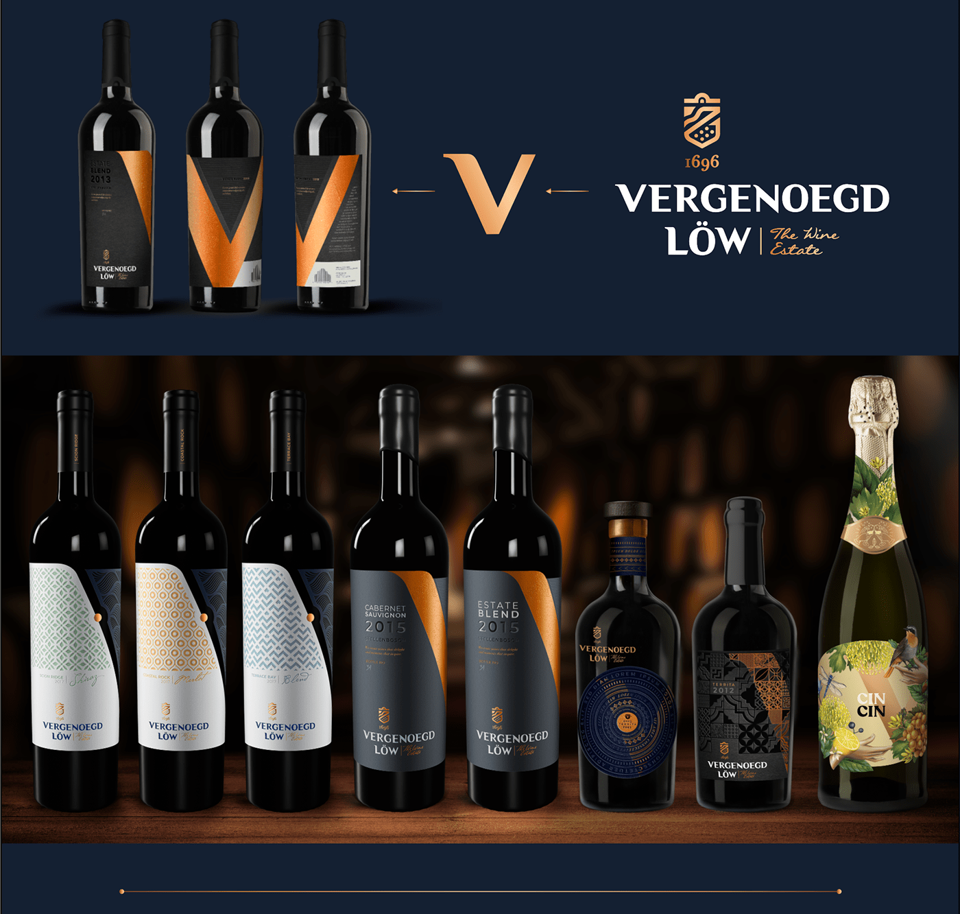
The copper-foiled V-shape that splits our label is reminiscent of the ribbon of a medal around a winner’s neck. This is a brazen tip of a hat to the fact that we take pride in our wine that is handcrafted with meticulous attention to detail and bottled with passion. The V-shape also has an uneven, irregular texture that is a toast to our unique terroir that attributes to the premium quality of our wines. Another principle the farm focusses on is the preservation of our unique heritage as one of the oldest farms in South Africa. Therefore the barcode design on the label is a silhouette of the gable of our homestead that was built in 1773.
CLICK HERE TO SEE PHOTOGRAPHY CASE STUDY

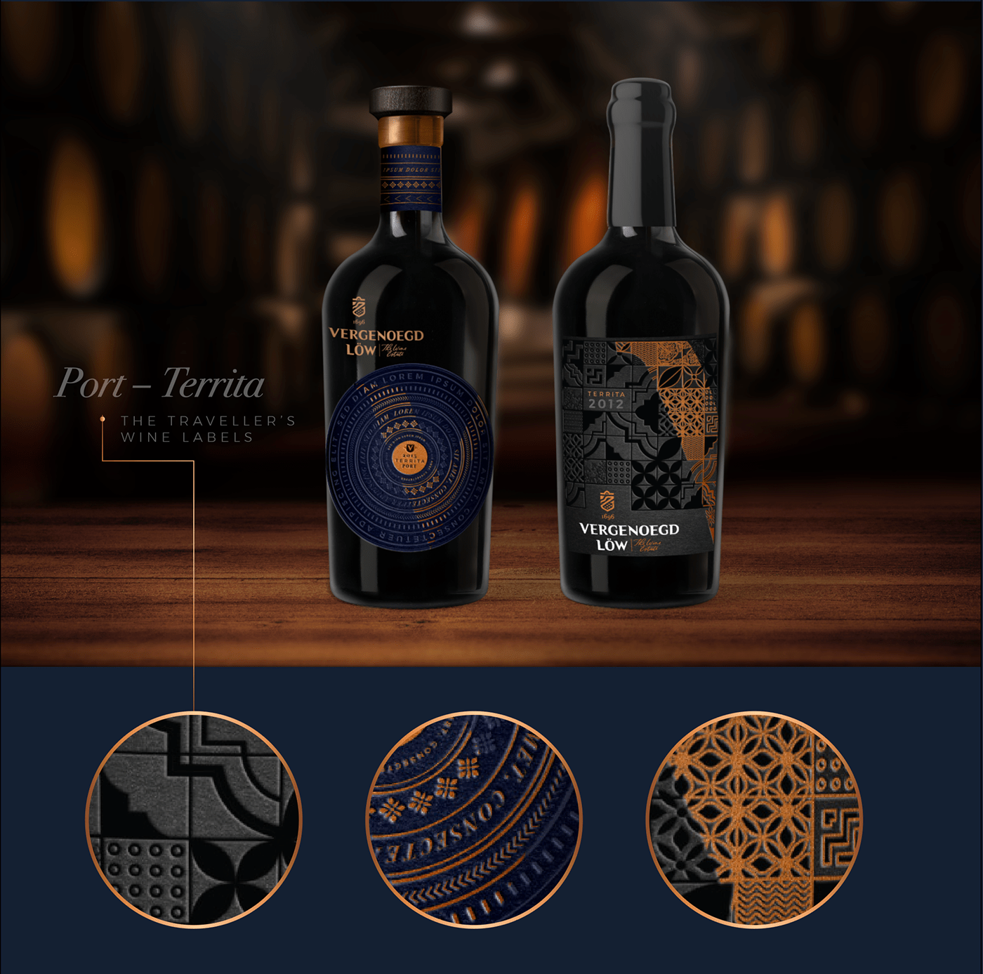
The year was 1986. Two Portuguese vines were brought from afar and sown in the rich soil of Vergenoegd Löw The Wine Estate. Territa serves as a love letter between the Portuguese heritage and the farm’s unique South African terroir. The Portuguese inspired tiling on the label is interlaced with the different patterns that represent the distinctive elements that make up this bold, complex Cape Vintage.
The copper foiled V-shape is our signature golden thread that can be seen on all of our Estate wines, it creates a dynamic diagonal split that is reminiscent of the ribbon of a medal around one’s neck. This is a brazen tip of a hat to the fact that we take pride in our wine that is handcrafted with meticulous attention to detail and bottled with passion.

The V-shape is our signature golden thread that can be seen on all of our Estate wines, it is derived from the “V” in our word mark from the logo. It creates a dynamic diagonal split that is reminiscent of the ribbon of a medal around one’s neck. This is a brazen tip of a hat to the fact that we take pride in our wine that is handcrafted with meticulous attention to detail and bottled with passion.