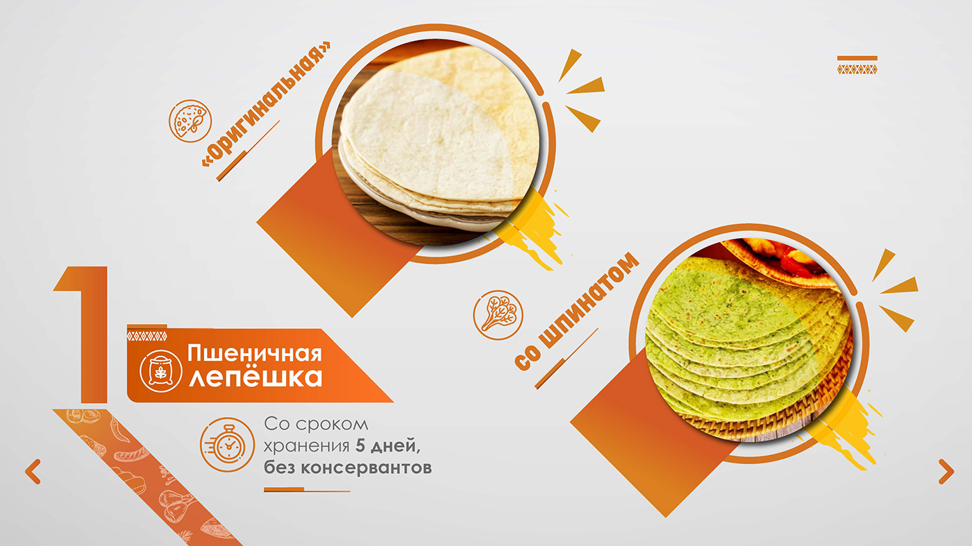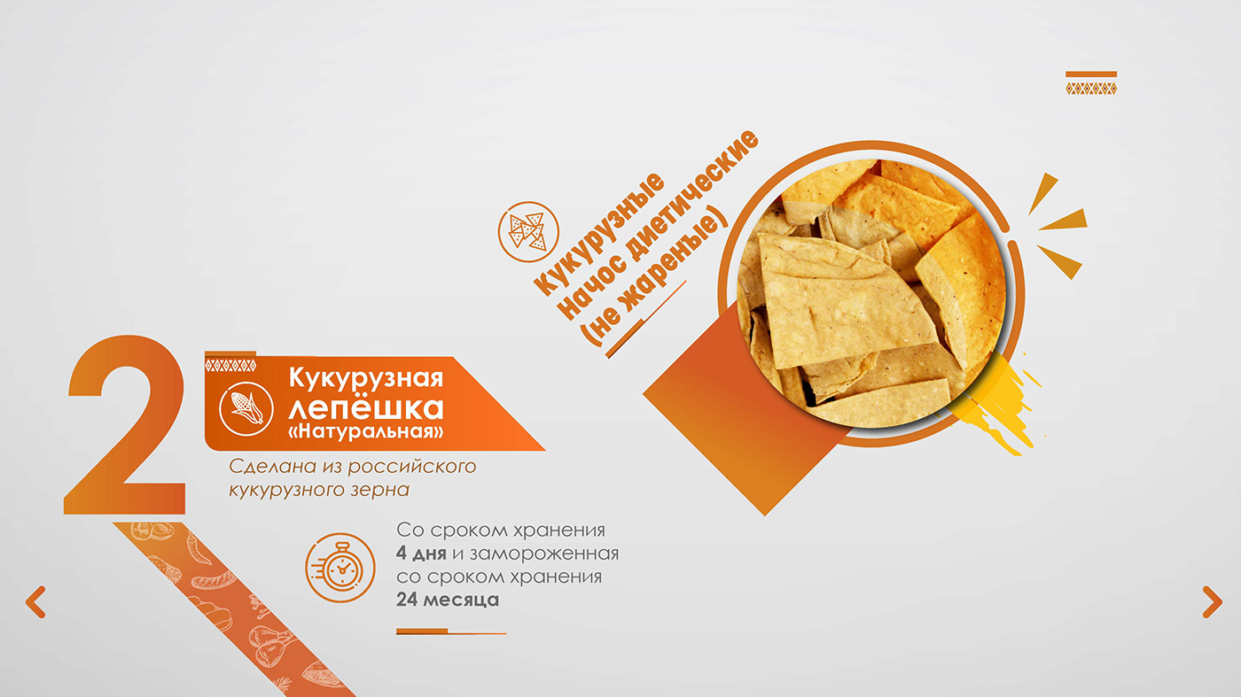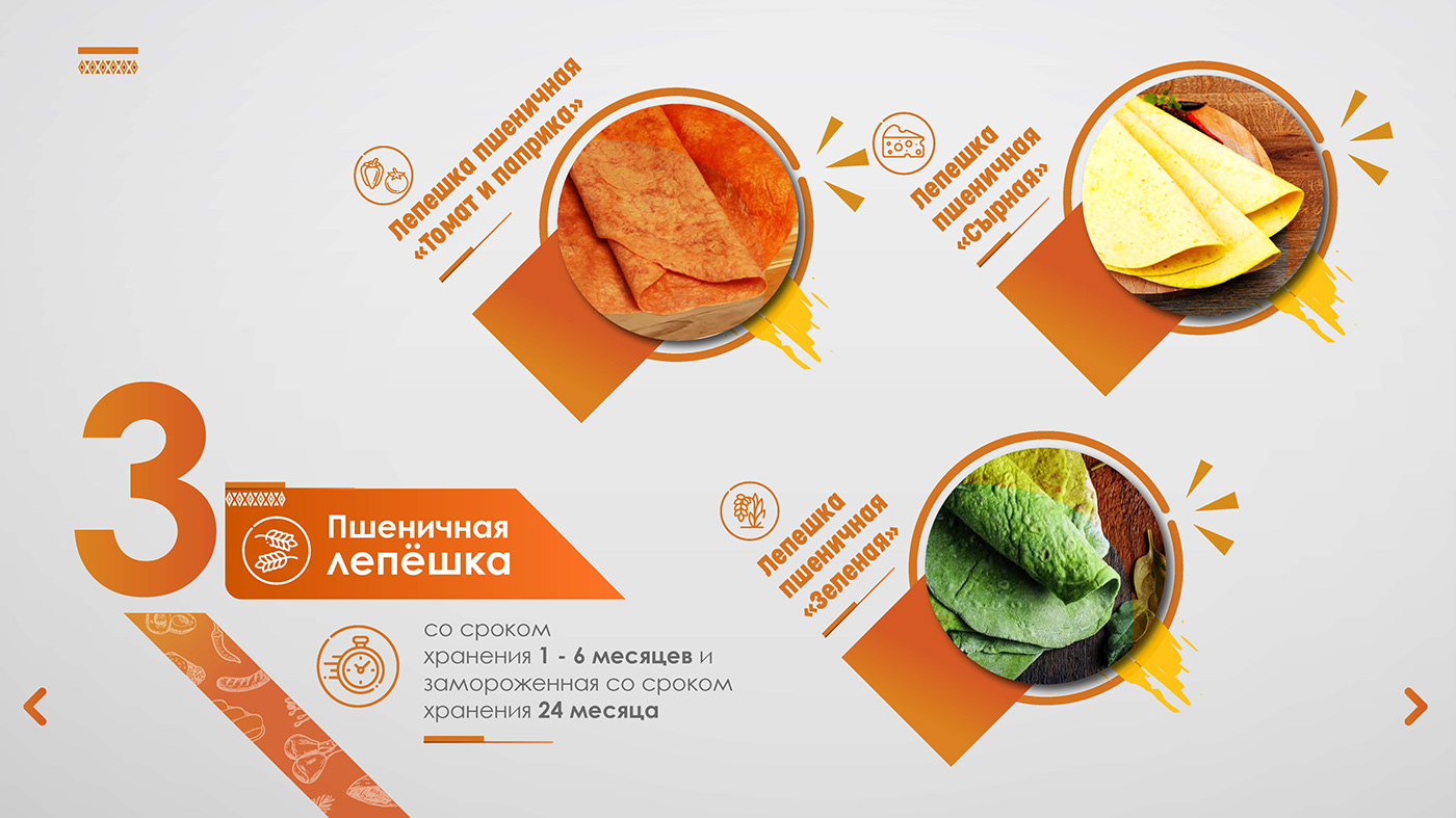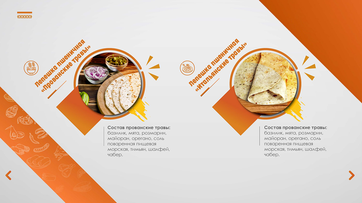
Asteka Mx is a brand that markets Mexican food products based in Russia and founded by Luis Ernesto Leiva. Our production specialty lies in corn and wheat tortillas.

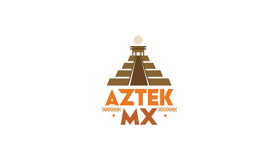
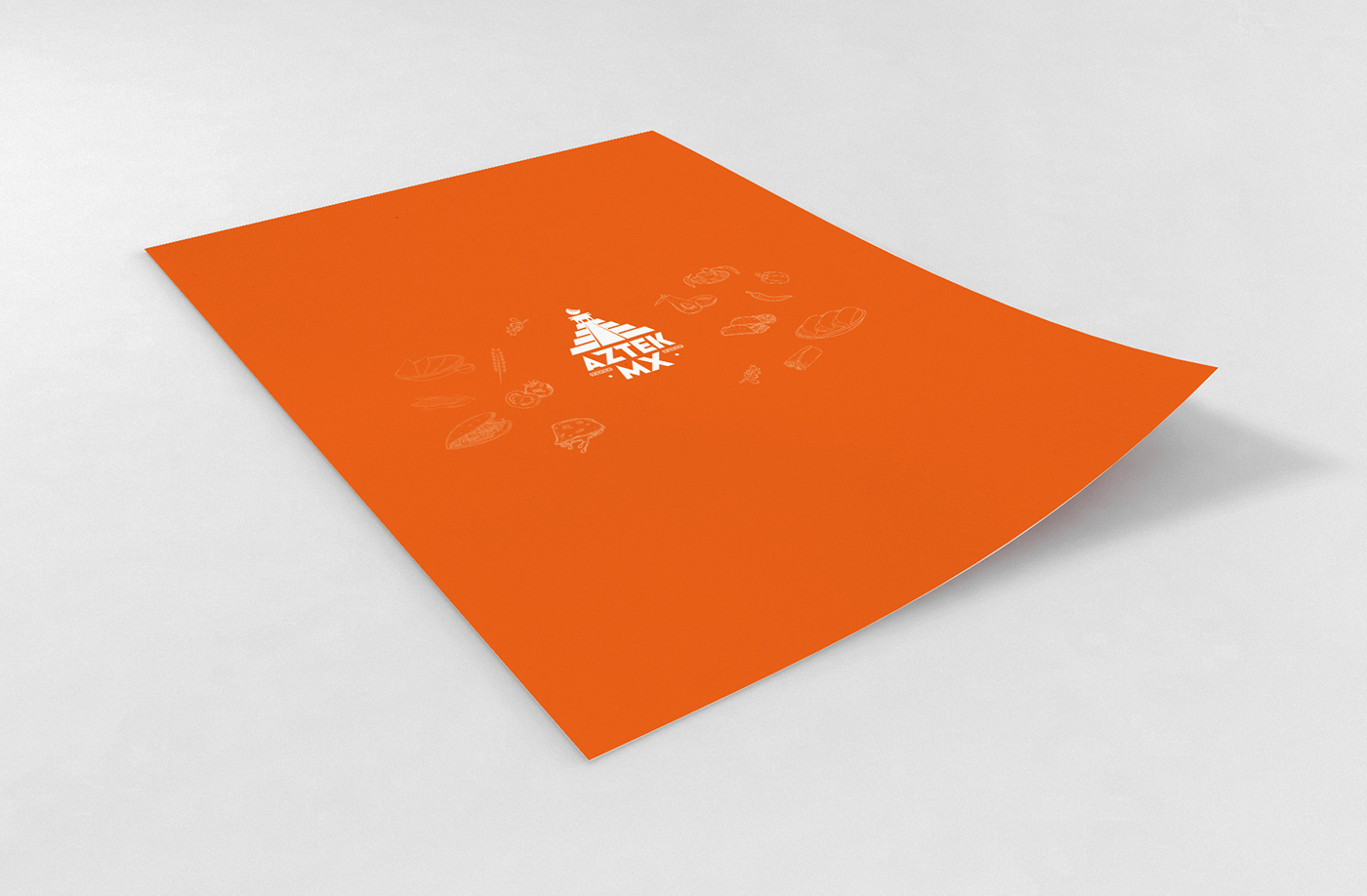
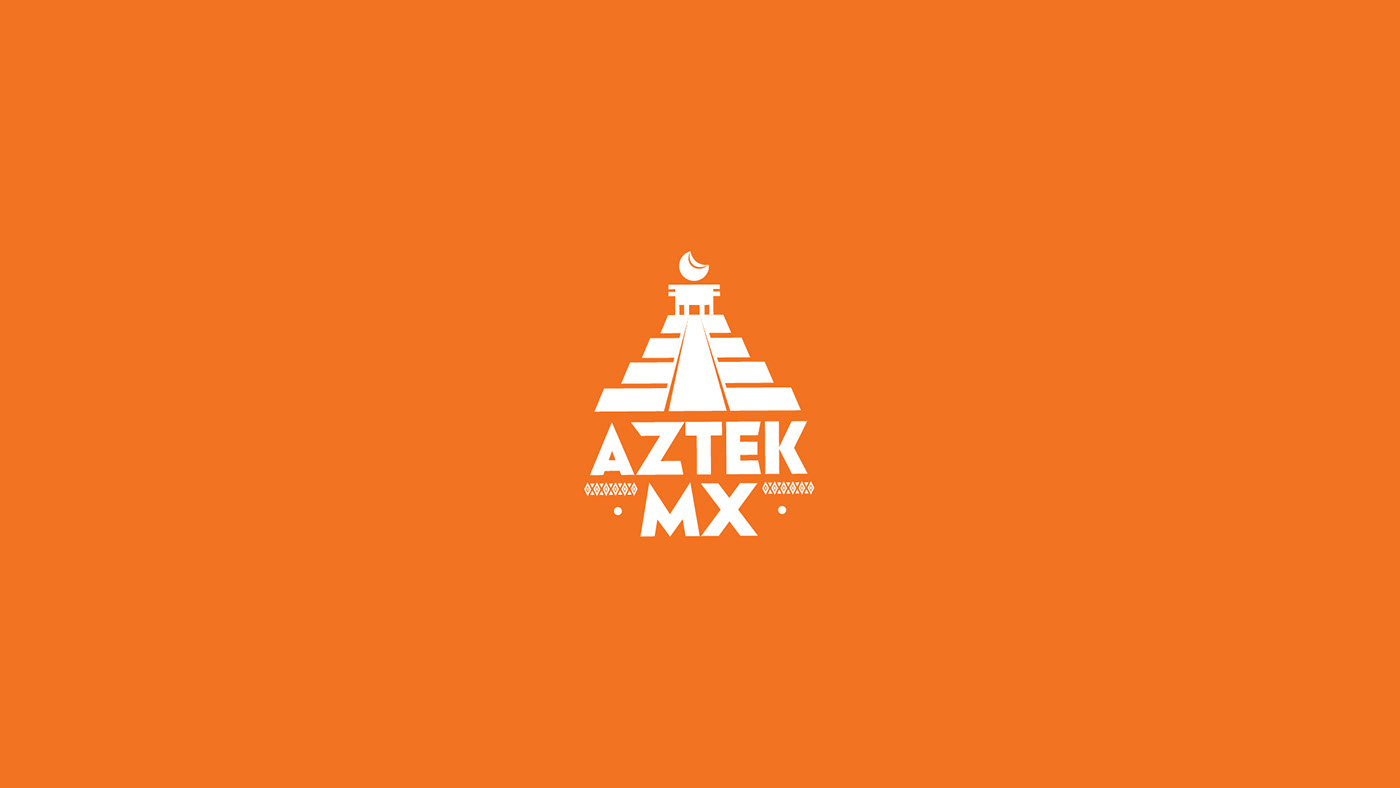
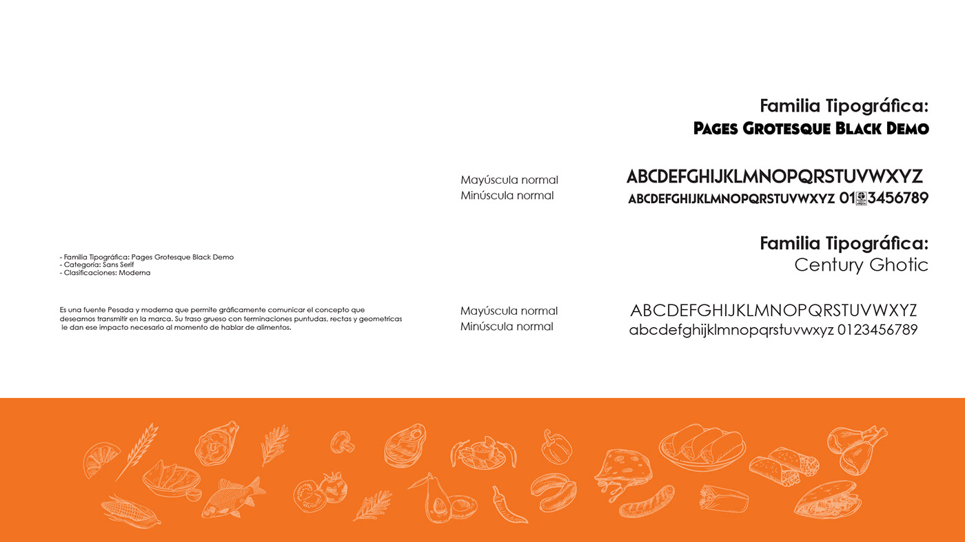
This logotype is built on the Pages Grotesque Black Demo typographic base and a simple symbol representing an Aztec pyramid, alluding to Mexican culture. At the top, a tortilla symbolizing the sun is depicted. It's a modern and minimalist redesign. The sans-serif typography is bold with thick strokes, making it impactful and eye-catching, allowing it to linger in the recipient's subconscious. The symbol is constructed using shapes, counter-shapes, and incisive lines that create rhythm and seamlessly integrate with the typographic component.

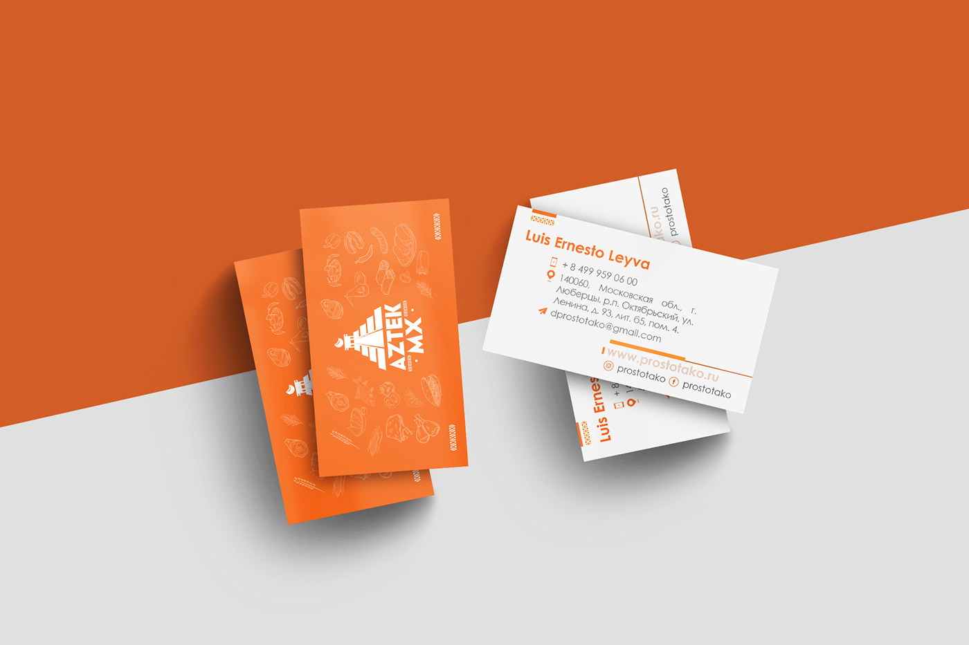
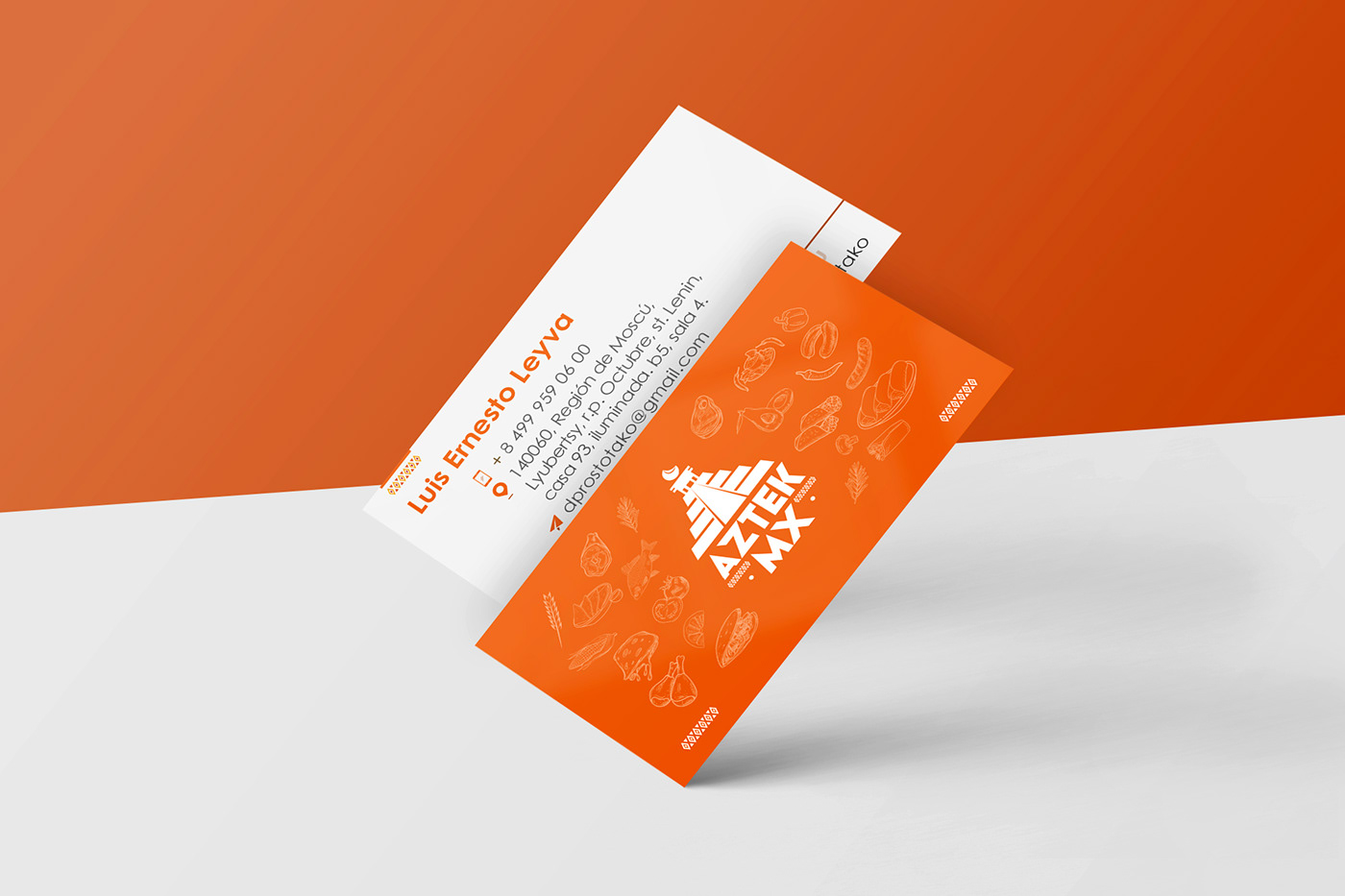
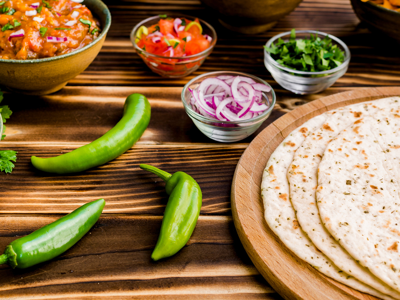
The complementary graphics of the identity system consist of a standardized background in Astek MX orange, a stripe generated from geometric figures representing the Asteka culture, and a series of illustrations of various foods directly related to the piece. This creates dynamism and a modern style representing Mexican gastronomy. The pieces play with orange stripes and composition cuts to consistently generate dynamism and modernity.