Brand Refresh for Headsnapper Wine
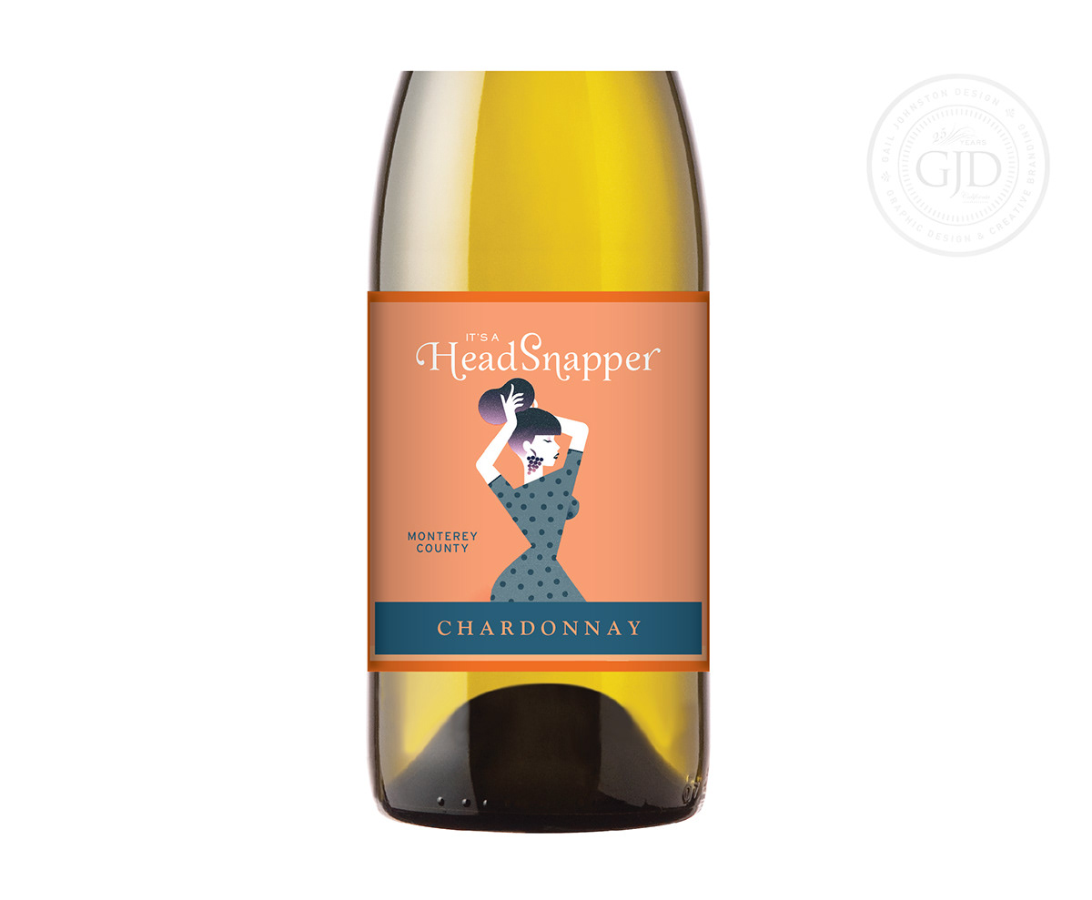
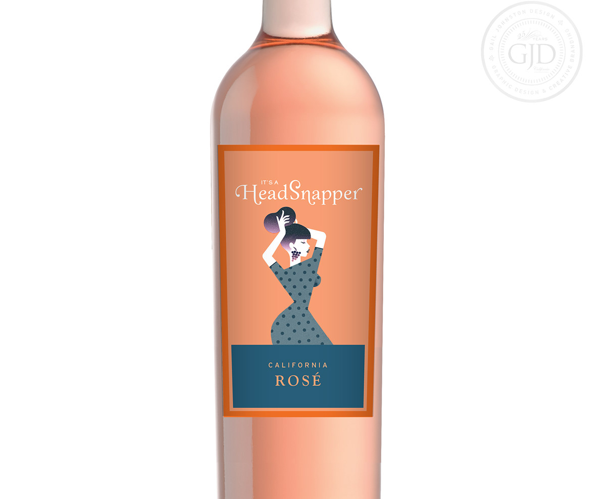
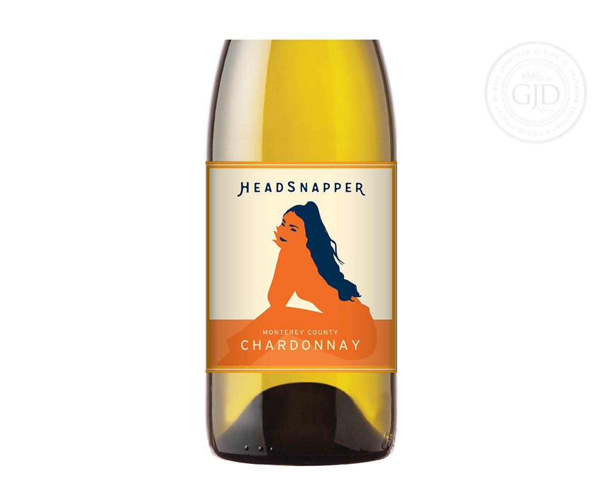
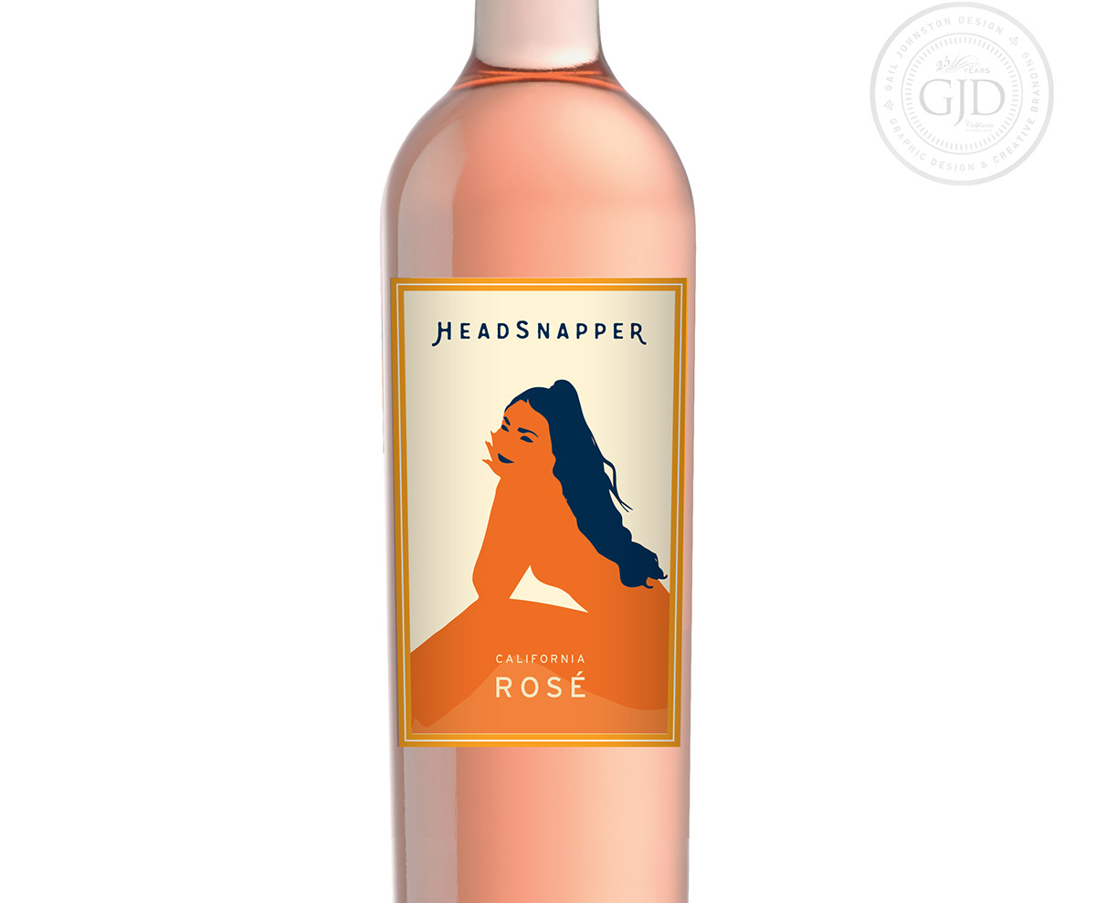
The label for “It's a HeadSnapper” stands out due to its intense orange color. For a brand refresh, orange had to be retained, but the old fashioned illustration of the giddy woman had to go. (Trust me on this. It’s not worth showing!) The concepts I presented included the two designs here. The first one shows an illustration by Benoit Drigny where I added grapes for earrings. The second design shows my illustration of a head-turning woman with a mischievous smile. Making the woman herself orange, verses a flesh-toned color, was an effort at diversity, but ultimately the client put a stop on the project, possibly to rethink the brand’s positioning.