


⠀
⠀
⠀
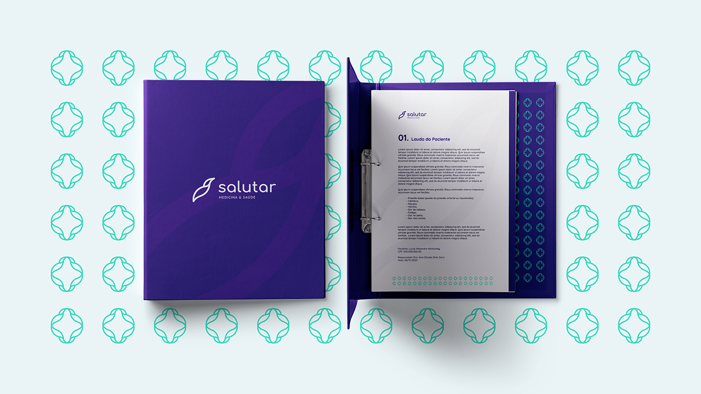
Salutar Medicina — Branding
Strengthening human connections through restoring health and well-being.
⠀
⠀
⠀

⠀
⠀
— PROJECT BRIEF —
We define the brand as an expression of longevity, hope, enthusiasm, passion, diversity, and search for a better quality of life. The focus is on people. Ever.
⠀
⠀

⠀
⠀
— DESIGN STRATEGY —
We think of this brand to have diversity and welcome any kind of person. Through the concept of origami tsuru, we developed a bird as a ascension symbol of the brand.
⠀
⠀


⠀
⠀⠀CLIENT
⠀⠀CLIENT
Salutar Medicina & Saúde — November 2020.
MARKO CRIATIVO STUDIO TEAM
Lucas Markovsky and Paloma Rodrigues.
CREATIVE AND ART DIRECTOR
Lucas Markovsky.
GOLDEN RATIO GRID SYMBOL
Paloma Rodrigues.
DESIGN STRATEGY
Lucas Markovsky and Paloma Rodrigues.
VISUAL IDENTITY SYSTEM
Lucas Markovsky and Paloma Rodrigues.
-⠀
-
2021 © Marko Criativo Studio. All Rights Reserved.
Developed in November 2020.


