The largest job vacancy site in the Netherlands, Jobbird.com, needed a fantastic normal, bold and distinctive new visual identity. Who you gonna call? Studio Lennarts & De Bruijn! Well, first they called HERC the Agency who quickly realised they needed graphic design experts to accompany them on this particular quest. So, they got us on board.
Fantastic, man.
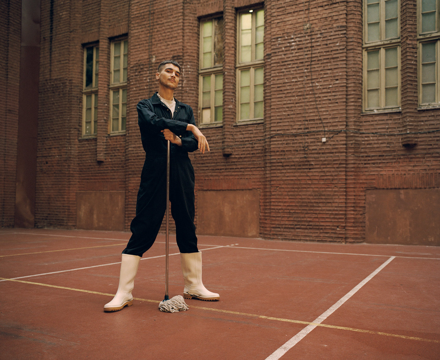
Visually, all of Jobbird.com’s competition have the same appearance. Their identities are quite dull and a bit boring to be honest. They’re not at all a visual representation of the diversity that a vacancy site has to offer, jobwise. To spice things up, and to honor that diversity, we felt that Jobbird.com’s identity needed to be bolder and more colourful.
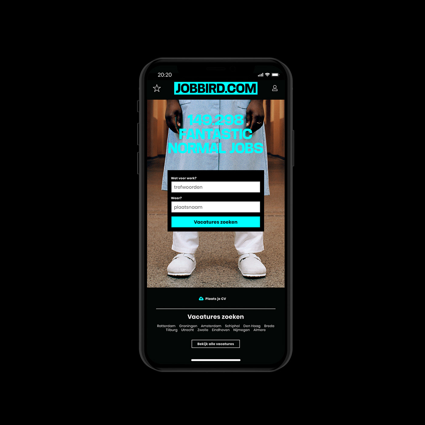
Sturdy, strong and outspoken are some of the fundamental characteristics which we've translated into their new visual appearance. We've loosely based the color palette and logo on one of the most infamous and functional office tools there is; the highlighter.
Sturdy, strong and outspoken are some of the fundamental characteristics which we've translated into their new visual appearance. We've loosely based the color palette and logo on one of the most infamous and functional office tools there is; the highlighter.
Who hasn’t used it to highlight every bloody thing in their college textbooks?
www.jobbird.com


Creative direction: HERC the agency
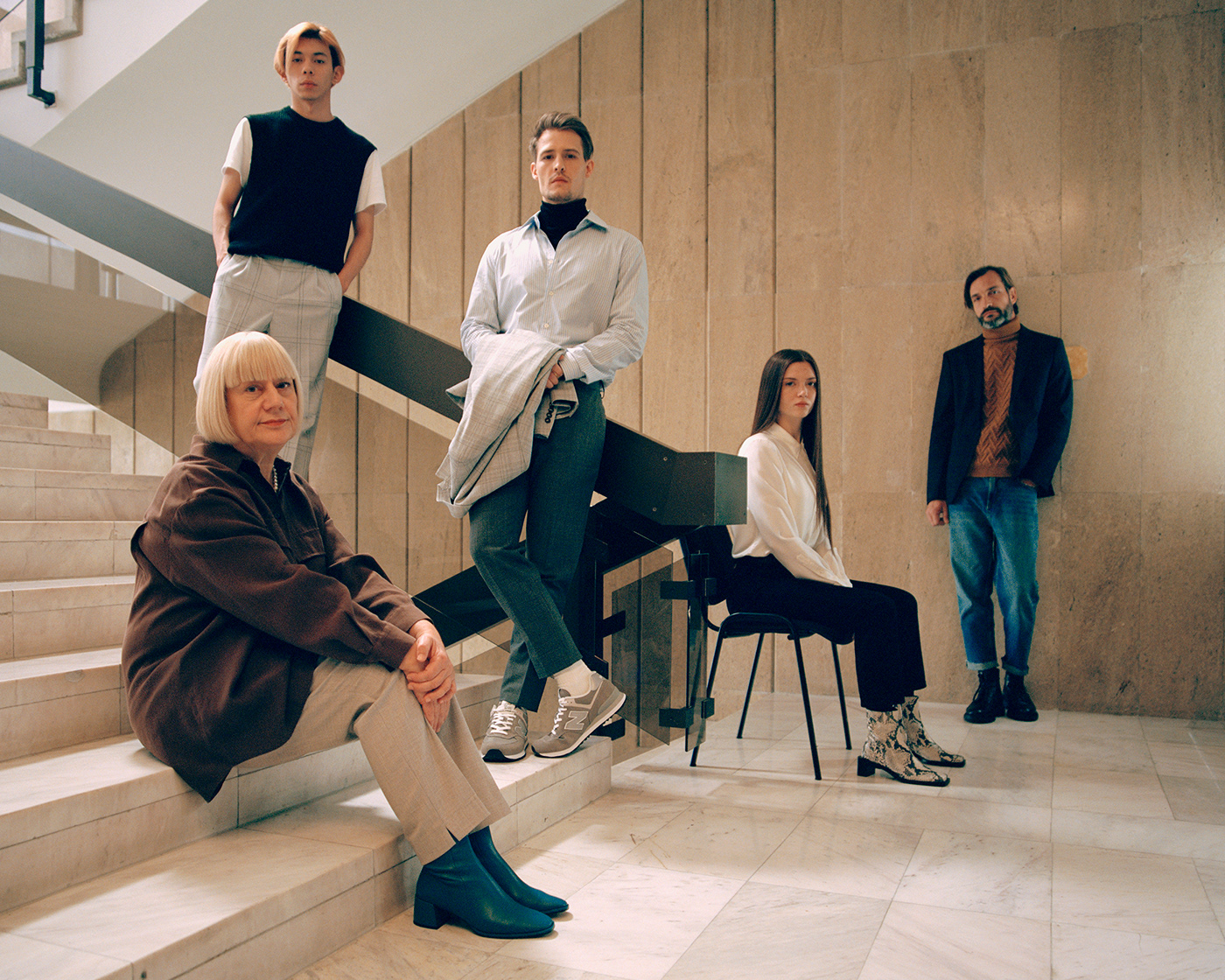
Fantastic photography: Gilleam Trapenberg
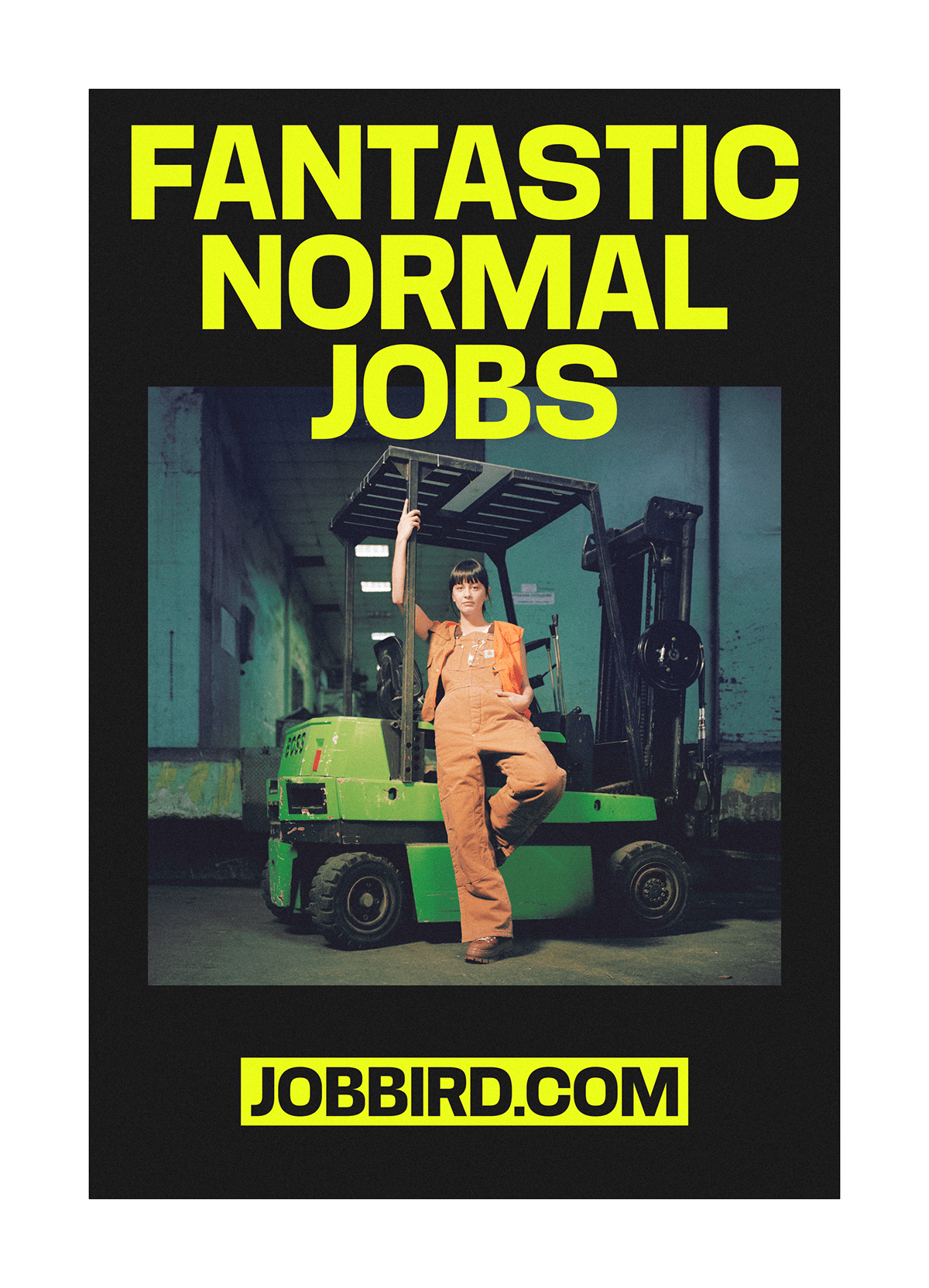


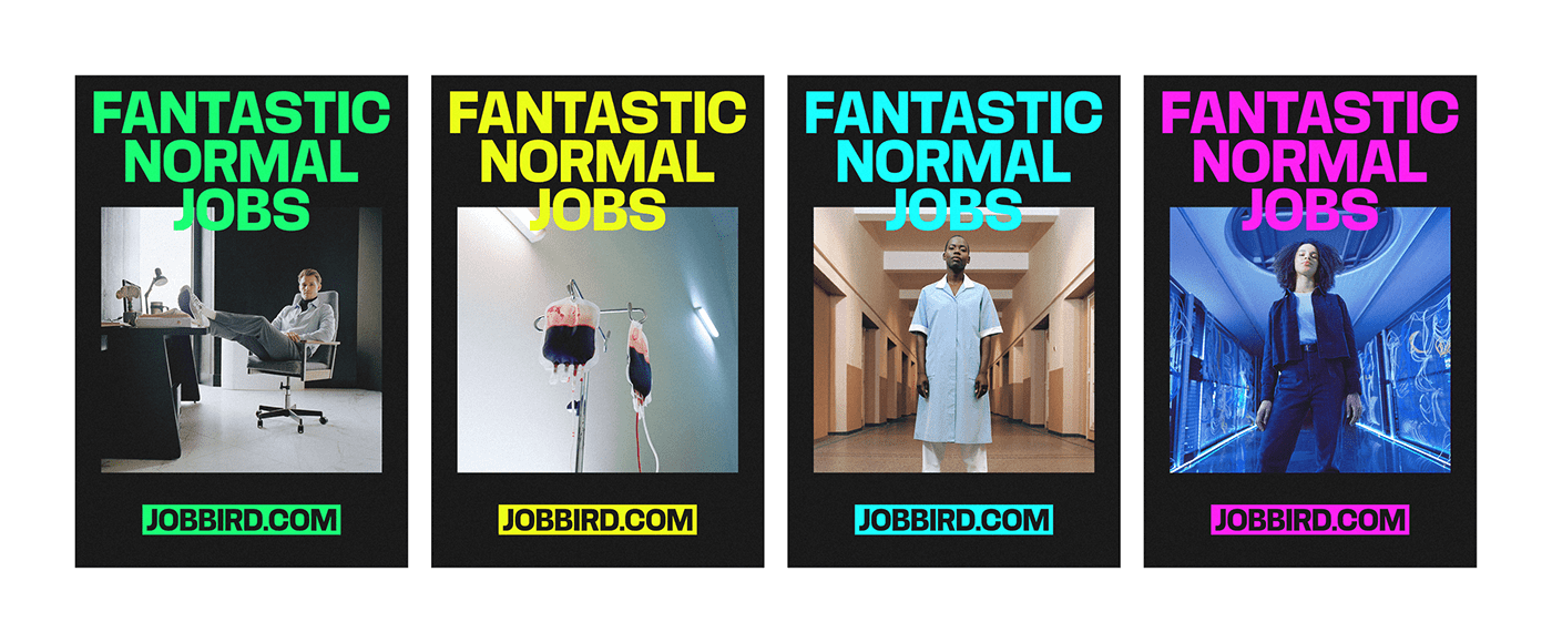


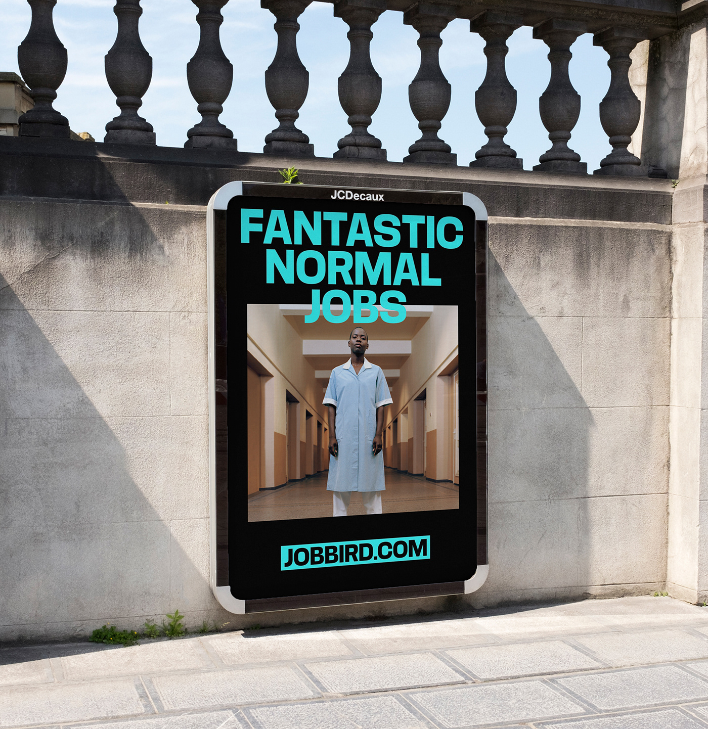
We’re not trying to paint a pretty picture here. Jobbird.com does not have the 0.01% of utopian jobs, like blunt roller, space pilot, travel photographer or influencer. But hey, they do have the other 99.99% of the jobs. And those fantastic normal jobs might even be better! The jobs that pay for your house, your car, your vacation and possibly even your coke addiction!
So, isn't it time to get back to normal? To put the utopian into perspective and to value the ordinary? Normal is the new special. So, crack open that ice cold coke and go get yourself a new fantastic normal job over at jobbird.com.
Fantastic, man.